Cognitive Dissonance
Cognitive Dissonance
I hope everyone had an enjoyable Independence Day weekend and took this opportunity to forget about the market for a few days and spend some time with your family. Life is short after all and as human beings in the 21st century we often have to force ourselves to stop and smell a few flowers. Of course market megalomaniacs like yours truly can’t afford such luxuries – a long weekend for Mole means an opportunity to break out the safari hat and hunt for exotic charts.

And boy, did I bag a few rare specimen – I was quite the busy bee. You better close a few tabs before you log in – what’s waiting is a veritable onslaught of charts.
But let me set the stage first: Over the weekend the blogosphere has been buzzing with the notion that the current H&S pattern on the SPX is most likely going to fail. The reasoning behind this prediction is simple and on the surface quite a delicious notion, one that would make complete sense to the average market contrarian:
Everyone is short the market right now.
Unfortunately I have this mental compulsive disorder which forces me to constantly question any type evidence or hypothesis that I come across. Sure, I have my own silly ideas but I try to back them up with data. Some people call that a ‘critical mind’ – but the magnitude of my chronic disposition stems from the realization that I am probably just a major pain in the ass and enjoy disagreeing with people way to much. But that’s a different story.
So, are the pundits may be over thinking this a little? Or is it me who gets the poison?
Alright, I bite! Let’s take a look at the evidence that, according to various analysts, will surely propel us back to SPX 1200 and beyond in the coming weeks:
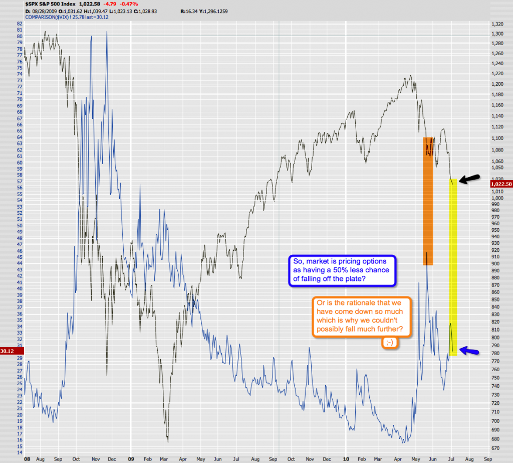
Let’s start with the simple stuff first. Mr. VIX against the SPX – everyone looks at that. Well, what I’m seeing is that volatility of S&P index options on the CBOE is currently 50% lower than when the SPX was trading at 1080. We are now at 1022. How does that make sense? Are we less at risk right now as we are slightly below the neckline of a monster size H&S pattern? Not that there are any guarantees but it’s not unreasonable to think that a VIX of 30 at this very stage just may be a tad optimistic?
In any case – if everyone is short this market, then why are market makers pricing puts so cheaply? Let’s be devious for a minute (easy for stainless steel rats) and assume that they are going to push the tape up to 1130 and higher next week – wouldn’t you want to push put premiums as high as you can? I for one see complacency here at best – and at worst a bout of cognitive dissonance.
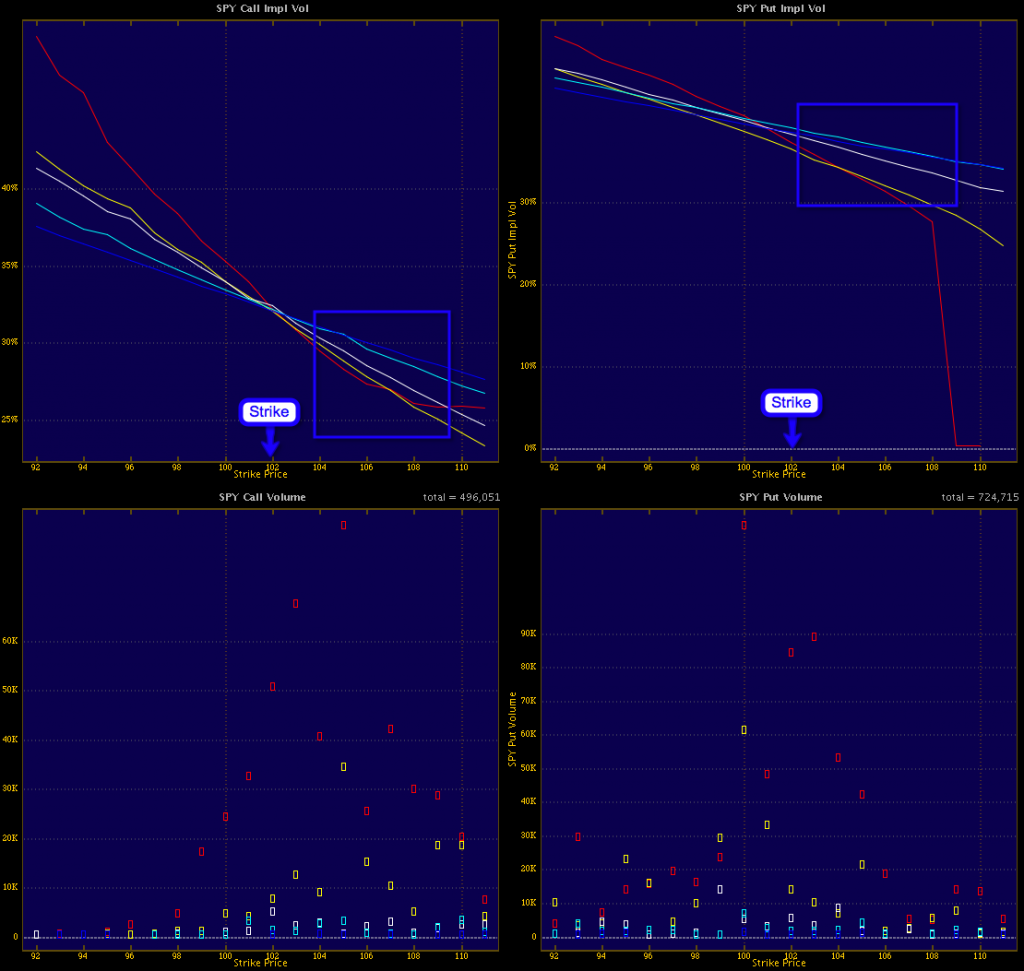
Well, let’s dig a little deeper – volatility skew on the Spiders: Seems to me that put strikes horizontally are priced higher than their call strike counterparts. If put volatilities are higher than call volatilities it indicates that traders are buying puts. An excess of put buyers reveals a skew that favors stock prices going down. A similar argument can be made for expensive calls.
Alright, so it must be all of us dumb retail traders then, right?
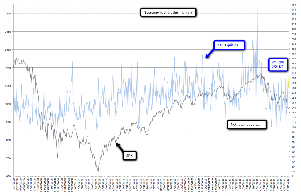
Actually no – things are a bit more bearish than in 2009 but the ISEE closed at 200 on July 1st and at 179 the day after. I don’t call that excessively bearish. Now if we were close to the 100 mark that would be a different story but that happened a few weeks ago after the first big drop. Seems to me that many retail traders are buying the dip – not excessively so but there is is buying.
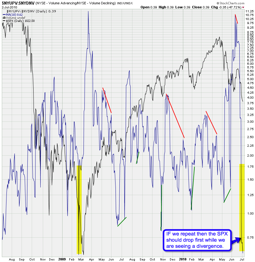
The one chart that does point to an excessively oversold condition is the NYSE Adv/Decl Volume chart. Boy, we have not seen a spike like this since the end of Primary {1}. But if you look closer – we did continue downward after that 0.75 reading and it was a divergence that indicates we were sitting at a low. Not unreasonable to think that the same may happen this time around and that a divergence would accompany the end of Intermediate (1) of Primary {3}.
But this chart is a cause for bearish concern, so let’s dig in even deeper:
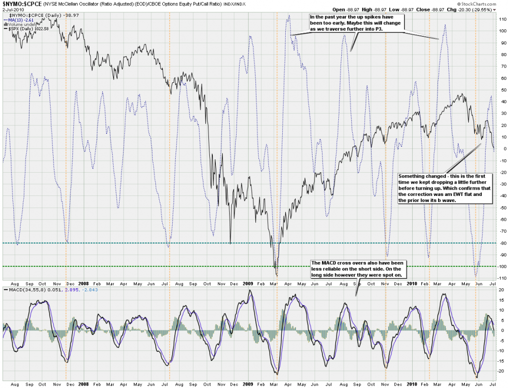
This chart is a ratio between the McClellan (a medium term momentum indicator) and the CBOE Put/Call ratio. I would have preferred the ISEE but there is no way to get that one into stockcharts (I think). What this thing seems to be really good at is to call market lows (see the vertical lines). It used to be pretty descend at market tops as well but that was weakened in 2009. So, let’s stick with the long side: Are we anywhere close to a low here?
Okay, maybe I’m looking at the wrong ratio – let’s try something else:
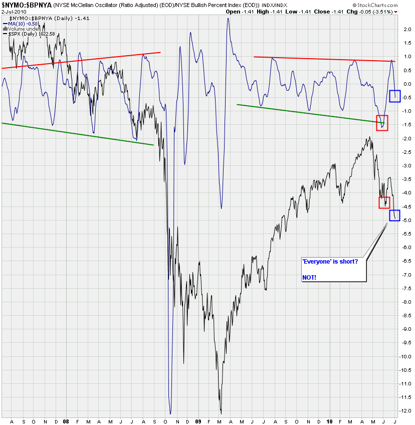
NYMO:BPNYA (the latter being a long term P&F based momo indicator). Granted – we are closer to an oversold condition here but we are far away from some of the recent lows.
Okay, let’s use an SMA instead of an EMA – the latter favoring the short term more. But it’s the same story – clear divergence between price and oversold reading.
How about the NYMO:VIX ratio chart which I posted here before? Again pretty good at calling medium/long term market lows, remember? And again I’m not seeing a reading that’s even close.
Alright, we’re not getting anywhere with this, let’s look again at the SPXA50 – which shows us all S&P 500 stocks above their 50-day SMA:
I have to admit that this one may make the hair in your neck stand up. So, first we are curious about how many S&P 500 stocks are above their 50 SMA. Fine – but that wasn’t good enough for Mole – too much noise. So, I slapped on a zigzag which shows the general trend – many Elliotticians use the zigzag indicator to indentify wave counts. We’re not doing that here. We are looking for long term divergences and fractals.
Once I added the zigzag I was surprised about the fractal nature of the pattern. I have labeled what I see – and again it’s not related to Elliott wave counts – I’m just trying to put things into context. Short/medium term it seems to me that we may face a repeat of 2008 – may be wishful thinking. But the CCI I added to the bottom also doesn’t think we are way oversold right now.
Same chart but this time against the VIX – let’s see if volatility alters the data. I actually think it increases the quality of the pattern – would you agree?
Maybe we are looking too short term – let’s go to the SPXA200 and do the same thing. Now, that in my mind is our chart of the week. Why? Look at the pattern accompanying the bear market rally of 2009. Boy, had I just uncovered this thing earlier, we could have saved ourselves a lot of pain. A fascinating chart indeed and it strongly suggests that we may bounce short/medium term but that the long term trend has most likely changed.
What do I base that assumption on? Let’s zoom in a little more: Look at the crash pattern in 2008 and what preceded it. We are now seeing a similar pattern as what was unfolding in early 2008. What’s also fascinating is that it shows two crashes – one to the downside (which everyone acknowledges) and one to the upside (which we call a bear market rally). These things go both ways – of course very few market participants associate a buying frenzy with a long crash.
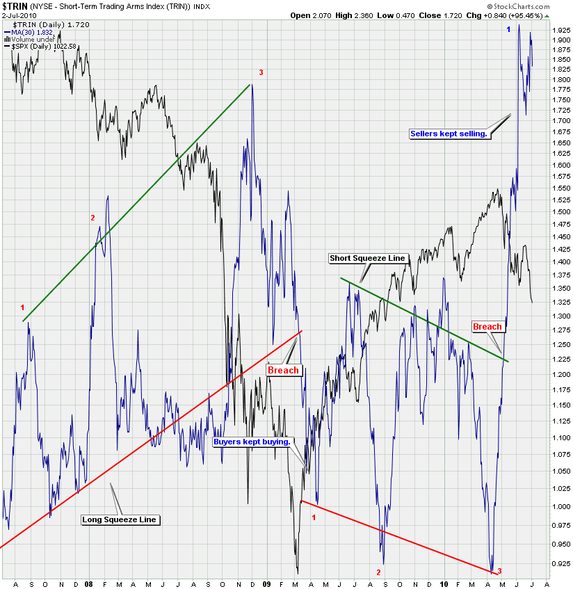
Many pundits are pointing towards the extreme TRIN reading as a sure sign of a bull market in the works.
Well, I think that my VIX:TRIN ratio chart is a lot more accurate at calling bottoms and tops. And if history is of any value right now then why are we not closer to my top line? Why are we so close to the bottom one?
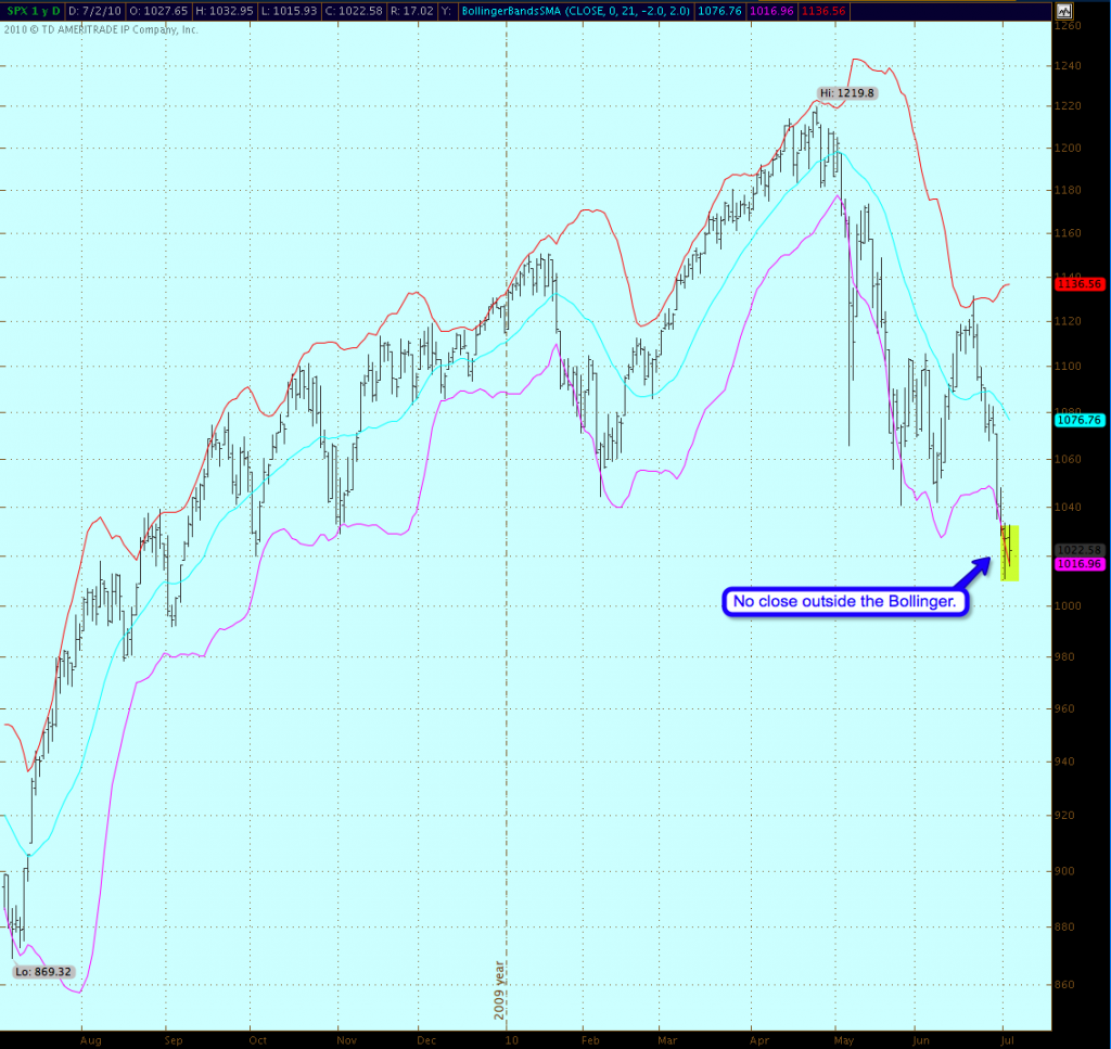
Before we get to the count one more chart and it’s a more subtle one. The 2.0 BB on the SPX, which shows no close outside its Bollinger just yet. So, we may see a bounce here but I have doubts about a violent snap back as the ones you get when closing outside the top or bottom lines.
Frankly, I myself would expect a bounce here pretty soon – but a rally to new highs and a failed H&S? I don’t think the fat lady has sung on that one yet. Let’s also not forget that H&S pattern (when they actually succeed) often breach that neckline and then snap back one last time to shake out as many passengers as possible. Remember – the bus moves fastest when it’s empty. Fair to suspect that this may happen this time.
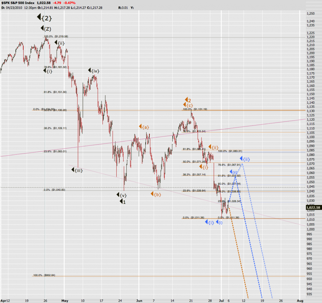
So, I’m going to stick with my medium to long term perspective – which is that we may bounce as indicated by Soylent Blue but that we remain inside Minor 3 of Intermediate (1) of Primary {3}. Which means that a low is quite some ways away.
When do I know that I’m wrong? Once we breach 1130 – I know that’s a bit late but that’s also why I’m playing this thing more long term. Calling market tops and bottoms is a fools game. So is calling market crashes. And maybe we won’t get one – perhaps we just keep descending like we have for the next few months. That would be a lot less profitable but IMNSHO a lot more profitable than trying to be long in this market. Too much technical damage has been done and I believe it’s going to get a lot worse before it gets better. In the end of course price will tell us when we’re wrong and 1130 is not that far away in the big scheme of things – especially considering the downside potential here.
If you think that Soylent Blue (or worse) is what we’ll get then I would suggest you try your luck at some vertical spreads. Granted Mr. VIX is only at 30 but if we bust higher towards 1070 I expect CBOE volatility to drop towards 25 and that would be a 17% change against your vega. So, a vertical spread is better medicine and cheaper too!
If we go that high then I personally will add a few more short positions – which I would probably hold into 1120. Any higher than that and our count is probably wrong and we’ll have to go back to the old drawing board.
Cheers,
Mole


