High Pole Warning
High Pole Warning
Sometimes the market will throw us a curve ball – despite all our fancy charts and especially once we imagine that we may really know anything beyond what’s right in front of us. Deal with it – better yet – embrace it because if you want to trade for a living that’s as good as it’ll get, no matter what anyone else will try to tell you. A few weeks ago I projected SPX 1220 as a good target for a then nascent counter rally. Once we got there quite a bit evidence pointed toward a continuation, nevertheless we presented important support lines that needed to be held. The breach of these support levels may be earlier than anticipated but represents technical damage that adds to our long term bearish picture (which is the good news). On to that theme I have produced a set of chart I am certain you will enjoy.
Before we get to the good stuff I’ll throw out some short term musings for free:
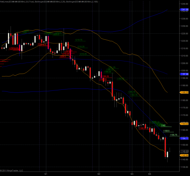
The spoos traded on Labor Day and continued Friday’s sell off with a close at 1145.50. The pattern looks pretty bearish and if you are still holding out for a reversal then 1156.75 is currently your magic number (and NLBL). There is one more NLBL above at 1158.5 but we are also facing the lower 100-hour BB plus the 25-hour SMA – quite a bit of resistance. All in all we are in a pretty tough spot here and I personally would wait for first a breach of the 25-hour SMA and a successful reterest before even thinking of a long position.
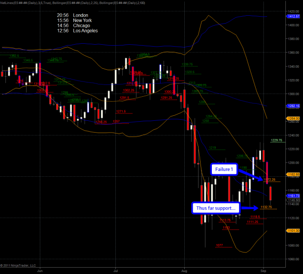
On Friday I told my subs that 1172.25 needed to hold but we wound up closing below it. The price paid for this transgression was a drop to 1132.75, not so coincidentally our second NLSL support. Suffice to say that we need to hold this and it’s really the Maginot line for the longs. A drop below that probably gets us in the mid-1100s, if not lower.
Alright, enough with the easy stuff – I have some really goodies for my subs today:
[amprotect=nonmember]
Charts and commentary below for anyone donning a secret decoder ring. If you are interested in becoming a Gold member then don’t waste time and sign up here. And if you are a Zero or Geronimo subscriber it includes access to all Gold posts, so you actually get double the bang for your buck.
[/amprotect]
[amprotect=1,13,9,12,5]
In order for you to fully appreciate what’s going on on a medium to long term basis we need to take a little stroll down memory lane. I’m sure many of you were around back in 2008 when the tape fell apart like a cheap suit. But I’m pretty certain that very few of you have observed it through the lens of point & figure charts. There is reason to my madness, so please just humor me and follow along.
First up – if you are new to point & figure (a.k.a. PnF or P&F charts) then you may want to direct your attention to this great resource over at stockcharts.com. P&F charts are an acquired taste in that they do not plot time, just price – thus they have the ability to discard a lot of noise and retain focus on important support and resistance levels. Like regular interval based charts they can be traded via technical patterns, which admittedly are a bit of an acquired taste but can be extremely useful – let me proof it to you.
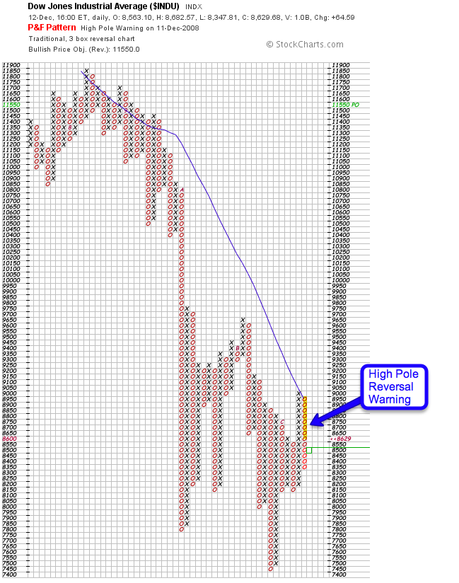
The pattern we’ll mostly focus on today is the ‘high pole reversal’ as well as its happy cousin, the ‘low pole reversal’. Here’s a good example, plotted on December 10th, 2008:
FYI – for you P&F aficionados: I’m using a traditional three box reversal chart. Anyway, here are the rules: The high pole warning is given when a chart rises above a previous high by at least 3 boxes but then reverses to give back at least 50 percent of the rise. The reversal implies that the demand that was making the prices rise has given way to supply pressure. The pattern is a warning that lower prices could be seen in the future.
Now it’s not called a warning without a reason – nothing is guaranteed but most P&F traders are less concerned with short term volatility. Their name of the game is the medium to long term time frame. With that in mind let’s look at the chart above. On December 10th there is a classic high pole reversal warning on the Dow Jones Industrial and you see a bit of follow through on the 11th and the 12th (the day of this chart).
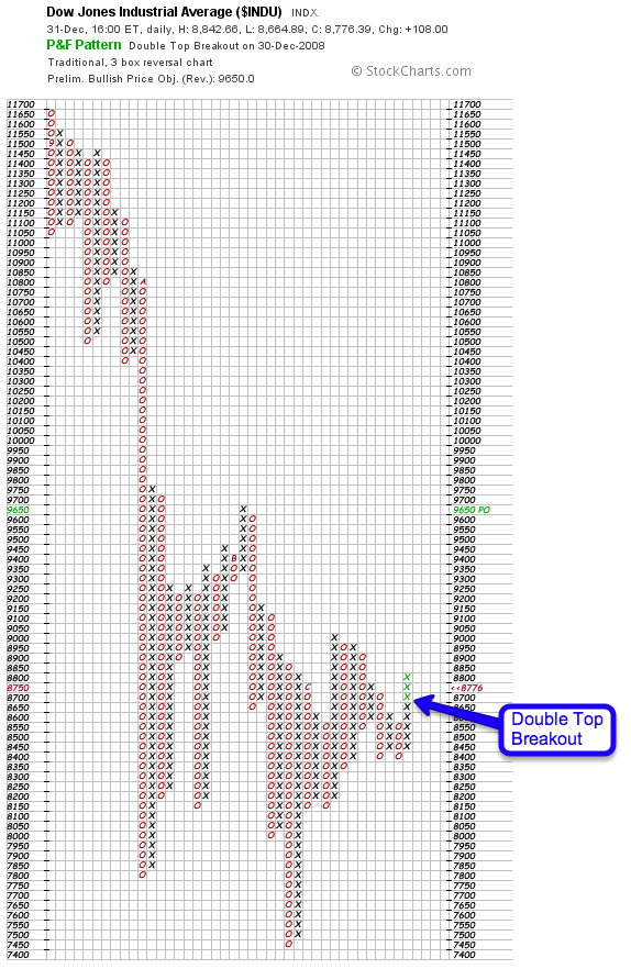
Let’s fast forward to December 31st – as you can see the high pole warning produced quite a bit of follow through but then stabilized around DJI 8400. Now we get bullish pattern called a double top breakout, which refers to two spikes to 8600. So a bit of a snapback is on the table.
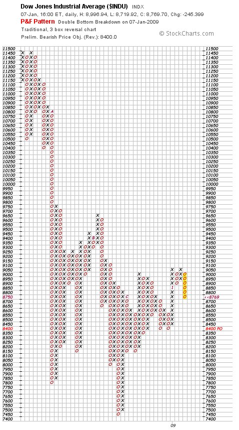
January 7th, 2009 – the double top breakout played out nicely but then hit a wall at the 9000 mark – plenty of opportunity to get out as I see a double top. We now got a double bottom breakdown – the inverse of the previous pattern.
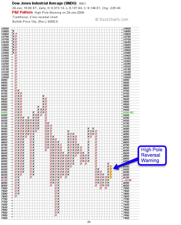
January 29th – the double bottom break down proved to be extremely profitable and got the DJI to 8000 where it found support. The ensuing reversal to 8400 was however rudely interrupted by another high pole reversal pattern – oh my…
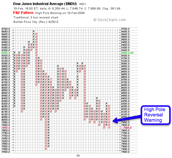
The 8000 mark proved to be tougher to crack than anticipated but that first high pole warning never got stopped out. And on February 10th there is a second one!
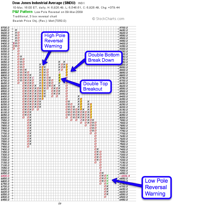
The rest is history as they say – this is the March 2009 low which shows us all the setups described before in context. Plus as an added bonus we got the inverse of the high pole now – the low pole reversal warning. And as you are surely recall the March 2009 low the rest is yet again history.
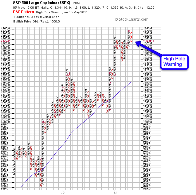
A bit more recently we got a high pole reversal warning on May 5th, 2011 – this time on the S&P 500. You all know how that played out. And that brings me to the most important chart for today:
This is Friday’s P&F chart on the SPX. And as you can see it painted a high pole warning which pretty much would have gotten confirmed today had the cash market been open. I actually filled in those boxes in blue circles – they are not officially on the chart yet but they will be unless some kind of overnight miracle unfolds in the next few hours.
Also on the chart is my own 25 SMA – which has been acting as support since the March 2009 lows (on the very left of this chart). There were two tests in recent history – on in 2009 and one in 2010 – both managed to paint a low pole reversal and maintain the upside trend.
However – we failed that 25 SMA (it’s not really day based obviously – and I best explain that some other time) back in August and have now produced an upside trend line which, has the SPX been trading today, would have been breached at the close.
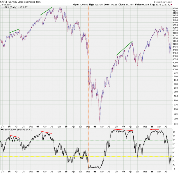
On the momentum side the SPXA200R managed to crawl back to the 30% mark but if we drop from here it’s going to be lights out as it may be in danger of becoming embedded down here. If you compare the 2008 crash to today’s setup you’ll see that the initial sell off was a lot more orderly in that we bounced off the 30% mark before things got really ugly. This was the last opportunity for the longs to get out – one that many missed and deeply regretted later down the line.
This time around we dropped from 70% straight to 10% and a pop above the 30% was key in allowing a more orderly sell off in the months to come. Basically what this chart tells us is that technically we are in much worse shape than at the onset of 2008 – and don’t expect oversold conditions to be the long’s savior. What’s good for the goose is good for the gander in that overbought conditions did not prevent a buying frenzy that overshot any upside predictions by hundreds of S&P points.
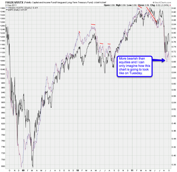
Our junk to quality ratio is also not looking that hot – over the past week it had already painted a slight bearish divergence and I expect this chart to be plotting quite a bit lower on Tuesday.
Bottom Line: Yes, it’s possible that Fed & Friends are going to step in overnight to pull the cart out of the mud yet once more. But long term the picture is pretty ugly – we have a first high pole warning on the SPX and the current pattern is looking a lot more bearish than what we saw at the May high and the July snap back.
The only thing that can safe the longs at this point is an immediate snap back and push above the support lines I have presented in the past weeks. A continuation lower here tomorrow may be bought at SPX 1100 or 1000 but it won’t matter as the high pole reversal right at the 25 SMA would represent what’s commonly referred to as a ‘last kiss goodbye’.
Keep it frosty and stick with your charts, folks – emotions have no place in the game.
Cheers,
Mole


