


June And Annual Seasonality
June And Annual Seasonality
One of my readers who goes by the callsign of ‘captainboom’ yesterday in passing mentioned that the week before the 4th of July was traditionally a bullish month, which of course peaked my interest. I used to work with a very talented statistician a few years ago going by Volar who among other things regularly posted very compelling seasonal analysis. I’m in the process of recreating some of that work in Quantopian but until then I think a glance of some of Volar’s general seasonal stats over the past fifty years should suffice.
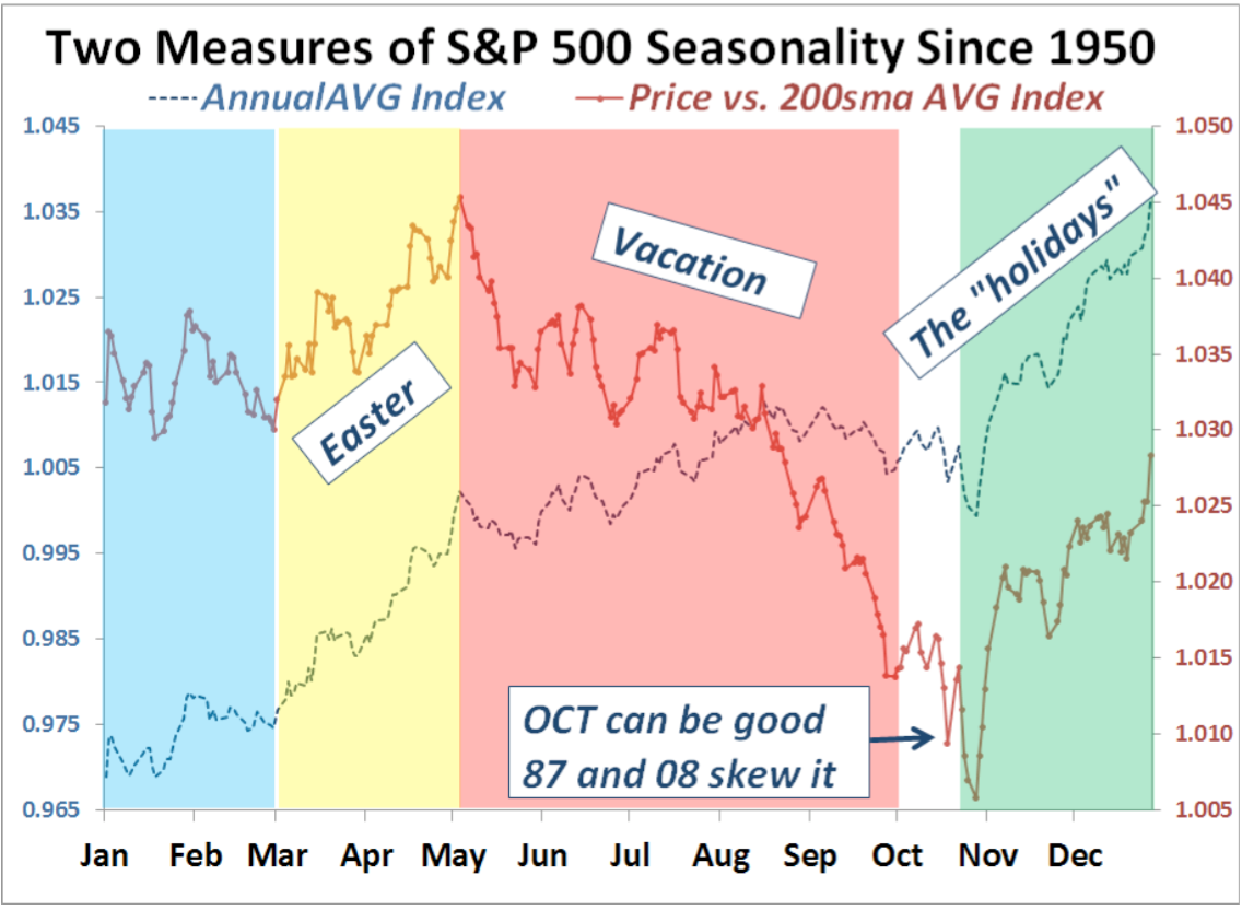
Let’s start with a very general overview of how annual performance looks like on a graph. There are two lines, one being the annual average index and the other the average price vs. its 200 day SMA. The colored sections clearly show us when the gros of the returns have statistically been produced.
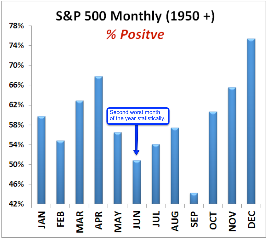
So which months are percent positive and which are most percent negative – meaning which months finish in the plus how often? June just so happens to be the second worst month of the year and is only positive about half of the time. September is worse and only finished in the plus 43% of the time. I should take a vacation in September… (before buying puts)
Apparently the old cap’n may have been thinking of himself as he’s running a … wait for it…. fireworks related company
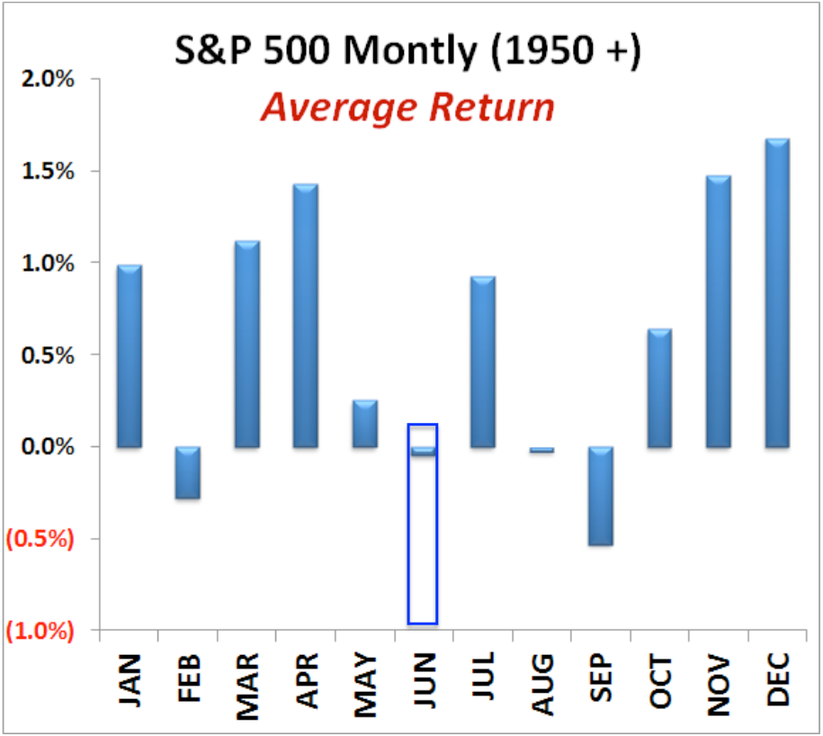
The average return in June however is slightly negative. Although it’s the second least likely to finish in the plus it seems to range around break/even when it comes to performance.
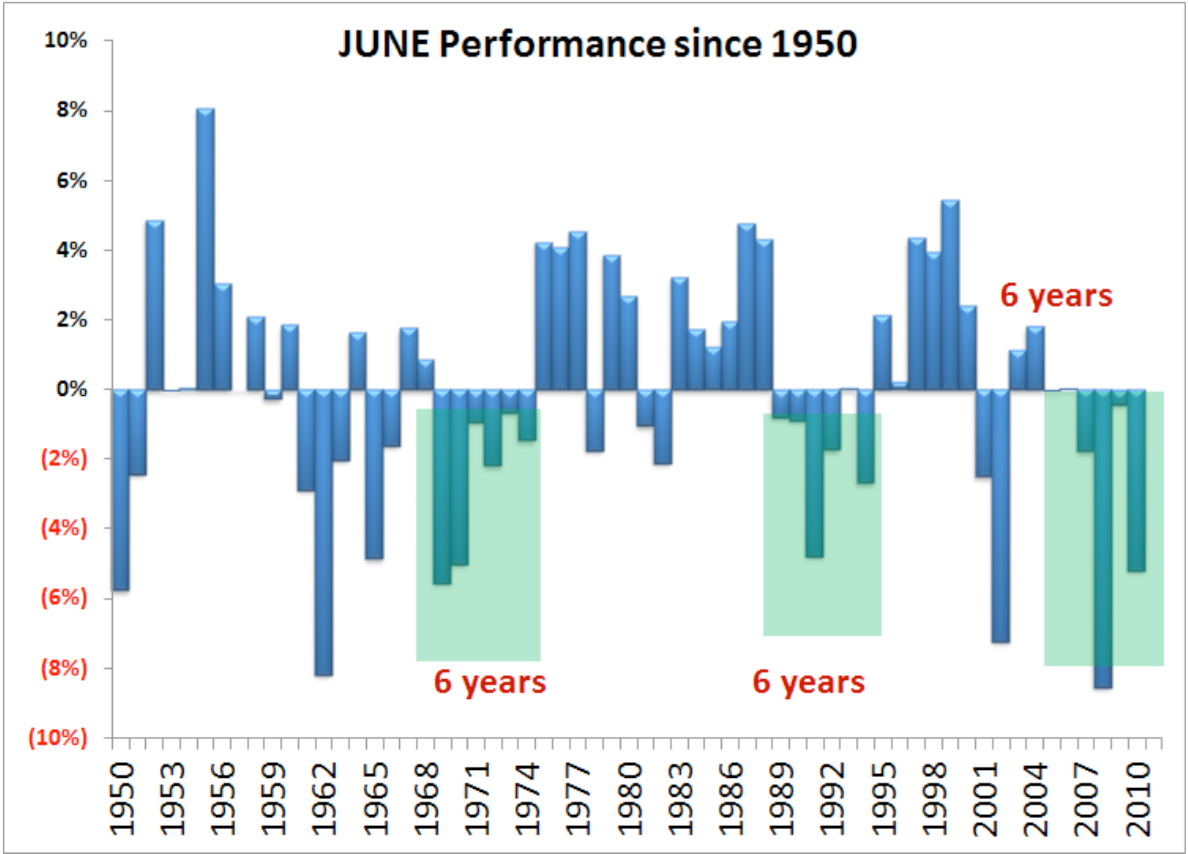
Here we have June’s performance since 1950 unfortunately the data cuts off in 2011 and requires an update (which I’m working to get my hands on). Anyway seems to me that June cycles quite a bit and returns come and go in clusters. Without knowing the updated stats I would hazard to say that we’ve probably been in a positive cluster over the past six years.

And here we have the distribution of monthly returns which mostly seems to have a slightly positive skew. October is the most fat tailed in the 3% range (which may surprise you) and June is clearly negatively skewed. It’s just sucky month apparently.

This chart is really fascinating as Volar separated all months into four quantiles and sorted them by performance. To no surprise we are currently in the worst quantile which features February, June, and September.
Now let’s dig even deeper and look at weekly S&P performance stats with a focus on week 25, which of course is our current week.

It's not too late - learn how to consistently trade without worrying about the news, the clickbait, the daily drama and misinformation. If you are interested in becoming a subscriber then don't waste time and sign up here. The Zero indicator service also offers access to all Gold posts, so you actually get double the bang for your buck.
Please login or subscribe here to see the remainder of this post.


