Momentum
Momentum
Since a lot of folks seem to be either gone on summer vacation or sucked into watching World Cup games I’m going to keep this weekend forecast pretty snappy. The title of today’s post is momentum – we are looking at those subtle clues in momentum changes that advanced traders learn to recognize and appreciate as possible profit opportunities.
Let’s get right to it.
The ATR panel on this chart was inspired by Andrew, an intrepid stainless steel rat who keeps insisting on inundating me with charts on a daily basis. His chart came with a comment, which I think describes the situation succinctly: Range contraction seems to correlate well with market tops.
Frankly, I’m not that sure – having looked back a few years it seems that range contractions usually seem to accompany rallying markets (and volatility drops as well), while range expansions seem to accompany falling markets. Be this as it may – a recent phenomenon seem to be divergences ahead of market turns – slightly ahead of the bottom. Meaning momentum to the downside is subsiding and the market is becoming receptive to a change in direction. Which is what happened three weeks ago – see the drop in both the ATR and Volume averages.
BTW, another way to plot Average True Range are Keltner channels – I don’t use them very much but that does not mean they are not valuable. Everyone develops their own style – use whatever works for you!
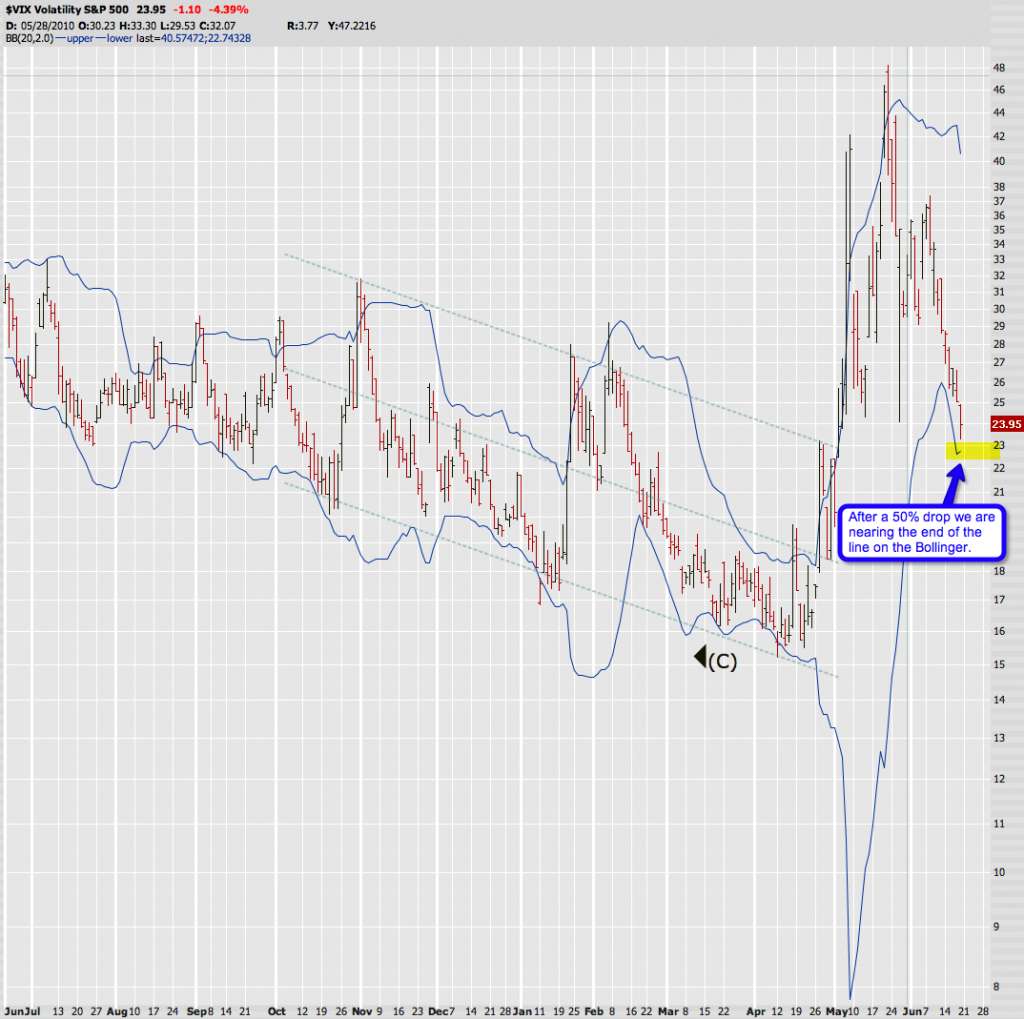
You all know this chart as the VIX is a commonly viewed expression of momentum – downward momentum that is, not so much volatility. Of course the average investor equals falling markets with volatility and rising markets with tranquility. We can bitch and moan about labels or perception – but in the end we can use indicators in the context of what they really mean. And the VIX is an expression of ‘perceived risk’ which I translate into ‘downside momentum’. I mean – does anone really believe that the proability of the market falling off the plate has been cut in half since mid May? Exactly.
So, what’s important to us is not where the reading is today or where it was yesterday. What matters most to us is how wildly volatility is changing. And a 50% drop in one month is quite volatile I’d say – imagine a stock would do that to you. Maybe a great trade for a nimble trader but not very attractive to the average investor.
Now, we are getting to the meat of things. What really matters to us on this chart is not the signal – it’s the Bollinger, which is an expression of standard deviation. How far are we off the ‘normal’? Well, right now we are again approaching the lower band of this Bollinger. Which we might start scaling down, yes. But more interestingly – the lower band has caught up with us – offering at least some kind of support. Until a few days ago there was nothing but air below, thus the risk of upside momentum was higher – it seems to me that that risk is now lower.
I hope I am not boring you with things you already know. All I am trying to do is to spell out the rationale behind my analysis. Some people adopt indicators without ever thinking about why they work the way they work. Which is why I maybe keep getting those countless questions about the VIX buy/sell signal rules. If you truly understand the concept behind standard deviation then those rules will start making sense to you. Knowledge is power – and often profit.
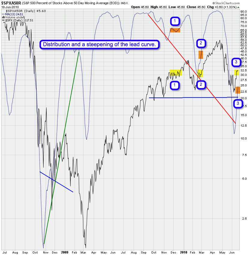
I have covered this chart a week ago and was pretty jazzed about the longer term version of it. This time we are however looking at if from a different angle and I think it exemplifies the concept of momentum like none of the other charts I present today.
What I have labeled on this chart are instances of when the PX was in the 1110 – 1120 trading range. Which was a lot more often than I care to recall – we seem to be trapped in this range and I am starting to feel like Bill Murray. Anyway, the yellow marks are periods we spent in this range and the orange marks is the moving average of the percentage of stocks above the 50-day SMA during that time. So, back in December at number 1 (yes, half a year ago – the horror!!) we were at roughly 65%. Three months later at number 2 we were between 40% – 45%. Now at number 3 we are at roughly 24%.
What does that mean? Do we care? Yes we do. What it means is that there is a distinct and rapid steepening of the lead curve. And by that I mean that there is a greater polarity between the number of stocks in the SPX which are pushing up sharply and the ones which are flat or dropping. That’s the difference between the average and the median.
Jeezzz Mole – what does that mean again?
The average (or mean) is the sum of the values of all the observations, divided by the number of observations. It is the average value. The median is the value at which 50% of the observations lie above, and 50% lie below. Alright, now your head is spinning – let me fix that. Here is an example:
Here is a series of numbers: 1, 2, 3, 4, 5000, 9000, 8700. The median is the one in the middle: 4. To get to the average add them all up and divide by 7 – which is 3244.
Aaaah – I’m sure a light bulb just went on in your head 😉
You can assume that the median for stocks is usually lower than the average close to market tops. In other words again (and now we finally get somewhere), the price on the SPX represents the average, as it is a free-float capitalization-weighted index (please don’t ask me what that means), and the median (sort of – it’s based on the 50-day SMA) is the SPXA50R (which I put an SMA on, just to confuse you further).
Moral of the story: On the median side we can see that an increasing amount of stocks are dropping below the 50-day SMA, despite price claiming that the ‘value’ of the SPX is the same.
Here is another expression of momentum: I introduced this chart a few weeks ago and thought it represented a good visualization of the market cycle. Now again, put the price movement in context of the momentum change expressed in the ratio between the McClellan and the Bullish Percent Index. Or in non-fancy lingo: Look how far we dropped on a lesser downside energy expended change in comparison with the energy spent to push things up not even 50% of that move. What this means is that upside moves are now literally pushing up hill and the inverse. Hope this makes sense.
Also notable is that we are closing in on the upper range – if this is still P2 then we may just continue pushing up while momentum starts deflating. If this is truly P3 then we should be turning on a dime, just as we used to during P1.
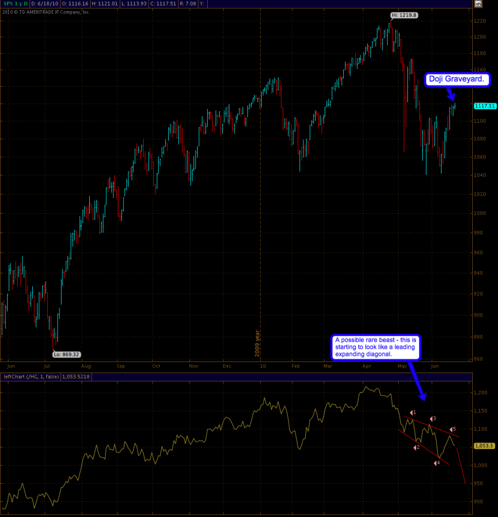
Often we doubt the validity of market moves – which in a way is silly in itself, because price is always right. Maybe we should rephrase it to ‘sometimes we believe that the majority of market participants are getting ahead of themselves. That’s fair – especially if you are a contrarian and not a trend trader. So we look for ‘true momentum’ or ‘leading price movements’ in other markets which are known to be early movers. One such example right now appears to be the copper futures – traditionally associated with the health of the general economy. Be this as it may – it’s been quite spot on as an early alert system – to the up and downside.
What I am currently seeing is a very rare beast – it should probably be hanging in some oligarch’s private gallery – the oh so elusive leading expanding diagonal (page 40 Fig. 1-21 in the EWP). Based on this pattern copper should start to fall quite hard in the near future and probably drag equities with it.
Yes, perhaps I’m seeing things but what you can’t argue with is the push down in the past few days – a very obvious divergence. That in the context of that ‘doji graveyard’ on the SPX and I think we may be nearing a top in this current push up. A blow off top may still be in the works however – I’m still eying the 1130 mark.
Which brings me to the wave count. Not much has changed. Soylent Orange is tracing out exactly as I anticipated, which is why I left the markings on the chart. Hey, let me bathe in a moment of glory every once in a while, alright? 😉
It’s possible we turn right away but I think this pattern is not done yet and will get us to 1130 before it’s all said and done. So while I allow myself the luxury of Soylent Green what we’ll get is most likely Soylent Orange, which should conclude Minor 2.
And that’s all I have for this weekend – I hope it’s been fun.
Cheers,
Mole


