Our Journey Continues
Our Journey Continues
It still feels like summertime over here on the West Coast and I feel fortunate not having to deal with the freezing weather conditions the rest of the country has to put up with right now. But if it’s any consolation to you Mid West or East Coast rats – today’s financial weather report indicates that arctic conditions are soon to return to equity markets as well. And that means hunting season for us bears – after all, nothing warms the heart like a rapidly growing portfolio.
Remember back in November when I talked about intermediate wave (4) and all the whipsaw ugliness we would have to endure in the coming months?
Boy, we sure have come a long way since then and we have waited patiently for our moment to strike. Fortunately the market has been kind enough to stick to the evil plan I hatched in the murky depths of my demented brain – thus far at least. The past two weeks have been very profitable, but as I’ve said before – this is only the beginning. Stick with the script and you shall be amply rewarded.
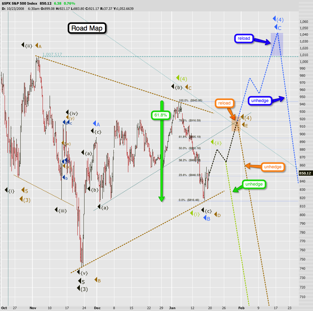
Looking at the chart above you can see three possible scenarios – let’s cover all of them one by one:
Orange: The triangle scenario – probability 40%. Based on that count we are now tracing out the final E wave which is expected to conclude around 900 – 920. This scenario would accommodate a little Obama rally before we decent into the abyss.
Blue: The flat scenario – probability now 20%. This count leads us to the maximum retracement I would give the bearish case, which is around 1040 on the SPX. It’s still a possibility as the market always has a knack for hurting the most people and this would surely surprise a lot of the bears – not us of course. But based on the swiftness of the past two weeks I have decided to lower this probability.
Green: The intermediate (5) scenario – probability 40%. The sheer momentum and strongly bearish breadth levels of the past week points towards a scenario Berk suggested early this month. Which was that intermediate wave (4) had concluded and that we were already in minor 1 of intermediate (5) of cycle wave c. My position then was that I would have to see supporting evidence to that effect. Well, evidence is what we got. The tape of the past week suggests that this possibility is very real and at this point equal to the triangle scenario. I also like the fact that last week’s push down ended right at the 61.8% fib line of the counter wave starting at the November 21st low (marked as the green arrow above). The turning point for this scenario is coming up soon at around 880.
The good news here is that all three scenarios lead us higher for a bit longer – the only difference being the turning points. I have taken the liberty to add action items for each scenario on this chart: when to reload/add and also when to un-hedge (i.e. leg out of those puts you sold). Many of us chose to hold on to the puts we bought at relatively low volatility by turning them into spreads and these appear to be the safest moments in time and space to expose ourselves back to the downside.
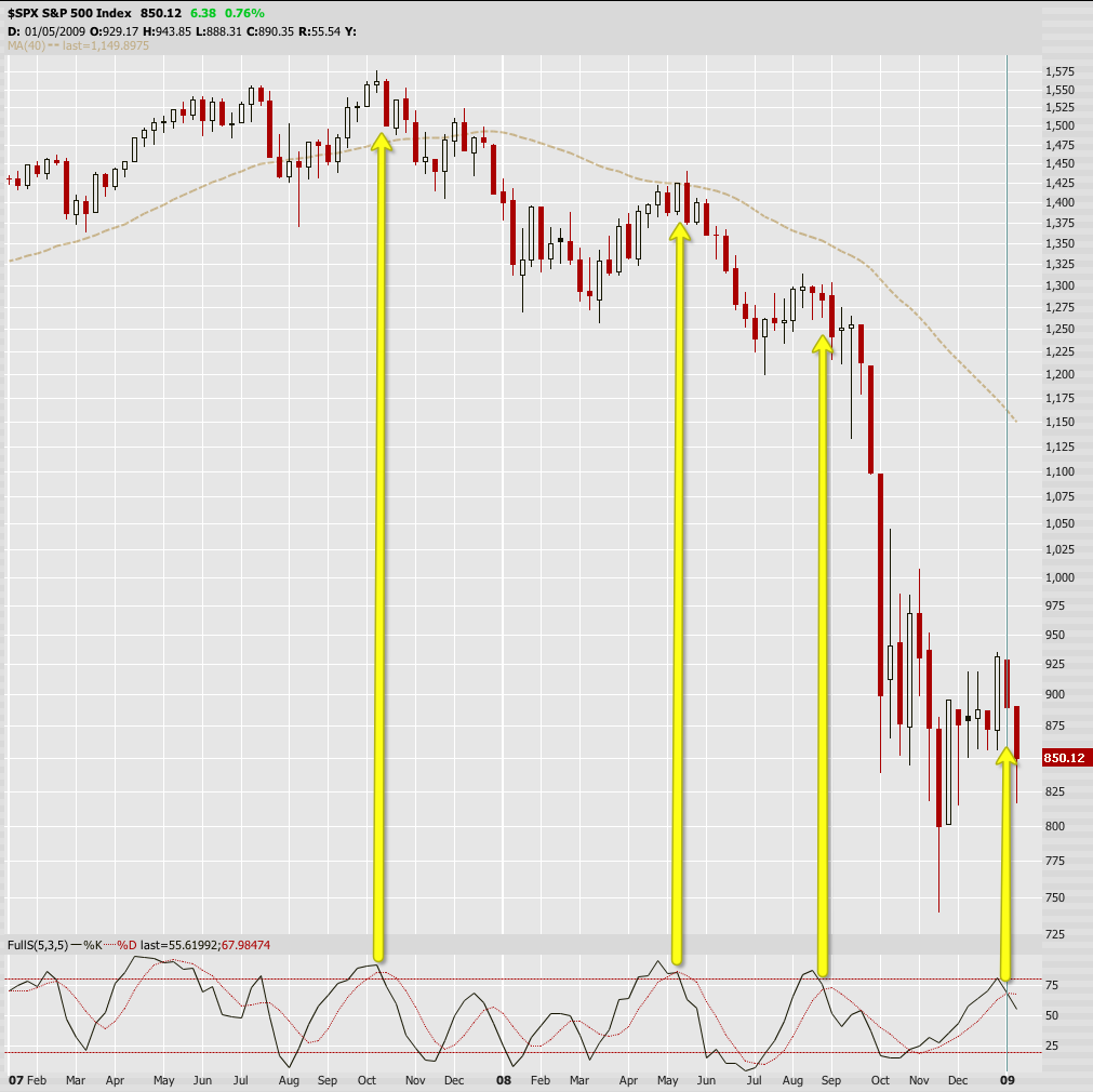
Curiously, supporting the orange and green scenarios is my trusted weekly semi-fast stochastic indicator. We touched the 75% line and the K line has already swung below the D line – a clear sign that trend is to the downside. As I’ve mentioned in the past – this chart has rarely let me down, which is complementing indicator in favor of a continued trend to the downside.
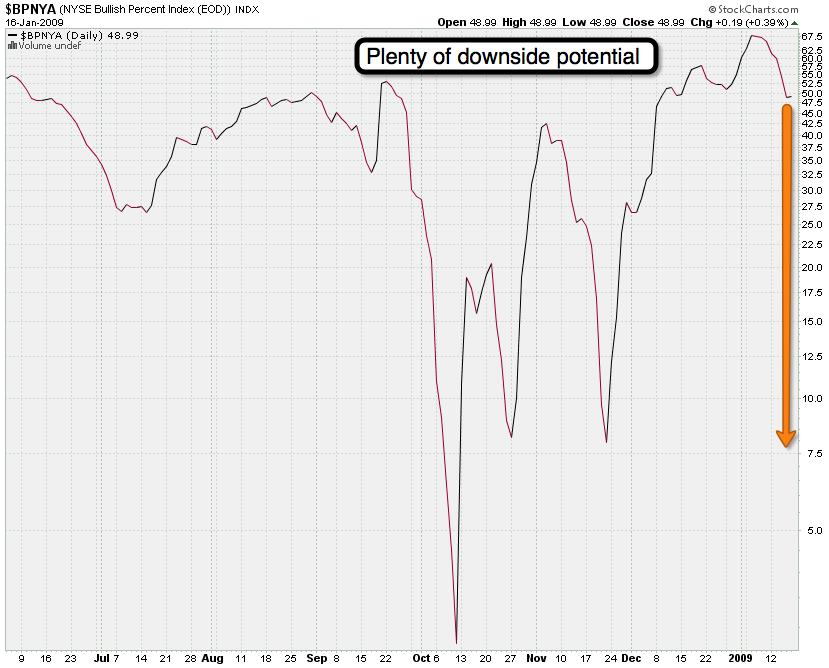
One of my favorite market timing tools is the NYSE bullish percentage index, Stockcharts.com symbol $BPNYA. This indicator shows the percentage of stocks in the NYSE Composite Index (NYA). It is an objective market barometer and traditionally interpretation is simple: If the index is above 50%, we are in an uptrend; if it is below 50% we are in a downtrend. If it is above 70% the market is overbought and unlikely to go much higher. If it is below 30% the market is oversold and it is feeding time for the bulls.
Of course as all indicators they need to be observed in context and even a cursory glance at the chart above reveals that the scales have shifted dramatically in the recent past. The new 30 seems to be the 7.5 mark and the new 60 is approaching the 70 mark. But even if we read this chart in its traditional context there is still plenty of downside potential ahead of us, and remember that we’ll probably see a bounce to the upside in the coming days. My personal take is that we’ll see this indicator push back below the 20 region before the end of February.
If you read my Saturday post then you might understand the fundamentals behind the continued rise of the Dollar. From a purely technical perspective we seem to continue wave 3 of 3 to the upside and I don’t expect any significant corrective moves until about 88. The line in the sand here is around 77.5 – if we somehow drop below that I would have to re-evaluate the short term bullish scenario.
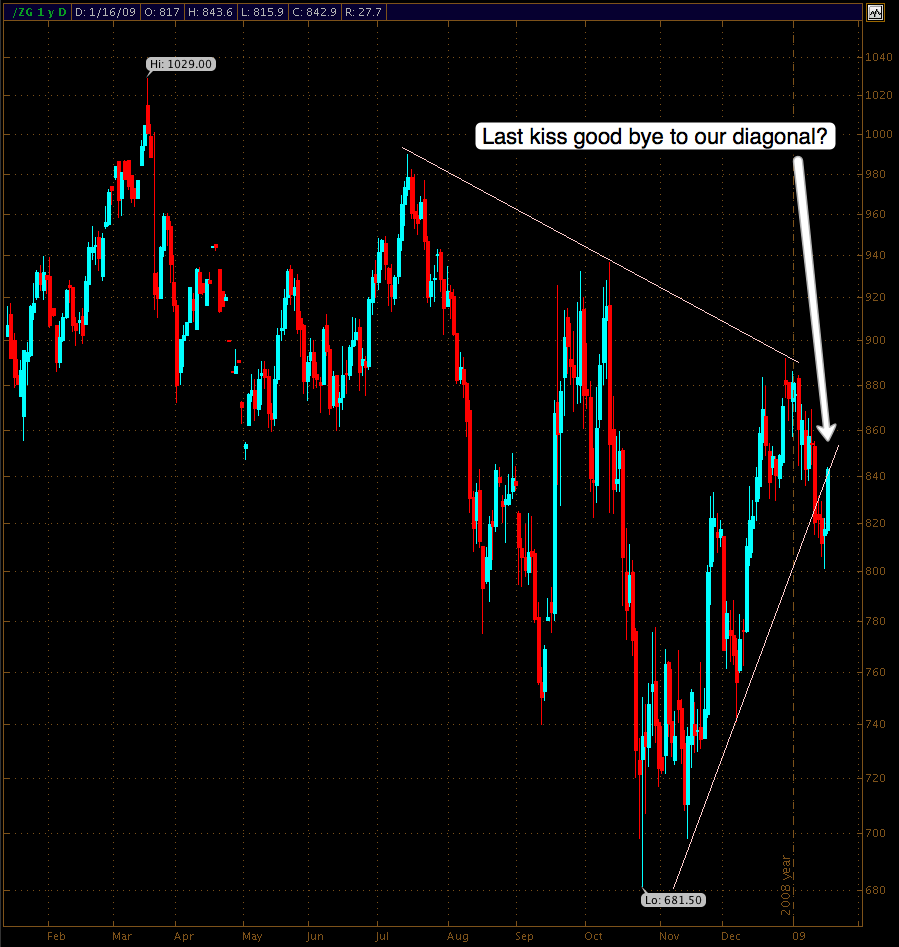
Gold has decided to test our patience yet once more and is back for a re-test of that diagonal. I think this is actually a great place to reload on puts as this line should not be breached. Thus it’s a very defensible position – a chance we rarely get with our favorite precious metal. A good stop here would be 850 – use a GLD correlation chart to pick your exit if you prefer trading the ETF.
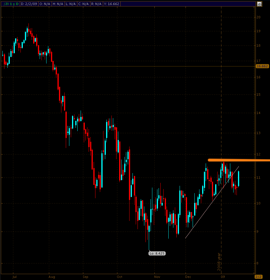
Gold’s little brother, silver, is actually in a very similar position but a stop would be even easier to manage at around 11.7, which was the recent top. FYI – my target for silver is around 6.5 – 7, so this could turn into a nice ride to the downside. When it comes to silver I have been doing well with PAAS in the past. I also like DBS, which is a silver based ETF.
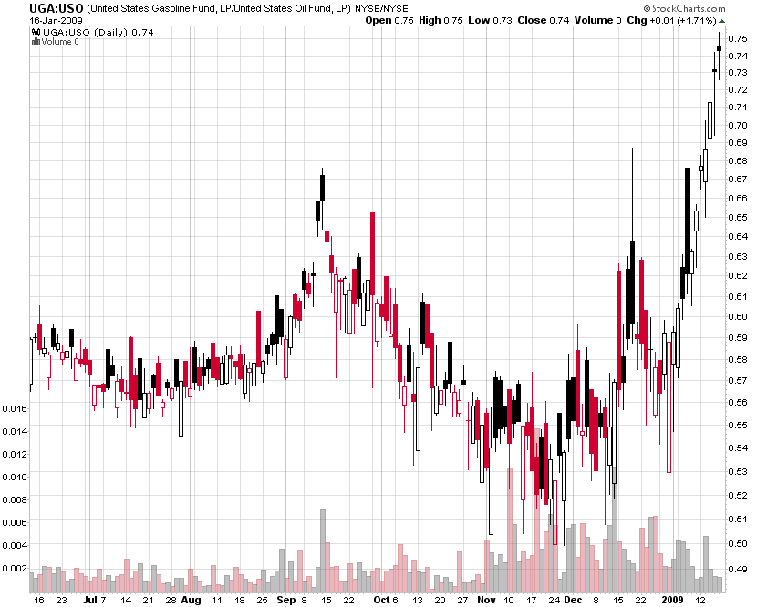
Some of you might remember my little excerpt on the crack spread last week. Again, the crack spread is a term used in the oil industry and futures trading for the differential between the price of crude oil and petroleum products extracted from it (i.e. gasoline) – that is, the profit margin that an oil refinery can expect to make by “cracking” crude oil. Now, I’m the first one to admit that I know very little when it comes to the fundamentals of oil and other energy markets. But as a technician I do recognize an exponential curve when I see one – and this one has turned almost vertical. What goes up has to come down eventually – but I suggest to not step in front of a moving train. Let’s wait for some weakness here and once we see a little roll-over it may be time to short some of those refiners.
Looking at the poll I am happy to see that many of you stuck with the script and covered those puts around 820. The ones who decided to sell will soon have to buy them back at much higher volatility, which means higher premiums. There’s no chance in hell that the VIX will touch 37 anytime soon again – exception being perhaps the blue scenario described above.
Let’s keep it clean going forward. This has been an excellent start for 2009 – we almost peeled some rubber here – and I intend to continue our winning streak. Let’s keep collaborating and most of all, let’s not get complacent. The vigilant and nimble rat is the one that gets the cheese.
I leave you with this – courtesy of the ETF Corner:
Cheers!


