Maginot Line
Maginot Line
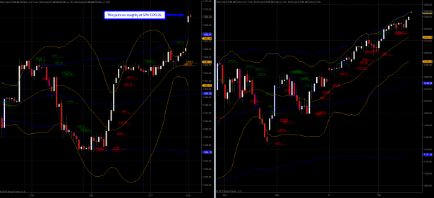
As I’m watching the spoos here on Sunday night I am seeing an nice setup which I would like to pass on to you guys before I move on to the more long term stuff:
It’s a long weekend and so this may have changed considerably by the time you catch up with this post, but as long as we remain where we are the spoos may be worth a short trade. Has the Mole completely lost his mind? Indubitably, but that’s a different matter altogether – so let me explain the setup:
I mentioned the SPX equivalent of 1370.25 on the prior chart, which of course accounts for fair value – in other words the SPX usually trades at a premium (PREM) in comparison with the futures contract. There a several sources out there reporting what’s called the ‘fair value’ and it’s currently near -2.25, depending on who you ask. So you deduct that from the spoos and you get your SPX equivalent.
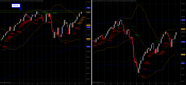
If you look at my SPX chart then you may recognize that 1370.58 Maginot Line, which when breached would probably trigger an acceleration higher – maybe after some hemming and hawing due to the thin volume profile right now – see my recent posts on that. Anyway, since Monday is a holiday the current high on the spoos may just be good for a few swing trades, as long as we do not breach 1368.25. Your stop should be one tick above that and you’re good to go.
Alright, on to the long term stuff – I dug up quite some interesting material:
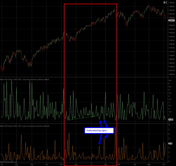
We are revisiting my 2011 A/D ratio fractal chart, which lies at the core of this post. My proposition (which thus far has been correct) was that the December 2010 to March/April 2011 time period very much resembles that of December 2011 to right now. Before we get to the current pattern please take a few minutes to observe the slowly support line on the A/D panel (the D/A panel is plotted below).
I have also highlighted what I consider early warning signs that preceded the eventual correction which came long after any bear shorting that rally had expected. When a reversal finally took place I am sure that very few bears were on the bus riding it down – and that’s how it usually works.
Now let’s look at the 2012 analog – we are seeing an almost identical pattern here. Just like in 2011 it starts at the end of the prior year and thus far has managed to hold that support line. We did get a slight breach a week ago but when you look at the D/A ratio below then we see a signal that barely scraped 3:1 – a bit weaker than that first spike on the 2011 analog (don’t let the scale fool you as we got a big outlier last year – I actually already normalized the chart a little).
That bearish spike could be a first warning signal but if the pattern continues in a similar fashion we should see a more pronounced signal above at least a 4:1 ratio before anticipating a major reversal. Well, as the old saying goes – history does not repeat itself, but it rhymes. Accordingly I decided to spend a bit of time looking at my other momentum measures and to compare the winter 2011 period with the current one:
[amprotect=nonmember] More charts and cynical commentary below for anyone donning a secret decoder ring. If you are interested in becoming a Gold member then don’t waste time and sign up here. And if you are a Zero or Geronimo subscriber it includes access to all Gold posts, so you actually get double the bang for your buck.[/amprotect] [amprotect=1,13,9,12,5]
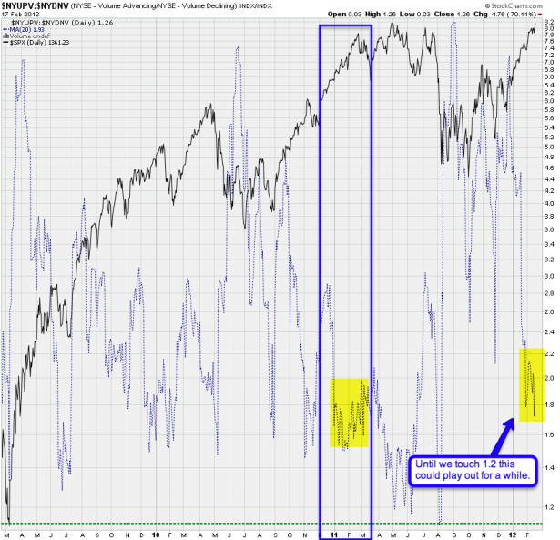
NYSE Advancing/Declining Volume Ratio: We are admittedly in an overbought range but this could play out for a while longer. Last time around a touch of 1.2 was needed to open the door to a more meaningful correction. And even then it took weeks for prices to form a topping pattern.
Now here’s again the ratio between advancing and declining issues – exactly what’s shown on those two ratio charts presented above. By showing it as a left line chart against the SPX we are looking for momentum patterns less clear on those previous panels.
Now, this looks a bit more bearish in that we did drop quite a bit lower than in 2011 (remember, history never exactly repeats itself) and we are also painting what seems to me a slight upside divergence. BUT, it’s still a bit short and prior patterns suggest that this could play out a while longer.
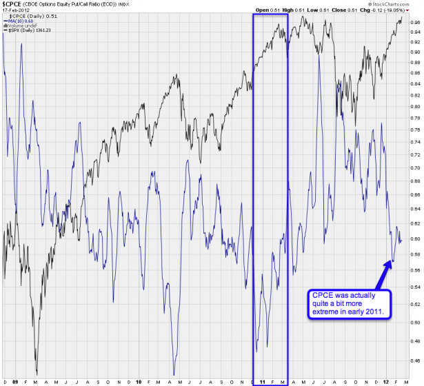
Believe it or not, the CPCE was quite a bit more extreme back in early 2011. This chart at least still offers us room to run. Again, observe the pattern ahead of the final highs in 2011 – a more pronounced divergence would make a better case for an impending reversal.
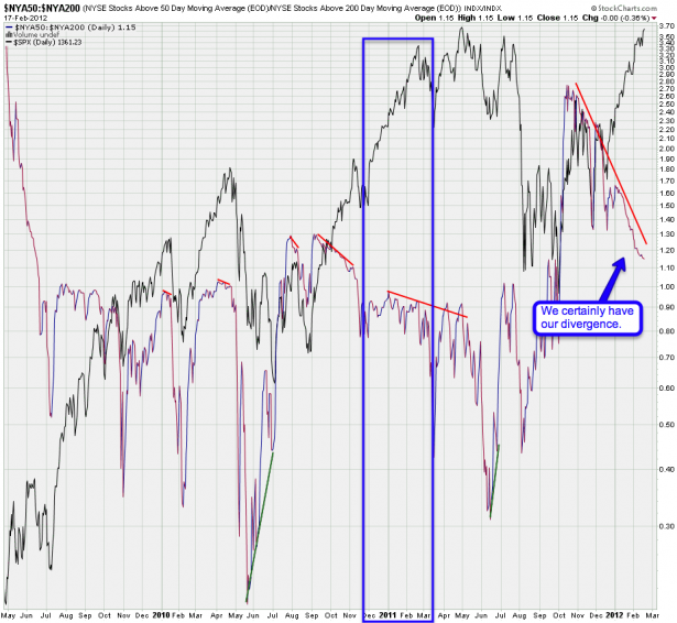
This is a long term ratio of the SPX50R versus the SPX200R – obviously we are plotting the quality of any extended rallies or sell offs. This remains to be one of my most bearish charts and the divergence we see is quite pronounced at this point.
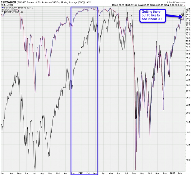
However the SPXA200R on its own was plotting near the 90 percentile last year before we got a turn. And maybe that is what we’ll need to see before we should even think about getting into long term short positions.
Bottom Line:
Nobody has a crystal ball and it’s always possible that we turn right now and right here – only a few ticks away from an important resistance line (i.e. SPX 1370.58). And I do recall reversals happen only ticks away, which is why I am not completely discounting the possibility despite those bullish looking ES futures. However, should we breach above 1368.25 sometime this weekend then odds support a continuation higher. The purpose of this post was to give you guys an idea of how ridiculously overbought conditions can become before gravity finally sets in. Just because the market has been pumping higher does not mean it’s going to stop.
Remember my post on when not to be bearish – and accordingly I see very few reasons if any to look down right now. As long as things continue to bubble higher I plan to just go with the flow. YES – equities are extremely overbought right now but I personally remain uninterested in taking on any long positions. Most likely I’ll just watch dirty voyeur style and focus on my naughty FX or commodities trades. But if you happen to be a trend trader on the equities side then you just got to love this market.
[/amprotect]Cheers,


