Red Flag Day
Red Flag Day
The heat is on – and not just in the markets, it seems. After having enjoyed almost spring like weather all summer here in Los Angeles, temperatures suddenly popped into the 100 degree (Fahrenheit) range just a few days into fall. Just in case things get out of control I have my put Red Flag Emergency Team on standby:

The selection criteria to join this exclusive unit are extremely stringent and only the most talented and well trained applicants gain acceptance after undergoing a long series of physical and psychological tests. As you can imagine the failure rate is high – and only the best make it to the bottom 🙂
Although a hot early fall may not be that unusual in Southern California, the concept of seasonality has seemingly been abandoned across the board in our financial markets. The month isn’t over but thus far equities have enjoyed their strongest September in seven decades. Which is almost humorous considering that the bears have been expecting a historic correction to the downside. So much for predicting the future – you expect one thing to happen and you most likely get the complete opposite.
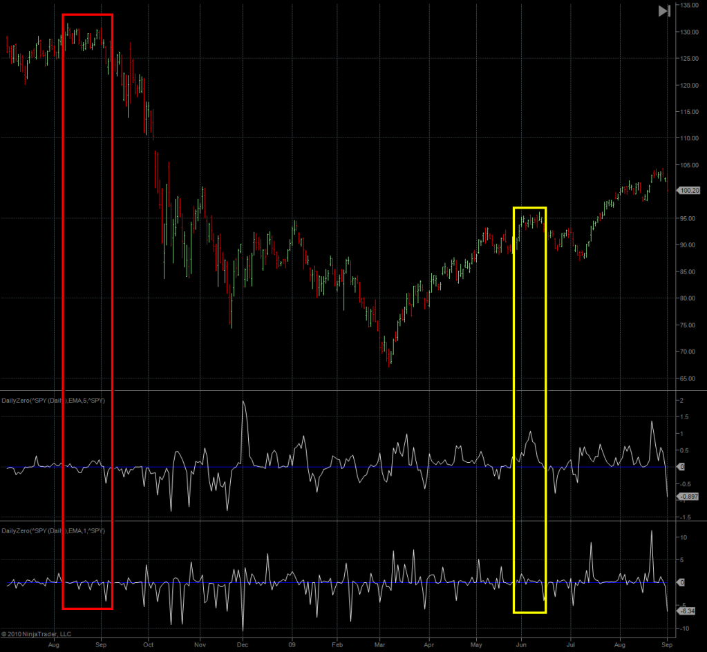
Today we’re going to start off with a little stroll down history lane – more specifically we are going to take a look at the last three years of historical data on the daily Zero. The grand idea here is to analyze the signal formations around major tops so that we can draw correlations to what’s going on right now. For the ones amongst you who are curious as to how the Zero has performed in the last few years this is a great opportunity to see it in action. We also look at some of my other momo charts to see how they fit into the current melt up in equities.
We get started right before the 2007 peak in equities. What’s very apparent to me is the major divergence on the smoothed daily Zero (again, the mid panel) as we were painting historic highs. The signal was pretty lackluster and stuck close to the zero mark. Compared with the signal observed in September 2007 something certainly didn’t seem kosher.
The second red box highlights the peak of Minor 2 of Intermediate {1} and again we see a divergent and falling signal as equities race higher.
The third box is painted in blue as it is the only major failure I was able to identify on the daily Zero. I have no idea what would produce such a strong bullish signal as the tape started dropping into Minor 3 and fortunately I have not seen another big failure like it.
The fourth box, again in red, sports a very beautiful bearish divergent pattern which again precedes a drop to the downside. At the very bottom of Intermediate 1 (i.e. March 2008) we also see a nice bullish divergence developing on the bottom panel. Now this is important as it is exactly how the daily Zero appears to show us bullish vs. bearish divergences. The bearish ones seem to show up more clearly on the smoothed middle pane in the simple shape of a lack in momentum. The bearish divergences however show up as final long spikes on the raw signal bottom panel, then followed by touch of the zero mark accompanied by lower prices. This pattern has been very reliable throughout 2010 and we have traded it a few times already. If you have no clue as to what I’m talking about point your browser here for a series of examples.
The final red box on this chart marks the May 2008 highs, just before the real fun began. I don’t see a major divergence here but the signal was continuously weak despite rapidly rising prices. Had I looked at this chart back then I would have been very cautious about the long side. The start signal would have been that long final spike up which was accompanied by flat signals on both daily Zero panels.
Here is the meat of the 2008 crash in equities – the March 2009 bottom and the ensuing buying frenzy. There are only two major bearish roll over periods and of course I have left out a lot of other readings on that chart.The daily finally drops below its zero mark on 9/4/2008 – not at the very top but early enough to scale into some short positions.
What’s however is a lot more important is the ignominious 9/18 date – one that shall be remembered by the bears with infamy. It was that very day that then SEC chief Christopher Cox(sucker) instituted a temporary ban on shorting 799 financial stocks, thus launching a short squeeze of biblical proportion. Even on this long term chart the spike up is very visible (it’s a few days after the red box), and it forced a lot of shorts to the sidelines. To be negated less than a week later of course – the ban basically had zero impact.
Now look at the daily Zero during the entire affair – it did not budge. There was one little push above the zero mark but it painted a bearish divergence the on 9/19 – the very day after the short sale ban had become effective. The rest is history and the signal was spot on in predicting a continuation of the bearish cycle.
There are plenty of good signals and distinct divergences even during the early October 2008 to early January 2008 period – which was very difficult tape – basically we saw two months of sideways wild gyrations.
The yellow box in June 2009 one again shows us a non confirming period which again lead to a drop. I have painted it yellow as the signal did not drop below the zero mark – however the bearish divergences on the smoothed daily Zero is very pronounced and would have alerted me to the possibility of an imminent drop.
What’s also important to keep in mind is that many bears at that point already expected a winding down of Primary {2}. The daily Zero however was not impressed and even though we saw a one-month long downside correction right after the yellow box the negative signal accompanying that drop remained quite muted. Even better – there was a distinct divergence on both the smoothed and the raw Zero panel, indicating that the bulls were ready to but the dip and drive the tape higher. Of course this is exactly what happened.
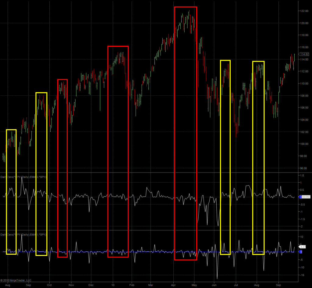
And finally we get to the past year starting August 2009 into the present. Plenty of boxes here – the signal actually started to be very clean as it almost appeared to follow some type of rhythm. The first two yellow boxes show divergences but again no drop through the zero mark. The divergence hinted at a drop but the fact that the smoothed signal remained above the zero mark also suggested that no ‘profound reversal’ was at hand.
I cannot over emphasize the importance of this to anyone having chased the Primary {3} mirage since early August 2009. I distinctly recall the level of excitement that was prevalent back then and into late 2009. Each dip down was considered to be a possible top of Primary {2} and I remember myself getting caught in the fray. Had I seen this chart back then I would have immediately recognized that the smoothed signal did never linger below the zero mark for long. A quick shallow dip to the downside and up it swung again. This would have been key in predicting what was to follow.
The two red boxes that follow do show a drop below the mark but again it was very shallow. The first one is a bit cleaner than the second one, I must say – however both clearly indicate that the current rally was running out of steam. And of course we got a textbook divergent spike at the very bottom (the yellow arrows on that chart I posted on the Slope).
The third red box around this year’s highs is a real beauty and shows the type of signal I would expect when irrational exuberance was rising to a crescendo. It was clear that the longs were in for a major spring surprise. Finally, observe how the smoothed signal clearly remained below the mark until the downside move had exhausted itself. Some may criticize having missed the final lows but for us vega conscious options traders I think that monster divergence at the very bottom would have been a lot more profitable.
How About Today?
Which of course brings me to today’s reading on the daily Zero. What I’m seeing right now is a slow degradation of upside momentum – we are above the zero mark but barely. Based on prior examples it’s possible that we paint a high and start dropping before we get final confirmation on the smoothed panel. But that’s okay – to me the current divergence (i.e. higher prices along with a weaker signal) tells me that this ramp will find its maker in the near term future. Whether or not this will lead to a major reversal we cannot know just yet.
However, I also want to make it clear that, until we see a breach below the zero mark on the smoothed signal, the momentum is with the longs. Calling tops at this stage is premature and if you don’t feel the long side then I suggest that you simply remain in cash. Legging into short positions is possible but expect to be potentially be squeezed. There is simply insufficient evidence supporting a big downside correction here – which doesn’t mean it cannot happen – the emphasis is on insufficient evidence. We shall not trade ideas and hopes – we trade the evidence we are able to gather.
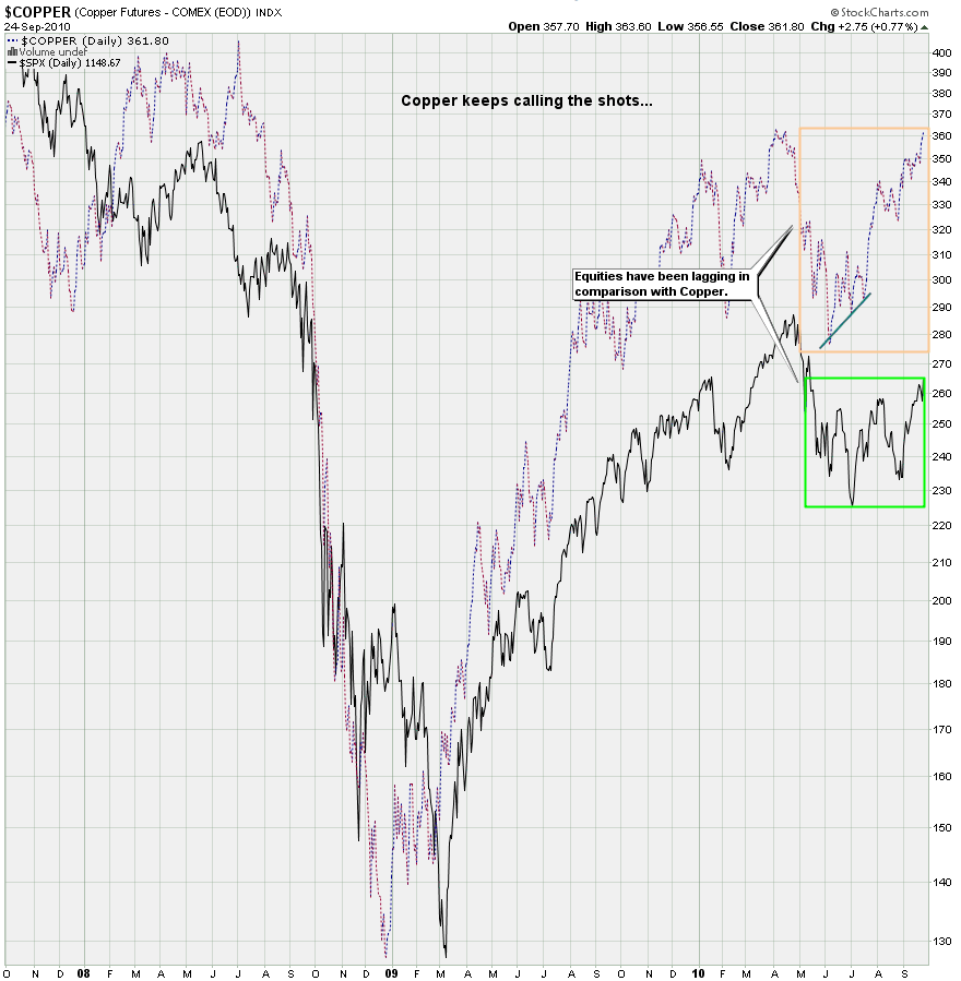
Alright, let’s take a look at the one chart that has been leading the SPX by the noose – copper. Bad news for the bears as copper is close to breaching its April highs. And it’s pulling equities in the process, which arguably have been lagging behind copper. This tells me that if copper finally makes a turn to the downside equities will most likely take it up the rectum in a bad way. But until that happens the wind is in the backs of the bulls.
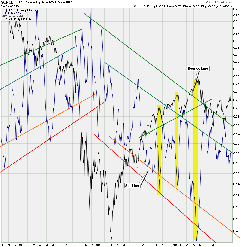
This chart should be outright scary to the bears. I have highlighted the smoothed CPCE readings (i.e. put/call ratio but equities only) taken at meaningful tops. And it’s clear that we are miles away from anything supporting ‘should turn soon’ territory. Again, I have seen horses puke in this market but what are the odds here? Not good for the bears – and it seems that a recent ZeroHedge article is spot on in describing the stubborn disposition of any remaining bears. This has the potential for a continued short squeeze – maybe even leading to new annual highs in equities.
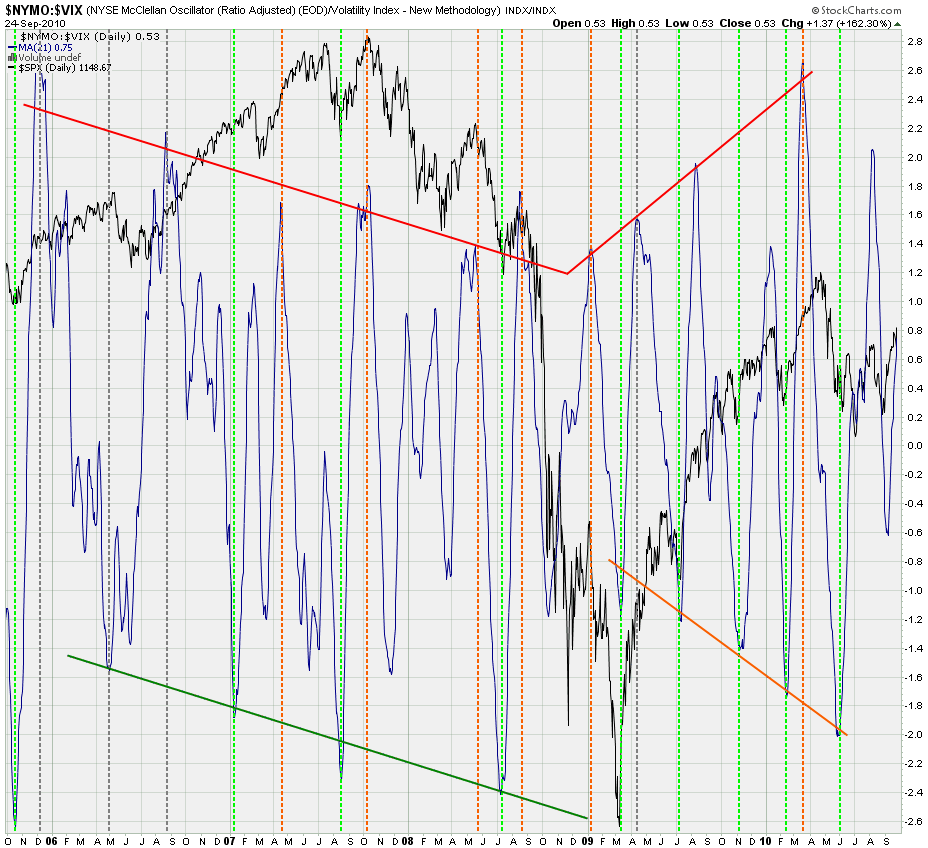
Same situation on my trusted NYMO:VIX ratio chart. This thing has been spot on in calling major tops and bottoms for several years now (noobs: see the green and red dotted lines highlighting channel extremes) and the readings right now are in neutral territory. Which means that more upside remains a possibility – again, not a necessity – but a real possibility.
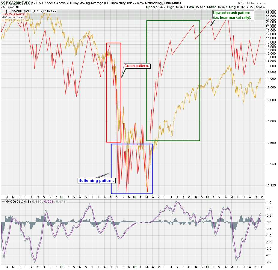
This chart may be a bit difficult to absorb for any new subs but it’s actually quite simple. The SPXA200 tells us the number of symbols in the S&P 500 which are currently trading above their 200-day SMA. The difference between this and slapping a 200-day SMA on the S&P 500 cash index is that the former shows us the median instead of the average. Now I divide that data by volatility – donated by the VIX and I get the signal in red above. Now I can take that data and apply a MACD to show me trend and momentum changes as well as divergences.
Seems to me that the current uptrend is continuing undisturbed and it would take a bearish cross on the MACD or at least a divergence just like in spring to consider an impending reversal.
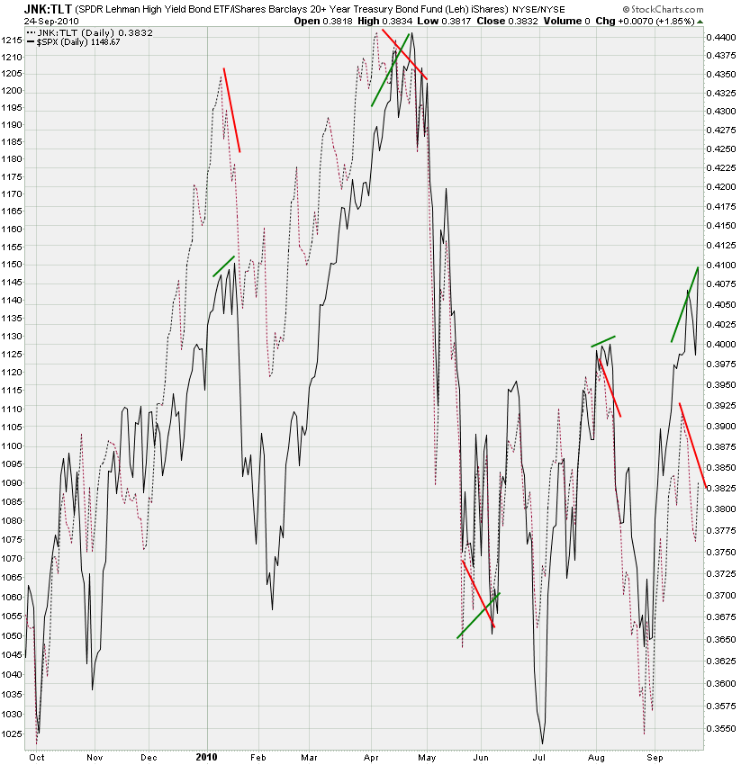
It seems that there is a softening in the number of investors chasing high yield – at least compared with the recent plunge into treasuries. The black line is the SPX and you can see that it has been stubbornly steaming ahead – leaving the JNK:TLT ratio behind. That does give me a bit of pause and if we see a continuation of this it may be a harbinger of at least a medium term correction in equities.
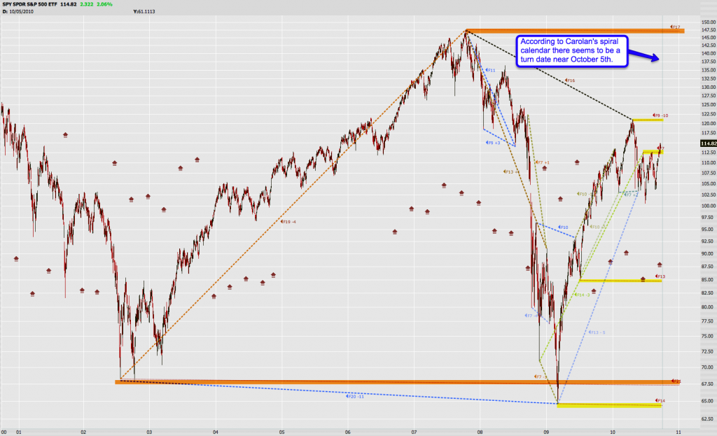
I strongly recommend you click on this chart for a bigger view. This is my notorious spiral calendar cycle chart, which I have not shown for a few months now. Well, the next turn date is getting close – various cycle intervals converge near the October 5th date. Perhaps this is where equities take a turn to the downside, and perhaps nothing will happen. But I will definitely keep an eye on my momo indicators ten days from now, and if I see distinct cracks in the tape I will be taking on a few lottery tickets.
The second turn date, and one that could be more powerful as it’s supported by two converging long term cycles is early January 2011. Whether this may be near a bottom or a top remains to be seen. For more information on the spiral calendar please point your browser here for a summary of the rules. The various lines shown above are my personal historical and ongoing map of relevant cycles in the past decade.
And that’s all I have for tonight – again my apologies for the late post – I do have more charts but am running out of time and energy (it’s getting late). The DWP here in Los Angeles put my entire neighborhood out of commission for over six hours until the early evening, and that in over 100 degree Fahrenheit heat I may add – perfect timing.
Fortunately my Red Flag Emergency Team quickly jumped in and saved the day – unlike a certain UPS that’s going on a trip to the junk heap tomorrow.
Cheers,
Mole


