Summer Smack Down
Summer Smack Down
Until yesterday night I anticipated this to be a long winded and torturous weekend forecast with much conflicting evidence and various exhibits depicting the pros and cons of the current bearish scenarios. Fortunately, I saw the light and although I am going to present a boat load of charts as well as some short term bullish evidence my position at this point is: Don’t sweat the details. For what’s coming may transpire tomorrow, next week, or a month from now – but it’s coming and either you’re positioned for it or you’re not.

It’s really that simple – forget about the short term – on a medium term basis the bulls are about to get hit by a folding chair WWF smack down style . Obviously, this has implications on how we deal with whatever transpires next week. After presenting what I deem to be some compelling evidence I offer some strategies that should keep us out of trouble plus leverage any sudden moves to the max.
In that context I greatly recommend that you carefully study my Friday update on EWP Option Strategies, if you have not done so already. Please make sure you fully understand the basic premise behind the Bull Put Ladder (a bearish option strategy) in particular and also it’s cousin the Bear Call Ladder (bullish as suspected) – although I reckon that we won’t be needing the latter for quite a while. It is key that you develop a taste or at least an understanding of these strategies as they will be key in grasping some of the trades we’ll be looking at in the near term future.
Alright, plenty of charts waiting – prepare your browser for a regular chartalanche:
Long Term View
Let’s start with our long term chart roll call first – after all I told you to not sweat the details and of course there is method to my bearish madness:
I am pretty confident you by now understand what the SPXA50 chart is – if not I recommend you read up on my recent discussion of average vs. median, which is another topic you should be firm on at this point. What we are doing here is to put the SPXA50 in context with volatility as expressed by Mr. VIX. And then we slapped a CCI on the entire frankenchart. Why? Because we can! Plus it seems to nail roll overs quite nicely. And rolling over it did just when we expected it to happen – that breach of the 100 mark worked like a charm. As you can see there is plenty of downside momentum remaining.
Same chart – except that we’re zooming out to see the last four years and are also using a MACD it on it. Which seems to move quite cleanly – always appreciated. And as you can see it just rolled over from quite severly overbought conditions – which without much of a price move. Again, plenty of downside momentum remaining.
Here we are applying the same rationale – in this case we are looking at NYSE stocks above 50-day SMA in the context of declining volume. Basically we are measuring how much those market makers are lying to us – the higher the spike the thinner the volume driving those market leaders up as rising down volume increases the divider. I know it’s a mind bender – just trust the chart as it seems to be pretty spot on – at least on a long term basis.
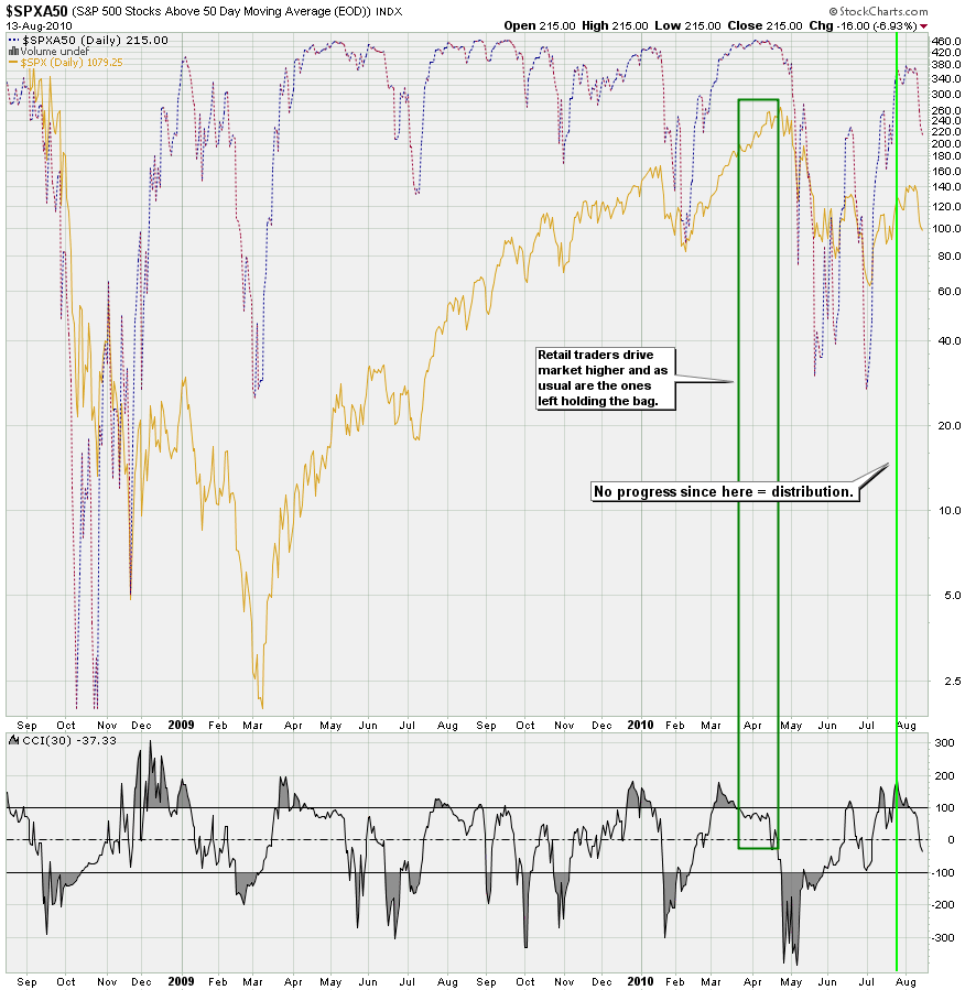
Having fun yet? Well, we’re just getting warmed up. This is the SPXA50 chart on its own and again we’re using that CCI as a measure of momentum. Again, I have no particular reason for having picked that one, except for that it seems to work pretty well. Last week I showed this chart and proposed that there was a lack of progress despite prices melting higher. Well, it seems that this divergence played out as expected – thus far at least. Again, plenty of downside potential remaining – long term.
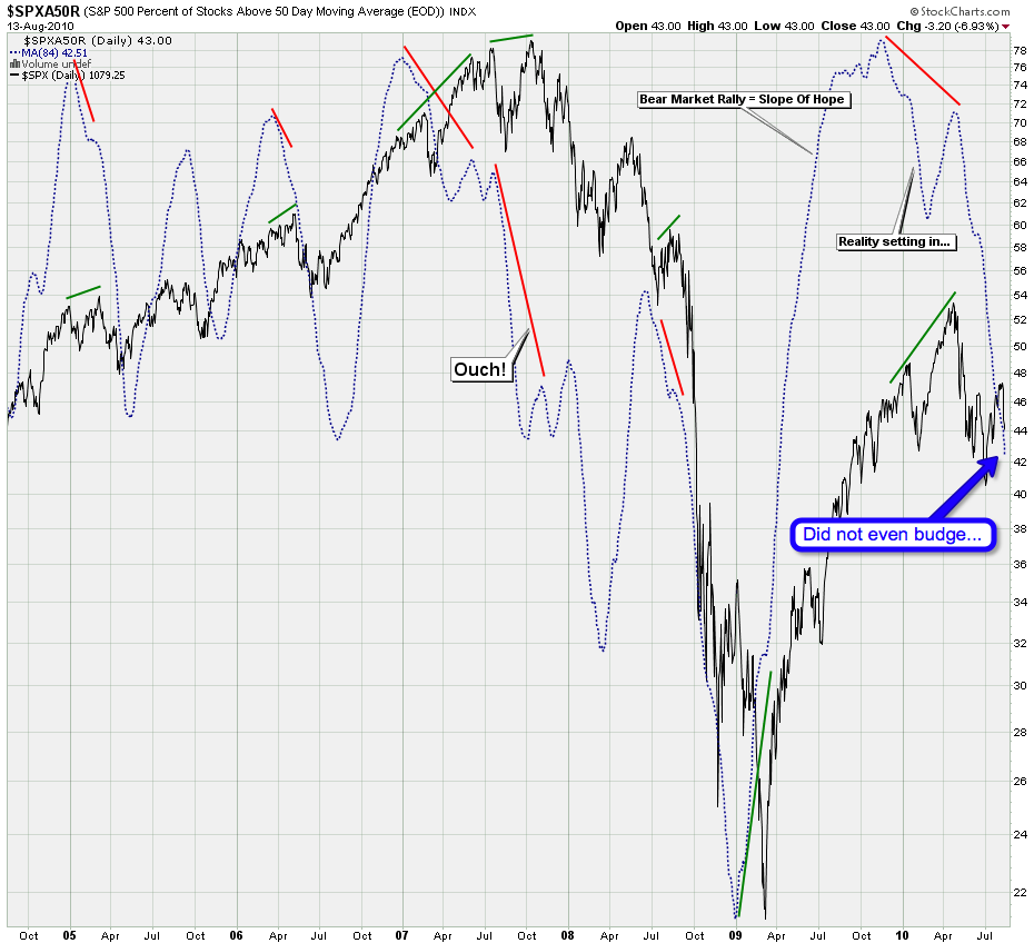
The SPXA50R is the same as the SPXA50 – only difference is that it measures the percent of stocks above the 50-day SMA instead of the number. I posted this chart a few months ago as it depicted distribution as we were painting new highs for the year in equities. Quite interestingly the 84 SMA has not even budged, which speaks to the continuatin of the current downtrend.
And here we go even more long term – we are using a moving average of the SPXA200R (yes, you guessed right – stocks above their 200-day SMA). I have highlighted each time we painted ~1120 on the SPX and as you can see we are at around 60% of what we saw at prior readings. Which means distribution – which means weak hands getting frustrated and kicked to the curb – which means many of you stainless steel rats.
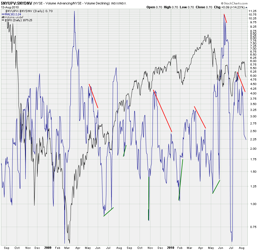
The proof is always in the volume – and the NYSE advancing/declining volume ratio chart again pointed the way as advancing volume began to lag downside volume after that first spike up in early July. Again, much downside remaining here.
This chart is the product of a collaboration with Tooncez and myself – I mentioned that I wanted to see a MACD style histogram showing the delta between the SPX and the SPX:VIX ratio and he sent me an early version which has been going through a few iterations since. RaisedByWolves also joined the fun and suggested to use a log on the ratio in order to bring it in line with our stockcharts predecessor.
Anyway, I think that chart is absolutely beautifully stunning. No other chart I have seen depicts the trend of the past two years as nicely as this one. Good to see red readings in the histogram and we definitely want to keep it this way. It’s now time for those readings to intensify to the downside again as we are too close to the zero mark for bearish comfort.
One more long term chart before we look at the more immediate trend. The McClellan measures the medium term and the NYSE Bullish percent the long term. Each of them is calculated completely differently but we just choose to not care and look at it as a ratio chart. Which rolled over just when we thought it would – fantabulous! Again, there is still plenty of downside momentum remaining – especially if we bounce up a little in the short term.
Which brings me to the short and medium term charts:
Short/Medium Term View
The long term remains quite clear and unless all those charts are wrong down we go. Short term however the tape will throw us a few monkey wrenches and it may be as soon as early next week:
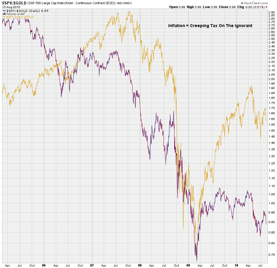
First up, the Dollar seems to be in the process of completing a first motive to the upside (clearer on my 135min chart). Which means we probably will get some profit taking either here or a handle or so higher which will favor equities. If you have any doubts about that please remember that the entire melt up from the March 2009 lows was due to massive quantitative easing and thus the destruction of the Dollar. Let me show you how much your buying power measured in Gold has been degraded:
That’s right – relative to gold your fancy stock portfolio is still worth jack and we are near the 2009 lows. You can thank government (i.e. Fed) sponsored Dollar dstruction for that. Anyway, that’s a story for another day – let’s move on with our short term perspective.
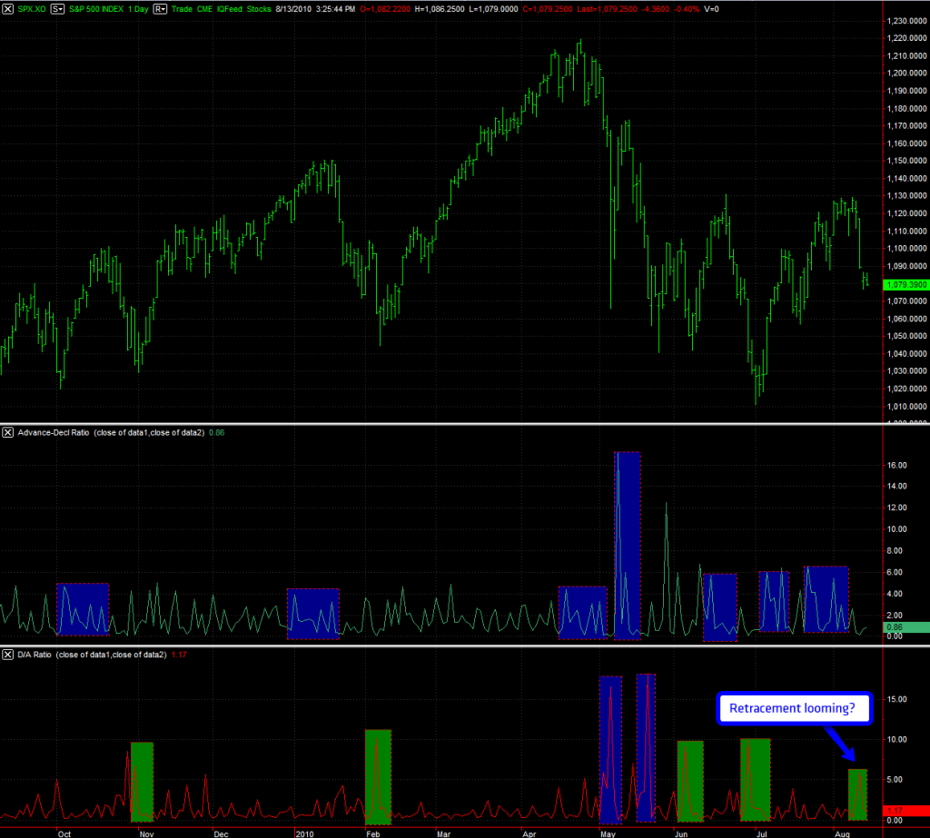
My NYSE A/D ratio chart and in particular the D/A signal seems to be running a bit out of steam. Unless we get a strong spike to the upside on the bottom panel we may be completing a bullish Gothic Church Tower (GCT) fractal, which seems to be a harbinger of green candles ahead. How many and how long is unclear – if this is a GCT it appears to be a mild one, so the expectation is that we remain below this month’s highs.
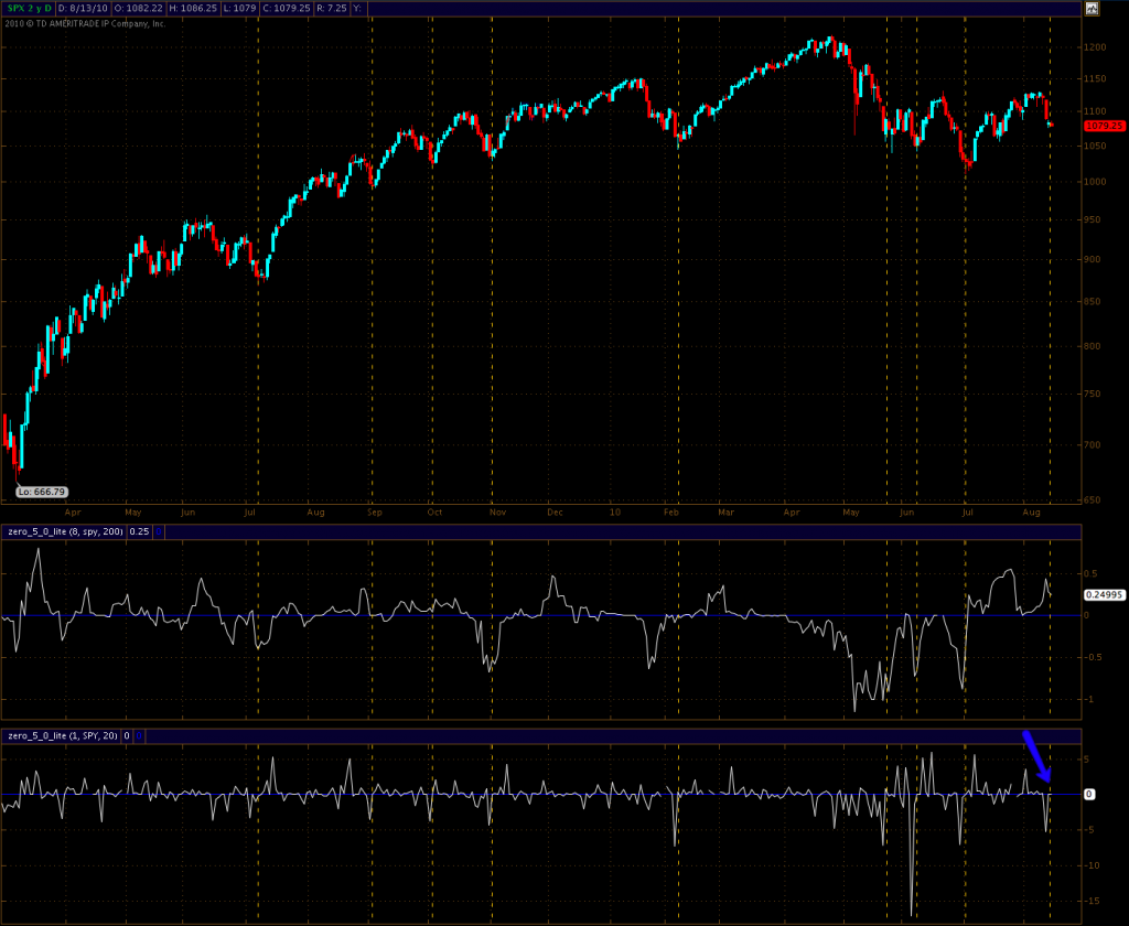
The daily Zero also spiked down and then went flat for two sessions despite the SPX painting new lows for the month. Which also may mean that green candles loom ahead. The spike down was not super strong, but it is strong enough to qualify.
FYI – that smoothed panel has been puzzling me all last week. Either it’s right and we indeed whipsaw around a bit more, driving the bears crazy, or there’s something wrong with that reading. I’m not sure yet and as of now I recommend you simply ignore it, as it’s a fairly new version of the Zero. In case you read this after it becomes available to no-subs – the Zero is a proprietary trend indicator (there’s also an hourly and a 5-min intra-day version) and you can sign up for it here.
This is the short term version of the SPX:VIX chart I presented above in the long term section. Note that I am not using a log on the ratio – if I do this on the hourly it just doesn’t work. Which is something we’ll have to continue looking at. For now a simple SMA suffices IMNSHO.
But what I’m seeing right now argues against an immediate drop to the downside. Of course all that can change come Monday morning but thus far the downside plunge late last week was not accompanied by a strong negative reading. Could be that we simply need a bit more time and that we may get another push up before a big push down.
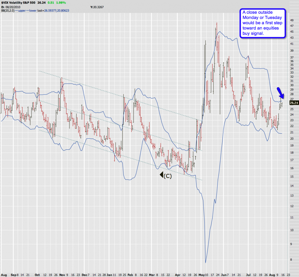
Mr. VIX is also creeping along that upper 2.0 Bollinger. If the bears are lucky it stays inside – if not we may see a close outside which would be one step toward an equities buy signal.
Wave Count
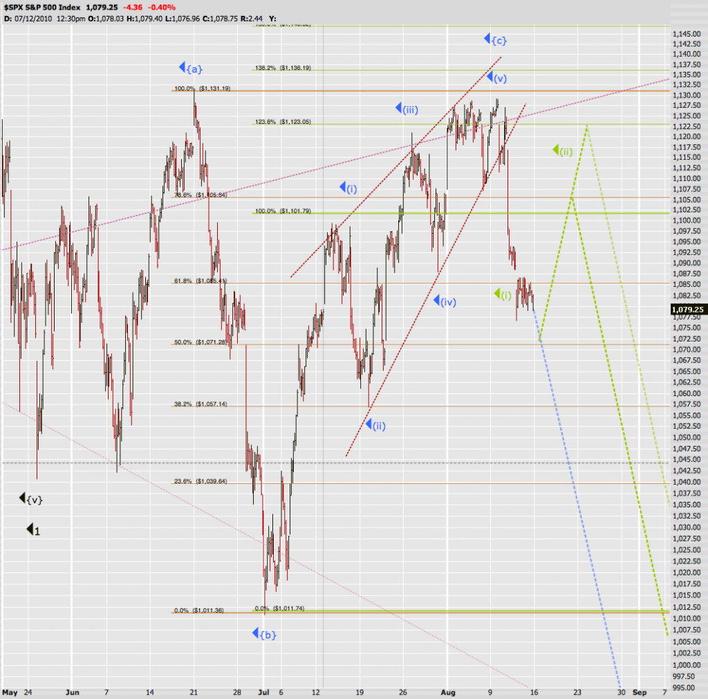
Based on all the above I am long term bearish but short/medium term bullish, right now. However, knowing that the long term trend can overwhelm any time I would not recommend going long here. Instead some mild hedging and in particular a ‘sell-the-rip’ strategy is what I personally plan to employ.
The Blue Plate Special has the lower probability right now, despite the fact that most bearish pundits seem to be in love with it. I expect a pretty scary retracement should the bulls finally gain some ground and the dip buyers decide to pour in. But we never really know for sure – and relying on ‘just one more rip’ will in the end lead to missing the bus. Thus, I plan on holding my bearish positions and even add more starting at 1100.
Soylent Green has a bifurcation – one suggesting a drop at 1105 and then one at 1122. I think both are reasonable targets and it all depends on how much energy the bulls are able to mount. This right now still is my preferred scenario, mainly due to the short term charts I posted. But I’ve been around long enough to realize that those charts may be fooling me, thus I refuse to over complicate matters by trying to play every swing. If we get a run up then I’ll add more short positions as soon as I see momentum roll over.
Suggested Strategy:
Wasn’t that fun? Exciting times indeed and extremely interesting from a technical perspective. Now based on what we learned on Friday I propose an alternative strategy of playing a possible swing up. If we do get to 1105 on the SPX, which roughly equals 110 on the Spiders – how about a S110P/L108P/L106P bull put ladder? I’m sure BobbyLow will have a field day with this and I’m open to various suggestions – as a matter of fact, that would be your homework assignment for this evening. I would love to see some TOS simulations and profit/loss as well as break/even analysis – as a matter of fact the winner gets a free week of Zero goodness.
Cheers!
Mole


