The Big Picture
The Big Picture
With all the drama in the MSM and red candles galore in recent months it’s easy to lose perspective and either find yourself being lured in the wrong direction or to become emotional and wind up missing out on perfectly good technical setups. The reason why you keep coming here is because the name of the game for Evil Speculator is to keep you ahead of the curve so that you won’t find yourself being the last schmuck in a game of musical chairs. After all the game is geared to be a sucker’s play by feeding you a ton of information that is completely useless in order to make you think what they want you to think. In essence the financial MSM is tantamount to a sheep dog herding its flock.
Take for instance the basic concept of ‘bull’ vs. ‘bear’ – it’s one fledgling traders quickly become familiar with once exposed to even a limited amount of financial news, training books, or other pertinent publications. Just like ‘Republican’ vs. ‘Democrat’, ‘ying’ vs. ‘yang’, ‘good’ vs. ‘bad’ the bull/bear metaphor it’s a grossly simplified perspective on what in reality is a much more complicated situation. Nobody is born a bull or a bear – admittedly there are optimistically predisposed people and more pessimistic ones. But even that should not matter if you consider that being short a stock can be as profitable as being long one (arguably even more so). What I grant you is that sufficient brain washing and financial MSM exposure will quickly have you convinced that being long equities is the patriotic and ‘right’ thing to do. Behind the scenes of the big kabuki play the big guns of course have no allegiances and are happy to trade the tape either way.
Bottom line is that market directions should not be adopted as a mindset, and neither do they make good spouses – so don’t get married to them, no matter how tempting. Do what I do – hit them and then quit them 😉
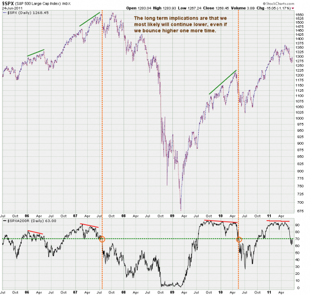
I posted this chart in my last market forecast as it’s important and gives us important clues for our long term outlook. The gist of it was that the SPXA200R had dropped through its 70% mark and that usually means that there is some bearish follow through over the long term. As you can see it has only happened twice in the past four years or so, and I would be very surprised if we were done here.
Medium to short term the odds now support a reversal, after which we should drop a lot lower. However, there is one caveat – while we bust higher what we want to see is for the SPXA200R to remain below the 70% mark – if it doesn’t then the long term picture supports new highs and perhaps even a run at the 1550 mark.
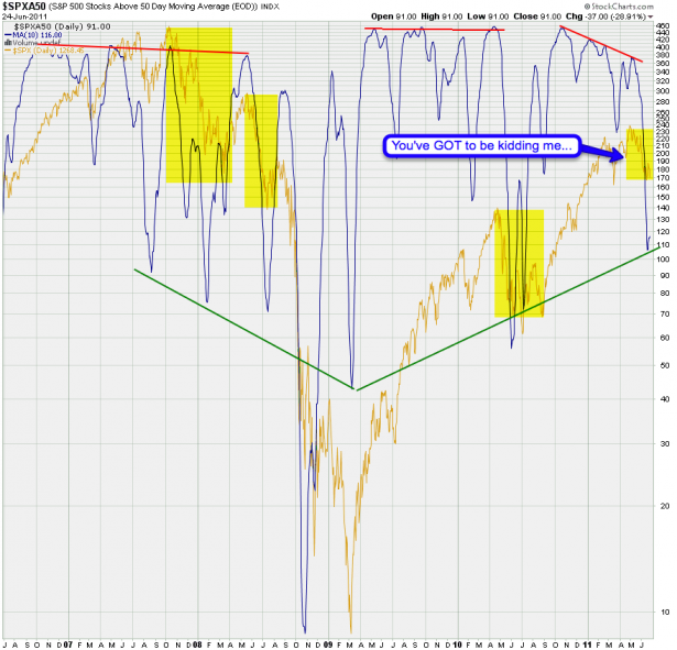
In my intro I was talking about the SPXA200 – here is the SPXA50 – it’s more medium term cousin. Clearly the fear factor here far outweighs price movement to the downside and I also think that drop down produces somewhat of a support line. Let’s see what happens early in the week but a bounce up higher here would be a good signal to increase long positions.
There’s another message on the chart however and it ties into the perception of gloom and doom that’s permeating the financial media right now. Look how far we’ve dropped on the signal line (which is a 10-day MA) and look how little we have dropped in nominal terms. Then compare it with similar periods in the past few years. I mean, you really got to be kidding me – we’re barely down 10% and everyone is in crisis mode. Greek Schmeek – we are near the 100 mark and this is not where you want to be short – this is where you buy back short positions.
A similar picture unfolds on my CPCE Deluxe chart (an old nickname of mine). As you can see we recently departed familiar territory and are now scraping highs unseen since the 2008 market crash. Maybe I’m a bit late in calling this the wall of worry but I truly believe that this is not a reading preceding a major drop in equities. Besides, that first drop down rarely is – usually you get at least one or two retracements on a medium term basis.
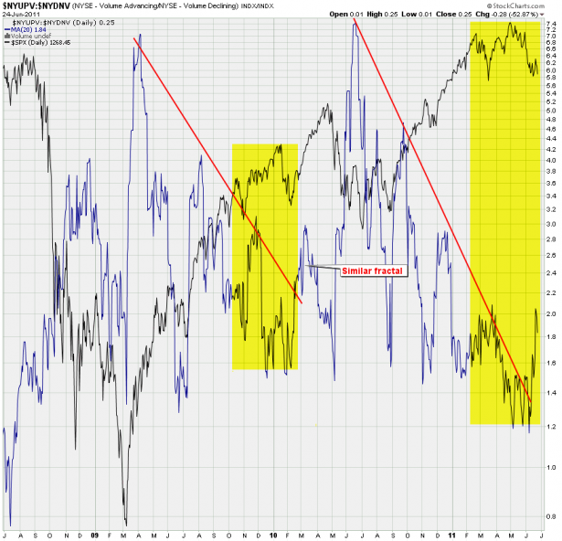
Let’s look at up vs. down volume on the NYSE. Now, the current pattern looks awfully familiar to me – wouldn’t you agree? So again, what we want to see is a quick spike up on this ratio accompanied by a distinct pop in equities. Then we want to see a continuation in equities while this ratio starts dropping. That would be a supporting signal that it may be time to back up the truck on short positions.
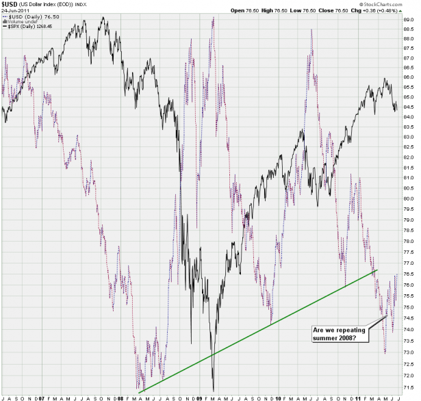
In the end, it all comes down to the Dollar – and yet again we may be painting a fractal here in that we may be repeating summer 2008. Heck, wouldn’t that be something? 😉
It’s possible that we see one more drop in the buck followed by a push higher – of course we could also drive higher right away. Once that happens equities are primed for a major drop – but that may be in early to late fall, so there’s no rush. Don’t be early in shorting a market – there’s a lot of pain associated with that particular exercise, especially during summer where markets don’t really have a tendency to make large corrections. And to you option traders – remember always: Theta burn is a cruel bitch.
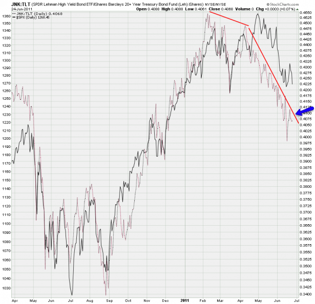
You surely remember my JNK:TLT ratio chart and it has continued to drop. Frankly, that one spike up last week was leading equities and helped us getting sucked into the short side (and bank a bunch of long trades via the 13 victims I posted). However, I really want to see some follow through now and for that we need to breach that diagonal resistance line – it has to go, preferably early in the week.
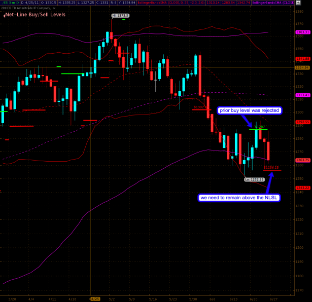
Clearly the onus is now on the longs to drive the tape away higher and away from that perilous lower line on my 100-day Bollinger. No matter what the charts above claim to tell us – if we drop much lower from here we could easily see some follow through that gets us toward 1200.
So our first line in the sand is the current Net-Lines sell line (NLSL) at 1256.25 – thus far we’ve been able to remain above support but if we close below that then the scenario presented with the prior chart could easily transpire. Perhaps it would be a drawn out summer long downside churn – it’s not impossible and as always price has the last word. If we drop to the NLSL and hover above it then it’s a wonderful level to take on a few select long positions. Stop should be placed slightly below the NLSL – but wait for the close.
Bottom Line:
The long term picture thus far remains unchanged and the take away message here is that we continue to line up for a bigger downside correction later in the year. But in order to validate that outlook we still miss a few important pieces to the puzzle which usually present themselves during the ‘Intermediate wave 2’ phase of a correction – i.e. degrading market momentum measures along with higher prices. We’ll be monitoring the next few weeks and months very carefully and either way should be well positioned ahead of any big moves, as usual. At least, that’s the idea 😉
Cheers,
Mole


