Yesterday’s Dogs May Be Tomorrow’s Heros
Yesterday’s Dogs May Be Tomorrow’s Heros
If you have been following the tape throughout the summer then you may recall that equities have been on a veritable rampage while other key markets have remained stuck in a slow sideways roast from hell. And you can’t blame global warming as any wretched soul caught long theta on any of those dogs is probably several foot underwater by now. Allow me to illustrate:
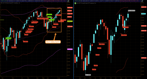
Here’s a long term chart of the S&P E-Mini – nice jump in June and it’s been one brutal short squeeze since then.
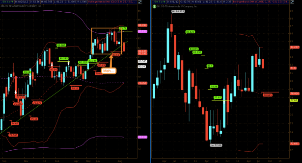
Meanwhile the Dollar has been tickling upside resistance and pretty much has gone nowhere fast since May. Note that an important trend/support line was breached last week. More on that further below.
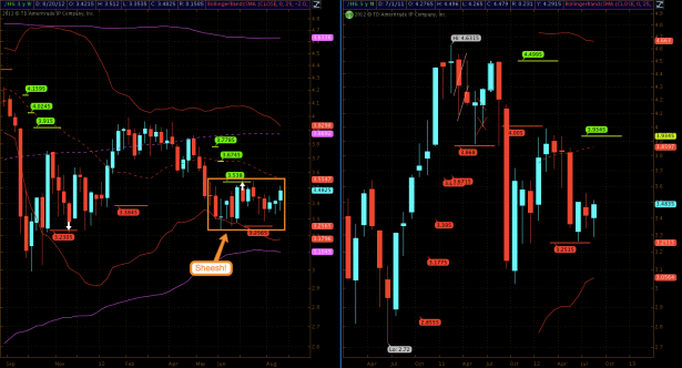
Copper – I literally had to control my gag reflex just looking at this chart.
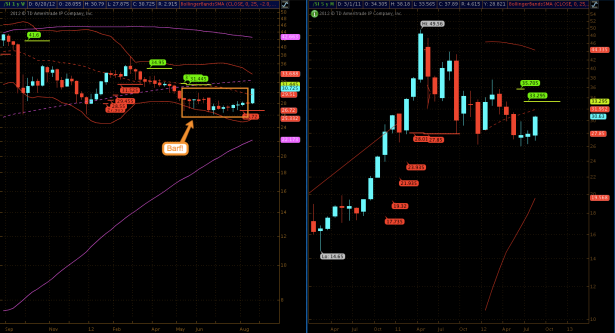
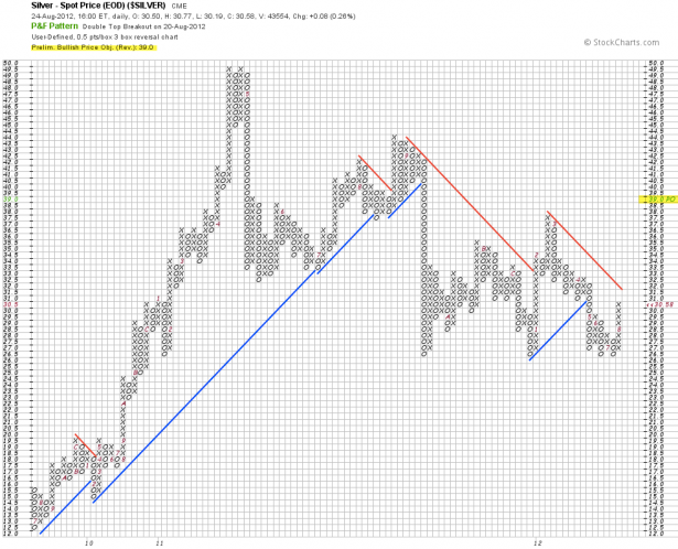
Silver – if you are a gold bug or a pertinent directional trader seek professional help immediately.
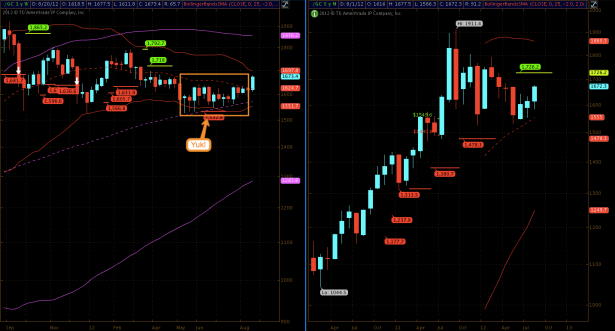
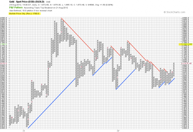
Gold – equally depressing and I would not be surprised if COMEX was considering a toll free depression helpline.
Now given my rather lurid heading allow me to make my case: Which is in essence that we have exhausted upside potential on the equities side – meanwhile we may see quite a bit of acceleration in yesterday’s dogs. Let’s cover equities first.
When given a choice between trading an easy or a difficult market you can guess which one I’ll pick every time. And when it comes to equities I am looking at a whole bag of conflicting evidence right now. Here are a few samples taken from a growing collection:
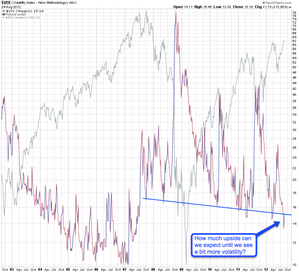
My long term VIX chart remains in five year low territory. Although I do think that we could drop a bit lower here (more details below) this casts serious doubts on a sustained continuation of the current rally. In other words – we had a good run but odds are your money may be better deployed elsewhere.
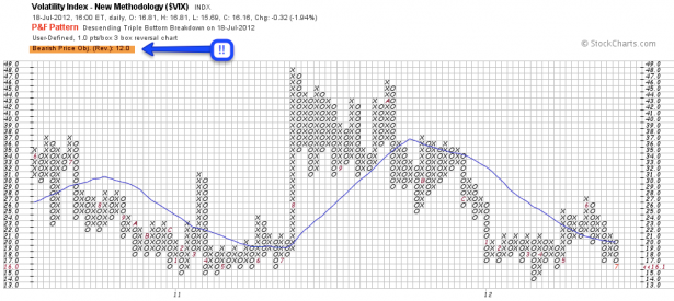
My P&F view suggests that we may drop all the way toward 12. I would not discard this possibility but as we are already trading in the low to mid teens it doesn’t leave much in terms of downside potential (or upside potential in equities).
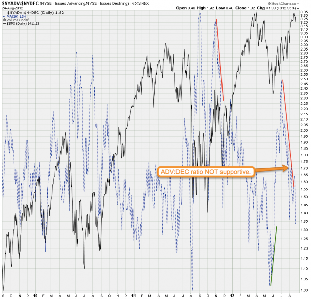
Here’s the NYSE Adv:Decl issues ratio – I have to concede that in this brave new wold of never ending quantitive easing bearish divergences have shown less impact. But I would rather see a bullish/supportive formation here than the divergence we are painting right now. FWIW the 1.40 mark has recently been where gravity started to kick and we are now starting to dip below. This may not be enough for a correction but it may be sufficient to push equities sideways for a while.
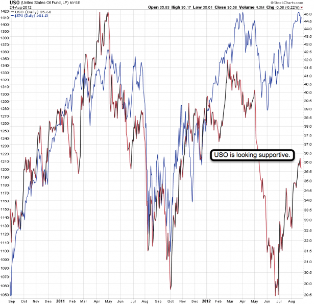
Crude has been pretty much in sync with equities in past years and I expect this to continue over the long term. At this point I don’t see a divergence here or any indication that crude is about to turn. And that puts a damper on any downside potential on the equities side. If crude continues to run higher it may pull equities along or at least minimize the magnitude of any correction.
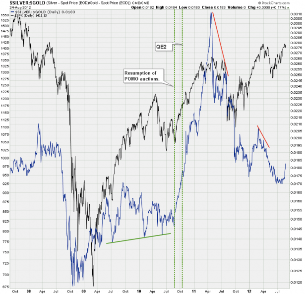
My silver:gold ratio also appears supportive of equites and thus stands in conflict with what I’m seeing for instance on the VIX or some of my momentum charts. This ratio has limped behind equities recently but is now pointing up strongly. At least in recent history a push higher here has not been met by an opposing move on the equities side.
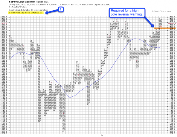
My P&F chart probably is a good representation of the current dissonance on the equities side. We raced higher after satisfying our bullish price objective of 1390, painted an exhaustion candle and are now very close to producing a high pole reversal warning.
Obviously nobody has a crystal ball and where equities are heading is anyone’s guess. The point of this exercise has been to demonstrate that we are looking at a conflicting picture right now. And that means the risk:benefit ratio of participation in equities appears to be rather high. Mix in the constant risk of news or policy driven surprise moves and it greatly dampens my apetite for anything related to stocks.
However there are several charts that get my juices flowing right now. Some of them afforded us almost optimal entries in the past week and thus we should be well positioned to participate in a trend change. Maybe yesterday’s dogs may just be tomorrow’s heros. Put your 3D glasses on – we are going to look at a few more P&F charts:
[amprotect=nonmember]
More charts and non-biased commentary below for anyone donning a secret decoder ring. If you are interested in becoming a Gold member then don’t waste time and sign up here. And if you are a Zero or Geronimo subscriber it includes access to all Gold posts, so you actually get double the bang for your buck.
[/amprotect]
[amprotect=1,13,9,12,5]
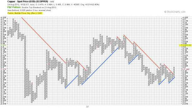
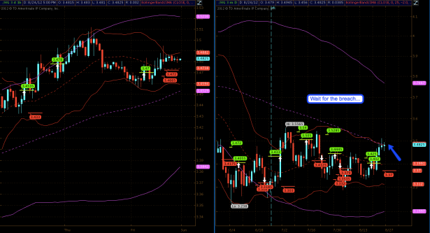
Copper – this ole’ dog has been limping around all summer since last week the situation has changed dramatically. We breached resistance and my P&F is now flagging a bullish price objective of 3.285. But wait – there is more:
Just so happens that we are sitting right at the 100-day SMA and I am patiently waiting for a breach over to the other side. If it happens I’ll be sure to be on that bus.
Gold – we got a great entry last week and it’s been pushing up hard. What you may not know is that my P&F is flagging a bullish PO of 1790. Now wouldn’t that be something. The bad news is that there are never any guarantees in the market. The good news is that you are already well positioned to participate should things evolve higher from here.
Silver – another great entry last week and we’ve been smiling all the way to the bank. My daily chart shows me our first target cluster near 31.6 and the P&F seems to agree. But also worth noting is the bullish price objective of 39. Which may be a reason to keep a few lottery tickets in the running for a push higher.
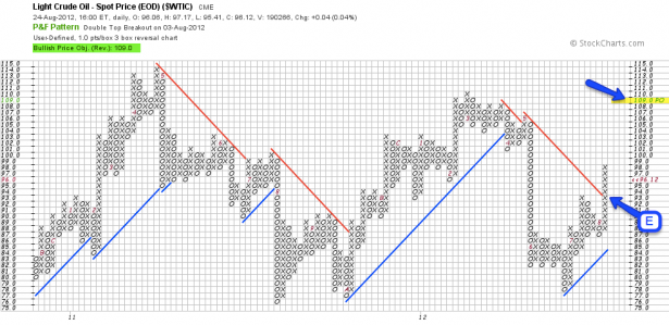
Crude – as I said it continues to look pretty strong. We got a great entry right at the 100-day SMA (near 92) which also turned out to be vertical resistance on our P&F (of course mileage may vary as I only see two touches). Our current bullish PO is near the 100 mark and holding through the expected gyrations may pay off.
FXA – the Aussie hit a P&F inflection point and is now donning a bearish PO of 102.6. If you squint then you can also make out the rising diagonal support we just broke. Unless we breach higher here soon that bearish PO may be on the conservative side.
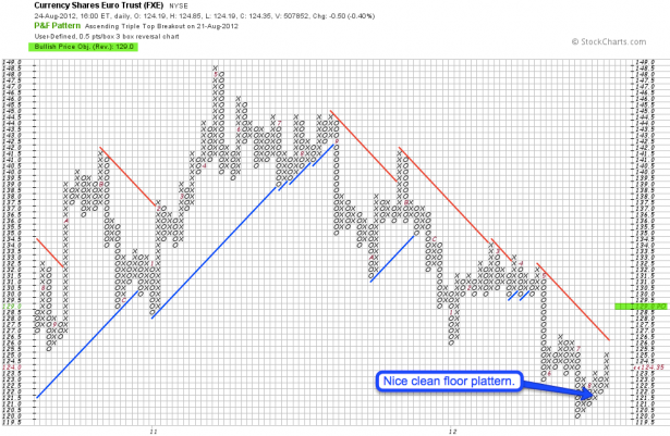
Last but not least the Euro – here’s the FXE P&F chart. I call that a nice and clean floor pattern. Which was followed by a break out and we are now seeing a new bullish PO of 129.
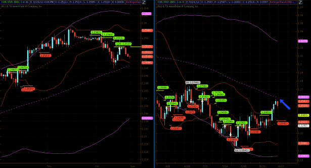
FYI – the EUR/USD chart has us positioned right ahead the 100-day SMA. We already bounced back a little but I am pretty certain we’ll see another attempt. A break out here would most likely take us to 1.29 and possibly higher – thus completely ruining my recently discounted exchange rate. Well, it was good while it lasted 😉
[/amprotect]Cheers,


