Smile Modeling; What Is SKEW?
Smile Modeling; What Is SKEW?
I am sending this out, but will not be able to respond to questions till Monday as I am on an annual “family” business trip this weekend.
This post will be a bit dry, but hopefully interesting to those who trade options. This may sound educational, but hopefully it encourages some deep thought. To be blunt- all of this- is so I can say I have a vega of 3 today and a vega of 4.5 in two weeks. 99% of traders cannot do that (or they think they can but their math is wrong). Yet the guy on the other end of the trade (market maker) clearly knows about smiles, convexity, or stochastic volatility. This is why call rape (patent pending), skew rape (patent pending), and retail IV crushes (patent pending) all occur. If you believe it or not, as tricky as the SPX is concerning IV’s inverse correlation to price and skew’s positive correlation to price, I have seen more blowups in Corn futures when novice traders do not fully evaluate IV and IV smiles.
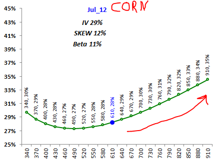
First off, what is an IV smile? Smiles are the shape of the IV for a particular contract at 1 point in time. Each option has its own IV. I use a simple polynomial regression (eg beta means smile width, skew means direction, IV means the smile intercept). Its a “quadratic” equation, but also a simple “right click, add trendline, click polynomial, order 3” in excel. Or {=linest(YY,XX^{1,2}) }if you prefer.
Why does this matter? Well first off, it is hard to value options without modeling the smile- let alone evaluate risks in the form of using greeks. If you think you have a -50 delta, and the market moves south, you may or may not have a -1 delta at a lower price. That depends on how much theta or vega you have on your book. In any case, you have to understand what is moving your P&L- otherwise you might wake up one morning being completely correct on market direction but wrong on vol. Corn futures do this often.
Without EVIL ado let’s dig in to the data.
Here is what a corn IV smile looks like (recently).
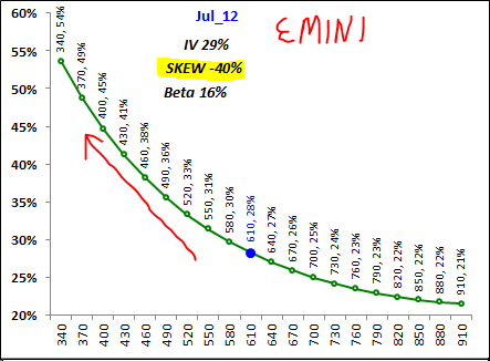
Here is the SPX (a while back if I remember).
Clearly the Emini looks completely opposite of Corn. Ignore the corn prices on the bottom of this chart, I applied the SPX smile to corn prices to compare the smile “apples to apples.”
What does this mean?
Well, in general, the IV smile tends to reflect market distribution. Distribution meaning probability of up versus down (averages mean little if you have read any of my previous posts). BSM (Black Scholes Merton) option pricing is based on lognormal (gaussian, normal etal) distribution. Normal meaning the up deviation and down deviation are equal. However, we know that the S&P has a bias to grind higher and flush lower; therefore, it tends to have a negative skew. Or the deviation from average has a negative tenancy (bias). To adjust for this real world problem, option pricing models “charge” a higher IV for OTM puts to compensate for real distribution. Many claim it is due to lack of liquidity- I do not really agree as options are priced at both the BID and the ASK and there no way the EMINI puts are illiquid and Corn puts are not inasmuch, relatively speaking. So it is more likely the smile reflects market distribution and not low liquidity IMO.
Here is where this gets complicated. If smile reflects historical distribution, then historical data should Jive with option smiles.
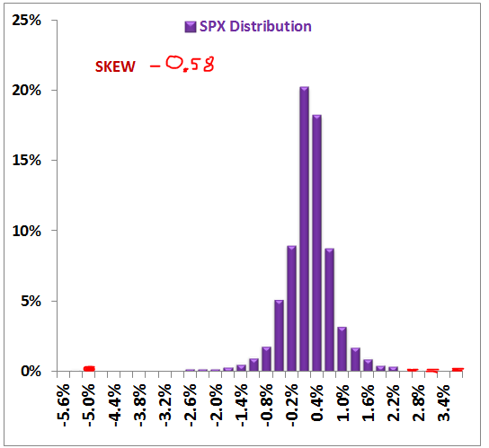
Here is SPX/EMINI historical distribution (since 1990 i believe).
You can see it clearly does have a negative skew. So I presume this makes sense with the smile – which is negative (above).
However, corn is different.
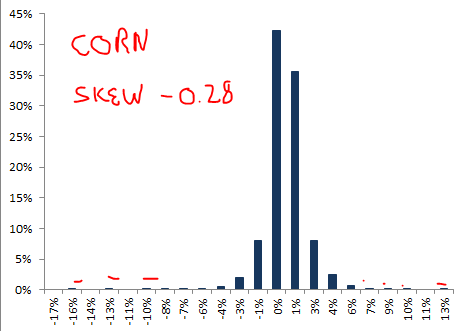
Here is CORN since 1957:
It has a negative skew, yet the smile is currently (+)???
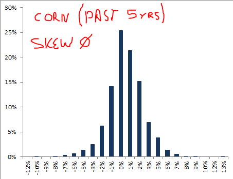
Now here is Corn over the past few years- just to confirm that there is no positive skew.
The skew here is 0, but yet not positive like the smile suggests? What is going on? Is theory fubar or is something else going on?
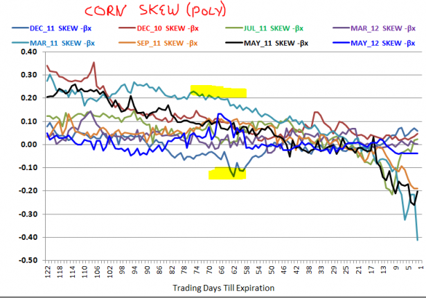
Well let’s look at historical IV skews for corn (past 3 years daily).
This tells me it generally has a positive skew.. which does not jive with historical real price distribution. Clearly it stays well above 0 until about 25 days till expiration.
Ok so what then? WTF is going on? SPX makes sense according to historic data but corn does not? If one just blindly traded on theory they (1) would have sold risk reversals on corn to arbitrage the skew and (2) probably lost money.
I think there are a few explanations.
(1) perception of a bullish bias for corn outweighs historical reality. I believe this, but I would also say China sells puts on grains since 2008 as well- which will in turn changes the smile. Both are “fundamental shifts” to the price of grain that I believe should be considered. I would like to believe this simple answer, but my mathematically inclined head says something else is different.
(2) The SABR (stochastic alpha beta rho) volatility model should be considered.
The SABR model was a concept originally published in Wilmott finance to adjust smiles for skews, correlation of skew to price, and vol of vol. It models fixed income very well, but I do think the “theory” does help to explain option IV skews and IV “contangos.”
Ok I know that sounds complicated, but lets discuss the “basic” concept.
Information is abundant at Wilmott or if you want the code you can go here.
The “basic” concept is that option prices should price in the RISK of future price movements (eg distributions). However, options truly must price in future OPTION valuation distributions- this includes IV curves. Remember an option’s value before expiration is dependent upon more than the price of the underlying asset. Consequently, if price (SPX speaking here) is to rise one must mathematically compensate for IV to drop and the SKEW to rise. So one cannot just model something linear as up moves decrease IV and increase skew, while down moves increase IV but decrease skew. So the present value of price paths for an option is not the same for up and down due to inherent smile correlations.
I am sure that sounds over complicated, bear with me…
We know from many posts here that SKEW moves with price and IV (eg VIX) is inversely correlated to SPX movements. Many claim this to be the black swan index (including myself). This is mostly likely the case- however- I do believe there is more to this story. Otherwise live cattle futures would not have a negative skew, corn a positive, and SPX negative when the underlying distributions are rather similar. Go look at JUL corn options versus DEC corn options. Notice from a fundamental standpoint DEC has MORE upside risk than JUL given the former $105 new crop old crop spread. Furthermore, old crop is planted- so theoretically there is no weather risk like DEC (new crop, just being planted). YET JUL has a larger (+) skew than DEC….
Here is SPX versus a skew. Skew moves with price for the most part.
In practicality, what does this mean? Sure higher prices mean more risk, but why then does the VIX not rise with SKEW? Again there are holes in both the black swan and the VIX sentiment argument. The reason is “arbitrage.” If vol does not equal IV gamma or option selling should make money.
So I am attempting to argue that SKEW reflects more than simple “downside distribution,” it affects theoretical correlation of IV to price (according to SABR theory). Just think when the VIX hit 80 or so the SKEW went to 0 because (1) there is obviously little downside risk after an epic collapse, but also consider what IV at 80% was pricing in? Risk was priced in, and SKEW was low. You can see my line of thought…. IV may reflect complacency, but the SKEW is an adjustment for option selling risk. Furthermore in 2008 the panic priced in high volatility, but one would ALSO expect the correlation of IV to price to weaken (say go near -40 as opposed to -99). Why? Well there was a large risk that prices could fall and IV not rise much above 80. Both the VIX:VXV ratio and actual results confirmed this in MAR of 2009. The VIX did not make new highs when the SPX made new lows- vol was 30% not 80%.
This further supports that skews and time spreads (VIX:VXV) also likely are affected by other variables such as actual volatility and correlation of IV to price.
As for corn, we know it tends to explode up and down along with volatility… but the correlation is mostly positive with IV; hence, the IV smile is slightly positive- especially when there is a break in price. So corn and the S&P may actually have similar downside tail distributions, but the smiles are different due to the different inherent correlations of IV to price.
Now another thing that many confuse is the VIX:VXV ratio (IV time spread). Yes it reflects market makers and sentiment, but it also is an adjustment for theoretical mean reversion of volatility (just like the lower low in SPX and lower high in VIX comment). Ever wonder why it is so seasonal? Or why it follows price? Volatility dries up around holidays, so 1M vol drops and 3M vol rises (relatively speaking). Ok so that explains the holidays, but why is the IV time-spread correlated to price?
Here is my best explanation (using SABR theory). (1) the market grinds higher and many know that can’t last forever so they bid up back-dated IV (just like skew). So volatility is low now, but common sense tells us the risk of it rising is high; therefore, the IV spread widens as volatility drops. Actual volatility forces the VIX lower, but estimated mean reversion volatility stays higher in the VXV.
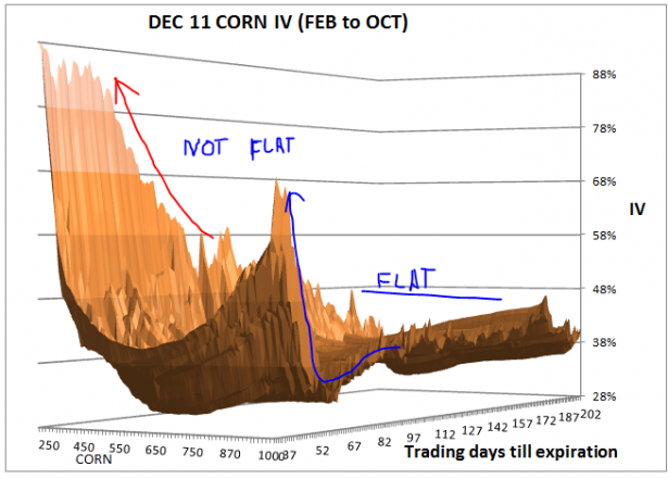
This also explains why both corn and spx smiles go crazy into expiration. Here how the smile changes over time for corn.
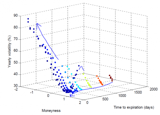
Here is what the SPX looks like. You can see that time affects the smile. Moneyness means “% in the money.” Given that prices are “lognormal” we us ln(strike/current price); this is also the first part of the BSM pricing equation.
Here is another cool view.
Why does the smile change? The reasoning is the underlying properties of the smile change.
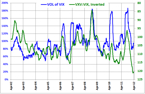
Volatility of Volatility is the primary reason for this change. Or volatility of the VIX, “volvol.” If volvol is low the spread remains high- or in English if SPX is grinding higher volvol drops and the VIX goes discount to VXV.
Here is some empirical evidence supportive of SABR theory of volvol.
Here you can see the correlation. VOLVOL affects time spreads for the most part. So this explains much IMO. IV smiles must account for correlations of IV to price- which also happens to account for SKEWS at the same time.
Now for the final question I often get? ” Why in general does the SPX VIX trade discount to VXV and yet Corn IV structures are the opposite?” E.g. why is DEC corn IV less than JUL corn IV? Most commods are this way just FYI.
This is complicated but the SABR does have some theoretical explanations. First off spot commodity months are more volatile than deferred commodity contracts. That is price discovery at its best, more information comes available for JUL relative to DEC; thus, more volatility for nearby months.. Very simple explanation and reasoning. As for the SPX DEC is fixed to SEP based on an arbitrage-able dividend yield. Corn spreads are a function of supply and demand differentials.
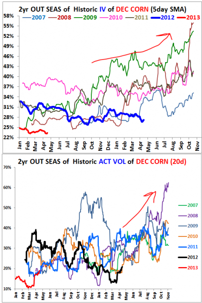
This chart is average IV (of say the smile), not ATM IV for DEC corn. ATM IV is actually much more range-bound (as previous charts above show). You can also see the crop reports here as well- notice how IV is bid up before the report, before volatility rises- no free lunch here!
BOTTOM LINE: My point is that different smiles occur on different commodities and different time horizons based upon different underlying correlations in conjunction with historical price distributions. So when you look at the MMR stuff, you now know what is really going on. This means for you rats attempting to buy OTM puts on the SPX betting on a IV spike and a price drop will not get the return you desire. You maybe better off buying vix futures or selling the S&P due to “smile risk.”
So there may be simple answers to the smile questions, but I do think there is quantifiable evidence for other influences.
For those of you wondering if I use SABR to model my stuff- no- I am an old fashioned modified (creative) cubic spline model guy. I just think there is evidence of the SABR theory when one steps back and compares corn to the S&P.
Also, on a side note, check out the CME data-suite. It is FREE (once you sign up) and they give live quotes for options and some futures. Here is what the calender corn spread options look like. Cool stuff if you like being creative.
Best of luck unbiased (and now creative) trading,
-Volar
