The bigger picture… (browser death style)
The bigger picture… (browser death style)
Berkster here. I am going to let you know ahead of time that this post will kill your browser (TK style). I am not going to apologize becuase A) I don’t need to and B) the more charts I can post, the more clear the picture becomes. Here we go…
As I have been scanning over almost any indicator that I (or y’all) could think of, some things became BLATANTLY obvious. Here goes: A) We are SO ready for a drop that it is nuts. Yeah, nothing new, as we are all in the same boat. B) That drop is spring-loaded, but nothing has triggered it yet. We have market indicators at extraordinarily bullish reading, even higher than at their 2007 peaks, but the problem at hand is that they are nearly all in an uptrend. Until those uptrends are broken, I struggle to want to trade against the current trend at hand, which is most certainly up (for any timeframe longer than a couple of days).
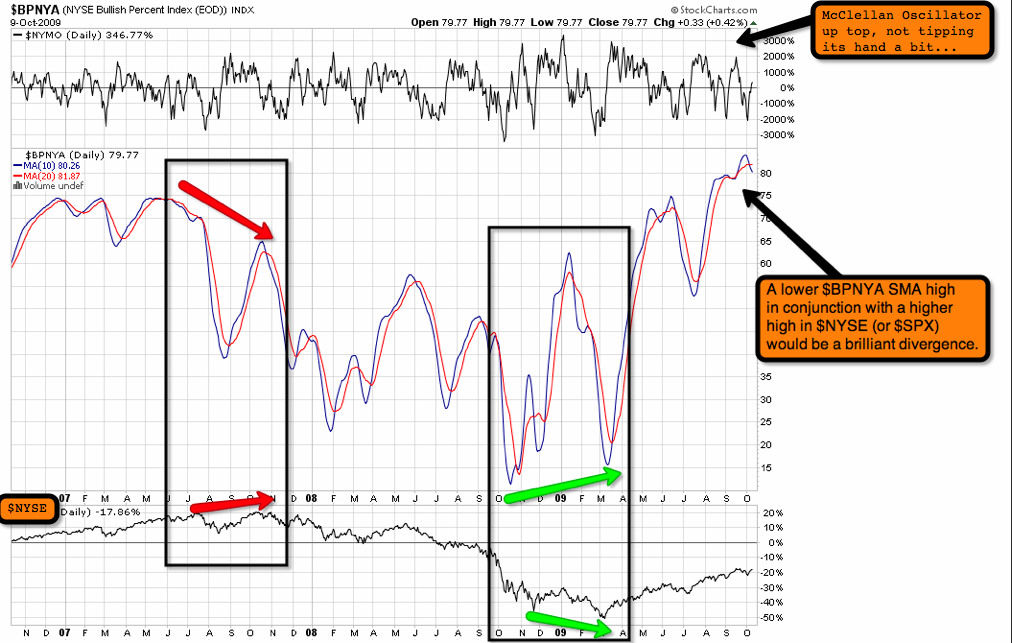
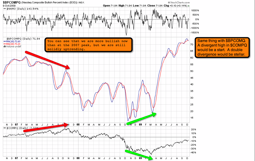
First up, I am going to look at a few bullish percent indexes (BPs). What I am looking for in the BPs is an extremely overbought condition (70+ on the moving averages {I use a 10 and 20, and occasionally a 5 or 50}), as SMA crossover, and a divergence to index price.
$BPNYA 10 and 20SMAs with $NYMO on top and $NYSE on bottom.
$BPCOMPQ same deal as above respectively.
As we all know, you only get 3 years worth of data at SC, not that we don’t love them, but we were observing a much larger degree peak in ’07 than we are right now, so there is some chance that we may not get one of these multi-month divergences, but I am not making a call one way or another yet, too many more charts.
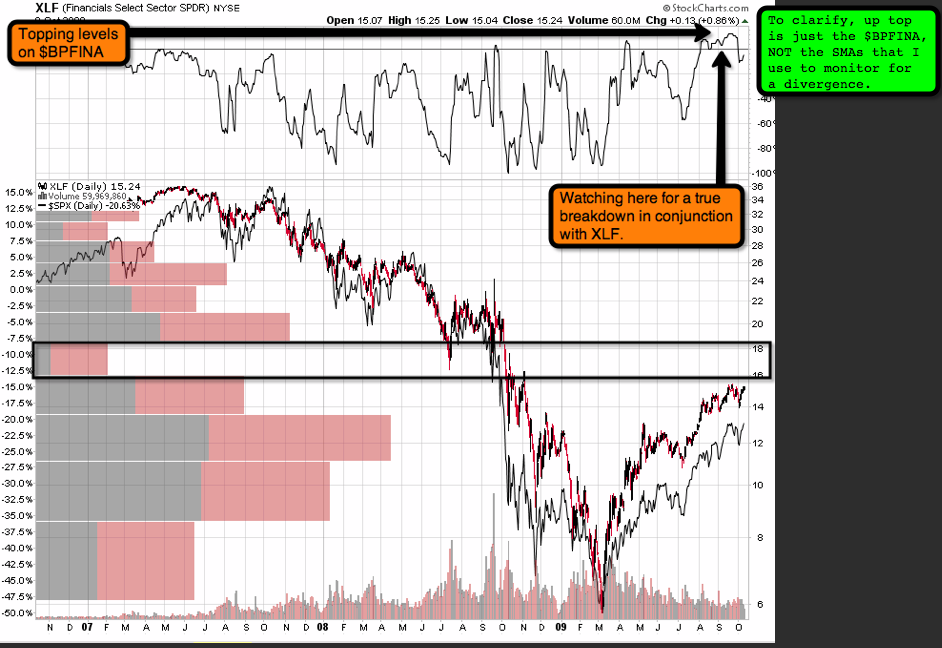
So how ’bout that XLF? A few things I noticed… Air above according to price-by-volume. BP breaking down, but I will warn you that this is just the daily BP, not the 10 and 20SMAs that I use for divergences. As we know, the 2007 peak in $SPX was met with a lower high in XLF, as well as the peaks of the minor and intermediate second waves. If the same is count to hold true, we would need XLF (15.24) to stay below it’s prior peak (15.44). It sure would be nice, but I won’t hold my breath.
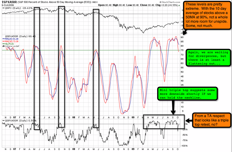
Mole mentioned in his earlier post that the $NYHL and/or $NAHL were still heading up. Even though they’re at insanely bullish levels, I can’t see much good in trying to fight this current until the cluster of SMAs can finally take a turn down. So instead I will take the suggestion from Scrillhog, and check out the $SPXA50R, commonly known as the % of $SPX stocks above their 50MA. Now this is where it gets good… As the last three charts have clearly been saying “Don’t fuck with the market trend,” (and if you weren’t getting that, we are NOT on the same page, and I ask you to step back a few feet and check out the larger view here) this chart says that maybe we are starting to break down.
$TNX is another market that is showing that we are awfully close to a turn. Now Mole had asked me to do some comparisons with Spiral Calender Dates, but I can’t seem to find $TNX in Prophet (go figure). If anyone kindly has the symbol, I will be glad to toss in that chart later. Anyway, as you can see below, the $TNX typically precedes the $SPX at market tops and bottoms. $SPX lagged $TNX for almost 4 months at the 2007 peak, we can expect some similar performance here. Only this time, we ($SPX) are likely to hang around a little longer due to indicator levels that are well above the 2007 peak. That’s my view anyway.
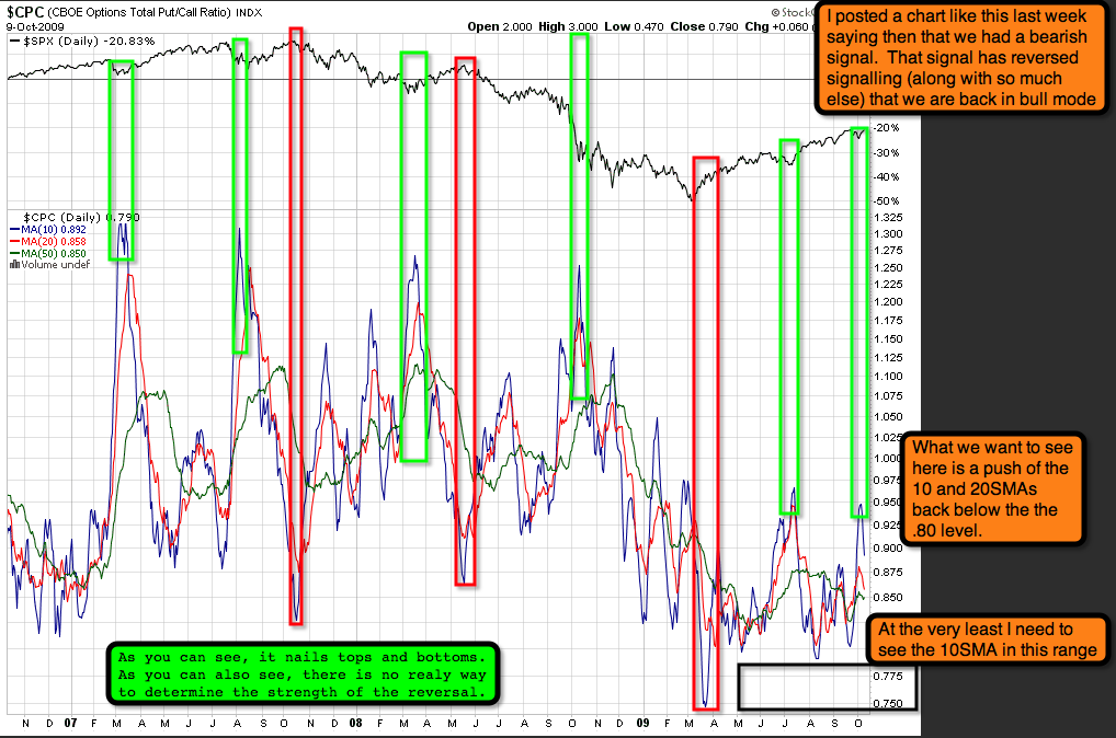
I mentioned $CPC last week (the call:put ratio) had flashed a bearish signal. By the end of the week, the signal had reversed, complete with a turn back down in the 50SMA, which is divergent at this point, but not enough to be convincing. I am looking for a MA cross-over somewhere under the .80 range. The lower the 10SMA can go, the better. I new low would be best, but we will just have to see.
We have all been watching LQD. We finally got a break-down, but we need to see it continue before equities are likely to give a reaction. Notice how at the 2007 peak, LQD had a nice break-down first, but then continued to rally well after the market was plummeting. At this point I am curious if we will see a repeat performance, I am thinking we will.
Here is GLD, off to new highs and a blow-off top sometime in the future. We are likely going to see above 1100 in /ZG, likely upwards of 110 in GLD.
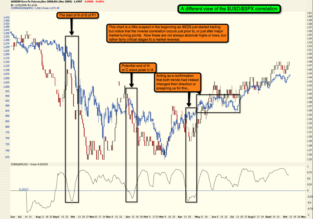
Next up is the good ol’ $USD. What I am looking for in this chart is a POSITIVE correlation with the $SPX. If we could get that (either market rally with $USD rally, or market drop with $USD drop), I would feel much more confident about the bearish case.
Adding in the /6E chart with $SPX correlation for a different view on the above chart.
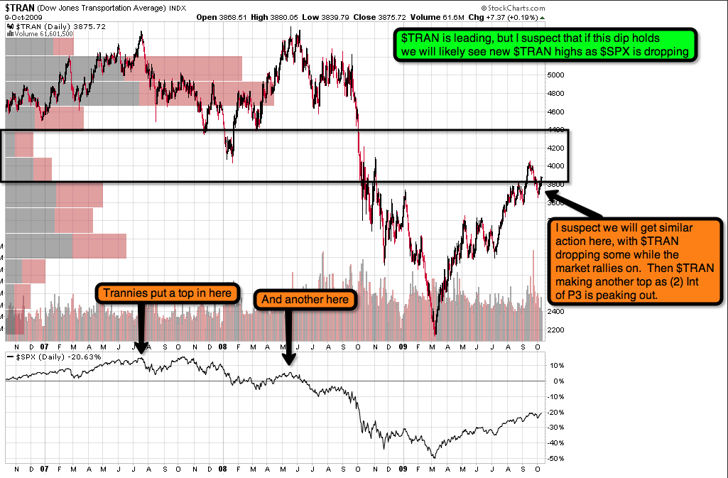
$TRAN makes a habit of reversing before the market, but also has a tendency to rally up a bit after the market has dropped. Will we get a repeat performance?
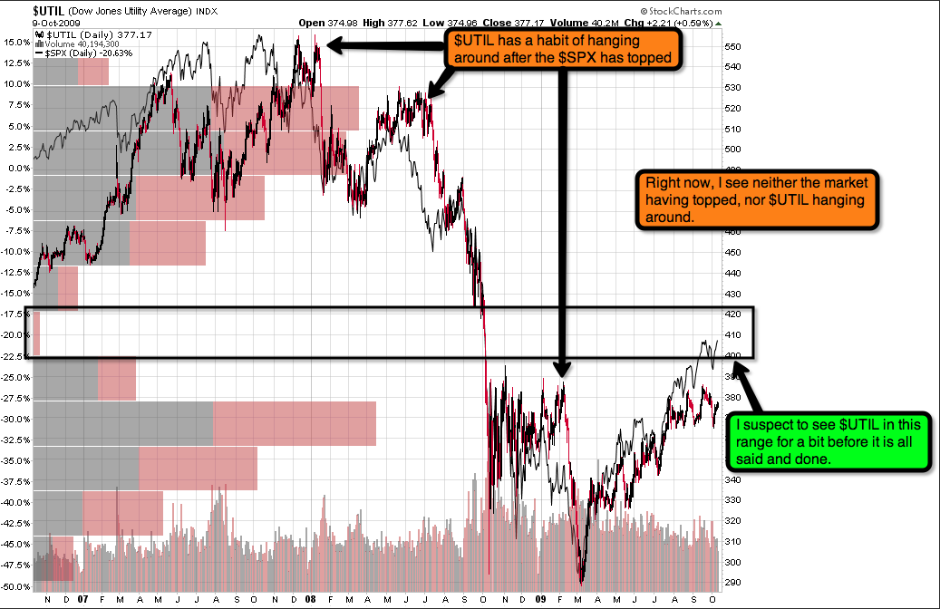
$UTIL is usually a laggard, and right now, it appears to be lagging the $SPX with some consolidation. We should soon see a turn up, and should be watching for $UTIL to continue its rally for a bit after the $SPX decides to take its turn down.
And finally GS. We have all been watching GS lead this market around by the horns (quite literally). I really see this puppy at 210, if not above, before I would be looking to short it. It might have a little bit of downside coming based on MACD divergence. But on the major peaks, we are not divergent at all. NOT a bearish sign.
So Berk, that is a lot of pretty charts, what does it all mean? It means that semi-fundamentally the market is still in rally mode. We all know there are targets here and targets there. EW says this, and Gann says that. And what has that gotten us so far? Only more rally. I am not going to post any standard market charts. Mole pretty much laid out the case straight-up. If we are going to decline, we need to start NOW (last week would have been preferable). If we are going to rally, I think we can expect another 3-4 months of rally, producing modest new highs each time. We are extraordinarily overbought in nearly all of the indicators I have looked at, but hey, that’s just called “being overbought in an uptrend,” until we can get a turn down in any (preferably most) of these indicators. Of all the charts I posted here, only $TNX and $SPXA50R are a little bearish. Most of the charts could be considered NEUTRAL at worst, in that yes, we are overbought, but yes, we are still uptrending. Now most of these are longer term indicators, so that tells me that we should be expecting a few more months of rally (we SHOULD still expect a massive drop at any point, but know that the trend at hand is still fairly healthy). As I noted before, when making my comparisons, I was using the 2007 peak, which is a number of degrees than the move we are currently in. That means that I may not get all of my beautiful divergences, and that the multi-month rally I am suspecting may only be a month or two. Only time will really tell.
I have a few more charts to toss up, but need to get a few things done first. I’ll let this circulate and set in.
Enjoy.
Skål!


