Are Trend Days Passé?
Are Trend Days Passé?
Over the weekend the old Convict sent me a pretty interesting write up discussing an increasing amount of trend day signal failures. If you are a sub then you know that this strikes very close to home as my own system sends out a trend day alert to all of you each morning at 10:15am EST. If you don’t know what a trend day alert is then please point your browser to our handy cheat sheet.
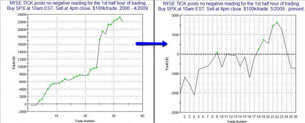
Chart courtesy of Quantifiable Edges.
The left side of this chart shows us the profit curve of a system trading trend days between January 2006 and April 2009. The right side of the chart shows the profit curve of the very same system between May 2009 to the present. We’ve gone from a pretty juicy edge to something I would consider a coin flip. And I think most of us would agree with the author’s conclusion – quite obviously since ca. late spring of 2009 those trend day alerts have been a hit and miss affair. The author opines that something has obviously changed – he doesn’t know what and neither does he care. As a quant his main job is to weed out trading rules which are not applicable anymore in today’s fast shifting market dynamics.
I cannot argue with the data – so does that mean that trend day alerts are passé and that you should ignore them going forward? Well, on that end I do approach trading a little bit differently than some of those quant boys. Let’s look at what makes a trend day in the first place.
[amprotect=nonmember] More charts and cynical commentary below for anyone donning a secret decoder ring. If you are interested in becoming a Gold member then don’t waste time and sign up here. And if you are a Zero or Geronimo subscriber it includes access to all Gold posts, so you actually get double the bang for your buck.[/amprotect] [amprotect=1,13,9,12,5]
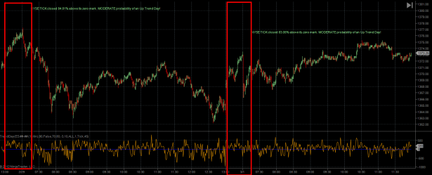
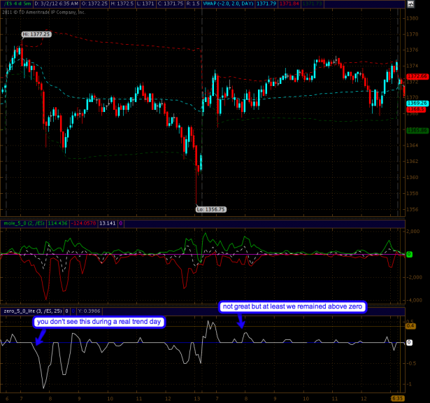
Here’s the chart that actually sends you guys the daily alerts – we are looking at two consecutive trend days, one on 2/29 and the next one on 3/1. On the second lane below the spoos you see me plot the actual NYSE TICK via a simple line chart. Behind the scenes my indicator grabs the first 45 minutes of the tape and then calculates the tick ratio – meaning how many ticks (of the NYSE TICK) plotted below versus above the zero mark. Pretty straight forward – it’s not brain rocketry.
Rather apparent on the left half of the panel is the fact that the first trend day alert was a complete and utter failure. It’s almost as if the HFTs were banging the tape higher intentionally just to turn the tape slightly before the measurement time at 10:25am EST (the chart is in PST – so add three hours). The second half also shows a bit of monkey business and it admittedly wasn’t a hugely profitable, day but in general March 1st had all the call signs of a proper trend day.
Now here’s where it gets interesting – this is a snapshot of the Zero Lite spanning those same two days. And it shows rather clearly that there’s some trouble brewing early in the first day. On the second there’s a lack of participation – but at any rate the signal line remains above the mark throughout the entire session. Again, not a great day but the Zero Lite was minimally supportive of a possible trend day.
Lesson learned: when trading a TrendDay alert make sure you keep an eye on the Zero Lite!
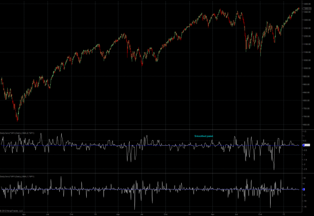
Now let’s zoom out by quite a bit – here’s the daily Zero which gets updated once a day. I expanded the panel a little to capture the entire timeframe between April 2009 to the present. Actually we have two Zero panels here – the one on top is smoothed and the raw signal is on the bottom. As you can see there are striking differences in participation and momentum when comparing ‘melt up periods’ (i.e. winter/spring 2011 and winter 2012) to ‘shake out periods’. The latter show a lot more signal strength while the former are relatively flat. I think it’s a pretty good expression of quantitative easing at work and if you know the inception/expiration dates of both QE periods then you’ll realize that they match up very well – I actually presented some pertinent evidence in the past.
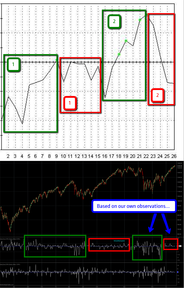
Now this chart is a bit experimental – my main difficulty is that trend days do not occur at regular intervals, rather they occur intermittently. To simplify things let’s assume a standard gaussian distribution which admittedly is being presumptive to say the least. So forgive me when I had to use a bit of creative liberty when mapping Rob Hanna’s profit curve to my daily Zero, but that didn’t keep me from trying. A bit of fuzzy logic here and there often levels the path to putting things into proper context.
In essence I think this presents a fairly reasonable case however and I would very much enjoy Rob’s input on this. Basically what I did here was to extract ‘performing periods’ and ‘non performing periods’. The PPs are framed in green while the NPPs are framed in red. I can say via personal observation that we are smack middle in a NPP right now and it’s one that started late last year, right before the onset of the Santa Rally.
I also spoke to the old Convict over the weekend and he agreed that last winter/spring felt quite a bit like what we’ve seen since December – it’s that 2011 analog idea again. Anyway, both of those periods may just correlate with the small signals we are seeing on the daily Zero, which after all is a participation/momentum indicator. No participation – more opportunity to bang the tape all over the place – simple.
Bottom Line: I don’t think the trend day signal is dead for good, rather it seems to me that it does not apply very well (i.e. almost blindly) during periods of quantitative easing with the purpose of lifting equities artificially. However, when correlated with the intra-day Zero Lite indicator then early warning signs are fairly easily discernible as evidenced by the example above. In essence – during a bonafide UP trend day you never want to see the signal line dip below the mark for more than 10 minutes or so.
If you are not a Zero sub then you may at least keep an eye on VWAP, which should not be breached at all – if possible dips do not even touch VWAP. It’s the inverse situation on bonafide DOWN trend days – you do not want to see more than one or two quick signal spikes above the mark and similarly any attempts to breach above VWAP should fail.
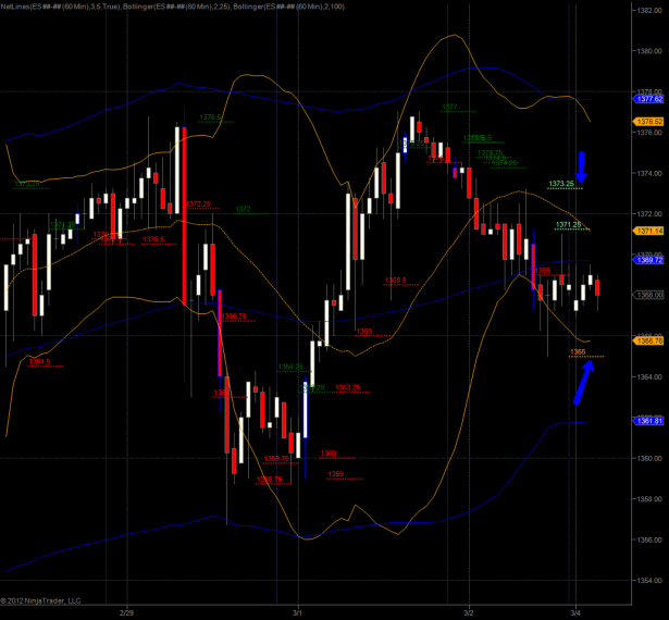
I don’t have much to add on the long term front – all the charts I posted in the past two weeks remain valid. Make sure you keep an eye on the spoos overnight in consideration of Friday’s inside inside candle on the SPX. The high was 1374.53 and the low of the day was at 1366.42. Fair value is about $1.15, let’s round it up to $1.25 and then adjust it to the spoos. Ergo we get a high of 1373.25 and 1365.25 which are your two inflection points.
And as ‘coincidence’ may have it we have two matching Net-Lines on the hourly spoos chart – this should make it easy to structure your trades. To quote Volar – happy unbiased trading! 🙂
[/amprotect]Cheers,


