Figure Pointing
Figure Pointing
Whenever things hand in the balance and I seek more clarity I turn to my trusted point and figure charts to fade all the noise. For one it’s a lot more productive than wasting time on trolls posting outrageous claims and cynically distorting my prior analysis. Don’t even think for a second that I will condone anyone marching into my evil lair and crapping on my carpet. This is not a democracy and I will ban your ass and erase all traces of you quicker than you can whistle yankee doodle. The only thing I care about is banking coin – for my readers and of course for myself. That is why we here after all, n’est-ce-pas? All the rest is just background noise and it’s part of the pleasures of hunting in a rat pack. Whoever crosses the line however is swiftly dealt with – don’t let the door hit you in the ass on the way out. This is Evil Speculator and I maintain a zero patience policy when it comes to dealing with distractions. Now on to the charts:
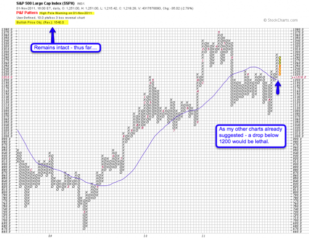
Let’s start with the SPX – I was rather elated when I saw that my P&F chart pretty much confirms what I already suggested earlier today. The bullish price objective is a bit dinged up but thus far remains intact – BUT we did paint a high pole warning and 1200 appears to be the inflection point that separates a violent short term correction (for the time being) from a lot more downside pain looming ahead. Those are the facts and if we cross over to the dark side I want you to be prepared.
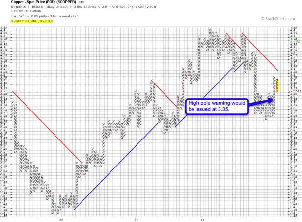
Copper is actually lagging behind equities and we are two boxes away from painting a high pole warning. So at least on that end we still have a clear bullish price objective. Again, two more boxes down and that warning would be effective.
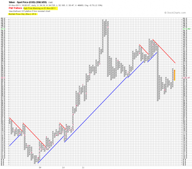
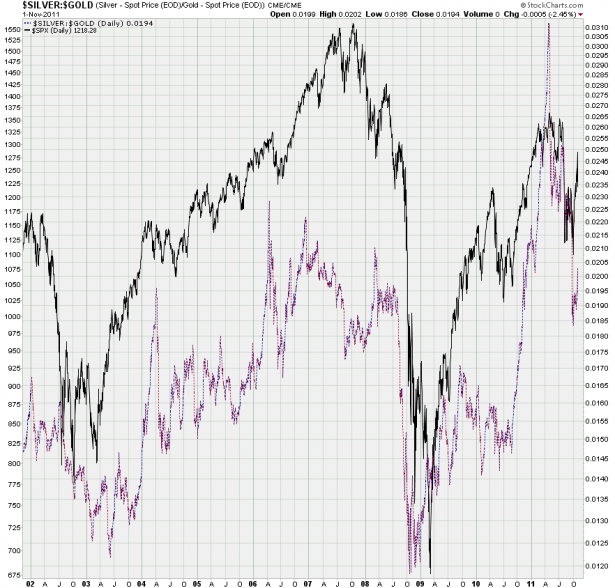
Silver is also painting a high pole warning but just like the SPX the bullish price objective remains intact thus far. Silver has actually been lagging behind gold and that is interesting in itself – I won’t post a gold chart but take a look at the gold/silver ratio:
Actually I was lying – I’m going to show you something better – the silver/gold ratio mapped behind the SPX. Those are some sweet divergences, don’t you think? Anyway, what I find fascinating (and what the P&F chart inspired me to look into) is that the ratio is actually pointing up right now. It has been painting divergences ahead of every single major correction in the past few years, so I find this fascinating. But no – I am not biased to the upside as I, unlike some of the trolls who occasionally show up here, know how to put on a short trade.
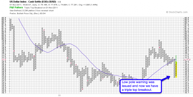
Back to P&F charts – here’s ole’ bucky and it has been bouncing back in a big way since the BOJ Yen intervention. Banzaaaaaiiii! We now have a triple top breakout and although the chart doesn’t say this anymore it was preceded by a low pole warning (or should have been unless it moved too fast). If ole’ bucky stays above this support line (in blue) it could make things very uncomfortable for the longs.
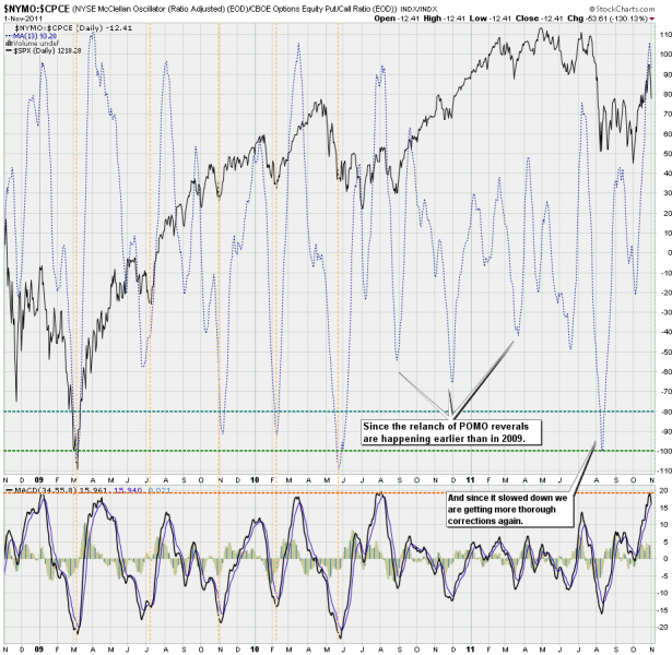
Here’s a pretty bearish chart – my NYMO/CPCE ratio. Frankly I have not looked at it for a while and I was a bit surprised when I saw it today. So, yes – there is definitely some potential for a more thorough medium term downside correction.
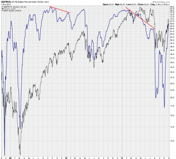
The NYSE Bullish Percent oscillator is actually very related to P&F charts (go look it up) – so it makes to show it here. Yes, we are in pretty high territory but that has not stopped the tape from bubbling higher in the past. What I would expect ahead of a medium to long term correction is a pronounced divergence – and right now I see none of that. So I’m slapping the inconclusive label on it but wanted to share it anyway.
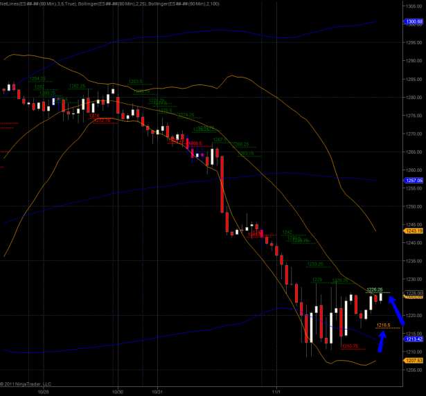
Now here’s a chart you AH traders can sink your teeth into: The hourly spoos is currently tickling a NLBL at 1226.25 plus we have two more valid hours left. If we close above it could be good for a push into 1240 and perhaps higher. So keep your eyes on that one if you’re feeling sleepless and ready to get in early. Of course a failure here could have nasty consequences tomorrow, especially if we drop through 1216.5, our current NLSL.
If we push higher overnight that does of course not mean we are done correcting to the downside. It all depends on the energy of the move and if we manage to push above those prior support levels I have been pointing out on many occasions (e.g. on the weekly and monthly SPX charts). If we drop lower from here I would of course keep an eye on the VIX as the may just get a VIX buy signal (noobs: relative to equities) by the end of the week.
That’s all for tonight – I’ll see you on the others side.
Cheers,


