Apples And Oranges
Apples And Oranges
Retail has yet again turned completely beartart. Starting Thursday afternoon the usual suspects were once again predicting a major impending correction if not a repeat of the 2008 crash.
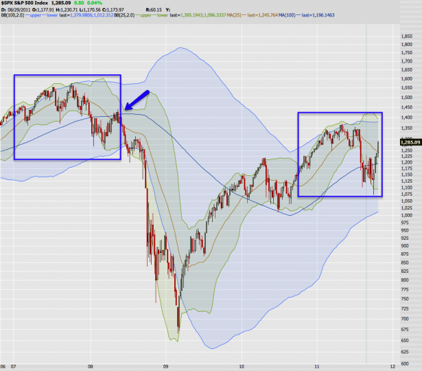
Exhibit A: This chart apparently ‘proves’ that we are in a repeat configuration that must resolve to the downside.
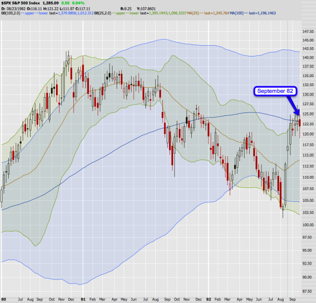
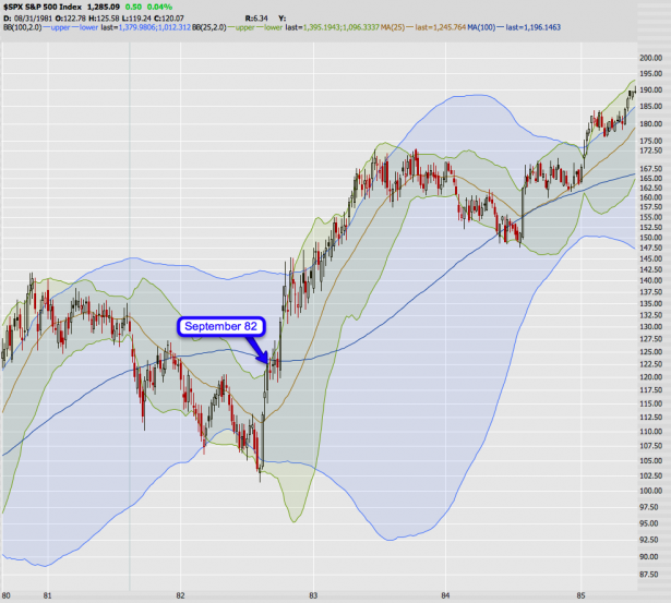
Well, I better dust off my time machine and tell those poor schmucks in 82 that the tape is going to drop into oblivion. Almost the identical formation (don’t argue with me – I spent a whopping 30 seconds looking for a similar pattern), and without doubt it will resolve to the downside, yes?
Well, except that it doesn’t. Boy, shorting the market here on any time frame would have taken you to the cleaners. If you were there (I was still a bit too young) then I hope you rode out the glorious 80s in style (and stayed away from the nose candy, IYKWIM). All in all 82 was a good year – if not for the reason that ole’ Mole got to third base for the first time in his life. I know – too much information. Anyway, that is the problem with the human mind – it sees the types of patterns it wants to see – if you want the market to drop (for whatever reason) then you will find evidence that points toward just that happening.
In reality comparing previous market formations is a bit like comparing apples and oranges. It’s not impossible (and I have done it here on many occasions) but you have to be mindful of ‘context’ – meaning is the fractal I am comparing technically comparable with the prior occurrence? If you look at the first chart once more what immediately jumps out at me is that today’s analog of the previous pattern happened in May – not in late October.
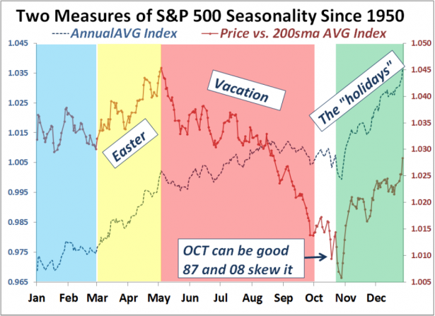
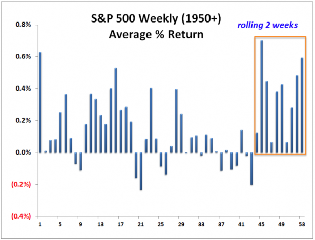
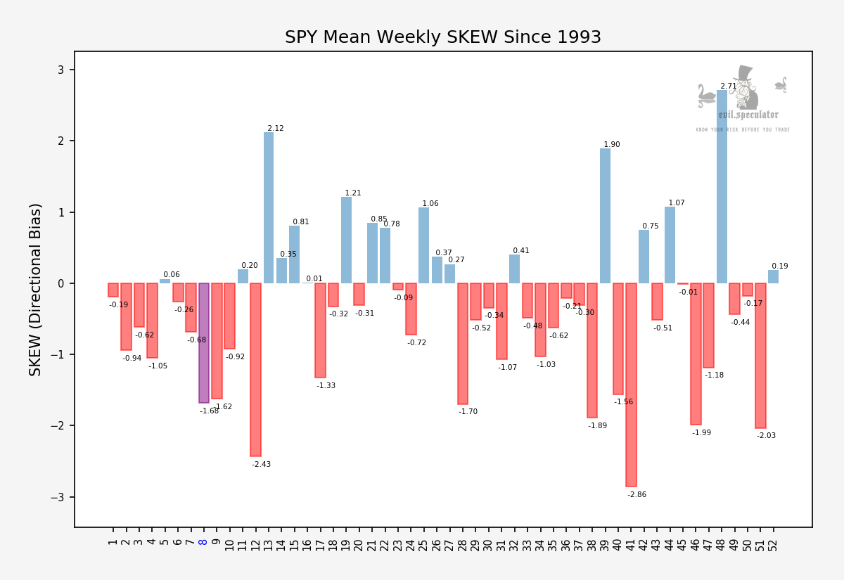
Which of course is an excuse to pull up one of Volar’s all time favorites again – the annual average seasonality chart. And look what early May represents statistically speaking: a period when many of the big market participants are on vacation and the tape has a tendency to correct or meander sideways driving everyone crazy. I’m sure Volar has a few pertinent volatility charts to boot.
Volar bonus chart (I hope he doesn’t mind) – I have drawn an orange box of the period we are now just entering. Weeks and weeks of statistically positive returns – pure heaven for the bulls. I frankly have little appetite fighting windmills this late in the year. Would the real Don Quixote please stand up?
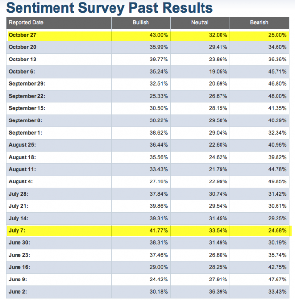
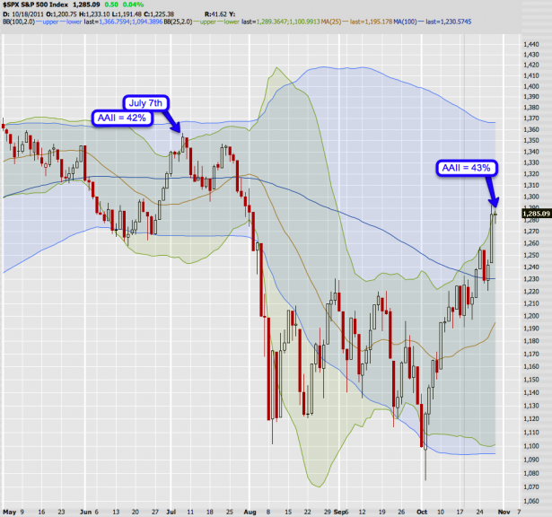
Exhibit B: The AAII (American Association of Individual Suckers) survey just painted a 1.72 ratio – the last time we saw such bullish sentiment was on July 7th of this year (see both readings highlighted above). Incidentally that was also the very day my beloved Squeaky passed away which caused a disturbance in the force resulting in a major market correction:
So once again the prevailing expectation is that it’s downhill here now for the foreseeable future. Now, I won’t debate that we are oversold and that a little washout here may go down any day now. However, the notion that we are about to embark on a multi month correction is statistically improbable (Volar – help me out here if you have more charts) and technically speaking far fetched. Let me show you why:
[amprotect=nonmember]
Charts and commentary below for anyone donning a secret decoder ring. If you are interested in becoming a Gold member then don’t waste time and sign up here. And if you are a Zero or Geronimo subscriber it includes access to all Gold posts, so you actually get double the bang for your buck.
[/amprotect]
[amprotect=1,13,9,12,5]
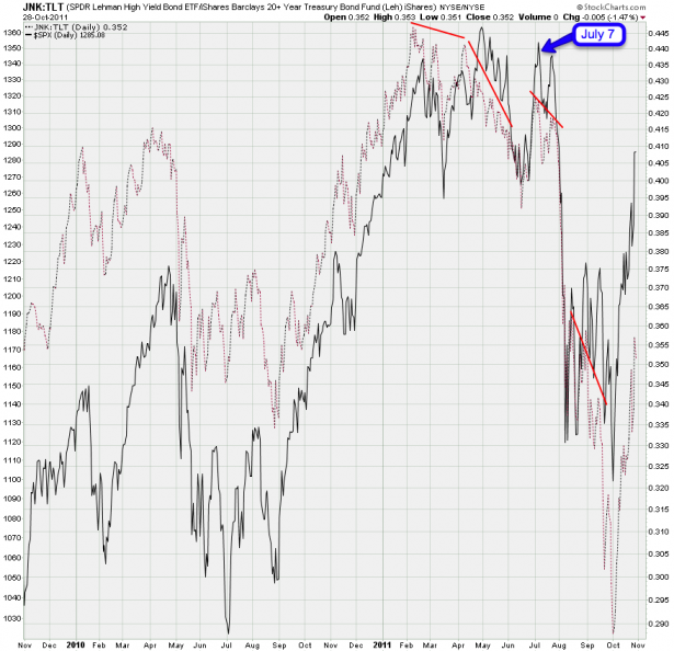
Here’s the JNK/TLT ratio chart and I have taken the liberty of highlighting July 7th to give you an idea of the setup back then. Can you see that cluster of bearish divergences that preceded that final drop? Do you see the same formation today? No? Okay, let’s move on then.
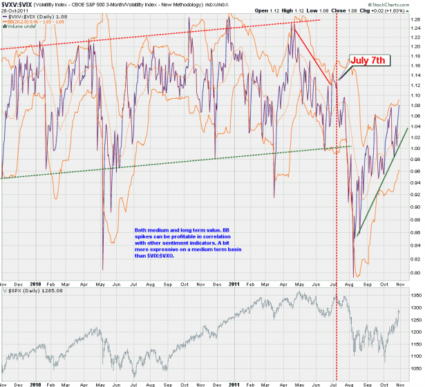
VXV-VIX – if you are a noob: the VXV is a cousin of the VIX but is a measure of expected volatility a quarter out. The delta between the VXV and the VIX, which only focuses on the front month options, is usually a good indication of what market makers are really thinking. Do you once again see that major divergence preceding July 7th? Should we have been surprised what unfolded in the months following that setup? Of course not, and since we rats know how to read charts we weren’t!
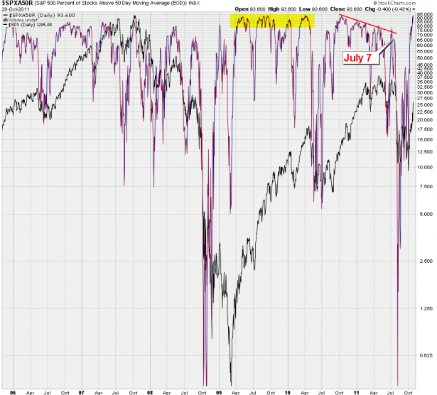
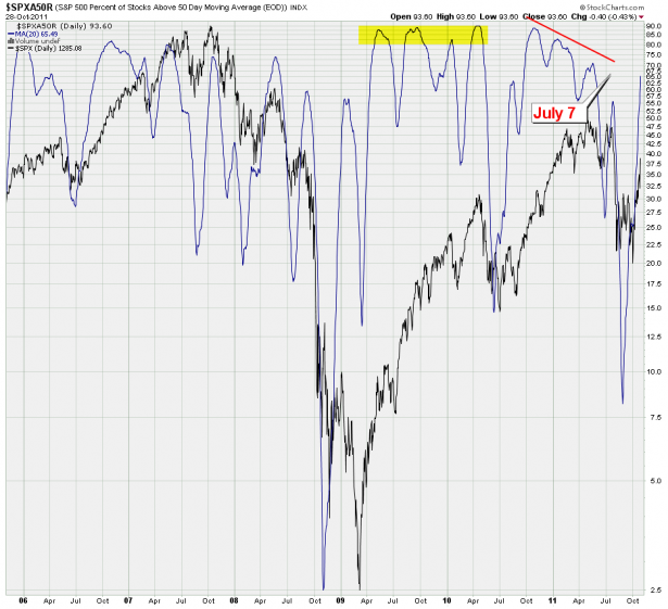
I’m just getting warmed up. Exhibit C is the SPXA50R – showing the percentage of stocks in the SPX above their 50-day SMA. Yes, that 95% spike is probably good for a little shake out – but a multi month correction?
The 20-day SMA shows us how overbought markets can continue upward by squeezing the bears for weeks and sometimes months (see the highlighted area). After all – that is the essence of trend trading – many of the most renowned trend traders pride themselves of buying high and selling low. It’s all relative and just because a market is overbought doesn’t mean a meaningful correction must happen right away. Timing is everything and the nine weeks ahead are simply the single worst time for the bears, statistically speaking. Sure, a six sigma event can happen any time but can you trade it? In the past two years the perma bears have proven that you can not, Taleb Schmaleb…
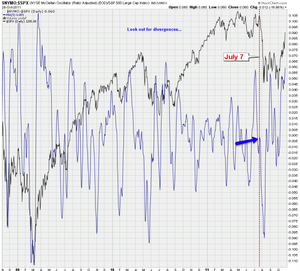
Alright – one more per the July 7 theme. I assume most of you are familiar with the McClellan, which is a medium term breadth based oscillator. When the McClellan is positive, it generally portrays money coming into the market; conversely, when it is negative, it reflects money leaving the market. Second, when the Oscillator reaches extreme readings, it can reflect an overbought or oversold condition.
Now, the readings are high, granted – again pointing toward a possible short to medium term correction. But I personally am always on the lookout for divergences as IMNSHO those represent the real predictive value of the McClellan. And thus far I am seeing zilch, nada, nichts, niente. In contrast take a peek at the mother of all bearish divergences it painted on, you guessed it, July 7th.
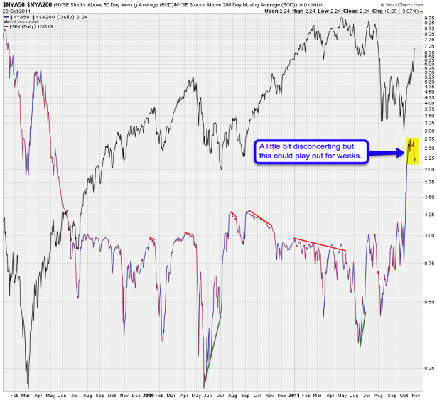
I’m not saying of course that it’s all rose peddles, chocolate, and champagne in bull heaven. There are a few cracks we want to keep our eye on – one of them being the ratio between NYSE stocks above the 50 and 200 day SMA. A bit of a divergence developing here but I may also want to point out that these things usually take a bit more time to finally resolve.
Nevertheless we are on guard as always – which brings me to the shorter term:
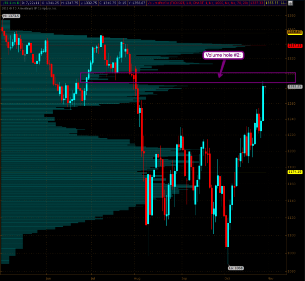
Here’s our treasury map again, which as I pointed out last week, shows us yet another but less pronounced volume hole looming ahead. Which of course makes the daily inside candle setup I proposed on Friday so much more fun. If we manage to overcome it then we should push to 1300 and above. And if we drop below the Friday’s lows then we could easily find ourselves back at 1250.
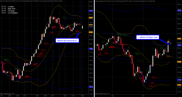
Personally I don’t give a rat’s rectum which way the tape turns as I intend to bank coin either way. If you are delta positive you may want to keep an eye on the AUD/JPY overnight. The tape has moved quite a bit since I took that snapshot but that hourly Net-Lines Sell Level at 80.76 has remained intact while I’m typing this. On the spoos I would watch an almost identical hourly NLSL at 1272.75.
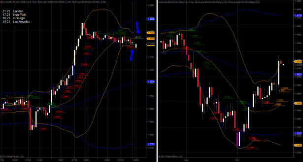
I love the setup on the EUR/USD right now – take a peek at the hourly panel where we find a compressed 25-hour BB and two opposing Net-Lines (the NLSL has since expired). I would go short on a breach of the lower 25-hour BB and long if we push through the 25-hour SMA (and NLBL). The Friday low on the EUR/USD was 1.4132 – so a breach of that would be confirmation of a move much lower, probably toward 1.40.
BTW, there’s also a nice setup on the EUR/CHF – I am keeping an eye on that NLBL at 1.2305.
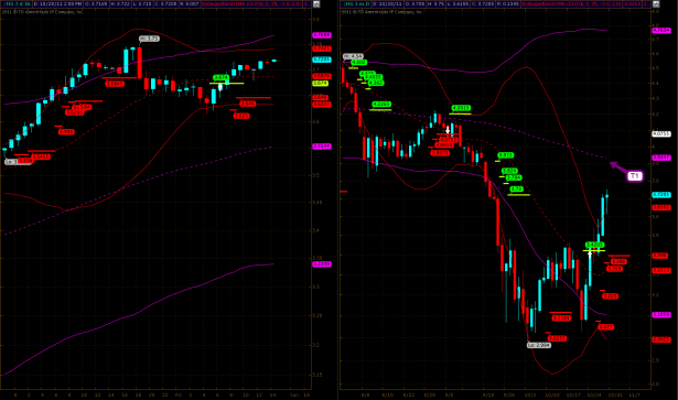
Finally copper is approaching T1 and I would probably hold into there as I expect a bit of a shake out.
Well, that should keep you guys busy for a while – see you on the other side 😉
[/amprotect]
Cheers,


