Chart Medley
Chart Medley
In preparation for next week I think my intrepid stainless steel rats need some low carb & high protein charts to sink their teeth into:
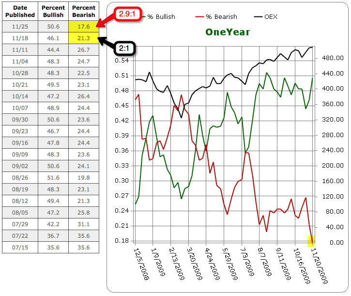
If you have never heard about the II Survey: Each week the service Investors Intelligence surveys some 140 financial newsletter writers to determine whether they are leaning bullish or bearish in their opinions to subscribers. The resulting Investors Intelligence Survey compiles the data to arrive at a weekly percentage of bulls v.s. bears. The Survey is considered a contrarian indicator, since extremes in either direction are signals of reversal of the market’s current trend. We like contrarian indicators – that’s where the magic happens.
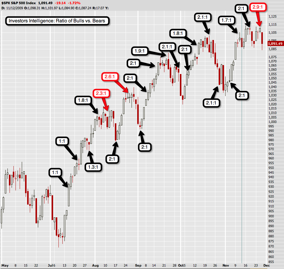
Based on that we can derive a bull/bear ratio chart, which IMNSHO is the most important. A rising trendline means bullish sentiment is outpacing bearish sentiment. Besides the numbers it’s also important to gauge the velocity of sentiment change. The 2.00 area is associated with bullish extremes and market tops, and the 0.60 area with bearish extremes and market bottoms. We are now touching 2.9 plus we also made a huge jump in a matter of one week. Mmmh – I wonder what’ll happen next…
Seems to me that since August investors have maintained a very bullish bias – as you can see turning points seem to happen when sentiment leaps forward in a rather short amount of time (indicated in red).
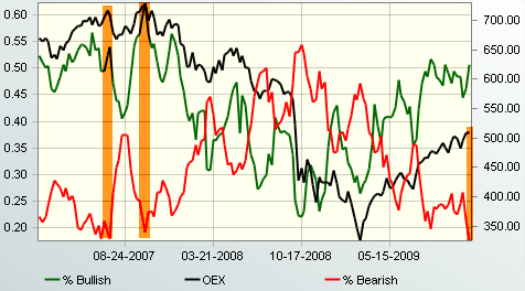
Sorry for the tiny chart but that’s the best I could find (please send me larger version if you can locate one). But what stands out nevertheless is the bearish sentiment reading, which now has fallen below that of the October 2007 top in equities. Despite the fact that we are way below the 700 mark painted during those ‘bullish days’.
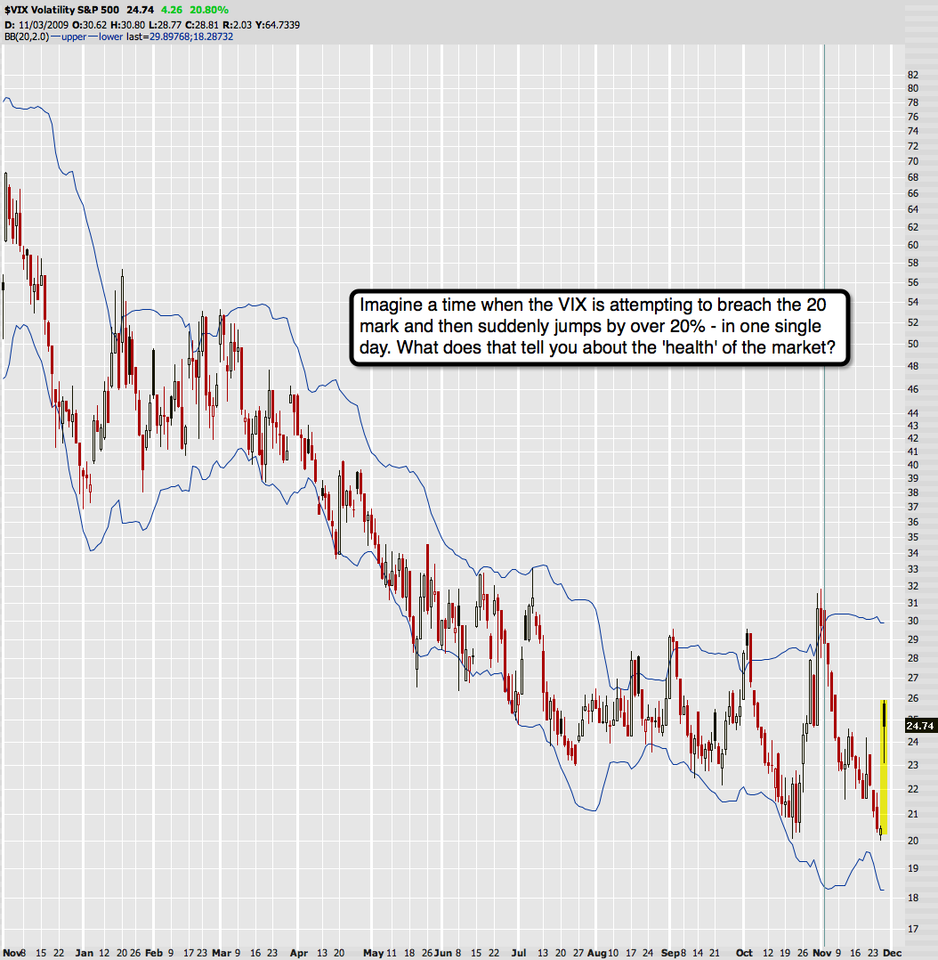
At the very same time we also saw the VIX descend to 2007 levels as it attempted a breach of the coveted 20 mark – however failed for the second time. Not did it just bounce – it gapped up the next day and closed 20% higher. Yeah, yeah – Dubai Shmubai… as if that mess wasn’t already known by anyone with real skin in the market.
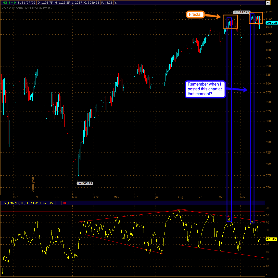
Bonus chart – remember when I posted this one right at the top?
What does all the above tell you about the ‘health of the rally’? Where do you think we’re going next? Dow 11,000 or Dow 9,000?
Exactly.
Give it time – stay the course.
Cheers,
Mole


