Frankenchart
Frankenchart
Alright – I went all out this time around. But I think some of you might actually appreciate the charting monstrosity I’ve cooked up this time deep in the murky depths of my evil lair.
Alliiiiiive – it’s alliiiive – it’s alliiiive!!!!
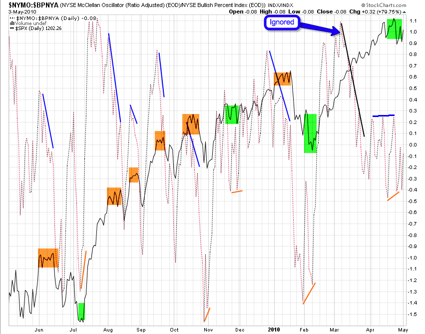
Well, I know what you are thinking: What have I done to deserve this?? But if you have the stomach to digest this beast it may just provide you with important clues right when it matters the most – at the brink of market reversals, long and short. Doesn’t work every single time – in the past year it did fail once – most recently during the relentless February through April run-up. But it also triggered successfully at least ten times prior to that – and frankly those are odds I can live with
Alright brace yourself and don’t look at it directly – squint a little and glance at it from a 45 degree angle. Also, make sure there are no young children or pets in the near vicinity:
And here it is in all its glory – my brand spanking new genetically fused NYMO:BPNYA ratio chart – on top of the SPX of course to spice things up a little. What are those two – well, don’t be lazy and look it up. But in a nutshell – we look towards the McClellan for medium term trends and the NYSE Bullish Percent Index for long term trends. If you merge the two you get the monstrosity above.
Does it make sense? I don’t know – does it have to? What counts is whether or not it works – and it seems the medium term trend divided by the long term points the way more often than not.
Of course now the monster wants an ugly bride – you know the story – so I guess I have to go back into my dusty dungeon for more unspeakable acts of charting. Let’s hope DWP doesn’t cut off electricity again…
That’s Gene Hackman btw… See you on the other side.
Cheers,
Mole


