Inflection Point
Inflection Point
First order of business is to announce that birthday wishes are way overdue as EvilSpeculator marked its one year anniversary on August 1st. I meant to post about it two weeks ago but then it skipped my mind. It doesn’t seem so long ago that I labored through a mid summer weekend and hacked together the early incarnation of what one year later now has become a fairly popular trading blog. We’ve come a long way since that first post and it’s been one turbulent year since then. I hit the ground running by announcing that a major crash was looming ahead, which of course fortunately turned out to be spot on . All in all we all had a pretty good run – most of my prognostications turned out to be in the ballpark and trust me – nobody is more surprised about that than yours truly evil.

The good news is that we’re just getting started and my goal for the second year is to guide everyone through what will probably be the biggest short trading opportunity in a lifetime. More about that further down.
Second order of business is to announce that I’m in the process of putting together Evil Speculator t-shirts designed by -273. No worries – they won’t be those lame pieces of crap they sell you for trade conventions – no siree – we’re talking first class designer stuff here. All evilwear will be designed and produced by -273 and will be available from their storefront. I could sell them from the blog I guess but I really don’t want to be in the t-shirt business – those guys know that what they are doing and I’m happy to let them handle this. BTW, good design is key here (I’m European after all) and I can no longer have you guys run around like slobs – it’s time to properly dress you up for the impending stock market crash of 2009 
Alright on to business now – we have a lot of ground to cover. Last week I ran into an excellent piece titled The New Bull Market Fallacy put together by Naufal Sanaullah at Shadow Capitalism. I mentioned it here that very day but didn’t have time to finish reading it until Saturday morning. The article covers a lot of territory but the salient bit for me was the chart on page four which is a projection of monthly mortgage rate resets starting in 2007 all the way through 2016.
When studying the original chart I immediately noticed correlations between the wave pattern in the SPX and the initial surge of subprime resets which is now widely accepted to be the main catalyst of last year’s crash in equity markets.
After a a sudden epiphany (or call it a bout of madness) I decided to overlay my current wave count to date on top of the left side portion of the original chart – I even highlighted the current primary wave we seem to be completing. Now things were getting interesting – it seemed to me that peaks and lows in rate resets appear to precede inverse moves in the SPX. Which of course would make a lot of sense based on what we know today, however I had never actively attempted to correlate both data sets.
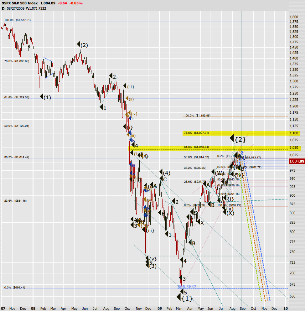
Of course I didn’t leave it at that – having already mutilated Nafaul’s poor chart I took it even one step further and started to align future peaks and lows in mortgage rate resets with my own anticipated wave count in the SPX. And voila – I present to you an early draft of what could be a rough time line adjusted wave count of what’s ahead.
I’m actually quite excited about this chart as it attempts to correlate future events in the credit markets with investor sentiment – or as Robert Prechter would call it ‘socionomics’. Which is the underlying premise of what after all defines equity markets: How does the public ‘feel’ about the economy and how does investor sentiment respond to macro economic events? Bad news don’t always immediately translate into a drop in market sentiment – sometimes, as evidenced by the past five months, ‘less bad news’ seems to be enough to reignite hope and lead even more lambs to the slaughter. Of course at some point reality must set in – as it always does. As a matter of fact, we are at the precipice at just such an inflection point, which will mirror and in the end thwart the events that took place in the second half of 2008.
Of course you all know I do not have the luxury of looking into a crystal ball (it’s broken and those damn gypsies keep telling me they are waiting for a replacement part). However, I have been bestowed with a relative rational mind which continuously attempts to use common sense to correlate existing data points and then extrapolate into the future. The chart above is my feeble attempt to incorporate the rules of Elliott Wave Theory (EWT) into the context of immutable credit markets events which lay ahead.
The current bear market rally is nearing completion, which however does not mean that the top is in. We could easily see 1050 or 1100 before we embark on Primary wave {3} of Cycle wave c. However, upside risk at this point far outweighs downside potential and like Prechter I prefer to be early as opposed to being late. To quote a key summary in Nafaul’s article:
Even if 1015 is taken out [Mole: that was before the 1018 peak], volume is diminishing, fundamentals are worsening, stocks are being chased, investor sentiment is at extreme levels, and supply will be entering soon. In addition, this current rally, the Dollar Index has declined from several-year highs to late 2007 levels, indicating a carry-trade, inflation-based nature to the rally in equities. Equities have become commoditized effectively, at least in the context of this rally, and their returns are being chased. Unsustainability pervades market internals.
As you all know I am not a fundamentalist but I would lie if I claimed that I do not consider macro economic data at least to some extent. After all, the missing link in EWT is the time dimension and thus we Elliotticians must turn to various market sentiment measures and complementary data to roughly time turning points in our respective wave counts.
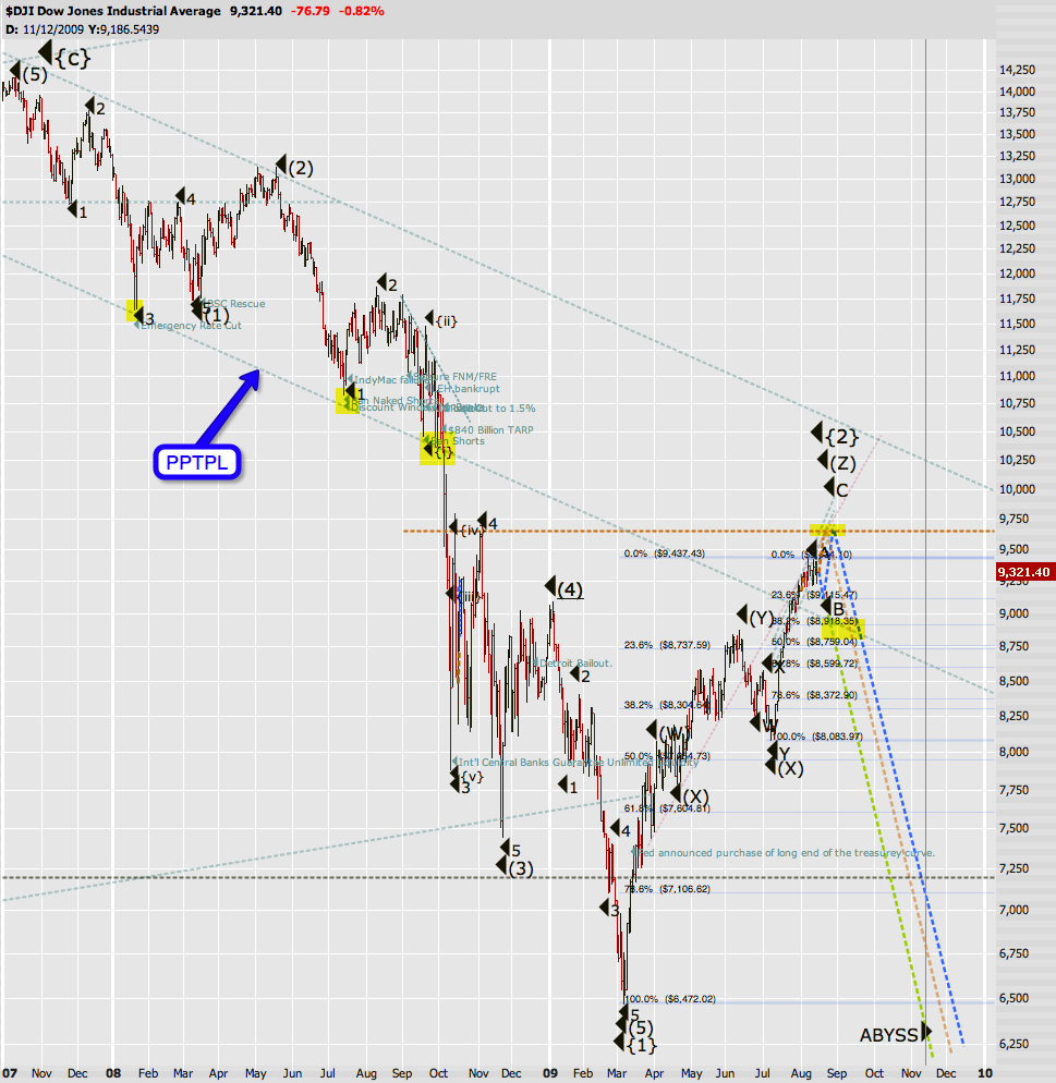
Here’s a similar view but on the Dow Jones – I thought it was appropriate to reincarnate my ‘drop into the abyss chart’ one year after its inception. And this chart also reunites us with my trusted PPTPL indicator, which was named last year after a lower channel boundary which I termed the ‘Plunge Protection Team Panic Line’. In my mind Primary wave {3} will be confirmed the moment we breach and then fail a retest of the PPTPL. Depending on the timing we’re about 400 – 500 Dow points away from that event, but when it happens you want to be solidly invested on the short side as things will accelerate rapidly from there.
The same line will probably also be retested once more at the peak of Intermediate (2) of Primary {3} – which will be your last opportunity to back up the truck and ride the rabid bear into the abyss. So, draw it onto your own chart and keep an eye on it.
On a more short term perspective various possibilities are currently on the table. It’s very much possible that we make new highs before we can safely count Primary {2} as completed. To me frankly it really does not matter at this point – if you want to know why please refer to last year’s post titled Anatomy Of A Missed Opportunity. The situation I refer to in that old post is almost identical to where we are now. Let me demonstrate:
Assumptions:
- You have $4000.- in long term capital.
- You buy $2000.- worth of SPY March 70 puts and $2000.- worth of SPY March 65 puts on Monday.
- You expect the tape to be lower than today come next March 15 or earlier.
- You expect the VIX to increase markedly from the current level of roughly 25.
Now let’s see what that $4000 investment bought you. Even if the SPX drops to only 800 and volatility increases by only 20% you make out like a bandit and bank over $27,000. Of course you all know we can do a lot better than that.
Let’s take a quick peak at Mr. VIX, who’s currently stretching his legs at the 25 mark base camp. Last October (i.e. 9 months ago) it was touching the 90 mark, which was 260% higher than today’s reading. So, do you think that we can hit a VIX of 50 sometime this or early next year? I think so too – and that would only be a 100% increase from current readings. I have not even bothered to put that level on the profit simulation above – the highest mark is an increase of 80%, which would be a VIX at around 45.
Now you might get an idea of why it really does not matter where you load up at this point. We have to get away from trading the short term and focus at least a portion of our assets on long term trades. There is no way you will be able to predict and trade around the wild gyrations that we will see in the months to come. If you have any doubts about that just pull up a one year SPX chart and scroll over to September 18. I was 300% up that day and 65% down the next. In order to ride this bear market you will have to sit it out at least to the middle or end of Intermediate (3) of Primary {3}. Which per my extrapolations puts us around March of 2010.
BTW, the lines I have drawn on the VIX chart are from last May – just for the record
The Dollar seems to be at the precipice of a long term rally, the final {C} leg in its a-b-c correction, which should complete sometime mid/late 2010. After that the ole’ buck is toast and we’ll most likely switch from a deflationary to an inflationary environment.
A drop through 77.43 would put the short term bullish scenario on hold for now.
So, bulking up on silver puts might not be the worst idea right now – again, think long term – you want to buy enough staying power so that you can fade all those head fakes and sideways consolidations that will indubitably precede a relentless drop to the downside. Again, a widening in the Gold:Silver ratio would support a drop in Silver as well as Gold. As you all know by now – I think Silver will outperform Gold in terms of downside momentum/performance, so I’ll use every rip going forward to bulk up on SLV puts.
Alright, I think I’ve spoiled you rats enough for today – see you on the other side
Cheers,
Mole
P.S.: Sorry for the late post but I was literally working all weekend on this one.
UPDATE 10:04pm EDT: Bonus Chart!
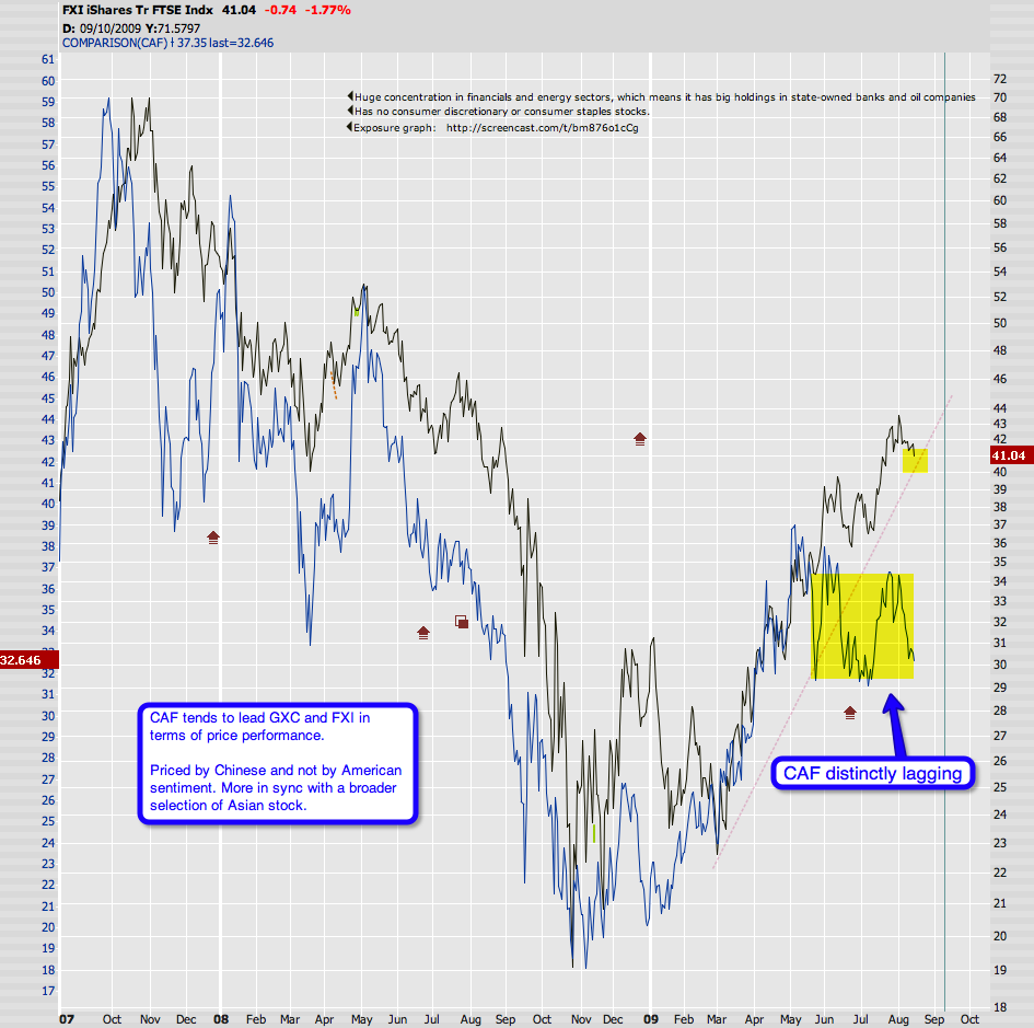
I had actually painted that one this morning but totally forgot about it. Bottom line is that the FXI just touched an important support line (in OHLC mode) and is most likely going to breach it soon. Also note how the CAF has been lagging the FXI for months now, which is mostly due to how the FXI (and GXC) are composed and that the CAF reflects real Chinese sentiment vs. the FXI/GXC which reflect American sentiment. You might want to grab some FXI puts – the bid/ask spreads are actually not too bad on that one considering the moderate volume.


