Just An Illusion
Just An Illusion
As so many times before in the past two years the inflationists won the game:
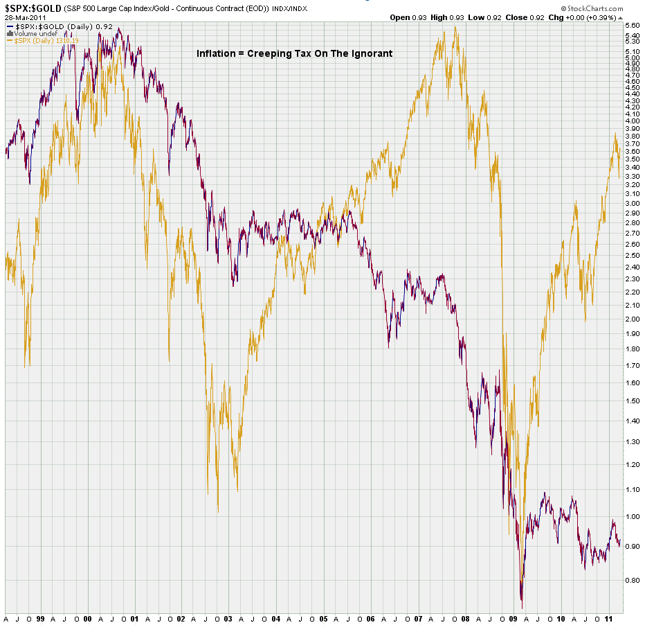
Every once in a while I put this chart up for everyone to keep an appropriate perspective. In gold the SPX as it’s trading – in purple the SPX as measured in gold (yes, I should swap those colors next time). In the end what you see in your equities portfolio is nothing but an illusion.
That’s right – I’m hip! I’m with it! Down with the man!
Alright, let me snap my lower back into place as it’s time for my long overdue trend chart roll call:
[amprotect=nonmember]
Charts and commentary below for anyone donning a secret decoder ring. If you are interested in becoming a Gold member then don’t waste time and sign up here. And if you are a Zero subscriber it includes access to all Gold posts, so you actually get double the bang for your buck.
[/amprotect]
[amprotect=1,9,5,2]
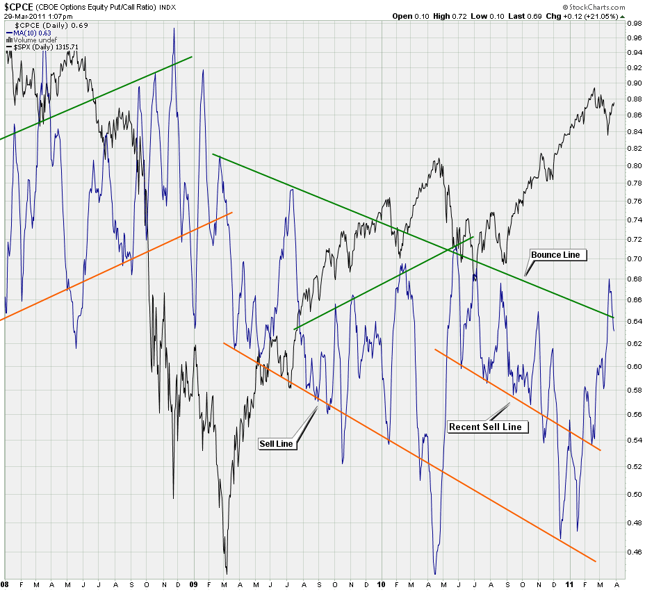
My CPCE Deluxe chart is our first runner up. I was a bit surprised when the smoothed signal made it through my resistance line. Didn’t last long however and we are now back inside. That does not necessarily mean we drop to 0.40 again but there is plenty of bullish potential, should the longs have the mojo to make a run for it.
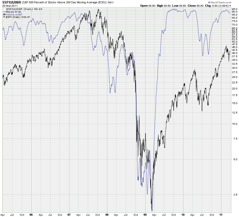
QE2 or not – the percentage of stocks in the SPX trading above their 200-day SMA has barely moved during the March tumble.
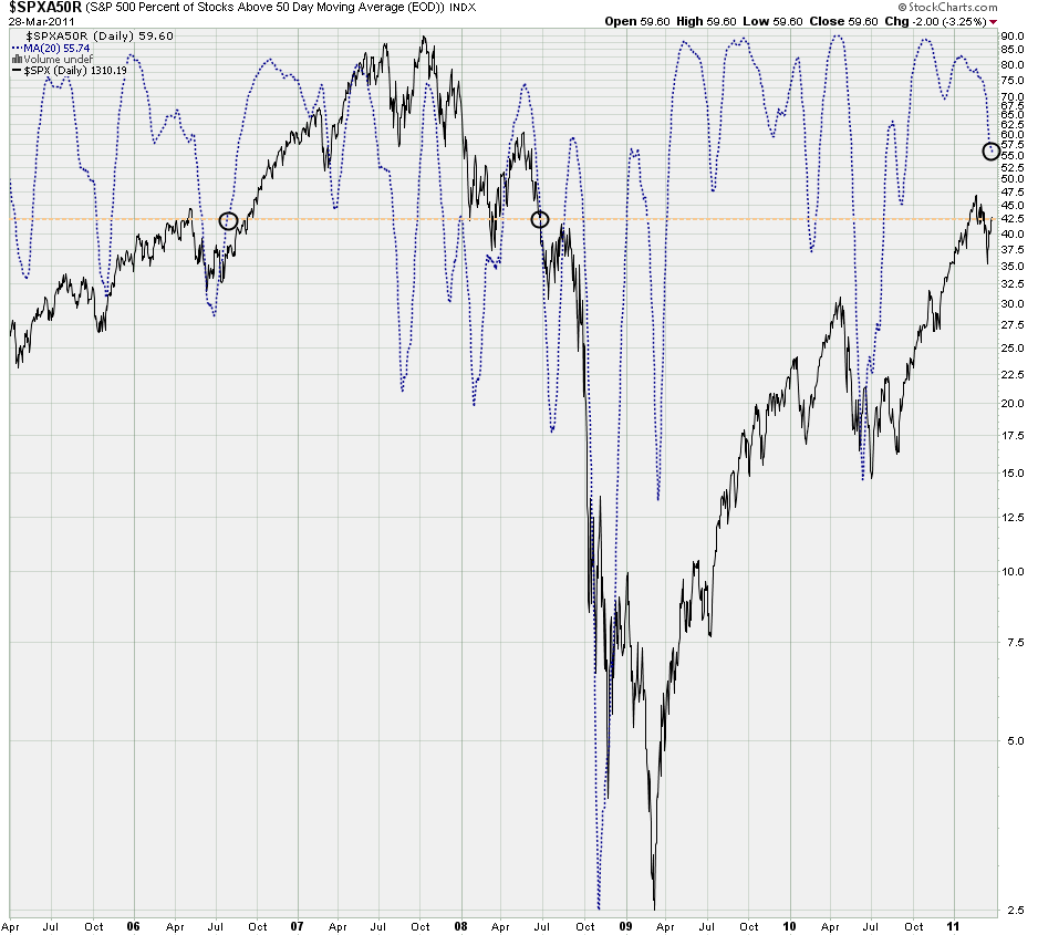
A bit more short term here are all SPX stocks above their 50-day SMA. A little bit of a drop here as expected but when compared with the past few years the current readings at the 1300 mark (follow the tan line) are higher than what they used to be during the 2007 bull market. Are we more overbought? For sure! Can it be sustained? Well, so far there are few indications that we could not run higher before the house of cards starts tumbling down.
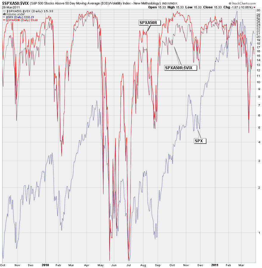
Similar chart but I’m correlating the SPXA50 with volatility. As you can see SPXA50/VIX is usually in sync but when it starts falling behind upside risk is becoming a concern. Very interesting and it’s a medium term chart we should consult more often.
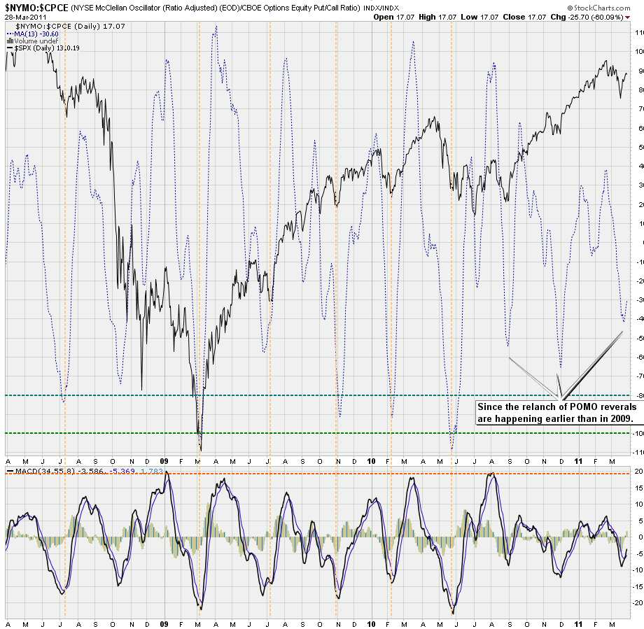
Here I am dividing the NYMO (a medium term trend indicator) by put/call interest – yes, it’s kind of exotic but the result produces support lines that I have learned to respect.
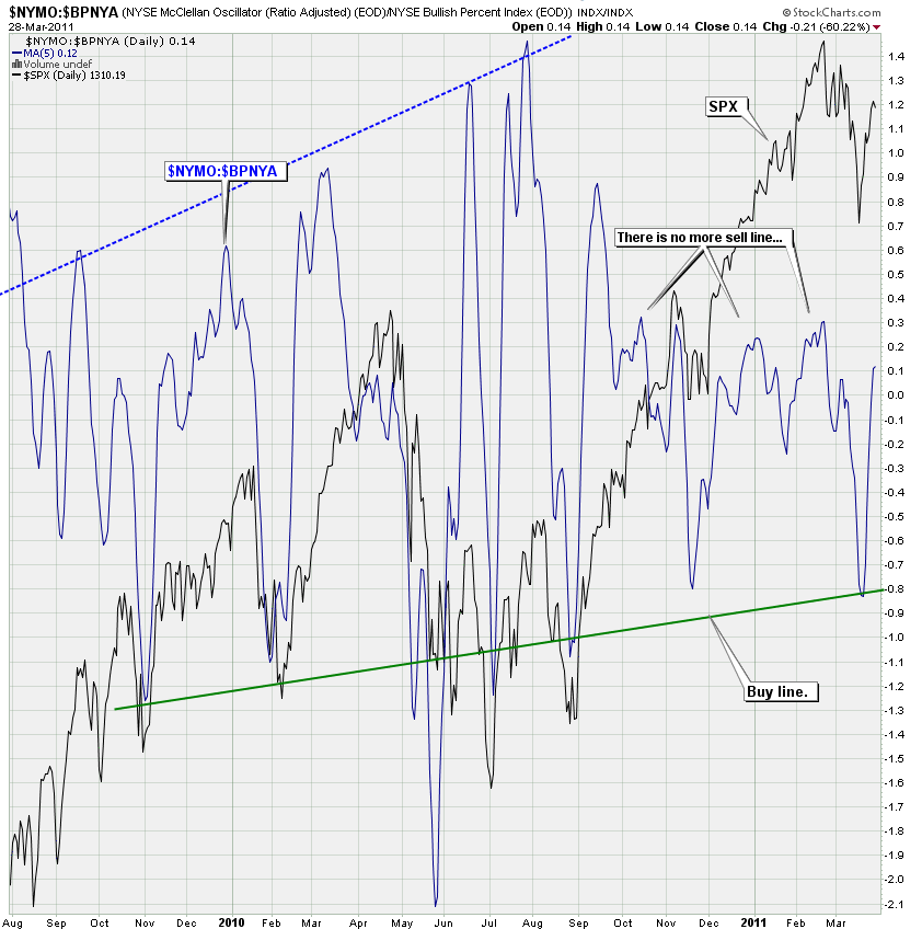
Same game but instead of the CBOE put/call ratio we are correlating the NYMO with the Bullish Percent Index, a more long term momentum measure (based on P&F buy signals). And again we have arrive at an important buy line that has been spot on for over a year now. Also notice that there is no clear sell line anymore – and that also holds true for the previous chart.
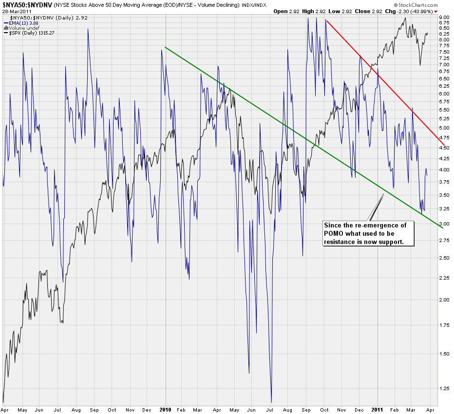
Last but not least we are taking all NYSE stocks above their 50-day SMA and divide it by declining volume. In essence that is my bullshit meter. As those levels are dropping either declining volume appears to be on the increase or the number of stocks above their 50-day SMA are increasing. Whatever combination is at play the reliability of that downward channel is almost uncanny and although I don’t see clear selling opportunities the buy setups are great for getting positioned.
Also notice that since the re-emergence of POMO acutions what used to be resistance is now support. Any damage to equities is clearly being mitigated and carefully managed.
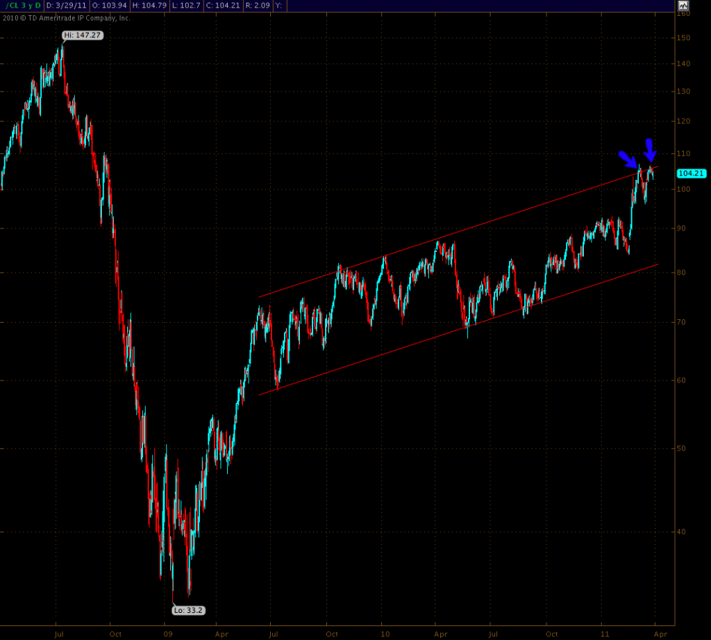
Bonus chart! I don’t really trade crude at all but if I would this seems like a good spot to either go short or long. A breach of the upper resistance line would catapult crude toward 130 (and Mole would have to dust off his bicycle). But until that happens selling this resistance line appears to be good medicine.
Bottom Line:
Unless proven otherwise, this is still a buyers market – until of course the day when these charts tell me otherwise.
Cheers,
Mole
[/amprotect]


