Momo Update W1817
Momo Update W1817
Yes, we are already three days into May but this kind of analysis takes a good mixture of time, attention, caffeine, and inspiration. But I think your patience will be well rewarded as we’re going to look at some rather fascinating charts. Now two weeks ago I posted a quick update which suggested that we may be at short term lows (on a daily basis) and that a reversal to the upside had good odds. Which is exactly what happened the Monday after when equities painted a big gap higher. You’re welcome, but thanks don’t pay the bills, so instead just sign up as a paying member and we’ll call it even
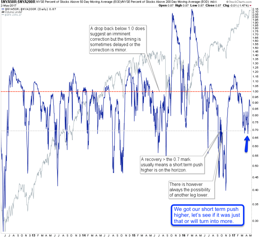
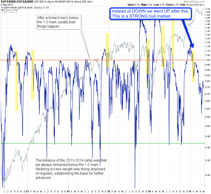
And if you recall the open question was whether we would we would see a second leg down or a push to new all time highs. Now we came a long way courtesy of one big gapping action on 4/24 with some follow up the following two sessions. But since then it’s been a slow sideways grind with very little participation. So what gives? We’re stuck here below the all time highs and there’s no interest in actually breaching them?
If it makes you feel any better, it’s been an equal opportunity market of confusion. Rapidly falling breadth suggested a correction was due several months ago already and instead we got a few more months of relentless upside. Which is why I continue to exert caution when it comes to calling intermediate highs in equities.
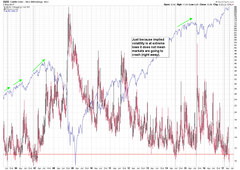
But the center theme of this post is implied volatility which means we’ll be covering the CBOE VIX and several of its IV derived cousins. The former has now descended all the way down toward the 10 mark and even scraped single digits for a moment on May 1st. Which had not happen for an entire decade and thus instantly triggered calls of irrational exuberance unheard of since the Greenspan days.
Record Lows in IV ? Record Highs In Equities
I fervently hope however that the very same people who are pointing at single digits in the VIX as a tell tale sign of a complacent bull market don’t fail to mention that those extreme lows in IV were never accompanied by all time highs on the equity side. Instead it usually took several more months until the first few waves of corrections started to throw a monkey wrench into an effervescent BTFD bull market.
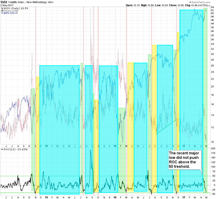
Here we’re looking at rate of change, which is one way of talking about realized volatility on what in this case is implied volatility. I call this the ‘easy rides’ chart as the green areas depict periods in which being long has the best odds. More upside can continue after that (cyan areas) but it is usually accompanied by more erratic market sentiment.
What’s worth pointing out in the current green phase is that it actually should be a continuation of the cyan region. The reason for that is that the ratio did not push above the 50 mark and until that happens we have not produced a convincing enough low.
You may note that we may be dropping below the -50 mark in the near term future. But be advised that judging by previous occurrences it’s a long way from there to any bearish looking periods.
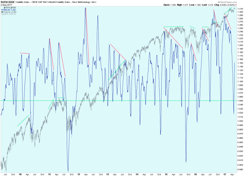
Just like the previous one this VXV:VIX ratio chart depicts the relentless strength of the ongoing bull market. We have been seeing bearish looking formations across various timeframes but they often get either bulldozed or do not reach maximum potential. Thus retracements are brief and relatively shallow.
So what actually does work for calling medium or long term tops and lows? As usual I have to keep the best for my intrepid subs:

It's not too late - learn how to consistently trade without worrying about the news, the clickbait, the daily drama and misinformation. If you are interested in becoming a subscriber then don't waste time and sign up here. The Zero indicator service also offers access to all Gold posts, so you actually get double the bang for your buck.
Please login or subscribe here to see the remainder of this post.


