SPX Target Zone
SPX Target Zone
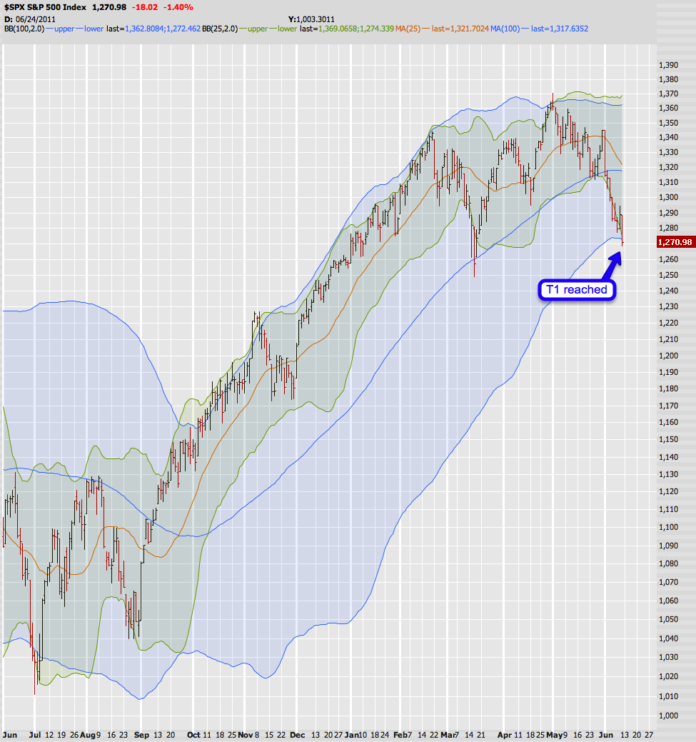
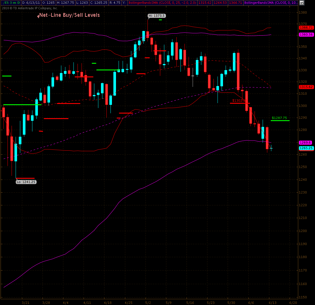
About a week ago the 1302 NLSL suggested that we would continue downward toward 1270 on the spoos, which (due to negative PREM) is currently about 1275 on the SPX. This happens to be the lower border of my 100-day Bollinger band and it is usually good for at least a little reversal.
As you can see that target was touched on Friday and if you kept some lottery tickets all the way down here – congrats to you – but I strongly recommend you start taking profits. Now, do I think we couldn’t possibly slide any lower? Not at all – as a matter of fact there is a fair probability we may drop a bit more from here – but most likely we’ll first see a quick spike up.
Long term however, this current leg down has shifted the overall dynamics by quite a bit and I have a few very interesting charts to show you:
[amprotect=nonmember]
Charts and commentary below for anyone donning a secret decoder ring. If you are interested in becoming a Gold member then don’t waste time and sign up here. And if you are a Zero subscriber it includes access to all Gold posts, so you actually get double the bang for your buck.
[/amprotect]
[amprotect=1,9,5,2]
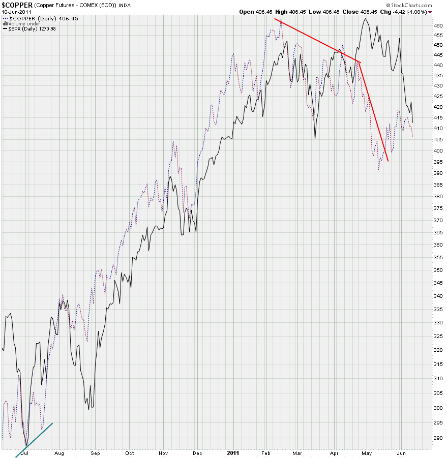
Copper has been rather prescient when it comes to calling the shots in equities during the past two years. Whatever copper does is usually followed by the S&P 500 a week or two later. And unless proven otherwise this correlation should remain part of our equation when assessing the odds for medium term moves on the equity side. Now, if you read my sentence carefully – I didn’t say that we should purely rely on this correlation. Trading correlations is usually a very precarious endeavor as they seem to work until they suddenly don’t. But taken in combination with sentiment measures, momentum indicators, price patterns, statistics, voodoo dolls, etc. copper should be another tool in your arsenal.
What’s it saying right now? Well, it’s pointing down but has not been dropping as hard as equities in the past week. My take here is that copper is either done or may drop a bit further to retest its May lows. I don’t however expect a lot of down movement here right now. So short term it’s not telling us much, medium term I believe it tells us to be careful and not to chase equities to the down side – no matter what happens in the next few days.
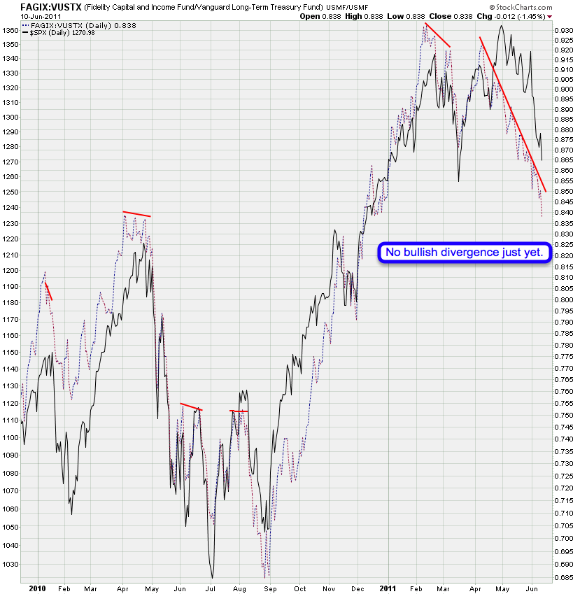
You probably remember this chart – it’s very similar to the next one actually. We are comparing the FAGIX ‘high income’ fund to the Vanguard long term treasury fund – basically junk vs. treasuries. The ratio has been dropping like a rock and I don’t see a divergence yet. This suggests that, despite the odds for a short term bounce on the SPX, we may continue dropping a bit further.
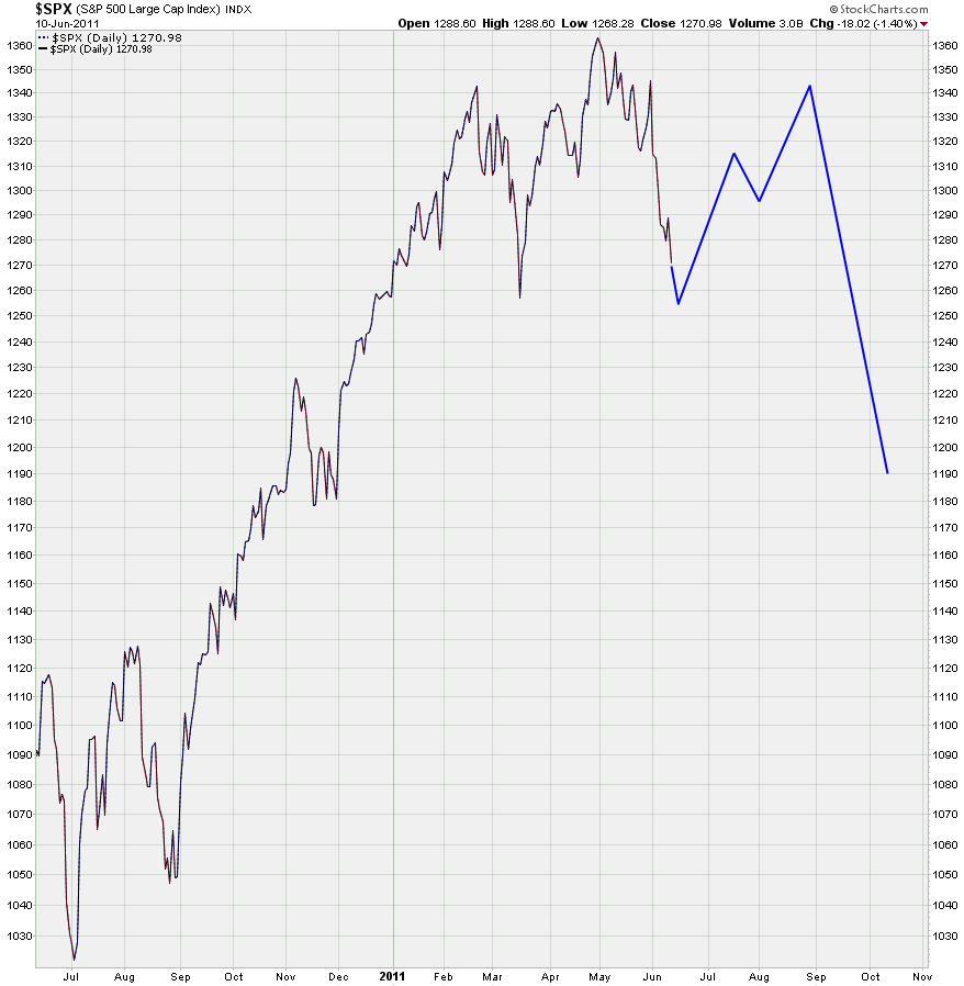
If you look at the very first chart of the SPX with my dual BBs you may notice that the 100-day is now starting to roll over. Now, what could happen is a bounce after which equities start sliding down that lower border for some follow through. If I was counting waves this would mean that we’re painting a third wave down, as opposed to some zig-zag followed by a motive up. So, what happens next is quite important to the medium term picture. A strong snap back on Monday or Tuesday would strengthen the medium term odds for the longs – a little whimper up followed by a breach of last week’s lows would mean we drop a bit lower.
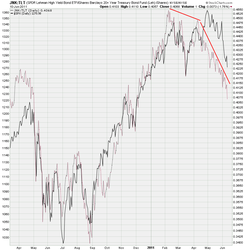
JNK vs. TLT is very similar to the previously shown ratio and it’s also still pointing down strongly. What the longs want to see here is a bullish divergence on either of those two charts which would strengthen the odds for a prolonged move higher and not just a quick bounce. Of course – if either of those two continue to drop while equities push higher I would recommend to sell any rips. So, we’ll be keeping our eye on those two charts over the next few weeks.
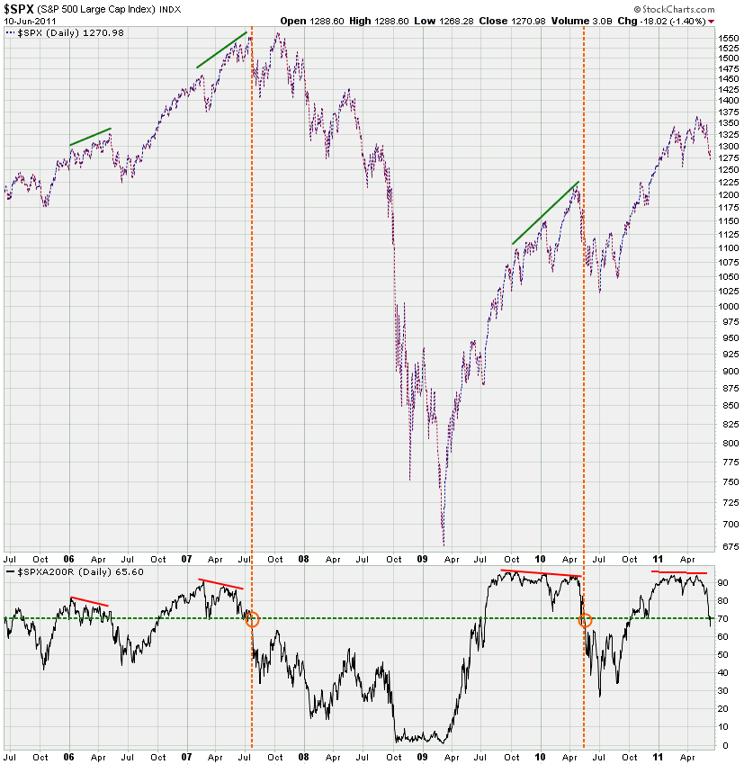
This is a very subtle chart but it may just be the most important one I am showing you today. What I’m plotting on the bottom is the SPXA200R, i.e. the percentage SPX stocks above their 200-day SMA. That divergence I pointed out a few weeks ago obviously resolved – or is in the process of resolving. But there is something else – do you see it?
For the first time in a year the SPXA200R dropped through its 70% mark and that has only happened twice since January 2007. The first time it happened we retraced and then dropped like a rock to 666. The second time it happened the Fed stepped in with POMO auctions and QE2.0 soon after – thus saving the day and yet again driving equities to new highs.
What will happen this time is anyone’s guess. But it is rather clear that the dynamics are shifting and that this has been more than just a regular reversal driven by extremely overbought conditions. What’s actually even more telling is that prices really haven’t caught on yet – after all we have barely dropped 100 handles. And the VIX is extremely low when compared with retracements of similar magnitude in the past two years. Now, some may actually interpret this as bullish signs but I would disagree. Seems to me that we may be looking at distribution here and that institutionals may start using any rips to leg out of their long positions.
The tape during May suggests that this may have already been happening and that the current drop was merely round one. Let’s not forget that the unwinding of large portfolios is an iterative process – institutions can’t just scale out within a week or two, otherwise they may create a selling panic and destroy their remaining positions. This is why you have second waves to the upside (yes, I’m quoting EWT today – bite me) – which is nothing but the strategic passing of hot potatoes.
Again, we’ll get a better picture once we start ramping higher again – the velocity and participation as well as the pattern will tell us what’s really going on.
This is a rough outline of what I think may be happening in the next few months – this chart is not supposed to be taken literally, it’s only a rough outline. As I shown above, it’s possible that we drop a bit lower but the 1255 mark should serve as some support, otherwise we may drop into 1230. I don’t expect the next few summer months to offer us any sort of conclusion – most likely we’ll see either a sideways or upside pattern. In early September we may be testing the 1340 mark again – of course it’s possible that we push higher, may main argument here is that we’ll most likely be tracing out a corrective pattern during the summer.
After that I expect a fast move down in late summer or early fall, a possible target is the 1170 region, but again we could drop a bit further, picking targets at this stage is very difficult as the dynamics constantly change.
Medium term here’s another good argument of why taking profits now is probably good medicine. My RSI_EMA indicator on the SPX has been pretty good to us and although we may become embedded here for a little while – why push our luck? This is a good level to get out and to wait for instructions.
Short term our NLBL has dropped to 1287.75 – so mark your charts boys and girls. Of course it’s possible that we push up to that level and then reverse hard, but after that quick candle higher on Thursday the odds have changed a bit and I expect us to run higher into 1290 until we reverse again. Again, if we drop lower from here those odds and any upside targets may change – of course I will post an update if that is what winds up happening.
Bottom Line:
Short term: Don’t chase equities to the downside right now – the odds are horrible on that end. If we drop to 1230 a long position would be warranted. As we finally start pushing higher again I will report on whatever medium term evidence may give us a reason to sell any rips.
Medium term: If equities start stabilizing and we are painting a floor then the we’ll most likely churn higher during the summer season. Which means we’ll be buying the dips or we may engage in a few creative sideways strategies – more on that when the time comes.
Cheers,
Mole
[/amprotect]


