That Vexing VIX
That Vexing VIX
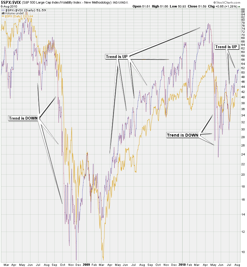
This weekend I have a special kind of treat for all you VIX charting aficionados. I have been playing with VIX ratio and correlation charts for months now but my recent effort began a few weeks ago with this chart:
Strangely it took a few days to see the obvious and the scales finally fell of my eyes earlier this week. The SPX:VIX ratio in comparison with the plain old vanilla SPX seems to be a pretty reliable purveyor of things to come – I think the markers above convey the idea. Of course me being Mole I couldn’t just leave things at such a simplistic level – so let’s take things up a notch or two.
That first chart seemed pretty promising and I made a comment that I would love to see the distance between these two signals plotted as a histogram – just like what you get on a MACD. So an intrepid reader you know as Tooncez sent me an email the next day with a ThinkScript concoction that plotted those two signals as a MACD, which was a great start. Gee – thanks a bunch for sucking me into yet another script hacking project, Tooncez! 😉
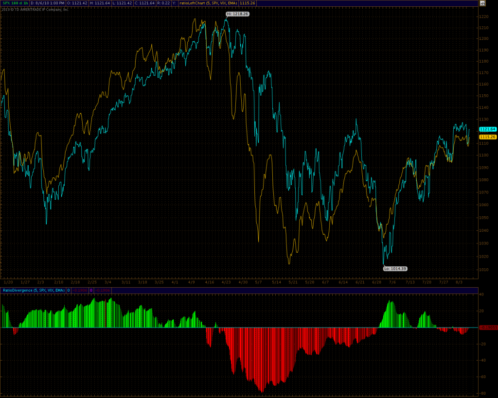
However, there were some problems with the left chart conversion (think conversion from one chart into the numeric scope of another) and I was able to offer a good fix for that. And after some closer inspection it seemed that a full MACD was complete overkill and that I was mainly interested in the diff between the two signals. I wound rewriting it a few more times and the current version is shown below:
Now, this is actually the hourly version containing a bit more medium term detail. As you can see I have also added a ‘ratio left chart’ version above which is similar to what we get in the original stockcharts version. However, it’s got the advantage of offering real time feeds and other more fine tuned settings I am able to add (i.e. SMA, BBs, etc.). On the lower panel you see what I was mainly looking for, which is the diff between those two signals. And that gives us distinct clues as to the state of the current trend in its particular time frame.
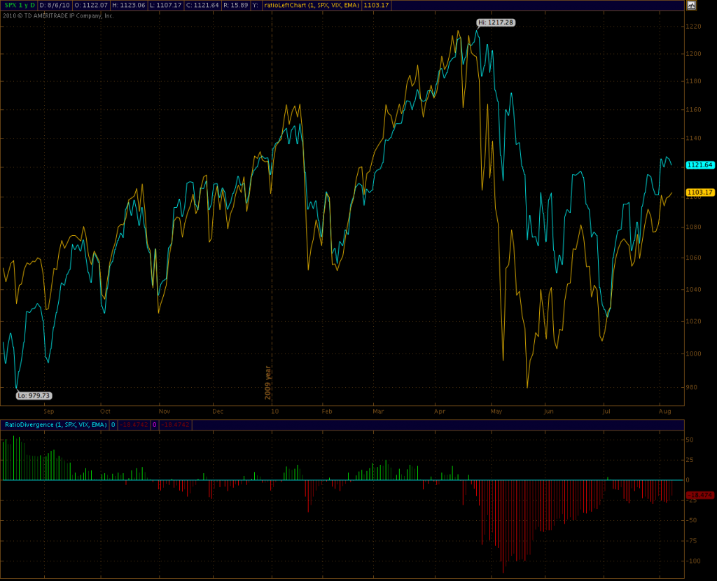
Here is the daily version, which seems to deviate a bit from the stockchart version shown first. That’s obviously related to the style of data conversion I am performing from the SPX:VIX ratio into the SPX chart space. Nevertheless the cross overs are pretty interesting and I’ll keep fiddling with the conversion to work better on the longer term chart.
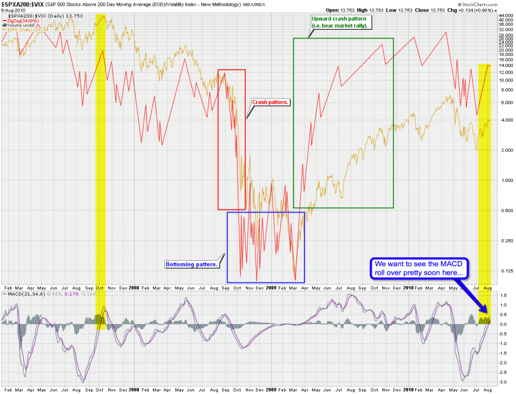
Another VIX related chart – the SPXA200 relative to the VIX – I showed that one a few weeks ago as it seems to map the overall trend quite nicely. Instead of showing a moving average I am using a zigzag to avoid over-averaging but at the same time I am able to smooth out a lot of the in-between noise. Just think of it as ‘connect the dots averaging’ instead of using a moving average. Doesn’t always work but often shows some very interesting patterns. Great for detecting momentum fractals if you ask me.
What I’m seeing here is that we seem to push into the ‘roll over’ phase of the current correction on a long term basis. Which means what it means – we may push into 1150 or higher to complete the current wave pattern, but this thing is definitely running out of steam. Nevertheless, to be more confident we want to see the MACD roll over pretty soon here.
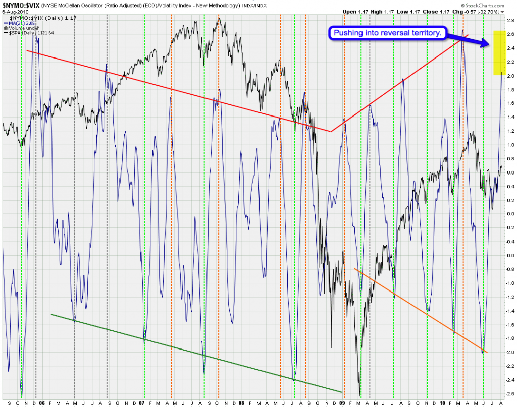
Another VIX related chart – the $NYMO (i.e. the medium term McClellan) in relation to the VIX. That is actually one of my favorite charts as it seems to be pretty spot on when it comes to calling reversals on both sides. However, it’s been a bit lacking on the short side since the end of Primary {1} – let’s hope that changes soon.
The yellow highlight marks what remains in terms of potential upside here. But it’s not guaranteed that we push all the way into 2.8 – we have come a long way since the early June extreme and this thing may start rolling over soon. However, bear in mind that this indicator is often early, especially on the short side, so allow for more upside and the conclusion of Soylent Green.
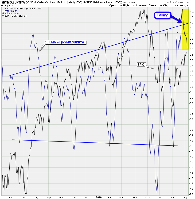
Okay, no VIX involved here – it’s my NYMO:BPNYA ratio chart – basically medium term in relation to the long term trend. And boy, did we shoot into the sky in late July. I am glad to see this thing fall to the downside again, which may indicate that a top in equities is near. A by saying near I mean we may rally for another week or so before equities are ready to give it up to the bears.
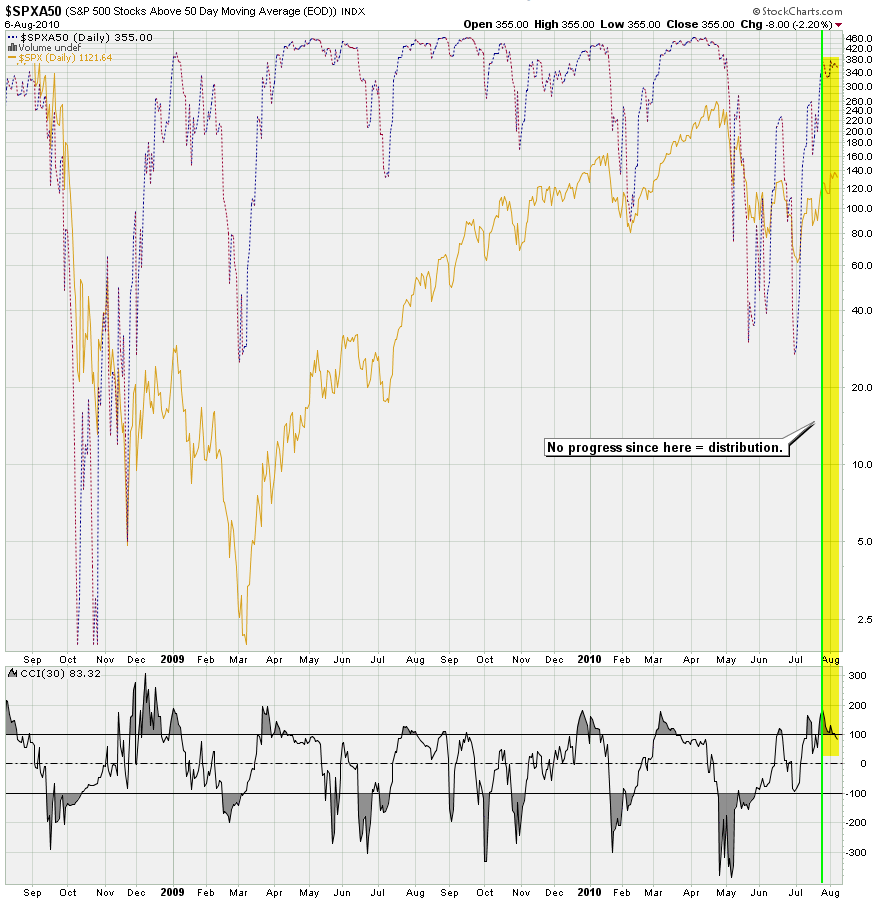
You probably remember this chart – it shows the number of SPX symbols above their 50-day SMA. I have various other renditions of this but the more purist version seems to agree with the two prior charts in that equities are running out of steam which is suggested by an increase in distribution and a narrowing of symbols that hold up the index as a whole.
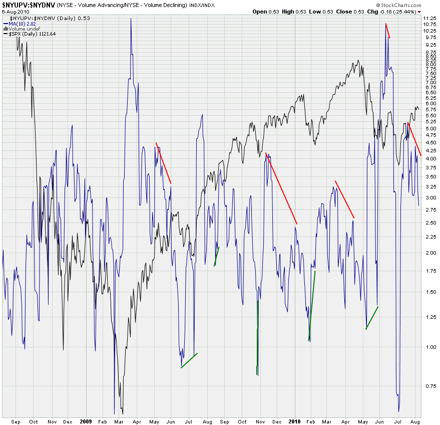
Which brings me to a chart that was instrumental in suggesting a bear trap in early July – the NYSE Volume ratio chart. The proof is always in the volume after all. It’s just that this thing is often tough to read, which is why I mostly am on the lookout for divergences. And again, it seems that the upside volume is diminishing. We had that big snapback after the extremely low reading of <0.7 and since then it’s been sideways to down.
But again – prior examples suggest that quite some time can pass between a divergent reading and the actual roll over, which is why we only use this in the context of other charts and supporting indicators.
And here’s the chart that is quickly turning into my favorite medium term trend indicator – the smoothed daily Zero. Which perplexes me by stubbornly pointing up. Quite frankly – a lot of the pundits have now embraced the short term bullish scenario, which is why I was actually hoping for a divergent reading (yes, I love to stick it to the competition). Unfortunately this indicator seems to agree with the pundits – unless of course the market somehow pulls a fast one on all of us. After all, no indicator is infallible, which is why I always look at my entire collection before forming an opinion.
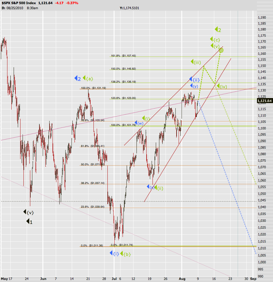
And here’s my opinion piece – the wave count for next week and beyond. Soylent Green remains my preferred scenario – there are two ways of how to count that ending diagonal thus I am leaving a door open for a top around 1150. However, chances are this bitch of a market will fake out both sides again by pushing a wee bit higher into 1165 – not guaranteed but be prepared for that to happen. That should however be the end of it as we are running out of time in the time cycle.
Soylent Blue still has a theoretical chance but we would have to turn starting Monday morning – if we push beyond Friday’s highs then this one goes to the big junk yard of Elliott wave counts.
Bottom Line:
The market is getting closer to rolling over but I do expect a bit more upside before it happens. Stay frosty and don’t try to pick a top – leave that to the crystal ball pushers – we stainless steel rats strictly focus on probabilities and place our trades accordingly. And if the odds are unclear we simply stay out of the market until the situation becomes more transparent. After all this market has become very sophisticated in faking out even the most savviest of traders – we had to step up our game to stay ahead.
Don’t let the tape’s wild gyrations get the better of you and stay frosty. As of late I am seeing a significant amount of exhaustion in particular among bearish participants. In the past few days I have come across various rants on the inadequacies of Elliott wave, critical opinion pieces demonizing Prechter and EWI, frustrated comments regarding the never ending manipulations by the FED, the fear of a looming QE 2.0, etc. Fortunately most of that has been missing on Evil Speculator, which is something I am intensely proud of. Instead of capitulation we chose to use the past 16 months as a learning experience – we developed a whole slew of market indicators that have kept us from getting cut to pieces at various setups that turned out to be nothing but nasty bear traps.
The moaning and complaining you see across the board mostly comes from market participants who still rely on trading strategies that may have worked a few years ago but are now ancient history. And I am not just talking about retail traders – several large funds have been throwing in the towel recently after their trading strategies have repeatedly been taken to the woodshed by a growing number of HFT bots. The lesson learned?
Evolve or be extinct!
Well, that’s a pretty easy question, right?
Thank you for flying Evil Speculator. Now buckle up – we expect the ride ahead to be bumpy.
Cheers,
Mole


