Tops Are A Process
Tops Are A Process
This weekend I don’t see much in my LT chart collection that bodes repeating. Our P&F charts have been spot on recently and as I have produced some updates this is an opportunity to share some pertinent musings with my subs. However, the overall take away message I would like to convey today is that tops (as well as bottoms) are a process and that they take time. This is a concept many retail traders have a hard time embracing, usually much to their own demise. Observe:
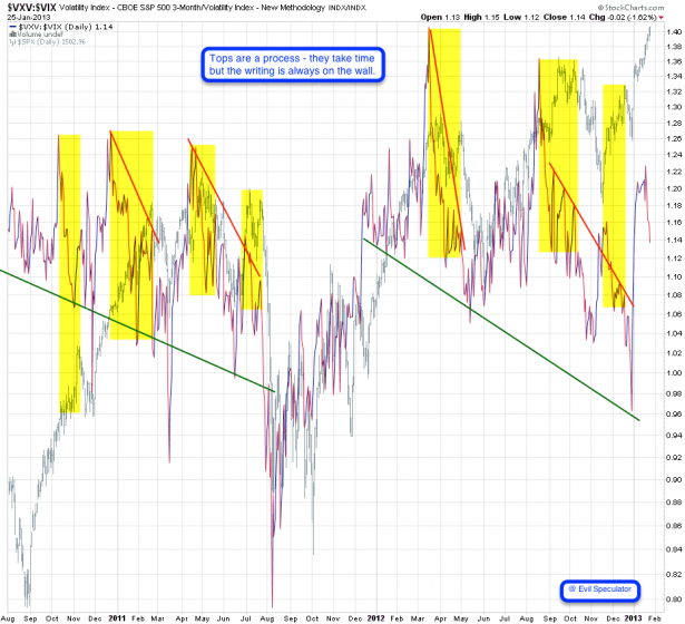
Once again we are looking at volatility plotted against the SPX, more specifically we are plotting a ratio between the vanilla VIX and the VXV, it’s 3-month cousin. There is method to my madness as this ratio, when plotted on a long term basis, often provides us with hints of what may lurk behind the distant horizon. More specifically we are interested in divergences which happen when price moves in one direction and our ratio starts pushing in the opposite.
I have highlighted the most salient occurrences and it’s surprising how we start seeing the ratio plot a divergence almost every single time, weeks ahead of prices forming a top. This again demonstrates that markets can stay irrational a lot longer than you can remain solvent. When attempting to short market that’s in squeeze mode you are almost guaranteed to get burned. Remember, you don’t get points for being first – what matters is catching the bus when the time is right. And on a long term basis we have a lot more time than we think. Very rarely do markets turn on a dime. It has happened but it’s the exception.
Right now we once again are seeing a divergence but in comparison with prior ones it’s minuscule. Which means that on a long term basis we ought to give this rally a lot more leeway before we even start thinking about short positions.
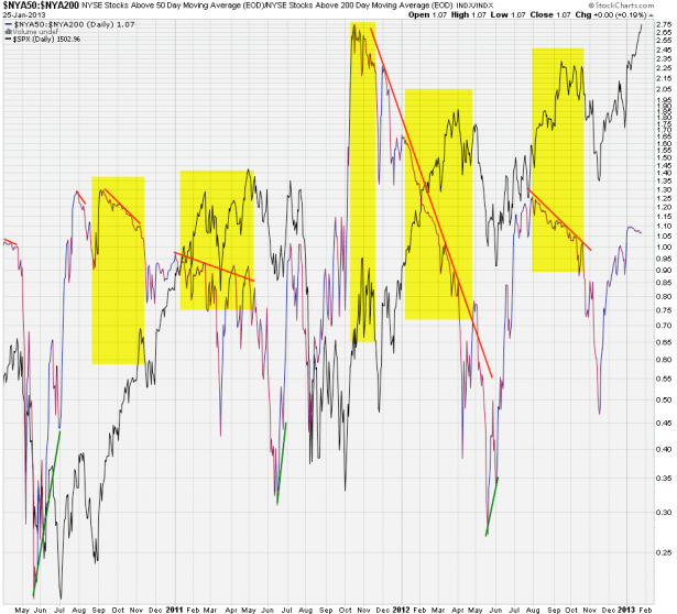
Here’s a similar example – the SPX vs. a ratio between NYSE stocks above their 50-day SMA and the ones above their 200-day SMA. Obviously the latter are considered more supportive of long term growth than the former. Again two key observations: 1 – tops take a LOT more time than you think. 2 – we are just now starting to form a divergence.
So does this mean the SPX is bound to make a b-line to 1600 or 1700? Of course not – these are long term charts and thus we need to be thinking in weeks and months, not in days. Even if we are going to paint new highs this year, the path upward will be littered with short and medium corrections. To us traders they of course matter the most but it’s always good to remind ourselves what the prevailing long term trend is. And as of now it remains to the upside.
Now let’s look at some P&F charts – specifically the SPX is currently making my head spin:
[amprotect=nonmember]
More charts and non-biased commentary below for anyone donning a secret decoder ring. If you are interested in becoming a Gold member then don’t waste time and sign up here. And if you are a Zero or Geronimo subscriber it includes access to all Gold posts, so you actually get double the bang for your buck.
[/amprotect]
[amprotect=1,13,9,12,5]
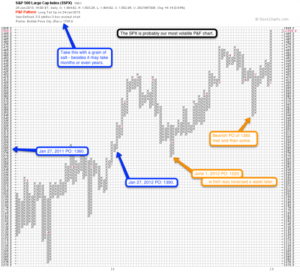
I’m posting this one with a bit more context so you all get a better feel for using long term P&F charts. Quite frankly the SPX is probably our most volatile P&F charts when compared to those we plot over in commodities or FX. Long term trends seem to prevail longer on the currency and commodity side – Elliotticians for instance have often made a point about ‘extended fifth waves’ in these markets.
In any case I would suggest you take the current PO of 1705 with a grain of salt. This is more a testament to the strength and velocity of the current advance than anything else. Sure, we may just get there eventually but we’ll meet many hoops and hurdles on the way. For instance, exactly one year ago the bullish PO was 1390 – which we met a few months later. But from where this triggered a 1390 PO was a very reasonable target. This particular advance commenced on December 20th, 2011 when the SPX met a ‘bearish signal reversed’ trigger near 1230. The initial PO was 1315 but was quickly advanced to 1390 as things heated up over Christmas.
After eventually painting a high above the 1400 mark we dropped all the way into 1275, which on the last leg of the sell off triggered a bearish PO of 1225. This one never happened and the lesson here is that price objectives triggered after extended runs can be deceptive and may often be reversed.
Had we satisfied the bearish PO and then only advanced tepidly it would have questioned the continuation of the overall longer term uptrend. But obviously we never got there as the bearish PO was reversed a week or so later. For me what usually counts the most are the bullish price objectives I see near bottoms and the bearish price objectives I see near tops. Those seem to be most attainable once a breach of a support/resistance cluster triggers them.
Price objectives like the current one triggered by a ‘long tail up’ on January 24th in my opinion point the way on a very long term basis, that is where we may wind up a few months or perhaps a year from now. But I would never make a bet for 1700 right now and right here, which would be foolish, in particular given the low level of volatility right now. I hope the above makes sense – I was once again attempting to demonstrate that context matters. If you always take P&F price objectives at bare value and consider them immutable targets you will often be disappointed, especially on the equities side (less so in commodities and FX I’d say). In would instead use the current PO as a testament to the strength of the ongoing trend. And as long as we keep painting bullish POs the bears will be relegated to waiting in the bullpen.
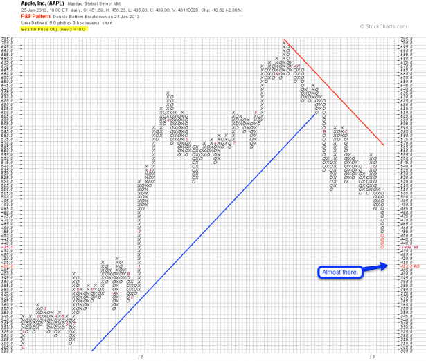
AAPL – I dedicated a post to this the other day and I’m sure you all caught it. Since then prices have dropped even further and we are now approaching our price objective. Another 30 handles and we’re there. If you have been riding this dog lower then you may start scaling out.
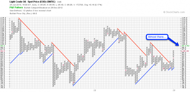
Crude – once again I covered this one last week in more detail. And once again our current price objective is almost in grasp now – if you have been long since our entry then I suggest you start scaling out. But bear in mind that price objectives are only estimates based on rules – we may easily overshoot and push into triple digits.
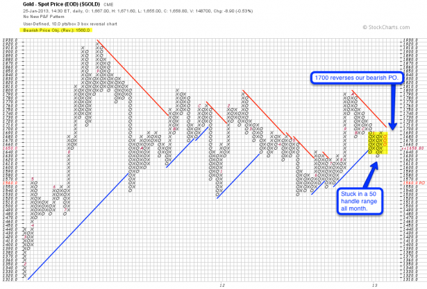
Gold has been stuck in a 50 handle range all month and I don’t sense much momentum right now. 1700 is an important inflection point as it would reverse our bearish PO.
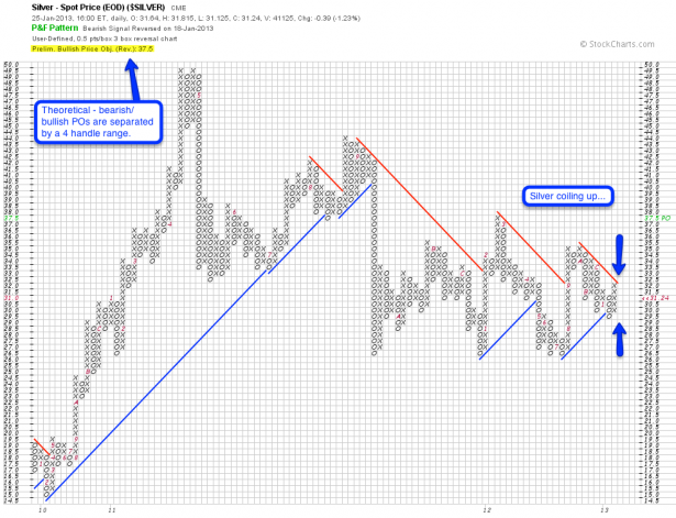
Silver sporting a bullish PO but I think this one is merely theoretical. As you can see this thing has been pushing sideways for months now and a mere 4 handle range separates us from a bullish or bearish PO. And after one of them triggers we may find ourselves reversing again once we reach the upper or lower realms of the current price cluster (i.e. 26 – 35). Ergo there is no clear trend in precious metals right now – it’s been a nothingburger for over a year now.
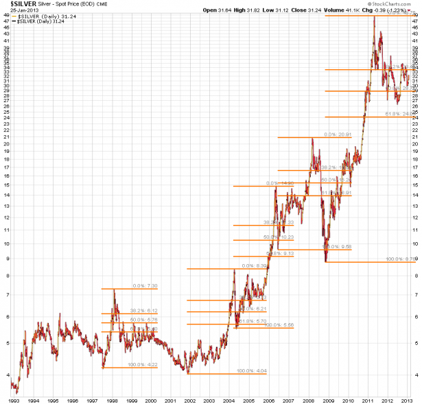
As a side note – we appear to be amidst a long term sideways correction, which in itself is healthy considering how one sided this trade was in late 2010. You may also recall from my previous post of mine (and per the chart above) that the ongoing correction in precious metals has thus far been mild compared with prior ones.
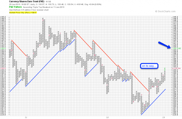
Finally the EUR which seems to be on its merry way. The bullish PO keeps pointing at the 1.39 mark which, much to my distress, seems rather attainable given prior context. Maybe time to raise my Dollar based subscription fees?
Cheers,


