Volume Holes
Volume Holes
It’s not unusual to see a sideways consolidation day after two distinct downside (or upside) trending days. After pointing out a distinct bounce potential yesterday I am a bit confused as to why many commenters seem to be surprised by today’s action. Have we perhaps chased the tape late to the downside? I certainly hope not!
Let’s talk about volume holes – they are quite different from assholes as not everyone has one
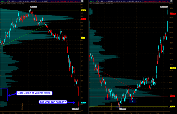
I have posted this chart and its S&P sibling on several occasions to point out how energy clusters in the form of volume holes attract and reject momentum. If your Bollingers line up with volume holes then it is my experience that in a majority of the time a reversal is on the horizon. However, this works until it doesn’t – and this in particular applies to downside moves. Look at the TBT panel and you get an idea of what can happen – once those volume holes are breached we enter new phases in the trend that can extend for quite a bit of time. Incidentally Elliotticians refer to this as third waves which indicates that the trend (up or down) is in its prime.
But Mole – TBT is inverse to TLT which pushed up hard – so why does that apply? Well, glad you asked that (or not)! It seems to me that treasuries trade a bit topsy turvy in that they represent ‘flight to safety’. Money flows out of equities and into bonds, gold, collector penis pumps, and what have you. In any case – I have very rarely seen volume holes being jumped like this on the equity side – the only exception was the 2008 crash. So, what we are observing here, silently and without much attention by the gray unwashed masses, may actually be an upside crash if you will. Just turn your monitor upside down (some graphic cards will do that for you) and then tell me what you see. Definitely looks like a market dislocation to me. Of course you won’t hear anyone talk about that tonight on BBC, MSNBC, or whatever you choose to bleach out your neurons with.
Anyway, let’s take a peak at equities, that comparably tiny market which everyone seems to be so enamored with:
[amprotect=nonmember]
Charts and commentary below for anyone donning a secret decoder ring. If you are interested in becoming a Gold member then don’t waste time and sign up here. And if you are a Zero or Geronimo subscriber it includes access to all Gold posts, so you actually get double the bang for your buck.
[/amprotect]
[amprotect=1,13,9,12,5]
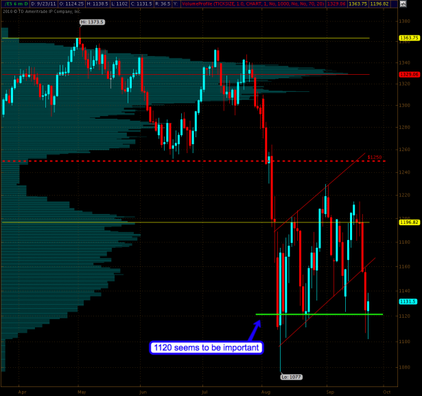
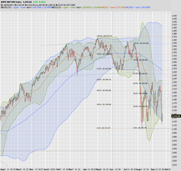
What a mess, right? But something stood out to me this morning. It seems that the 1120 mark has some meaning as we seem to always snap back to that level. I drew a line and all you see below are the wicks (with two slight breaches at the end of the August plunge but my point stands).
Here’s my SPX Bollinger chart for comparison – and note that we seem to be bouncing at both lower standard deviations. That doesn’t mean it’s all over but, as I said yesterday, this does support a brief bounce or at least a bit of sideways tape.
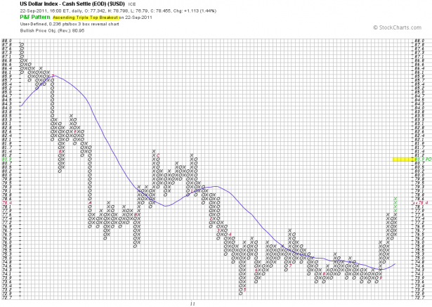
Of course currencies is really where the action is, which is why I have greatly increased my focus in that area. I’m glad some of you intrepid steel rats are finally coming around and are hopefully smiling all the way to the bank. The Dollar is now painting an ascending triple top breakout on my P&F chart – target: 89.9. Well, that would be sweet, but what’s an ascending triple top?

Here are the rules: A double top followed by another double top, or three tops, each higher than the previous is recognized as an ascending triple top breakout. The idea is that demand is continuing to outstrip supply on an ongoing basis.
May I add that this is an extremely bullish pattern with rather good odds? I swear – I’ll drag you guys into P&F charts kicking screaming if I have to!
Cheers,
Mole
[/amprotect]


