TA Minimalism
TA Minimalism
Since Berk decided to drown you rats in an ocean of high quality charting magic I chose to go the opposite route and shine with pure and simple TA minimalism. Yes, that’s right – Mole is only going to post one single chart but it’s a good one, so don’t despair:
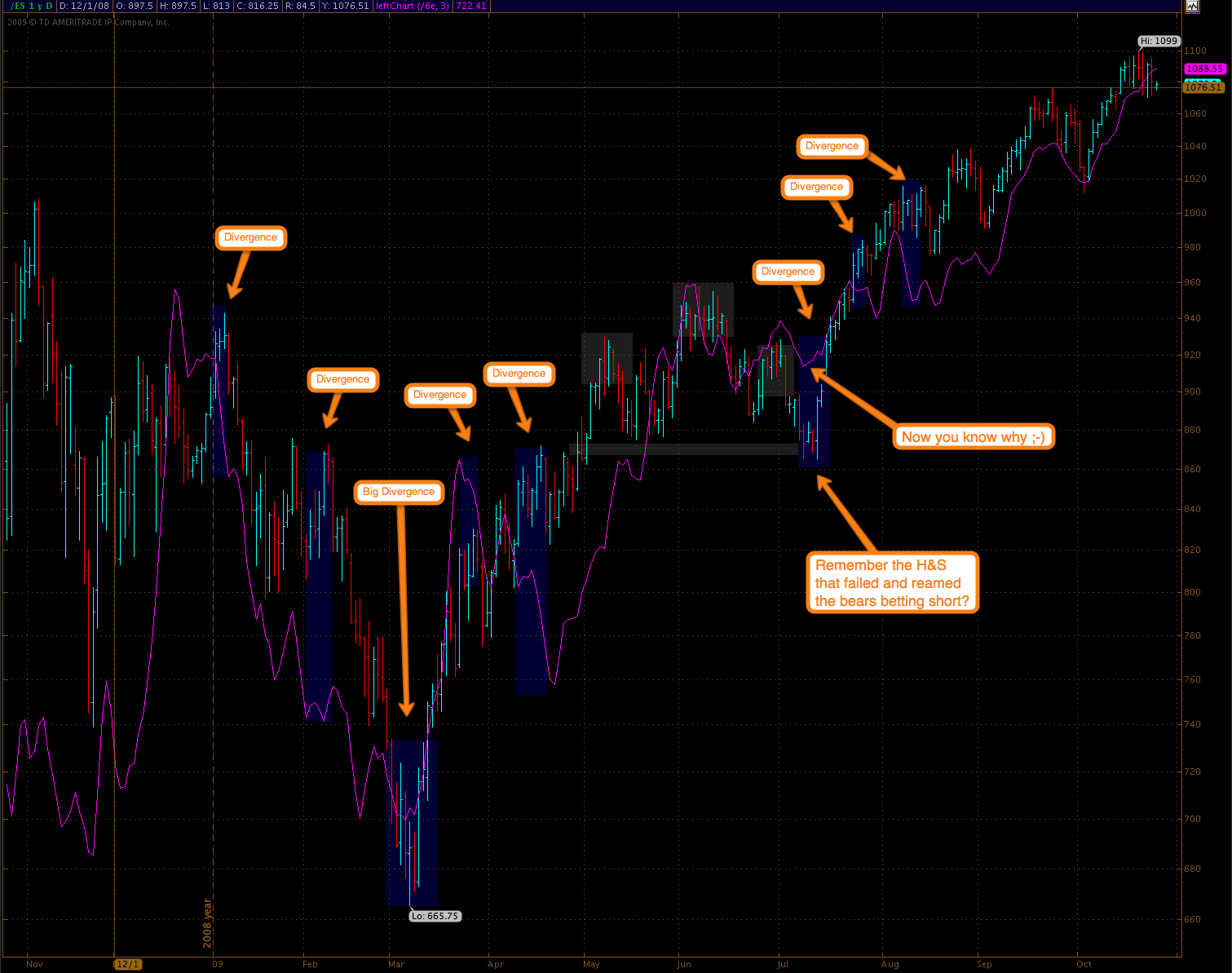
Okay, this is a big one – you might want to click on it. Hey, I can literally see you guys scratching your head, so let me explain. The entire exercise started with the realization that there really is no good way to create a ‘left chart’ in TOS (which btw is easily done in Prophet). I use left charts all the time and, sorry for pointing this out Tim (we still love you) but unfortunately anything lower than a 5 min chart does not update very well in Prophet – ahem (boy, will I pay for that one).
So, I finally sat down and wrote a conversion algo that adjusted a source chart to the scale and scope of a target chart (i.e. the ES futures in this case). It’s really not that complicated if you’re math boy (i.e. me) and bring along enough patience to squeeze the logic through Freddy Krueger’s Worst Nightmare, a.k.a. ThinkScript.
What you see above is actually a daily chart – so yes, I could have charted this in Prophet but it doesn’t look as clean and I don’t have as much control over how to visualize the whole shebang, e.g. smoothing, line over bars, colors, etc.
The purpose of this exercise was to visualize the ongoing carry trade in the Dollar – and in order to better show divergences, a.k.a. bear traps, I chose the plot the Euro futures against the S&P futures on a daily basis. The result was quite shocking – as in ‘shocking how much pain we could have saved ourselves’. I could go on here but you be the judge – I have provided some comments to draw you rats to what stands out to me. Perhaps you guys can offer additional insights as to how to interpret this chart.
One could make the point that the ‘Dollar carry trade’ was not happening yet seven or eight months ago – well that’s true – point taken. However, the divergence is there, and maybe some big currency traders were just getting into the game and knew something we didn’t yet, who knows.
A final thought – as you can see the 3-day smoothed Euro futures have not budged at all during last week’s drop. I’m not sure what that means exactly. Perhaps the Dollar carry trade is dying or the bears are about to get reamed again, just as Berk seems to suspect in his monster post.
Oh, I almost forgot – I promised you rats some TA minimalism:

Alright, it’s T&A – an itsy-bitsy of it. Meh, I’d do her… what you rats don’t know is that she’s inflatable, just needs some pressure adjustment in the right places. Great for emergency poonany when traveling – and she does fit nicely into my carry-on bag. Alright, I’m off to the gas station.
12:15am EDT: Someone asked about the Gold:Silver ratio correlation and why it’s inverse to equities, so I decided to post two more charts – you got me. Anyway, here’s my POV on the subject (others are free to join in):
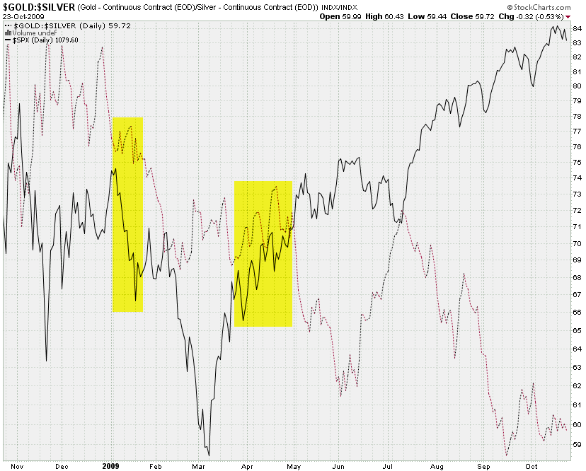
Why does the Gold:Silver (mostly) run inverse to equities?
I’m glad you asked (not really)! Think about it: The ratio describes Gold divided by Silver, right? So, if the ratio increases that means that Gold is either increasing in price in comparison with Silver, Silver is decreasing in price when compared with Gold, or any type of crazy combination thereof.
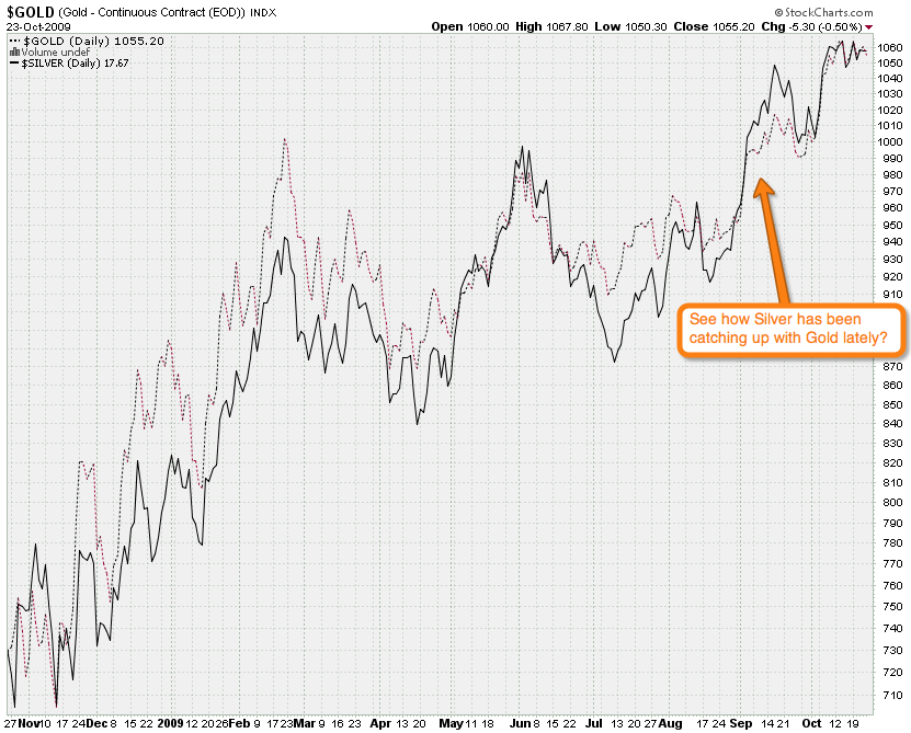
If the ratio decreases (just like it’s been happening now) it basically means that Silver is catching up with Gold – if the ratio was 1 then Silver would be on par with Gold. If the ratio increases, it means that Silver is losing relative to Gold. Get it? Got it! Good!
So, why is this happening? Silver is more seen as a commodity during economic turmoil and assets retreat into ostensibly ‘safer assets’ like gold. Thus Silver loses in value relative to Gold, the ratio increases, and voila, here’s your inverse correlation.
Careful with trading correlations however – there are times when they can suddenly break or soften:
Anyway, the Gold:Silver ratio is exactly why I intend to trade SLV puts and not GLD once I am more confident that a top is in place. Got burned a few times earlier this year and I remain cautious – but we’re getting close 😉
Before I go – some of you have been complaining about the swivel stick I posted above. Well, before you go on a tangent, here is a picture of her AFTER the pressure and valve adjustment 🙂

BTW, this picture is implicitly an online gay test – enjoy!
Cheers,
Mole


