A Few Charts With Honey
A Few Charts With Honey
I barely had any time this afternoon to even think about the market but once I started poking around in my long list of stockchart links I decided to share two of my favorites. I think they might be quite useful to you damn leeches going forward:
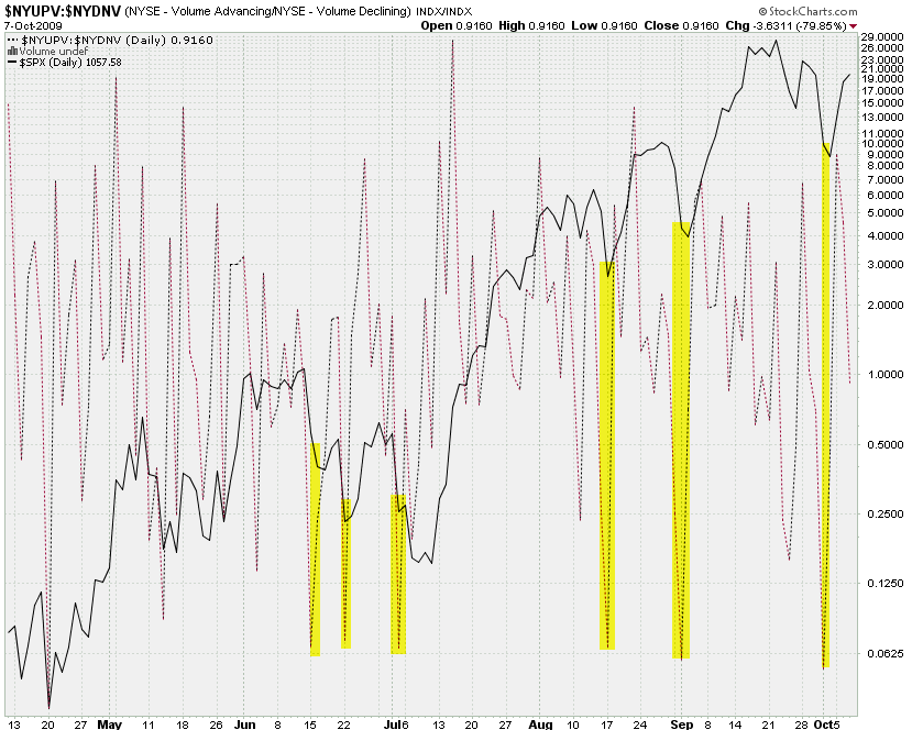
This is the NYSE Advancing Volume in relation to the NYSE Declining Volume – do you happen to see anything interesting here? Yes, I thought you would – now can you please explain to me what’s so damn special about 0.625?
1/1 = 1, 2/1 = 2, 3/2 = 1·5, 5/3 = 1·666…, 8/5 = 1·6, 13/8 = 1·625
Coincidence? Yeah, probably – but I thought I’d point it out just to freak you out a little.
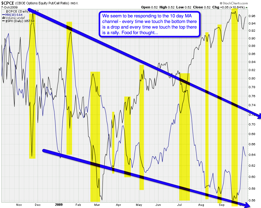
Now, this is tonight’s favorite and it was actually inspired by Berk’s CPCE chart from this afternoon. While I was looking at it I noticed something peculiar – and here you have it. Isn’t that extremely interesting? We seem to be responding to the 10-day MA as it travels down this rough channel. Every time the MA touches the bottom of this channel we seem to be at the brink of a drop and every time we get close to the top of this channel we seem to be getting close to a rally.
Am I seeing things or could trading this tape really be so easy? The big question however remains:
Why the heck did fucking Mole not see this months ago?
Unfortunately I have no response to that
Have a good night.
Mole
P.S.: When you click on those charts it will actually pop up the stockcharts.com original. So bookmark those suckers and let us know when you see anything of value.


