A Lot Worse Than You Think
A Lot Worse Than You Think
As all ThinkOrSwim platform services were still down on Sunday morning I decided to spend a bit more quality time with my long term charts. One that you may have seen over the past week fits right into this weekend’s theme: It’s a lot worse than you think, folks.
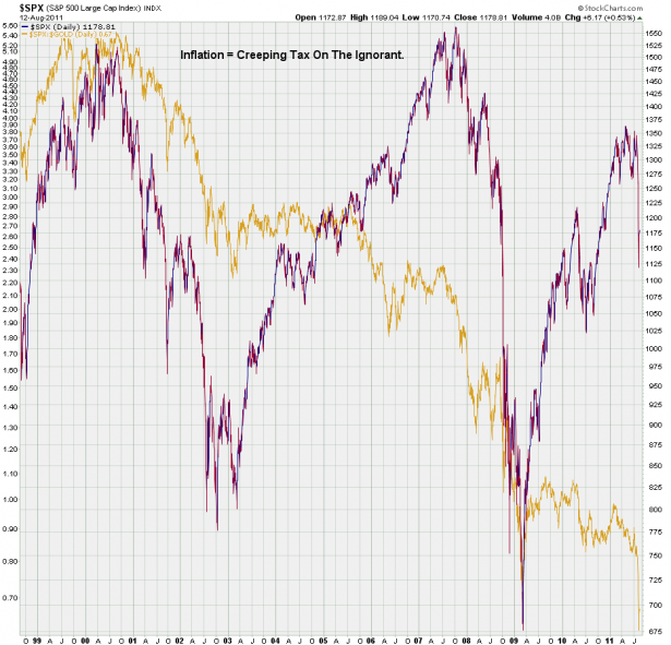
In dark blue you probably recognize the S&P 500 cash – and it’s only there to serve as a contrast. The line that really matters is the one in gold which represents a ratio between the SPX and the price of gold futures. In simple terms this chart shows you how much gold you are able to buy with the amount of Dollars representing the SPX. So the first take away message here is that in gold terms we are now trading way below the March 2008 lows. The second is that the U.S. Dollar is worth jack and despite a massive loss in confidence in equities during the past week has not been able to recover (yet). Telegram to Obama and our Do-Nothing-Congress: I got your jobless recovery right here!
For the record – you all know I am not a gold bug and am not about to turn into one. But one big lesson I did learn way back was that the purchasing power of gold has remained pretty much the same over the centuries. Sure there were up and down swings but compared with the U.S. Dollar which has lost 90% of its buying power over the last 100 years your grandpa bent on leaving you with an inheritance would have been much better off digging a hole in the yard to bury some gold bullion. Unfortunately grand-pappy was not a pirate, so I’m out of luck.
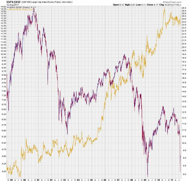
But not all currencies are being taken to the woodshed – the Swiss Franc stood up against gold rather nicely in the past year as I incidentally have been proposing for about the same amount of time. So, had you been holding Swiss Franc instead of U.S. Dollars your net impact in terms of lost buying power would have been greatly mitigated. I recently read that a BigMac in Zürich will now set you back US$17.19 – so you better bring along some MREs next time you’re heading into the Swiss alps.
If you live in the United States holding your assets in any other currency is extremely difficult – and trust me, they are not about to make it any easier for you. Now, if you want to be clever and set up some kind of currency hedge one way is to engage in FX trading and another is to open a an account offshore. It’s not too difficult to open a multi-currency account in Hong Kong or in Singapore and select your favorite among many currencies to hold your assets in.
That is unless you are an American – I hate to tell you that due to increased IRS pressure on banks abroad many clients showing up at an offshore bank with a U.S. passport are politely been shown the door. Also, even if you are lucky enough to have a second passport and manage to open a multi-currency account you’ll have to pick the right basket/ratio of currencies – how do we know that the CHF won’t tank soon due to currency manipulation by the Swiss National Bank?
I recently saw a report on a slump in Swiss tourism due to the growing CHF exchange rate – even Swiss nationals are heading abroad for the summer as it’s a lot cheaper for them. So, it’s very much possible that the SNB will at least attempt to weaken their currency at some point in the future, so be careful. Finally, suffice to say that if you hold some of your assets offshore you will have declare that with the IRS in your annual tax filings, otherwise you may be pursued for tax evasion.
You would think that an alternative and more accessible way to hedge against inflation is to engage in FX speculation. But you are now dealing with leverage, which represents real risk of losing your entire principal (although holding cash Dollars or Yen may represent inflation risk there is a minimal chance they’ll reduce your buying power to zero within a matter of days). So I’d call that a no-go for anyone but the most experienced and nimble FX traders.
There is another possible alternative I recently came across however, it’s called an Unidad de Fomento and it is found in Chile from all places:
U.F. (Unidad de Fomento)
Sometimes you will see prices in newspapers or on billboards selling houses and apartments in U.F. (Unidad de Fomento). This is a unit of money used mainly in business and formal financial transactions that involve large sums and was created at a time when inflation was high. It is frequently used with rental contracts and buying and selling homes or businesses. The rate of the UF varies daily according to the monthly inflation rate and the exact figure can be found in the newspapers. There are no physical coins or notes. It is only a value.
I found an online calculator for converting most currencies into CLF and as of today US$1000 buys you 22 CLF. Disclaimer: I have never done this but it sounds very interesting and if any of you are pursuing converting your assets into CLF or have already done it then please share your insights in the comment section.
Alright, on to the charts:
[amprotect=nonmember]
Charts and commentary below for anyone donning a secret decoder ring. If you are interested in becoming a Gold member then don’t waste time and sign up here. And if you are a Zero subscriber it includes access to all Gold posts, so you actually get double the bang for your buck.
[/amprotect]
[amprotect=1,13,9,12,5]
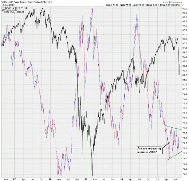
Sticking with the currency theme for another moment – here’s the USD, which is now coiling up in some type of symmetrical triangle. IF this is a repeat of 2008 then it ought to make a run for 76 at some point in the next two months. However, despite last week’s ‘flight for safety’ things have remained rather flat on the Dollar side, which is a bit of a repeat of 2007. BTW, why anyone would seek shelter in U.S. treasuries due to a downgrade of U.S. treasuries from AAA to AA is beyond me. But heck, what do I know…
Anyway, the take away message here is that further weakness in the Dollar may give equities a slight boost, but beware if ole’ bucky ever gets a bid and rallies above 76. This most likely would have an disastrous effect on equities and if you think the recent drop was bad then you most likely ain’t seen nothin’ yet (as they say over here). Again as a corollary refer to late July 2008 as tanking equities forced everyone into a rallying Dollar – the rest is history. And that was before ZIRP and two rounds of quantitative easing. Food for thought.
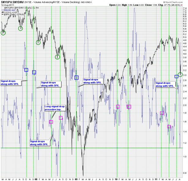
This NYSE advancing/declining volume chart may look a bit complex but please set your neurons into overdrive and bear with me. I actually spent a lot of time on this one today and it seems the effort was rewarded with some important revelations. First up what stands out is that we snapped back exactly where I thought we would – near the 1.2 mark. We could have easily dropped a bit further but that’s usually retracement territory.
Secondly I marked all the readings accompanying major market highs with blue rectangles (see the tan lines marking the SPX highs). What is extremely interesting are the dynamics of those readings during the last bear market in comparison with those of the recent bull market. During the 2007/2008 bear market we first started with seeing SPX drops with the ratio hanging around the 3.0 mark – usually there was also a bit of a divergence preceding them (very valuable). The signal also continued dropping with the market until finding a low – again very valuable when trying to pick a low (and then there’s the 1.2 mark as well).
During the 2008 crash (i.e. the third of third wave down) starting in August the signal actually started to push up hard while equities dropped equally hard. That is rather puzzling to me in that you would expect the opposite, but it’s something to bear in mind next time we see the signal move in the opposite direction.
After March 2009 the dynamics shifted and we did not see equity corrections until a divergent ratio signal was well established, which obviously made it very hard to pick a top. By the time the signal bottomed equities were near the bottom as well and often snapped back beforehand, which made projecting lows easier.
What just transpired in the last week much more resembles the 2007/2008 bear market than anything we have seen in the past two years. The signal started in 3.0 territory and then dropped hard to our buy line, just like it used to do in late 2007. Again, the 1.15 reading was also the lowest since summer 2008.
In the past few trading sessions the signal has pushed up hard and we are now again near the 4.6 mark, which I believe may be a nice setup for a second drop down. Obviously we may see the signal first paint a top and then a divergence until equities are ready to correct again. The current reading suggests this may come sooner than many traders may care for.
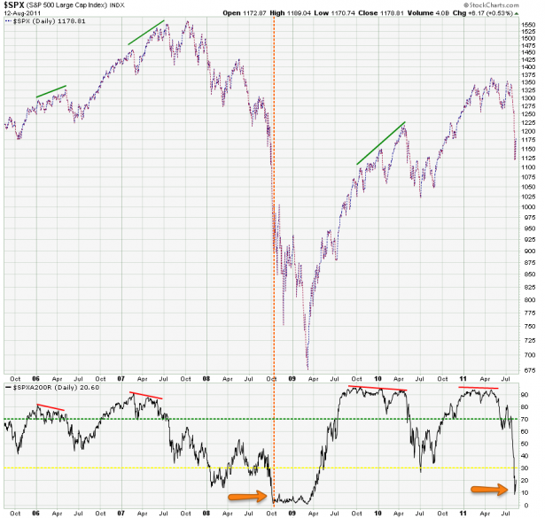
Another notable signal extreme is found on our SPXA200R chart, i.e. the percentage of SPX stock trading below their 200-day SMA. A punch into the teens has not been seen since the 2008 crash, which is a bit puzzling if you ask me considering the vehemence of this in comparison with only 200 handles shaved off the SPX. But it most definitely represents a signal extreme I don’t see we are not going to see again for at least few weeks and most likely months. Perhaps the fact that U.S. exchanges are now primarily dominated by HFT bots does produce more extreme swings and thus it’s reasonable to expect more volatility going forward (in both directions).
Which makes identifying the odds of medium to long term turning points an increasingly important endeavor. Not, I’m not talking about calling tops or bottoms, which really nobody can do reliably on a long term basis. Rather I am referring to incorporating various measures into your trading routine that provide important clues as to when the odds of a volatile swing are present. You can then decide to either hold out in cash or to swing for the fences, in the end that is up to you.
I think we here at Evil Speculator have done a pretty good job at repeatedly pointing out major bear as well as bull traps. And if we continue to focus on our charts instead of the news or our emotions and cognitive biases then I have good confidence we can continue to remain on the right side of the tape, no matter which way it’ll swing.
On a medium to short term basis I don’t have much to add to the upside targets I already presented on Friday afternoon. Let’s see what Monday brings and then decide whether or not it’s time to start legging into short positions. But until further notice my medium to long term outlook has now shifted toward the downside.
Cheers,
Mole
[/amprotect]


