Bullseye!
Bullseye!
If you follow Eastern philosophy you are surely familiar with the concept of yin and yang. The symbol represents the ancient Chinese understanding of how things work. The outer circle represents “everything”, while the black and white shapes within the circle represent the interaction of two energies, called “yin” (black) and “yang” (white), which cause everything to happen. They are not completely black or white, just as things in life are not completely black or white, and they cannot exist without each other. And the underlying message is that there needs to be balance between opposing forces. As one side becomes over dominant a correction usually brings the two back in alignment to restore much needed equilibrium.
It goes without saying that the bulls have completely dominated the month of September, a traditionally ‘challenging’ (as in bad) month for equities. As a matter of fact the bulls scored the most bullish September since 1939 as the Dow Jones Industrial average gained a whopping 7.7 percent. Pretty much the exact opposite of what most bears expected just four weeks ago. So where do we go from here? Is it time for a reversal or was this just an overture leading us to a veritable stampede of the bulls?

Well, to propose some answers to that question I took a look underneath the hood to get a better picture of what drives this market. And unlike just a few weeks ago the picture is coming into focus quite nicely. Buckle up – we’ve got quite a few charts to go over.
Let’s start with a chart we closed last week with – my spiral calendar projections which suggested a major turning point around October 5th. Well, tomorrow is the 4th and, as I pointed out last week, there may be a variance of several days on the plus or minus side.
Originally – a few months back – I imagined that October 5th would present us with a major low. Since we have ramped up for the past month the only direction of a cycle turn can now be to the downside. Which of course does not guarantee one will happen – again a setup does not mean that a reversal is more or less procedural. But if the coming trading week leads into a reversal it is clear that it can only be one for the bears. With that in mind I looked at my momentum indicators for evidence and was surprised how things have snapped into sync in the past two weeks.
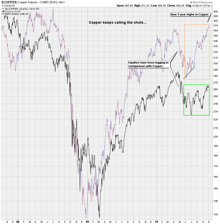
We’re actually starting off with the most bullish chart I have today. In the past few years copper has done a great job leading equities and there are two messages to take away from the chart above. First, copper is on a rampage and has painted a new 2-year high last week. Second, equities have lagged it considerably in the past few months, and as such we can derive three prime directives before we move on to my other charts:
- As long as copper pushes up equities will either follow or at least move sideways.
- Equities will most likely continue to find a floor at important support levels as long as copper pushes higher.
- When copper starts a meaningful reverse equity longs will most likely find themselves in a world of hurt.
Considering these three directives please bear in mind that the charts I am going to show you represent a ‘setup’ – but not a ‘guarantee’ for equities to paint a meaningful correction in the near term future.
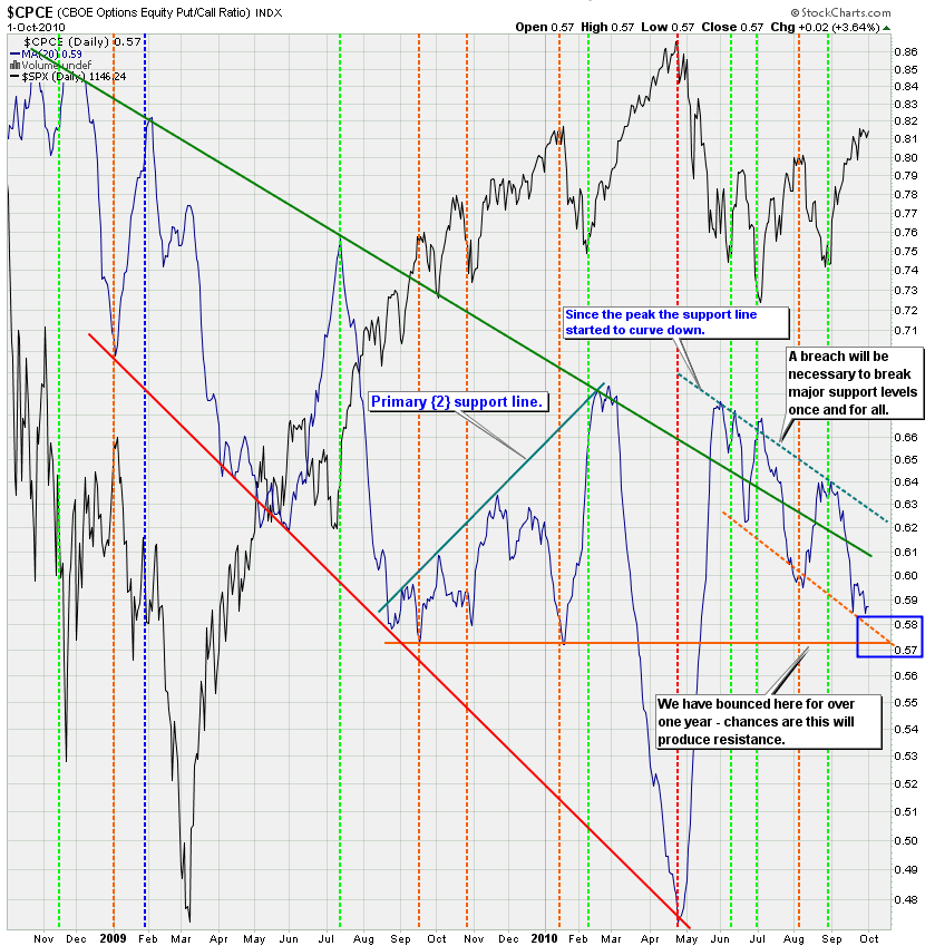
You may remember my CPCE Deluxe chart and the more I study it the more fascinating I think it is. For all the noobs who joined us via the Zero Pimp-A-Thon let me explain: The CPCE in blue represents the put/call ratio in equities only. I have chosen to smooth it down with a 20-day SMA. The channels I drew in green and red represent important support and resistance zones, which seem to shift as equities transition between bearish and bullish primary waves.
There is a lot of information on this chart but if you focus on the past few months you surely recognize that the dotted blue-green support line has been sloping down since equities painted this year’s high in late April. Now, one may attach meaning to that in itself but we shan’t jump to conclusions. Similarly there appears to be a new support line in dotted green that has given the bulls a trampoline for reversals. Both of these dotted lines have produced a clear channel to the downside, which we are touching again right now.
But what’s also apparent is that there is a very strong bearish reversal line in solid orange, which has coincided with some of the few major opportunities to short equities since the start of Primary {2} in March 2009. The dotted and solid orange lines will soon converge, which tells me that even if we slide down this line for a bit more (and thus equities continue to rally from here) we will soon find ourselves at a reversal point that has held up for over a year now. And a drop below that line has not happened in years.
Similarly the dotted blue-green line is also important to us as it represents a clear support line for the longs, which will have to be eviscerated in order to give the shorts a shot for the big one.
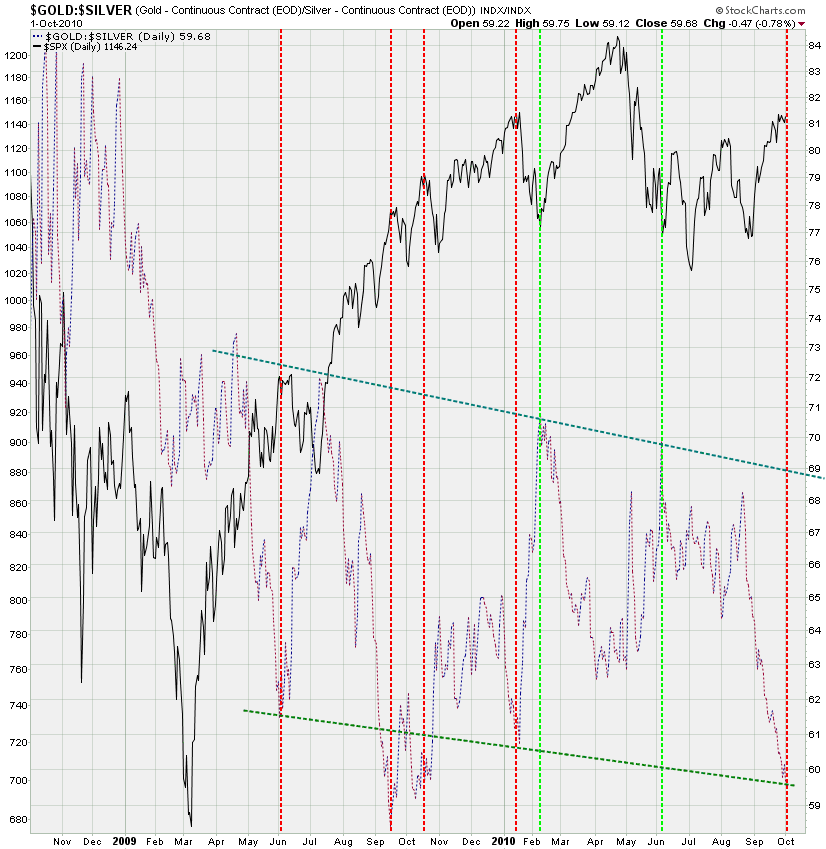
The gold/silver ratio chart has also painted a channel (although there was a slight drop below the lower line last October). After breaching a long term support line we are now back at the lower border and there is an opportunity for a drop in equities.
Here’s the same chart but zoomed in to show the past two years more clearly. Can the ratio drop further from here? Absolutely, but again – the setup is there and it’ll be up to the bears to cease the day or to miss yet another opportunity to the downside.
If you are a noob here you may not be familiar with this chart. The SPXA50 plots the number of symbols in the SPX trading above their 50-day SMA – an average traditionally followed by investors to assess the overall trend. Another important one is the 200-day SMA, which we’ll look at further down. BTW, the difference between the SPXA50 and the SPXA50R is that the latter is quoted in percentages – otherwise it’s the same.
What I’m seeing on my 8-day SMA of the SPXA50R is that we are near reversal territory, which doesn’t mean we drop right here and now but that again the door is open and at least a short term reversal may be near.
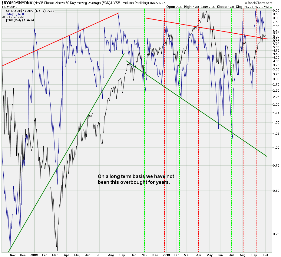
This is an slight variation on the theme. We are plotting a 13 day SMA of the NYA50 (NYSE stock above their 50-day average) and the NYSE down volume disagreeing with it. The smaller the down volume in comparison with the number of stocks trading above their 50-day SMA the higher the value plotted on this chart in blue. Clearly we have not been this overbought in years.
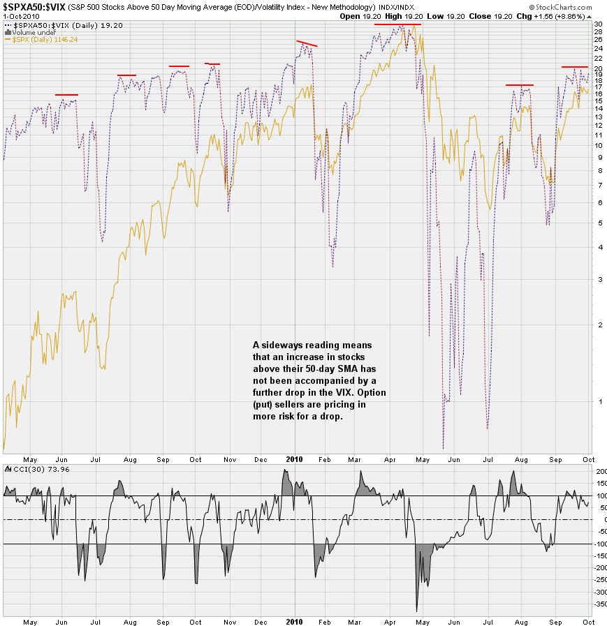
And here we are plotting the raw SPXA50 divided by the volatility as expressed by the VIX. We want to see if an increase in symbols above the 50-day SMA is reflected by a drop in the VIX. If not then that means that put sellers are pricing in more risk, and that is reflected in divergences as shown above. We are painting one right now it seems and although this situation can prevail for quite a while it’s another chart to be aware of when betting on the long side right now.
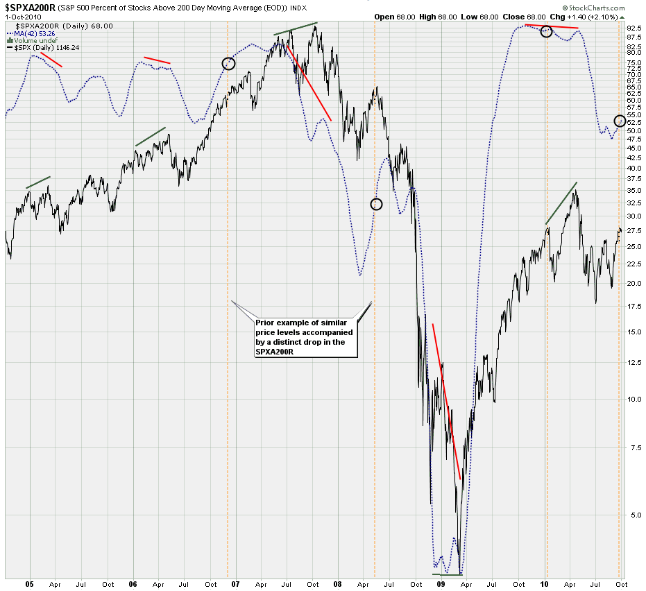
The SPXA200R follows the same idea as the SPXA50R – we want to differentiate between average and median – the SPXA200R shows the latter and thus gives us better information than a 200-day SMA plotted directly on the SPX. It seems to me that the underlying ‘quality’ of the price painted by the SPX has diminished. The same situation happened two years ago just as we were heading straight into Primary {1} – see the tan lines on the chart for the prior precedent I’m referring to. The last time we pushed upward toward 1140 on the SPX over 90% of its symbols were trading above the 200-day SMA. Right now it’s only 52% on the 42-day SMA – quite a drop. And yes, a similar situation is shown on the 13-day SMA – in case you are wondering.
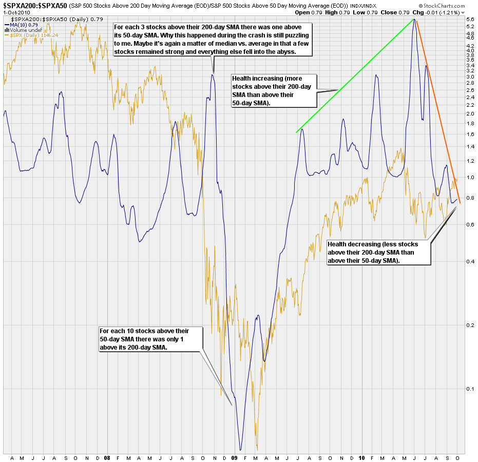
And since we’re having fun let’s plot the ratio between stocks trading above their 200-day SMA against those trading above their 50-day SMA. Again, a monstrous divergence which indicates that the current rally is not widely supported. This chart strongly suggests distribution and the quality of the current rally is questionable.
Now, in comparison with the more complex charts above this one is a breeze – we simply plot a ratio between NYSE advancing and declining volume. And again we are seeing a distinct drop here reflecting that advancing volume is not keeping pace with price. Divergences like these are usually not a good omen for the longs – and again I would caution when betting the farm on more upside.
The FAGIX is a high income fund which we contrast with the FUSTX, a fund based on long term treasuries (more secure – at least for now). Let’s take a quick look at the Yahoo finance definition of FAGIX:
The fund typically invests in equity and debt securities, including defaulted securities, with an emphasis on lower-quality debt securities. It may invest in companies in troubled or uncertain financial condition and in domestic and foreign issuers.
Yes, yes – lower quality debt – just what we need in this stage of our economic melt down – but it’s selling like hot cakes and who am I to argue. Well, actually what I argue is the textbook divergence I’m seeing, which means that at least some investors are doubting the rally in equities.
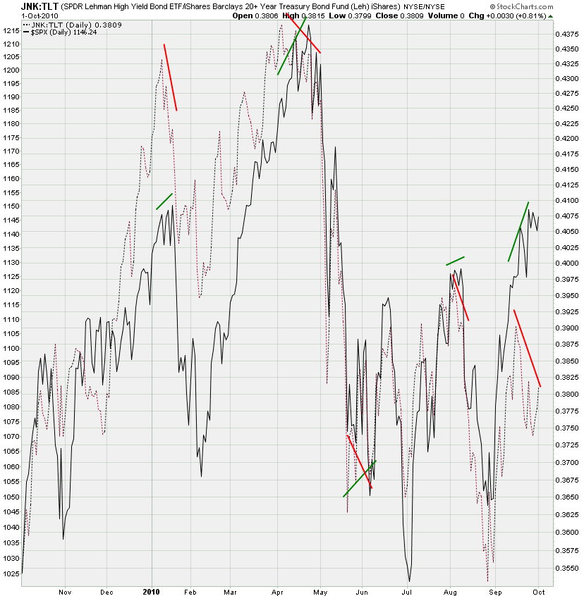
And the same situation is reflected on our trusted JNK:TLT chart (similar idea as the prior one) – seems that the ‘smart money’ (ahem) is pushing into U.S. treasuries while equities have been steaming ahead.
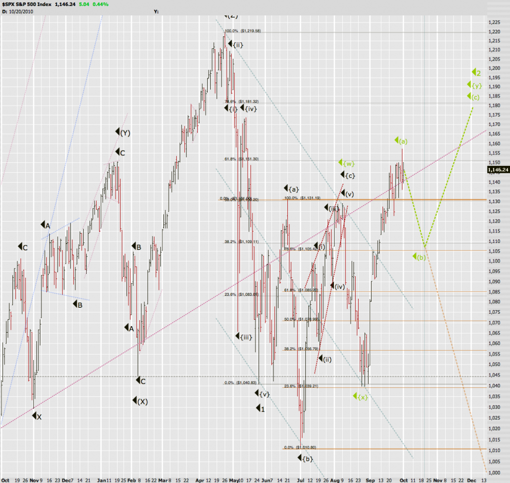
All of the above tells me that the longs are running out of time. The medium/short term charts I posted last Friday do support a short term reversal or more. I frankly would be surprised to see last week’s top breached next week but nevertheless being the paranoid cynic that I am I do see two high probability scenarios on the horizon.
Soylent Green: This is the one that argues that the ‘powers that be’ won’t let equities go to hell in a hand basket right before the November midterm elections. Quite frankly, that would be political suicide for the Dems and although I would laugh my ass off it happened the odds of it happening here are low. So this scenario suggests a drop lower followed by a final bounce in the form of the ‘traditional’ X-Mas rally. The next turn date would be early January. Bear in mind that we could drop lower than 1105 – 1085 is also a reasonable line of support. A breach of 1040 however would get us to scenario deux:
Clockwork Orange: The technical purist of the two suggests that the gobermint has no control over the bearish forces to be unleashed and points straight down. And if it happens we’ll know it right away as the velocity of the move down will be unmistakable, there won’t be much second guessing as we should slice through support levels like a hot knife through butter.
Bottom Line:
Obviously Soylent Green flies in the face of the spiral calendar turn date I posted. Well, as I often say – it’s an opportunity not a necessity. These turn dates are usually highly speculative and we never know for sure until much later. That still makes them worth considering but we can’t let them dictate our trading. I think that the momo charts I posted are much more expressive and do allow for a leg down – how extended a reversal we shall see. So far copper is still pointing up and the Dollar is fighting to find a low. Until both of them turn I don’t see anything even remotely resembling Clockwork Orange – especially with midterm elections looming ahead. What I see is an unhealthy market – but if recent history teaches us anything then it’s that everything needs to line up perfectly to afford the bears are fighting chance. Maybe it’ll happen right now but January makes for a more convincing setup.
See you on the other side.
Cheers,
Mole


