Coffee Is For Closers!
Coffee Is For Closers!
Mole: Let me have your attention for a moment! So you’re talking about what? You’re talking about…(puts out his joint)…bitching about that stop that got hit, some son-of-a-bitch broker that doesn’t let you borrow any Apple shares, that call spread that didn’t get filled, some broad you’re trying to screw and so forth. Let’s talk about something important! Are they all here?
Volar: All but one.
Mole: Well, I’m going anyway. Let’s talk about something important! (to Teddy) Put that coffee down!! Coffee’s for closers only. (Teddy scoffs) Do you think I’m fucking with you? I am not fucking with you. I’m here from downtown. I’m here from Goldman. And I’m here on a mission of mercy. Your name’s Teddy?
Teddy: Yeah.
Mole: You call yourself a bear, you son of a bitch?
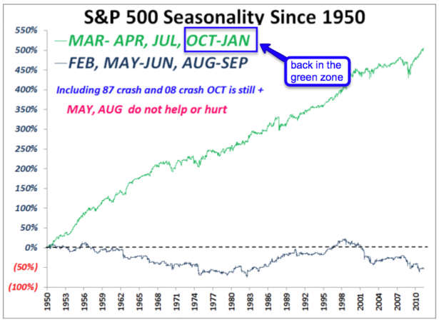
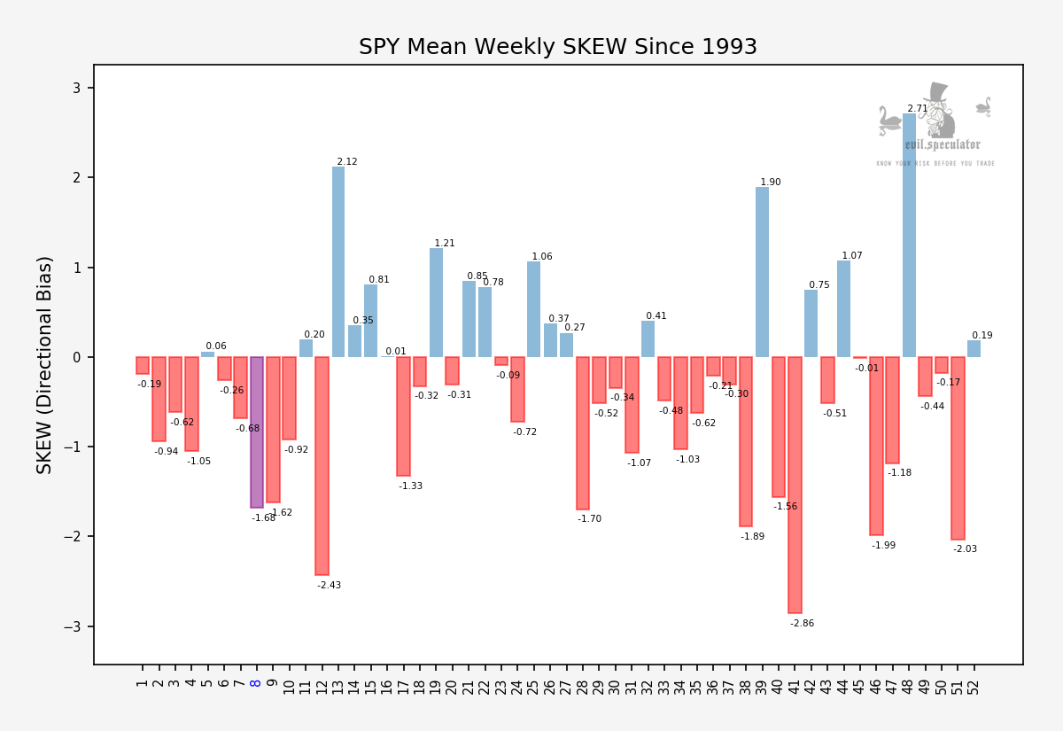
You may forgive me for slightly recasting one of the best dialogs ever caught on film but I’ve got a pretty important point to make tonight, so consider this my special way of setting the mood. And now that I caught your attention let me direct you to my first exhibit – which is one of Volar’s chart I am taking the liberty warming up again:
Yes, we are back in the green zone, baby! October can be a very bad month, but often it is actually squarely in the plus. Remember the difference between average and median – on average October is a bloody tosser – on the mean it’s a good month. If you don’t know the difference between average and median then type those two words in the search box on your right and read my pertinent post from way back – which goes into exhaustive detail on the subject matter.
So that’s where we are right now – week 40 out of 52. Twelve more to go – solidly bullish I may add by historical measures – and tomorrow is the start of week 41 which looks like a pretty happy one. The only remaining down swing potential appears to be week 43, starting on October 24 – which may work out well on the timing side as this week brings us the next new moon on October 26th. I don’t want to say any more about that as I don’t like to step on the toes of fellow bloggers. If you are curious about the moon cycle and how it has affected the tape in recent times then look no further than Chris Carolan’s blog – he’s the go to guy in all things cyclical and in that department he’s the one and only person I take seriously.
The point of this post however, my dear stainless steel rats, is that of failure. And like Blake in Glengarry Glen Ross the market does not reward failure – instead there is usually a steep price to be paid. And no, there are no fucking steak knifes for second place either – sorry.
Mole: (to Teddy) The good news is — you’re fired. The bad news is you’ve got, all you got, just three week to regain your jobs, starting tomorrow. Starting with tomorrow’s session. Oh, have I got your attention now? Good!
Alright, now that I have set the table, let’s dig into the good stuff
[amprotect=nonmember]
Charts and commentary below for anyone donning a secret decoder ring. If you are interested in becoming a Gold member then don’t waste time and sign up here. And if you are a Zero or Geronimo subscriber it includes access to all Gold posts, so you actually get double the bang for your buck.
[/amprotect]
[amprotect=1,13,9,12,5]
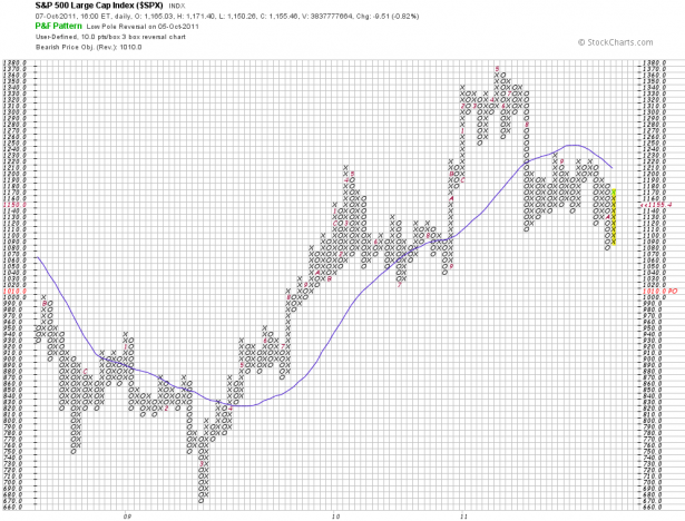
Let’s start with my trusted P&F charts. The SPX painted a low pole reversal warning, which if you have paid attention is rather bullish. Now that is still a warning only and that’s why you still see the bearish price objective of 1010. Week 43 beckons and I consider that the very last opportunity for the bears in 2011.
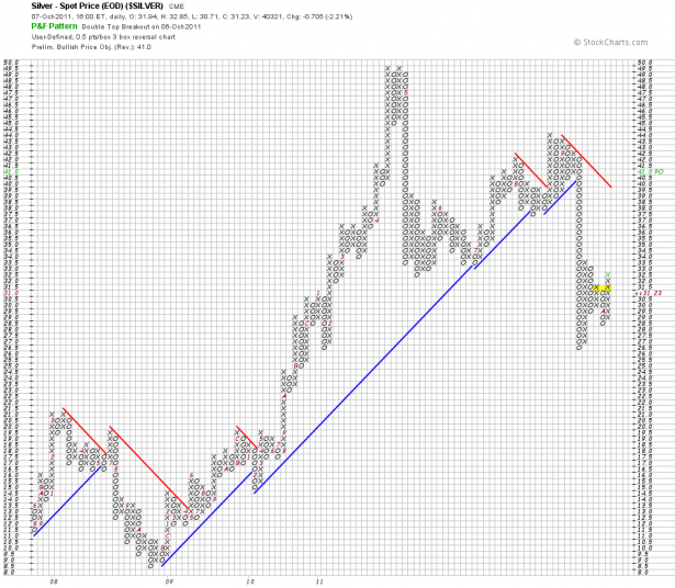
Silver is painting a double top break out with a bullish price objective of 41 – that’s sweet but I’d be out at 39.
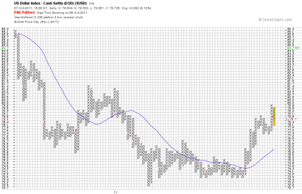
Of course it’s all about ye ole’ Dollar – and than one is painting a high pole reversal warning. A breach below 77.4 would be painful for the Dollar bulls (too man of them anyway right now).
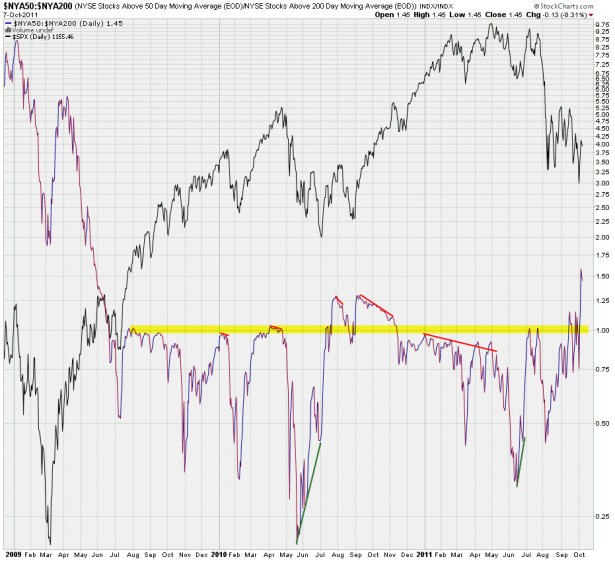
Hell, I’m just getting warmed up. Here’s my NYA50:NYA200 ratio chart, which is painting new highs! And yes, excessive highs are usually good for a correction (again, week 43 beckons). But that might not resolve until sometime next January.
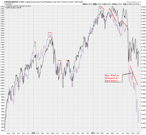
Junk vs. quality as expressed by FAGIX and VUSTX (look it up – I have shown this chart quite a bit). And what I see is a dismal failure by the equity bears to take advantage of a flight to safety. I have rarely seen such distance between the SPX and this ratio.
Continuing the theme – a quick peek at treasuries – I got myself a nice ratio between the 2-year and 30-year. That new spike up means that there’s a bit more delta on the yield side. This may also tie into the NLSL alert that the ZB futures painted last Friday – this could be very favorable for a continuation lower.
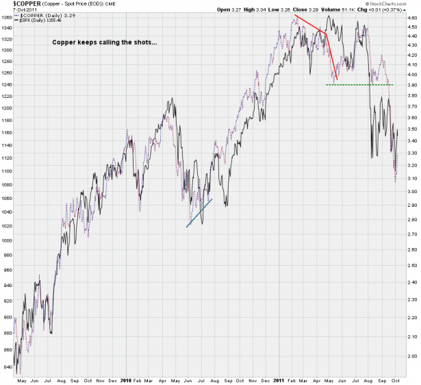
My copper chart paints a similar picture – look how far it dropped after the support line gave way. And then compare that with lackluster equities, which continue to ‘pretend to fall’ – in terms of price however we have not even taken out the long term support stemming back to summer 2010. Miserable failure.
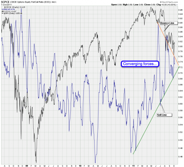
My CPCE Deluxe chart is coming to a point – we have two opposing trends converging. Gee, I can’t wait to see how this one resolves – I’m all giddy
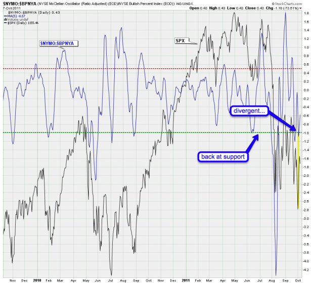
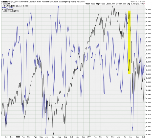
My NYMO:BPNYA – medium term trend vs. long term trend. Completely differently measured however: The McClellan Oscillator is a breadth indicator derived from Net Advances, the number of advancing issues less the number of declining issues. Subtracting the 39-day exponential moving average of Net Advances from the 19-day exponential moving average of Net Advances forms the oscillator. That wasn’t so hard, was it? We are talking breadth here – how many NYSE symbols are pushing higher in relation to the ones that are dropping lower. Now hold that thought.
If you have the that ratio dropping and the SPX is pushing higher then you know something’s fishy is going on. Let me give you an example of just such an event:
Well, we all know what happened next – oooops!
See – once you start thinking this stuff through it actually is becoming useful. The tools are all out there but the problem is that a majority of retail traders are usually to lazy to dig deeper in order to gain a more thorough understanding of how things work. Knowledge is power, my intrepid rats – and profits over the long term.
Now back to my NYMO:BPNYA ratio chart – the latter component, the BPNYA or NYSE Bullish Percent Index, also measures the breadth of the New York Stock Exchange. But it does it based on the number of stocks on Point & Figure buy signals within the NYSE. Fortunately you now are a bit more familiar with P&F charts and thus you understand that the time dimension does not matter when it comes to crossing and circling those magic boxes. It’s all about price – and thus it’s all about the long term trend. Important support and resistance levels become more clear as all the noise in between does not matter and never gets plotted in the first place.
So, why would I put two completely different breadth indicators into a ratio? Well, because I can! And it consistently seems to produce patterns that I am able to leverage. That’s another difference between us human beings and computers – we do have intuitions. Sometimes some crazy concoction just works and as long as we bank coin – why worry about it?
Bottom Line: The bears had every opportunity in the book to walk through that wide open door, but it never happened. There is one final chance for mix things up in week 43 but after that I am getting dressed up for the 2011 fall/winter rally.
I’ll chime in on the short term front tomorrow – until then keep it clean and frosty.
[/amprotect]Cheers,


