Curly’s Massive Momo Update
Curly’s Massive Momo Update
It’s the last session of the month and that means you’re getting treated to a massive momo update. It’s been a long standing tradition here at Evil Speculator and I rarely miss an opportunity to step back and look at the big picture. To me personally the process of compiling it helps me gain a deeper understanding of what drives the ongoing market phase and where we may be heading next. However this time things are a bit more tricky as technically speaking we seem to be in uncharted territory (pun intended).
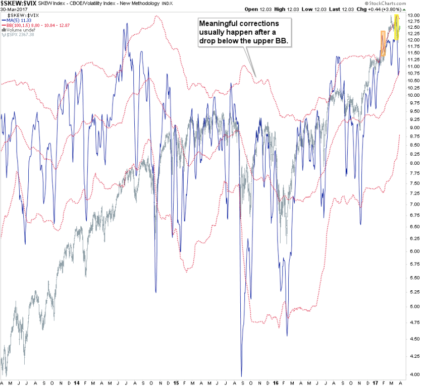
So let’s dive right in – I’ll start with the easy stuff first to frame the overall picture. Above you see a slightly smoothed ratio between the SKEW and the VIX. You will not that the upper Bollinger band seems to delineate price extremes in the S&P 500 which precede a medium term correction. This is actually quite reliable – it doesn’t always work as sometimes you’ll get MT corrections ahead of time (see the pre 2014 range) but in general it catches the ‘bigguns’.
Except that we now touched it twice in the past few months without much of a price response. To paraphrase Curly from the three Stooges: “I tried to sell but nothing happened!”. Sure equities managed to drop a little during my time in Tenerife but it’s been comparable shallow, especially given the magnitude of the preceding rally, and we already seem to back on track to retest the highs.
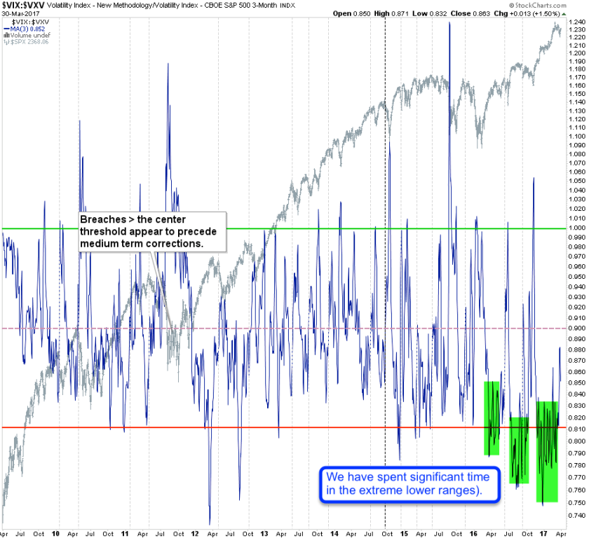
VIX versus VXV – it’s quarterly cousin. I plot this ratio to find out if implied ST volatility is out or under pricing implied MT volatility. What can I say – risk perception continues to be pretty low. As a matter of fact we have spent most of the past year in the lower ranges I have highlighted in green. Looking back five years I am unable to identify a comparable range of comparably bullish market sentiment. What also stands out however is what happens as soon as prices dip lower. We see an almost panic laden spike higher which then quickly recoils and we’re back in the lower ranges. So it seems the range of risk perception has been expanding – it’s starting to resemble bipolar behavior. Hold on to that thought we’ll cover this later.
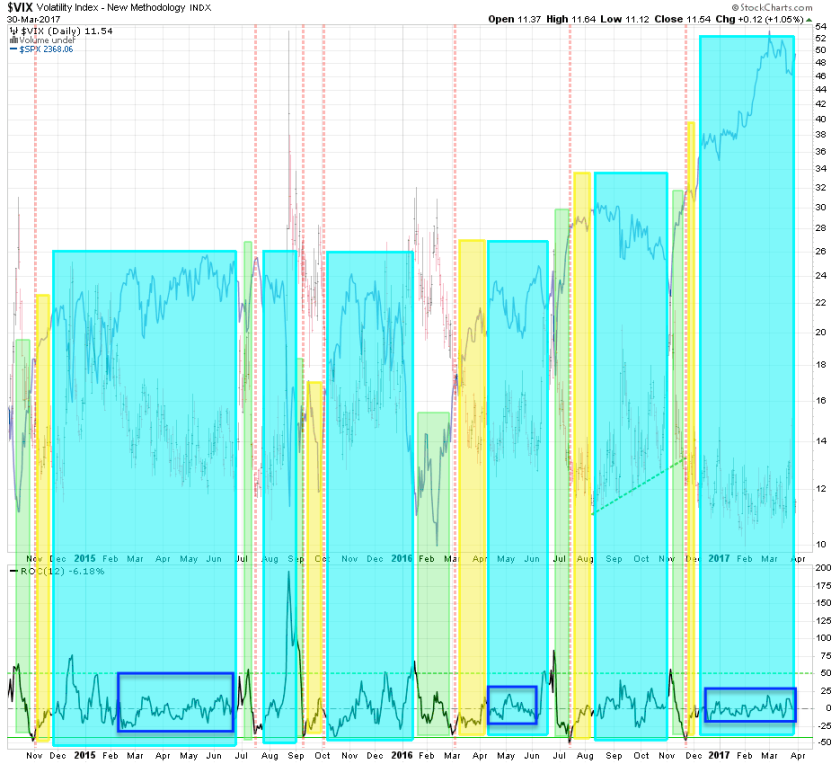
But we’re just getting warmed up. This is the VIX’ rate of change chart which I’m using to identify IV regime changes. The light-blue areas are the long stretches in which it’s hard to get a read. Usually those periods comprise both trending and sideways ranges. The green sections are the ones that mark periods when we see a range expansion in IV followed by a correction toward the lower ranges. I call these periods ‘easy time’ because after a breach below the 50 mark and until a breach of the -50 mark being long can pay off handsomely.
Unfortunately we don’t seem to be getting anywhere near easy time as the current ROC range seems to be gyrating within a very small window. That is bad news for the bears but it may be great news for the bulls. Because until we see risk expansion this bull market is probably just going to keep ripping higher and higher.
Quite a bit more waiting below the fold. If you haven’t joined yet then this is a great time to become a member:

It's not too late - learn how to consistently trade without worrying about the news, the clickbait, the daily drama and misinformation. If you are interested in becoming a subscriber then don't waste time and sign up here. The Zero indicator service also offers access to all Gold posts, so you actually get double the bang for your buck.
Please login or subscribe here to see the remainder of this post.


