Divergences Galore
Divergences Galore
If you happened to snoop around the blog late last night you might have caught my promise to post two kick ass charts which would blow your mind. Well, I had to take care of some personal business this morning (let’s just say that neighbor’s rooster won’t ever croak again at 5:30am) so this post comes a bit later than I had hoped.
While everyone remains focused on the short term drama (i.e. non-farm payroll report) I choose to focus on the long term. And the charts I dug up last night provide clear and irrefutable clues on how to recognize long term market highs and lows – while they are in process I may add, not after the fact. And of course, in good ole’ Mole tradition, they are based on divergences – which I seem to have a knack for digging up.
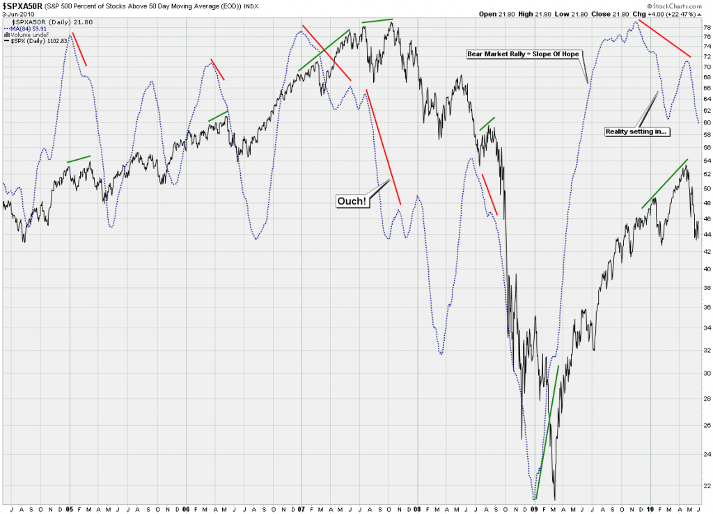
You might want to click on them as they are quite large. So, what are we looking at here? The black signal of course is the SPX and that’s our anchor against the blue indicator line. That one is based on the SPXA50R – which is very simply the percentage of symbols in the S&P 500 which currently trade above their 50-day SMA line. Not surprisingly that range goes from 0 – 100.
But wait – it doesn’t end there: Now I put an 84-day SMA on that signal and the result is the blue line you see charted. And what it reveals is quite stunning as we see divergences of varying magnitude on every single major turn in the market. I have already highlighted many examples which are quite clear in their form and final resolution.
What also stands out is the fact that in less than one year we pushed above the average registered at the top of the market (in fiat Dollars) in 2007. Now, I ask you – that alone points towards the ‘slope of hope’ – not the ‘wall of worry’. Which btw, is a term not coined by T.K. from you-know-where but by Robert Prechter himself.
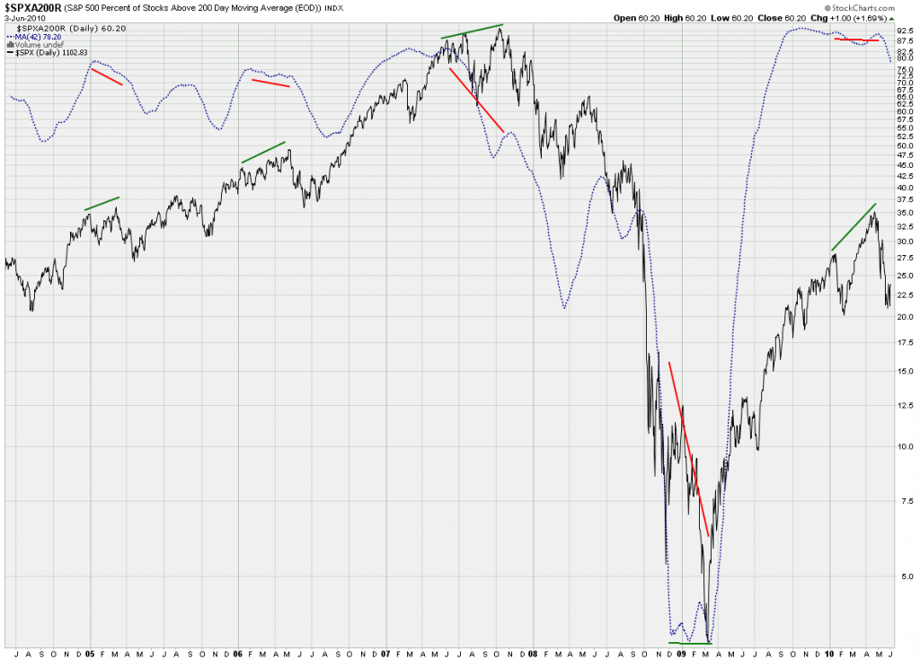
My second chart covers the same theme but is a lot more long term. This time I took the SPX200AR (i.e. all the symbols in th SPX above their 200-day SMA) and used a 42-day SMA. The very same story, which is astounding to say the least. What I found fascinating is that we went from less than 5% to over 90% in a mere seven months. Seven months!! Slope of hope indeed…
These two charts (among many of the other long term evidence I have presented in the recent past) will be integral to our long term trading endeavors as we move forward. Getting positioned ahead of long term trend changes right at their cusp should prove to be quite profitable (although nerve rattling at times). The longer I play this game the more long term focused I become. First up I sleep a lot better (and I can laugh off moves and opening gaps like those in the past two weeks) – but the noise level also seems to be so much more muted.
About today’s gap down and the continued drop since:
Frankly, I’m a bit surprised – I had thought that Soylent Green would get us to 1120 but we are now nearing the point where a lot of stops will be run. Technically the {c] wave can be counted as completed – and we can drop from here, but this would be happening alot earlier than I anticipated. But I knew that this market would throw us all a curve ball – which is why I insisted on staying short and why I was ready to sit through some pain.
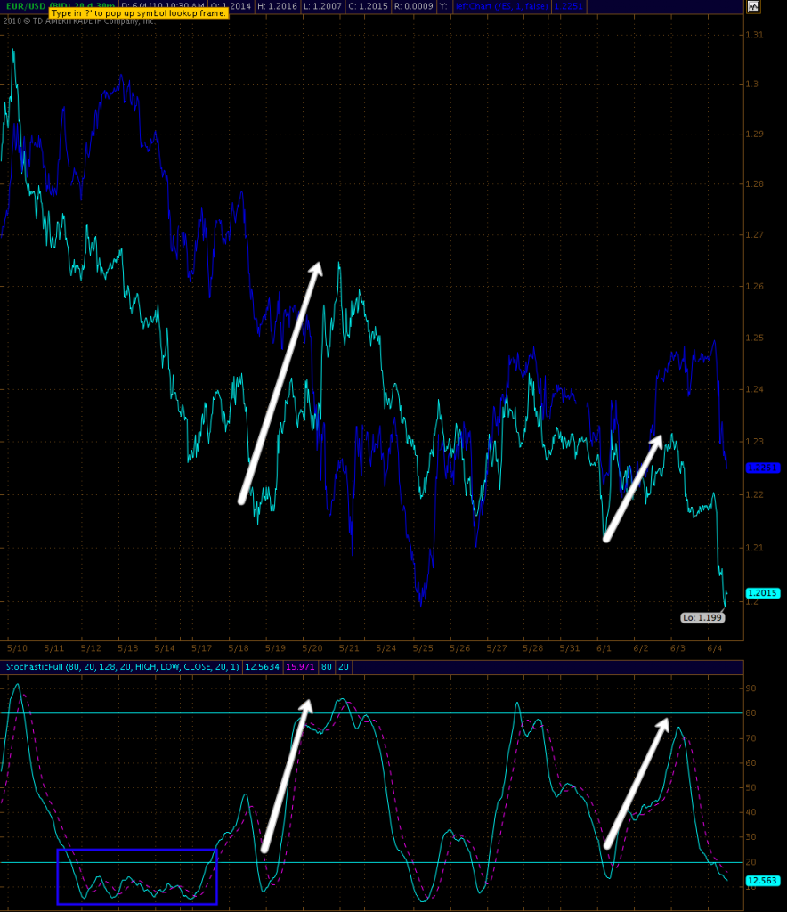
Before I run out – a quick look at the EUR/USD. You all know that I follow the EUR/JPY when it comes to matching moves in equities. But what’s interesting about the Euro in general is that the up moves and the expended energy in momentum measures like the stochastics are quite weak in comparison with the resulting price moves. Just compare the last two rallies – the recent one didn’t even make it above my 80% mark. What may happen now – and of course this is not a prediction, only a possible scenario – is that line might get embedded and we see the Euro drop into Dante’s Inferno. I have highlighted a recent example of an embedded situation in blue above.
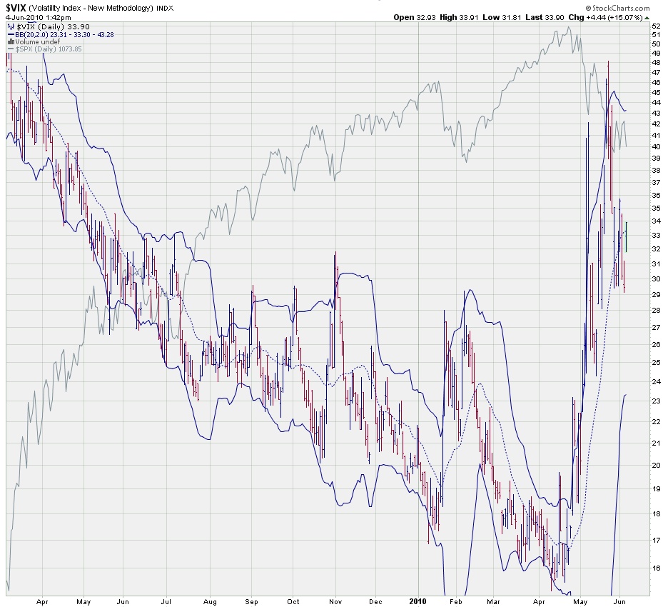
Mr. VIX is also back at it’s BB center line. If we push above (and I’m frankly surprised we haven’t yet) then we may also be back in 40 territory in no time. Fat lady has not sung yet however – judging by the past few weeks a price move like today should have led to a push above 35 or 36 – so there is the potential that this is some bear trap. I am not going to over-think this however and just keep sitting on my long term puts. Days like today show me that timing this house of cards is near to impossible. But the writing is on the wall, my dear stainless steel rats, this market is on the brink of extinction. Just a matter of time.
Public Service Announcement:
I have a little surprise for you guys – the Evil Speculator SWAG Outlet is finally up and running! The prior evil tees from -271 didn’t make me a dime (to keep the cost down) and that was a untenable situation for any self respecting market megalomaniac. Some intrepid rat pointed me towards cafepress and I got busy. Now, there is a cup for your poisoning your boss, a cool bag for your evil plans, evil tees of course, a mouse pad, and even a clock for your trading hours (you have to mark those yourself – LOL). So, go knock yourself out – and remember what GWB said: Go out there and spend – it’s patriotic!
Alright I have to run out for two hours but expect to be back before the bell. It’s been a very short week but by all means a very interesting one.
Cheers,
Mole


