Eclectic Trend Lines Mix
Eclectic Trend Lines Mix
We are one week away from Christmas and I expect most of you are more concerned about your last minute holiday preparations than looking at charts. For whoever is left I decided to nourish your manic compulsive charting addictions with an eclectic mix of long term trend lines worth keeping an eye on:
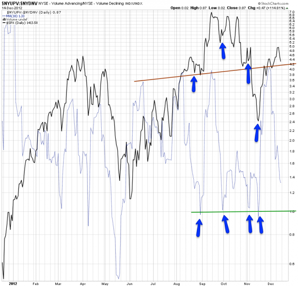
NYUPV:NYDNV – we are looking at a ratio between the NYSE up volume and its down volume. In the past six months this ratio is bouncing between two parallel trend lines, the upper one is on a slight rise. The bottom happens to be situated almost exactly at the 1.0 mark and it is there where usually bounces occur. They can be short term as well as medium term.
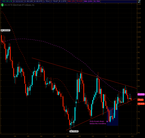
Here’s the Dollar – always looking ready to slide into the abyss. However the monthly chart reveals two converging trend lines, and we are near the tip of it. It’s also sitting between the 100-month and the 25-month SMAs – thus whatever happens here in the coming quarter will most likely have profound long term implications on the greenback.
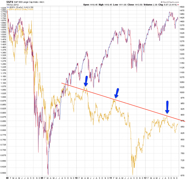
SPX versus gold – I have a similar more long term chart which I usually pull out to demonstrate what I call the ‘hidden tax on the ignorant’. However what’s also rather interesting is the solid upper trend line that has been forming on the SPX:Gold ratio. It seems that, at least when measured in gold, there is a clear ceiling on the equities side.
You may recall this SPXA200R chart – I post it every once in a while. For the uninitiated – you are looking at the percentage of all SPX symbols trading above their 200-day SMA, it’s an expression of LT market breadth. Once again there is a descending trend line which appears to act as an upper ceiling.
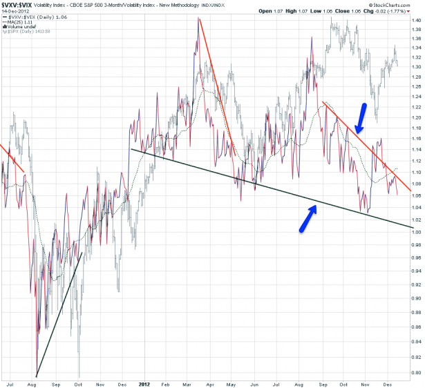
VXV:VIX – which means we are looking at a ratio between quarterly IV vs. 30-day IV. Once again we notice two distinct trend lines – the lower one has been developing all year and appears to be where bounces happen, short or medium term. Another benefit of watching the lower trend line are various bullish divergences that suggested the market was getting ready for a bounce.
The less pronounced and more recent trend line in red is however the one that has my attention currently. It’s clearly pointing downward suggesting that market makers are expecting potential trouble ahead in the new year. Perhaps it’s nothing and we’ll bust through it in the final weeks. But if not then I suggest extreme caution on the equities side as we head into January.
I have one bonus goodie left but you need to be a subscriber to see it
[amprotect=nonmember]
More charts and non-biased commentary below for anyone donning a secret decoder ring. If you are interested in becoming a Gold member then don’t waste time and sign up here. And if you are a Zero or Geronimo subscriber it includes access to all Gold posts, so you actually get double the bang for your buck.
[/amprotect]
[amprotect=1,13,9,12,5]
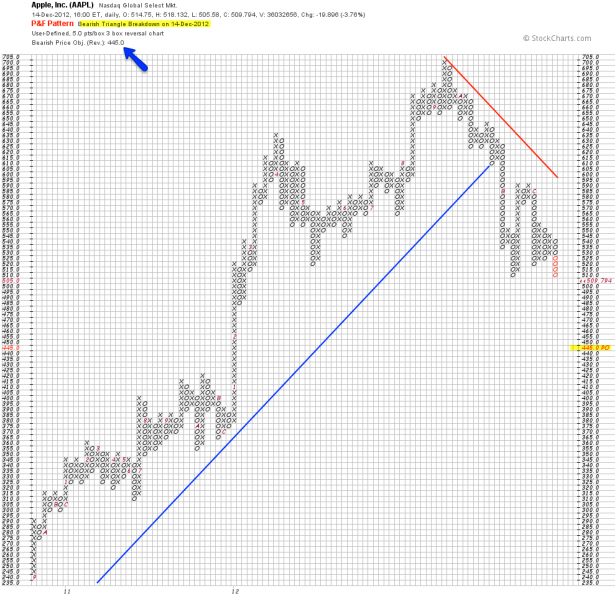
AAPL – what you probably do know is that it painted a brand spanking new low of 505.58 last Friday. What you may not know is that it also triggered a bearish triangle break down on it’s P&F chart that very day. The bearish price objective now is 445 – if you are not positioned yet and interested in riding this little horsy then I suggest you use the hourly panel to find an entry. I will also keep an eye on it for you guys of course and suggest short entries as they present themselves. Of course a P&F price objective is not tantamount to divine premonition – thus we are also looking a possible bounce here near the lows. And to that end once again our ST panel shall be our guide.
[/amprotect]Cheers,


