Long Term Musings
Long Term Musings
I don’t really see any compelling setups today, so I decided to look over my long term charts. And I’m glad I did as this gives me an opportunity to introduce some of you new readers to some of the charts we have leveraged quite effectively in the past few years:
Alright, let me explain what’s going on here – it may all look a bit complicated but makes perfect sense once you know what to look out for:
[amprotect=nonmember]
Charts and commentary below for anyone donning a secret decoder ring. If you are interested in becoming a Gold member then don’t waste time and sign up here. And if you are a Zero subscriber it includes access to all Gold posts, so you actually get double the bang for your buck.
[/amprotect]
[amprotect=1,13,9,12,5]
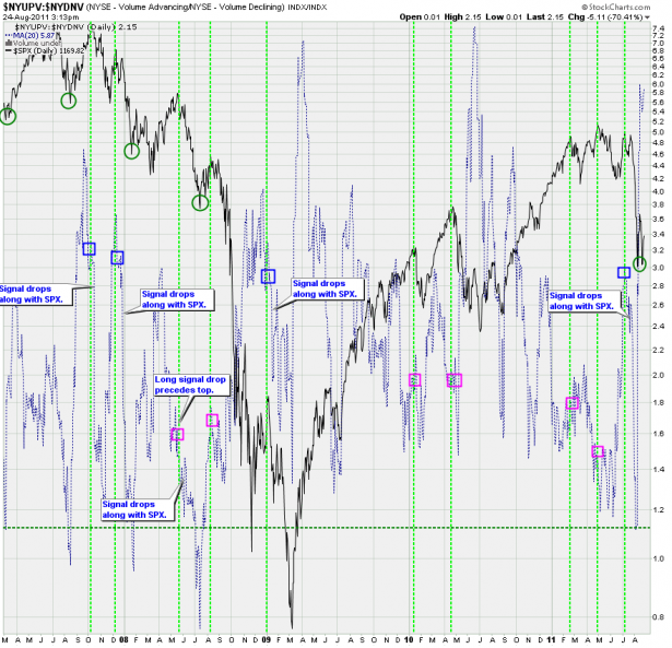
Sometimes reading a chart requires some out of the box thinking as the signal lines whip all over the place and one is tempted to use moving averages to slow things down. This works in some cases but it doesn’t in others. This chart is of the latter kind and it actually took me months to grasp what’s going on myself.
For starters this is a ratio between NYSE advancing and declining volume. What’s quickly apparent is that it’s very relative and doesn’t give us much in terms of reliable sell or buy lines. So it’s easy to dismiss this chart until you look closer. What I have done is to paint little squares on the signal line whenever there was an impending drop and circles when there was an upcoming rally. Having done that we begin to see a change in the characteristic of how the signal line behaved during bear and bull markets. During bear markets, especially during the early phases, we see strong spikes up as the price dropped along with the signal shortly after. In contrast during the last three years we see the signal spike and then work itself lower while the SPX continues to happily melt higher. Medium term drops do not gain traction until the signal line is almost near the bottom of its range.
So, although this may sound academic it provides us with important clues as to how investing/trading behavior shifts over time – obviously according to the overall ongoing trend. A bull market encourages dip buyers to come in early and to late stragglers to overstay their welcome – it’s the inverse on the way down.
If you look at the current signal you’ll see that it’s in pretty high territory not seen since summer of 2010. And what happens next is very important:
- If we paint a signal high and then start dropping while the SPX rallies higher than that would imply that the August 2011 wipe out was only temporary and that the longs still may get their mojo back. Maybe for weeks, months, or longer.
- If we paint a signal high and then start dropping while the SPX follows suit shortly after then this implies that we may be looking at a medium to long term correction here and that this year will most likely close below the SPX 1000 mark.
I know these are rather subtle observations but when taken in context with other charts they often prove to be valuable and help paint an overall picture where on the surface there is only chaos and emotion.
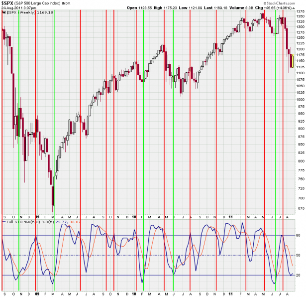
Next in line is my weekly stochastic on the SPX and although it’s rather simple at first sight there are important implications some of you may not be aware of. I am sure most of you understand that a brach of the 80% mark from above usually is a harbinger of lower tape to come – similarly a breach of the 20% mark usually means that we are pushing higher in the coming weeks. I have painted lines on major highs/lows and it seems this chart holds up rather well and supports that assumption. Sure, there are times when we get a fake out but usually it’s only a retest and soon followed by the real thing.
Now, the current signal is very interesting – for one we never closed below the 20% mark, which is rather surprising after how far we’ve dropped. Perhaps it all happened too fast but at this point it seems that we may be bouncing off the 20% mark. Perhaps it’ll be only for a few weeks and then we drop lower but the fact that we did not drop below the 20% and then swung up to breach it implies that a temporary low may be in.
What I expect to happen much later is an eventual drop below the 20% mark and for the signal to then remain embedded for a while – that’s a different subject and I’ll talk more about it once we get there.
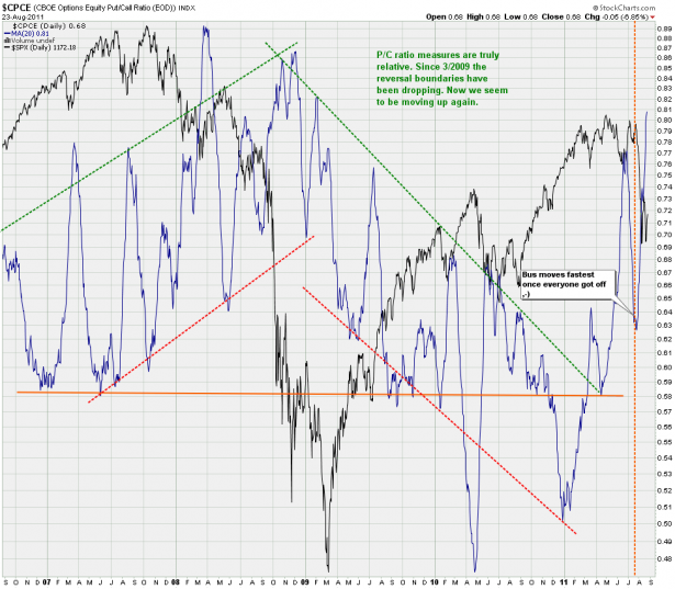
If you have been trading the tape for more than a year or two then I’m sure you’ve heard the expression that the bus moves the fastest once everyone got off. Well, my 20-day SMA of the CPCE (i.e. CBOE put/call ratio) proves that very point. I have drawn a dotted line at the recent highs. As you can see a lot of folks went short during that first dip down from which we recovered. After that the CPCE dropped like a rock and the rest is history – the bus once again left once the majority was betting on the long side. Let that be a lesson to you – when it comes to trading the majority is rarely right – especially once we see extreme sentiment and widespread complacency.
But who are we to complain? The market is a zero sum game – in order for big gains on your end there must be equally big losses on someone else’s side. It’s not politically correct, and no – it’s not fair – but the markets just like the universe we live is rather indifferent and does not care what any of us think or believe in. It does what it does and we are just along for the ride – may as well enjoy it


