Long Term Update – Continued
Long Term Update – Continued
Friday I indulged in a more comprehensive review of what to expect long term across our favorite trifecta – i.e. the equities, currency, and commodities side. As Sunday is traditionally my opportunity to step back from the daily grind I decided to fill in our macro perspective yet a bit more. In particular since we are seeing some movement on a number of my most trusted long term charts.
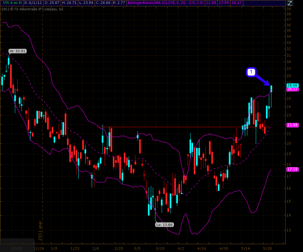
Before we dive in however here’s a quick update on the VIX which painted a first step toward a VIX buy signal on Friday (noobs – the term is relative to equities). As most of you intrepid steelrats know by now we require another close inside the 2.0 BB followed by another lower close in order to get confirmation. So please, don’t back up that truck just yet. In case we actually do see a bonafide VIX buy signal this week keep in mind that vega burn is a real bitch and for that very reason you may want to go back and re-read my recent post titled How To Trade Vega At Market Bottoms.
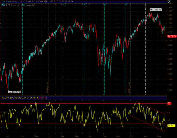
With that out of the way let’s get started on the long term. As simple as this oscillator chart may be – it happens to be one of my favorite ones as it has been ticking like a swiss watch over the past few years. Note the juicy divergence at the recent highs and in particular the developing channel to the downside I have taken the liberty to highlight. Quite often a bounce near the 30 mark is what I am on the lookout for but this downward channel has shifted the dynamics a little. It’s not unreasonable to anticipate another stab lower here. Several of the charts shown below seem to agree and we have barely scraped the surface – please step into my tackily decorated mediterranean lair:
[amprotect=nonmember] More charts and cynical commentary below for anyone donning a secret decoder ring. If you are interested in becoming a Gold member then don’t waste time and sign up here. And if you are a Zero or Geronimo subscriber it includes access to all Gold posts, so you actually get double the bang for your buck.[/amprotect] [amprotect=1,13,9,12,5]

I have said it before and I’ll say it again – if I have to choose between equities and bond traders I’ll believe the latter every single time. And apparently for a reason. The rest – as they say – is history. But now you know why I keep seeking out divergences such as this like a sidewinder missile.
While we’re on the divergence theme. Declining vs. advancing NYSE issues ratio – I posted this chart many times since the highs. Of course, if you weren’t a sub you probably found yourself on the wrong side of somebody’s trade. And until we start dipping lower here it’s reasonable to assume we’ll complete our current P&F target of 1225.
Here’s our ratio between NYSE stocks above their 50-day and 200-day SMA. As you recall that extended divergence near the top was a bit of a head scratcher to me. It took longer than I expected to resolve but then really picked up the pace. The question more recently was whether or not we would bounce on that support line. And we did but snapped right back at the resistance line. That is bearish until we breach above. Which means a push above 0.45 in the next week or so.
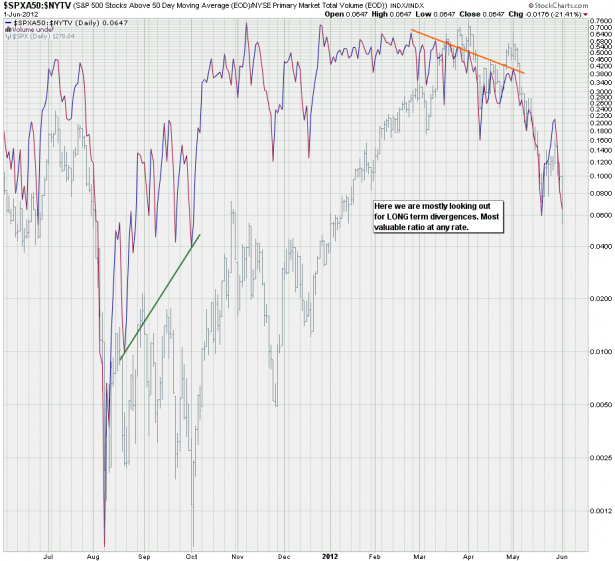
Here is a new creation of mine: I am taking the number of all SPX stocks above their 50-day SMA and correlate that with total NYSE volume. Basically I want to see how much volume keeps any rally afloat. As you can see this is a LONG LONG term indicator – we are talking months before a divergence really makes itself felt. But definitely worth keeping around, wouldn’t you agree?
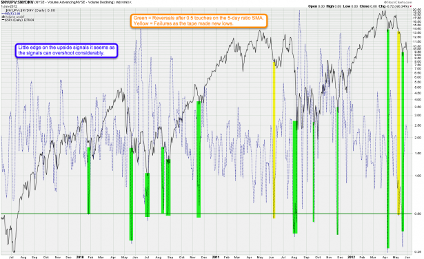
I have shown this one recently but I have improved it a little bit to make it more clear. This is a ratio between NYSE advancing/declining volume. It’s not an easy chart to plot until you find the right SMA to slow it down and then suddenly a pattern emerges. Apparently the 0.50 mark has been been good for a reversal for the past four years or so. I only see one and a half failures – the first one I would call delayed and he second one is a definite fail. But we seem to be back in the swing of things as we had a nice bounce just recently again. Also apparent on this chart is that there seems to be more downside potential before we should expect another bounce.
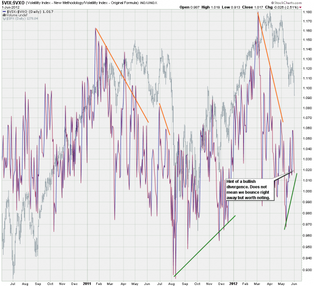
And now we are getting to the good stuff. Someone mentioned the VIX:VXO ratio the other day and since that is one of the charts in my arsenal I meant to cover it in more detail. Before we get to the divergences let’s revisit why anyone would even consider plotting this ratio. Well, it’s not really that complicated. As may of you (may) know the difference between the VIX and the VXO is that the former is based on the S&P 500 and the latter on the S&P 100. What some of you may not be aware of however is a key difference – let me quote right off the CBOE site:
The new formula that will take into account a broader range of strike prices (rather than using only near-the-money strikes as the original-formula index did). Each strike price will be weighted, with at-the-money strikes having the most weight. The new formula is intended to make VIX a better index for investors who manage risks associated with the growing markets for volatility and variance swaps.
Well, assuming that the CBOE has continued to use near the money strikes for calculating the VXO here’s why. We want to know when market makers price volatility on the front higher than on the back. I don’t have a wire into the CBOE but the chart above seems to strongly indicate that this is the case.
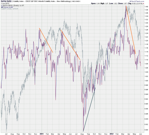
Here’s a similar ratio – this time it’s the VXV divided by the VIX, which in essence compares a three month to a one month volatility window. And again those long term divergences gives us strong indication that market makers usually have early insights (or very good instincts) on when the tape may plot a reversal. May I say that the one at the very top was absolutely magnificent. And no worries – I will keep this chart part of my regular rotation. Right now and here we seem a bit divergent but it’s too early to call for a bottom.
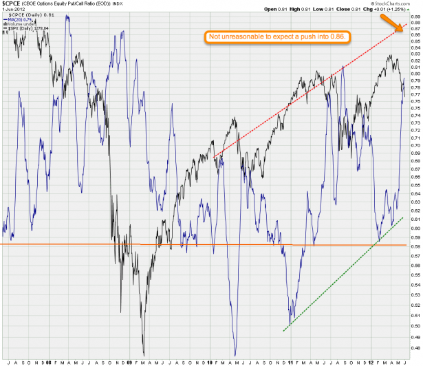
CPCE – a definite jump here but we seem to have a bit more space to run. Bear in mind that this only shows us upside potential – in the end I trust my price based support/resistance clusters more.
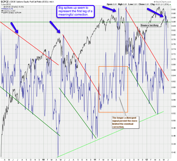
Here’s a variation on the theme – I’m using a 5-day SMA this time which reveals a bit more detail. Observe how we seem to have a repeating downside channel fractal here, usually launched by a fast spike to the upside which resets the pattern. As we just spiked higher there is still potential for a bit more downside BUT it should be considered a late stage drop, so we need to look out for any bottom signals. A touch of our SPX 1225 P&F target is where I would probably suggest stepping aside.
Bottom Line: It is always very difficult to predict downside targets after a strong sell off. Oversold conditions can maintain for longer than anticipated but I nevertheless prefer to pull the plug near reasonable price targets and then step aside. If I miss a quick stab lower then I console myself by the fact that I prefer to wish being in a trade then being out of one.
Consider a possible impending VIX buy signal, consider our P&F target, also keep in mind the medium/long term charts on the currency side I presented on Friday. If ole’ bucky is starting to reverse it will give equities a little breather which may be an opportunity for dip buyers to step into the fray. But right now and right here we are still officially in downside mode until we see clear signs that a floor is in place.
[/amprotect]Cheers,


