Market Breadth
Market Breadth
This will be a continuation of my previous weekend post titled ‘Tops Are A Process‘ – if you missed it please check it out as it remains relevant today. Since last week the SPX has been inching higher by a mere seven handles, which nevertheless is remarkable as the past two weeks appear to be part of a sideways correction. Many of you continue to wonder how much longer things can melt higher. To gain a better perspective we once again take a peek at market breadth and how it relates to price.
For the uninitiated – let me assure you that market breadth is completely unrelated to poor dental hygiene – ask any Brit. Here’s a good definition right off Investopedia:
Market Breadth: A technique used in technical analysis that attempts to gauge the direction of the overall market by analyzing the number of companies advancing relative to the number declining. Positive market breadth occurs when more companies are moving higher than are moving lower, and it is used to suggest that the bulls are in control of the momentum. Conversely, a disproportional number of declining securities is used to confirm bearish momentum.
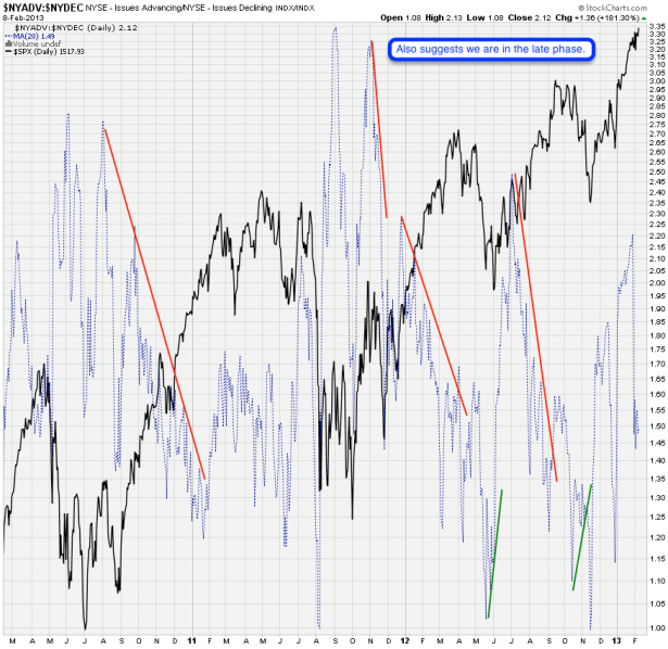
Now that we have the theory in the bag let’s look at reality, which if you are unfamiliar with this chart should be rather sobering. The blue line is a 20-day SMA of the NYSE Advancing vs. Declining issues. Unless you are crossing the road assisted by a guide dog I have full confidence that you are able to make out the glaring divergences that form near meaningful market tops. This by the way is a phenomenon that has become intensified post 2008 after Bernanke started dropping cash out of helicopters (he never stopped by my house however).
The lesson here is that divergences start to form rather early in the game and take quite a bit time to resolve eventually. Usually it takes a spike above 2.00 followed by a drop into 1.40 to even get close to triggering a medium term correction.
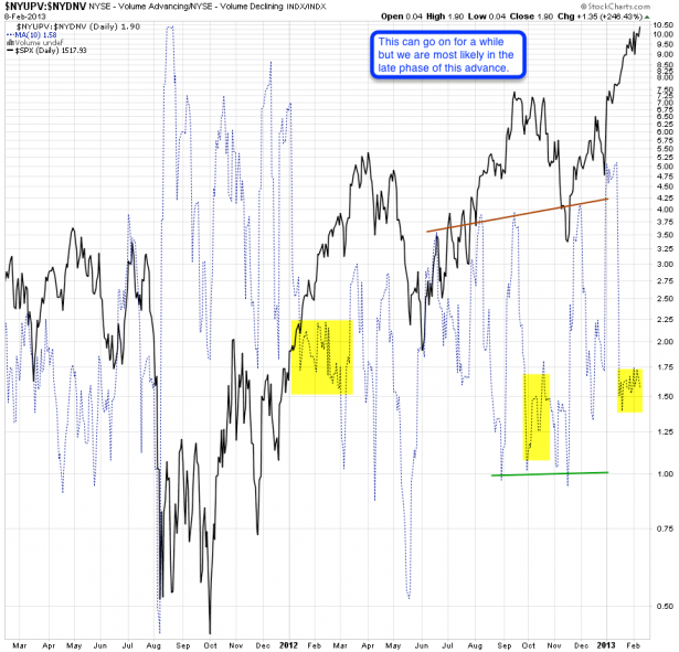
Somewhat related is advancing vs. declining volume. I actually find this chart a bit easier to read and just like my wife this one tells me ‘wait – just a little longer’. There was a sudden drop halfway on the way up and since then the ratio has been creeping sideways between 1.5 and 1.75. It would not be unreasonable to expect a quick (fourth wave – cough cough) correction followed by a final push into our original 1600+ P&F target.
The take away message from both of these charts is that tops take time. The first bears on the scene usually wind up stuffed and mounted up at some market maker’s holiday lodge.
[amprotect=nonmember]
More charts and non-biased commentary below for anyone donning a secret decoder ring. If you are interested in becoming a Gold member then don’t waste time and sign up here. And if you are a Zero or Geronimo subscriber it includes access to all Gold posts, so you actually get double the bang for your buck.
[/amprotect]
[amprotect=1,13,9,12,5,10]
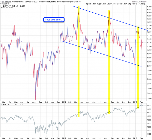
Here’s another way of looking at it. VXV:VIX – if you’ve been a subscriber for more than a month or two you are familiar with this ratio. Basically we are looking at front month vs. quarterly implied volatility. If the ratio rises it means that quarterly IV is outpacing that of front month IV. Translation: market makers are getting a bit antsy on the quarterly end, or really careless on the front month end.
So what has been the pattern here since early last year? A slow increase as markets run higher followed by again a divergence which manages to descend quite a bit before price responds. At least on the prior pattern we may run a bit higher before things start to top out.
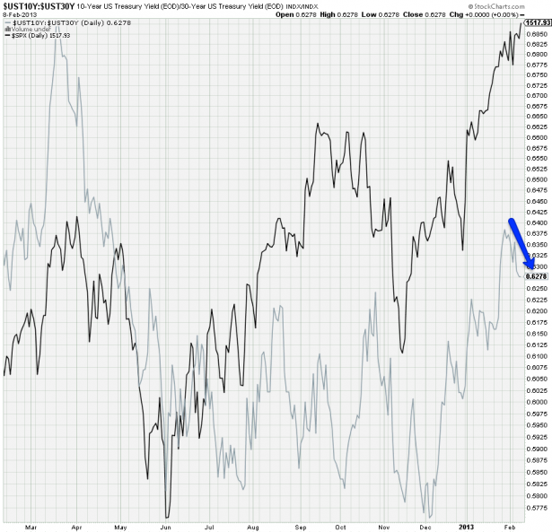
Sometimes the 10-year vs. the 30-year has given me early indications of what to expect on the equities side. But most recently it’s been mostly running alongside equities. Interestingly the ratio shows me a correction, which apparently on the equity sie resolved sideways.
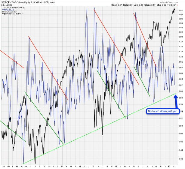
This is my CPCE Deluxe chart – I created it years ago and it has given us much joy since then. That green line has been working like a charm for us and we got close but have not market another touch down. What happens after a touch of that trend line? Usually a correction is usually a few weeks out. Now given that we haven’t touched 0.60 just yet I’m comfortable with keeping my bear suit safely mothballed.
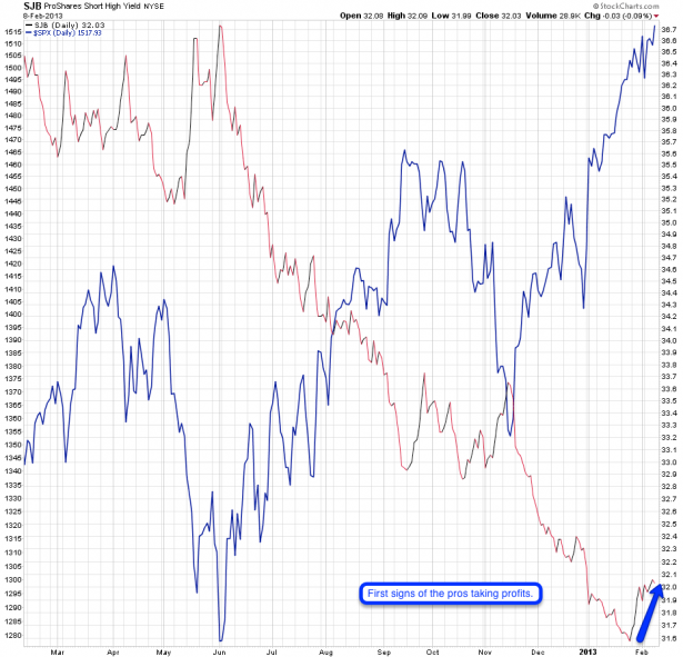
SJB – this index is designed to provide a broad representation of the U.S. dollar-denominated high yield liquid corporate bond market. As a side note – for the first time since 1991 the amount of corporate paper outstanding in the US is higher than the amount of mortgage related securities [source: soberlook].
This means it moves inversely to the price of corporate junk bonds (which are a bit ambivalent right now). When the fund’s price is falling, it is an indication that traders are more willing to hold risky assets. It’s been falling in lock step with the rise in equities, until late January that is when it started to push higher. Usually an appreciable bump in the fund signals a return to risk aversion. If this divergence continues then we should take note. Equity traders are usually last to get the memo but in the end gravity always does its thing.
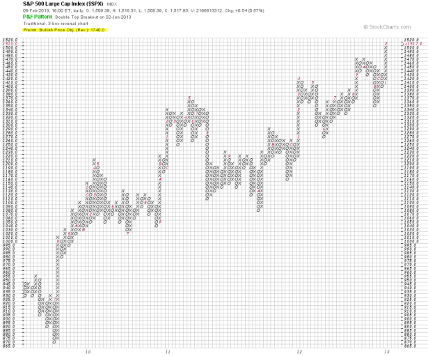
Bottom Line: At this very moment there are very few reasons to be long term bearish. There are sufficient reasons to be medium term cautious as we may be heading into a intermediate/minor term correction. However based on what I’m seeing in my chart universe there is sufficient room for a final spike higher, thus satisfying our P&F price objective which originally was 1660 and has now been upgraded to 1740. Quite frankly I find this rather optimistic and it may take a year or more to get there, but on a medium term basis a touch of 1600 has pretty good odds.
[/amprotect]Cheers,


