Momo Update W1617
Momo Update W1617
We’ve watched the tape gyrate on a slow downward trajectory for several weeks now and a final resolution, to the up – or down – side, continues to evade us. Which I’m sure has been jittering quite a few nerves out there, especially given that many participants are unaware of or unwilling to embrace the reality of distinct market cycles. Which unlike our seasons seem to come and go in fairly unpredictable patterns, much to everyone’s chagrin. However acceptance of a cyclical market is tantamount to survival as a trader, as has been the recognition of and then response to climate variations throughout our evolutionary history.
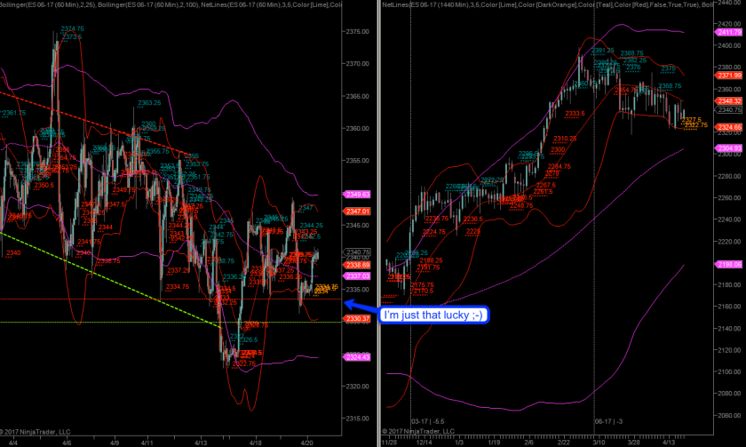
Now maybe you were smarter than me and did not decide to move your stop to 0.5R yesterday which would mean that you’re probably still in the game. Yes, I am just that lucky it appears. But given the continuing level of intra-day volatility in equities I am not certain that another stab lower isn’t in the cards.
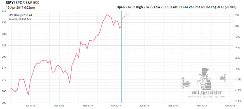
However with all that going on I decided to consult my momo charts in order to get a better idea of where we stand and whether we should expect further downside as we push into May. Let’s first consult our seasonal outlook courtesy of Financhill – click on the chart or here to look at a dynamic version plus some juicy stats.
So apparently April into May is seasonally bullish – these are the stats:
- Over the next 4 weeks, SPDR S&P 500 has on average historically risen by 1.9% based on the past 24 years of stock performance.
- SPDR S&P 500 has risen higher in 17 of those 24 years over the subsequent 4 week period, corresponding to a historical probability of 70%
- The holding period that leads to the greatest annualized return for SPDR S&P 500, based on historical prices, is 1 week. Should SPDR S&P 500 stock move in the future similarly to its average historical movement over this duration, an annualized return of 71% could result.
Okay, that’s all a bit theoretical but is giving us something to work with. Whether or not it explains the market’s inability to produce what I would call a technically healthy correction is of course open to debate. But instead let’s be constructive and look at our momo and breadth charts:
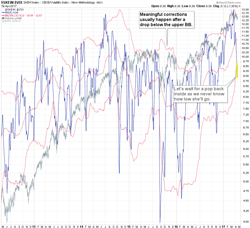
If you are a sub then you may recall this chart which I posted late last month in my momo update. It’s a rather exotic ratio between the CBOE’s SKEW and VIX indices. I then added a Bollinger Band (BB) which supplanted manual channels I had drawn earlier – as a matter of fact this chart has gone through several evolutions over the past few years. The current version of this ratio is slightly smoothed but still seems to do a great job of highlighting potential reversal periods, to both the up and down side.
As you can see the ratio is currently pushing below its lower BB, which judging by prior precedence appears to accompany selling exhaustion after a pop back inside its BB. I know what you’re thinking – WHAT selling exhaustion?
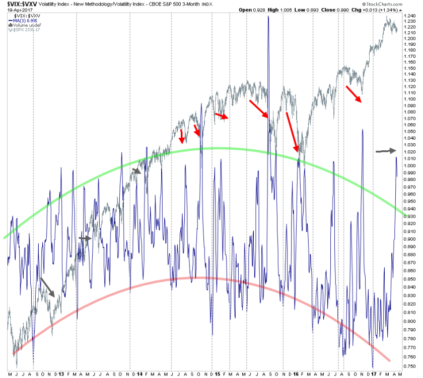
But let’s not jump to conclusions just yet. Here’s the VXV:VIX ratio onto which I have drawn two parabolas once again demarking reversal zones – I’m sure you can guess what the green and red colors mean. Once again we are way above the current bullish reversal threshold, but just like with the previous chart we need to wait until we see a drop back below our threshold.
Of course there’s more – please join me in our private lair:

It's not too late - learn how to consistently trade without worrying about the news, the clickbait, the daily drama and misinformation. If you are interested in becoming a subscriber then don't waste time and sign up here. The Zero indicator service also offers access to all Gold posts, so you actually get double the bang for your buck.
Please login or subscribe here to see the remainder of this post.


