Point And Figure Frenzy
Point And Figure Frenzy
It’s that time of the month again when we take a step back from the daily grind and revisit some of our more salient point and figure charts. So grab a cup of java or your favorite tea – we have a lot of material to cover. If you are a P&F noob then don’t despair – here’s a quick and dirty write up which should should answer all the questions you may have and never dared to ask. Let’s first delve into the equities side which has lead us beyond previously established bullish price objectives:
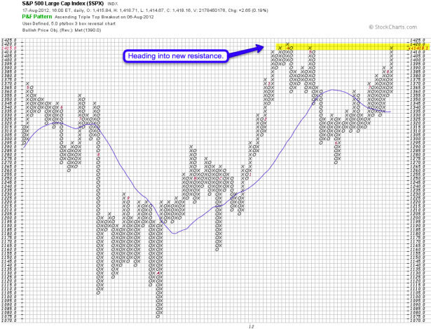
S&P 500 – met its 1390 PO and decided to just keep going. I have already suggested price targets on my weekly SPX chart but have also made a point about the fact that we are technically in limbo here. Meaning, a correction should have occurred and the fact that it has not puts us in a waiting loop. There is no sense in trying to satisfy our ego by forcing things. Yes, we may turn at 1420 but if we keep running the prevailing short squeeze will suffice to keep us beyond technical target points – in particular given low volume summer sessions.
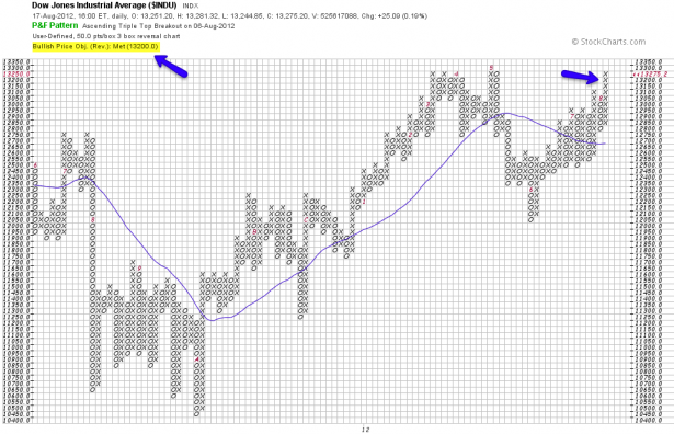
Similar picture on the DJIA – price target fulfilled and heading into previous price highs. Let’s use this chart to also bring in another aspect of P&F charts some of your may be unaware of. Whenever I see a long line of crosses what comes to my mind is what it would take to reverse the medium term trend. Various patterns exist but given the current outlier (particularly on the SPX) what I am looking for is an ‘early warning’ (on a medium to long term basis – we are obviously cover more short term material during the week). The one that has worked for me quite well is the high pole reversal. To quote stockcharts:
The high pole warning is given when a chart rises above a previous high by at least 3 boxes but then reverses to give back at least 50 percent of the rise. The reversal implies that the demand that was making the prices rise has given way to supply pressure. The pattern is a warning that lower prices could be seen in the future.
Like a good chess player we always want to think several moves ahead when it comes to our medium to long term strategies. Let’s assume for a moment we reverse right on Monday and keep heading down. Given the above rules it would take us 5 boxes (as we painted 9 up) to trigger a high pole reversal warning. Now, even if we get that one then the current uptrend is not officially threatened unless we trigger a bearish reversal pattern.
And the above is the most bearish scenario on a long term basis. Let’s imagine for a moment we keep on climbing higher. For every handle the Dow climbs higher our high pole reversal trigger climbs up by half a handle as well. Quite a sobering thought given all the technical warnings we’ve been seeing. But let’s constantly remind ourselves that August is a fine month for trend traders and if you are stubbornly betting on mean reversion you may be getting burned.
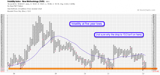
Trending markets or not – I personally have a hard time being long while Mr. VIX is down bubble and approaching the Mariana Trench. I don’t know why the drop to 13.3 isn’t on this chart – it should have been and painted another x at the 14 mark. There is one pertinent long term ratio I have been mapping and it’s one you definitely will want to see – please step into my lair:
[amprotect=nonmember]
More charts and non-biased commentary below for anyone donning a secret decoder ring. If you are interested in becoming a Gold member then don’t waste time and sign up here. And if you are a Zero or Geronimo subscriber it includes access to all Gold posts, so you actually get double the bang for your buck.
[/amprotect]
[amprotect=1,13,9,12,5]
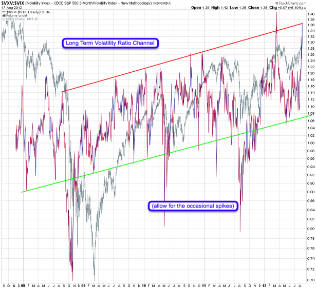
You may recall that I like to plot the VXO against the VIX for short term reversal warnings. On the medium term I scale up to the VXV and drop the VXO. The resulting chart you see above is a VXV:VIX ratio plotted over the past five years. What should stand ou to even a novice chartist is an obvious rising channel, only occassionaly broken by sharp spikes – in particular to the downside. Which is not surprising if you understand how fear and panic easily leads to leptokurtic market periods.
More salient at the current time is the fact that we are again approaching the upper channel, once again adding to my list of arguments advising against riding the current advance in equities any higher. The number one rule for me as a trader has always been that of capital preservation. In other words – all those great setups we may see in the future are meaningless if I waste trading capital to chase low probability setups to satisfy my ego or to nourish a perma- bear perspective on the market. Once the market is ready to turn it will let us know – until then it’s a a bull market, you know?
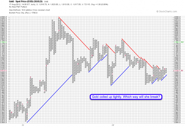
Gold is wind up so tightly I am very much looking forward for it to snap. Recent attempts at catching a ride higher have failed and at this juncture we are relegated to trading the weekly swings (please see my previous post for more details). But that does not mean that we are giving up on this beast altogether. If you cut out all the noise of the past two years then it’s rather clear that we are coiling up and are now near what I would consider a possible release point. Either direction here would be equally exciting – if it’s the upside then the suggested bullish PO of 1780 should be worth all the pain it takes to get there.
Copper – once again bumping against resistance. I don’t sense a real direction here but as it used to be a good indicator of what to expect on the equity side I keep watching it closely – so should you.
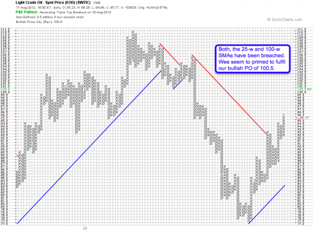
Crude – what a trooper – it managed to breach the 25-w and 100-w tangle and is now free to fulfill its bullish price objective of 100.5. You yanks with your big SUVs are not going to have fun at the pump later this year. Believe it or not – the Mole is driving a moto these days as I absolutely detest driving a car over here in Europe. Have you seen the parking spaces over here? I couldn’t fit a bicycle into those!
On to currencies – Aussie Dollar dangerously close to triggering a high pole reversal warning. If you read the pertinent passage higher up then this chart illustrates the rule rather nicely.
The Euro seems to be slowly building a floor here. No guarantees as the previous attempt failed ignominiously but thus far it’s holding the line. We even have a bullish price objective here which of course flies in the face of any bearish theories on the equities side. Another reason to treat carefully and let things play out before making any big bets to the downside.
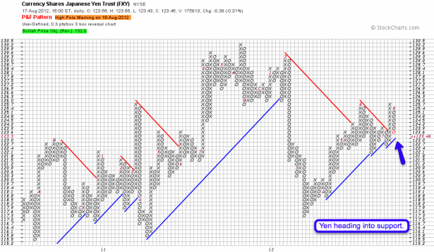
Yen – already triggered a high pole reversal warning and is now approaching long term support. If we breach 123 (easy to remember) then it can kiss that bullish PO goodbye for a while.
Here’s the XLF – a relatively new addition to our P&F team. Nothing really exciting has happened here recently but I noticed something rather interesting. The fact that we have been in a very small range during the past few years (the visualization of which is another strength of P&F charts) made me think as the most previous occurrence was in 2006 and 2007. I am not going to jump to wild conclusions but one may wonder how high equities can go while the financial sector as a whole is going nowhere.
If that doesn’t make sense to you then here’s a regular LT chart which should convey the gist of what I’m suggesting.
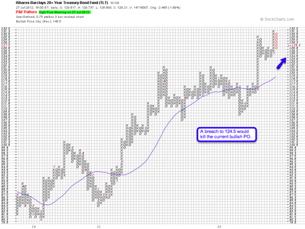
Last but not least here is your favorite treasury ETF – TLT: What a bullish chart but there seems to be trouble in paradise as we have triggered a high pole reversal warning. A breach of 124.5 would disqualify the bullish PO, so let’s keep an eye on that. Either we get a great long setup here or a chance to trade a retest of that SMA, which would get us near 118.
[/amprotect]
Cheers,


