POMO Update
POMO Update
I hope you guys can forgive me for taking Eastern off – as a matter of fact I was actually working on ZeroFX a little and will soon have some very exciting news to report. Today however it’s time for our popular POMO update series in which we plot the amounts of free cash being thrown and banksters worldwide.

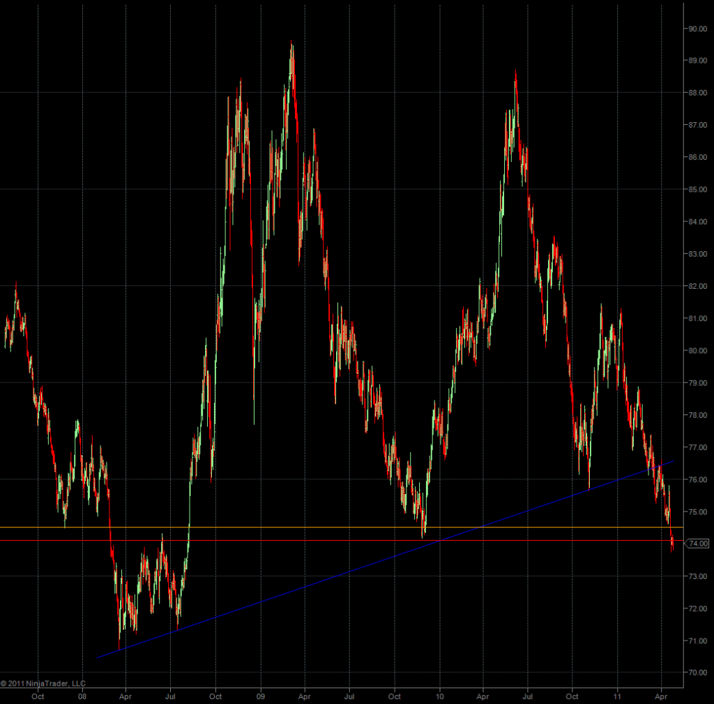
Of course the result of all this all this money creation and lending at zero interest has been a shift into the short end of the treasury curve and a slow but consistent destruction of the U.S. Dollar:
A few months ago I responded to EWI’s incessant Dollar sentiment references with a warning. I basically stated that as long as the Fed kept printing and lending at zero at an increasing rate a bearish extremes in Dollar sentiment would not matter. Well, this is one where I would have preferred to be proven wrong – but unfortunately wound up being right (again).
Reminder to myself: I’ve got to stop drawing lines on this damn chart as every time I put up a new one it’s being breached a short while later. Quite frankly I have no clue as to when the DXY will find even a temporary floor – it’s looking grim and the chart I’m about to show you is not encouraging.
BTW, Volar posted a nice Dollar sentiment chart over the weekend, which also clearly shows that bearish sentiment can prevail for months until there is a counter reaction. And that was during pre-POMO days – the game has changed quite a bit since then.
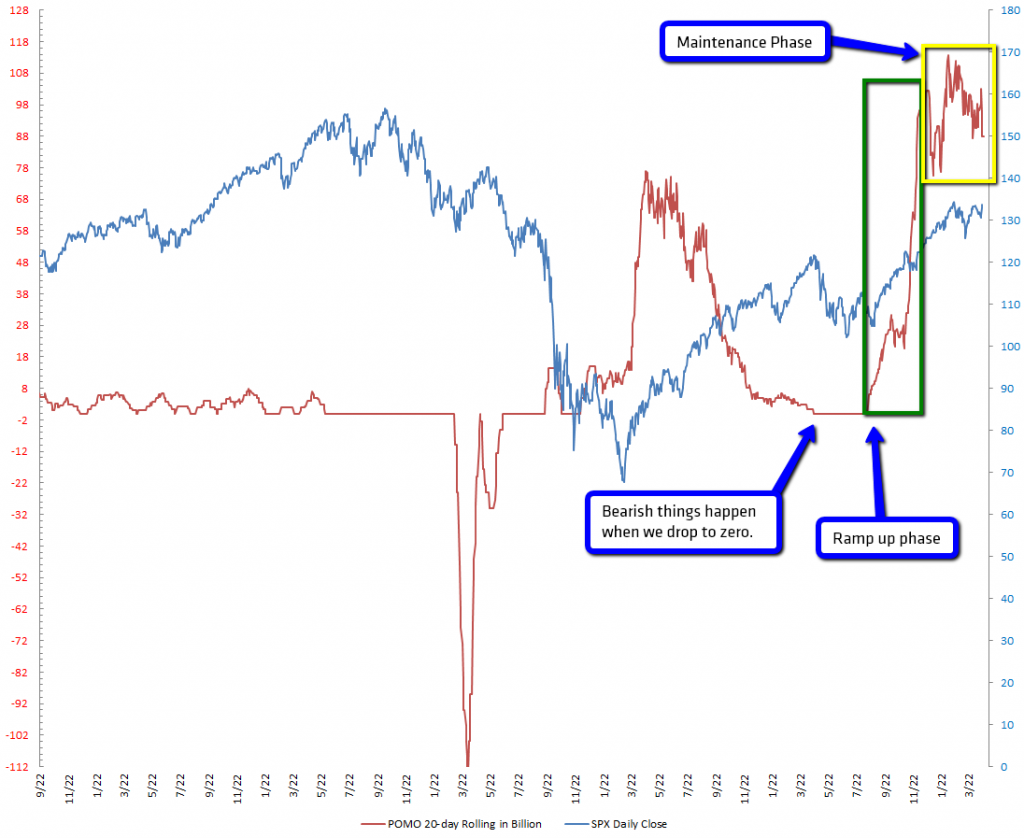
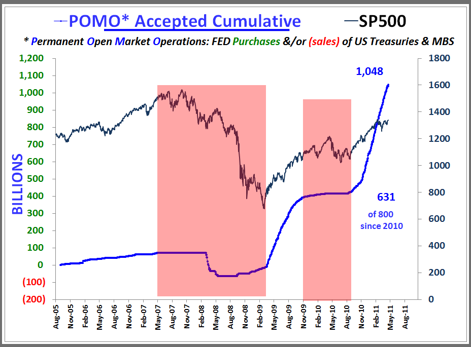
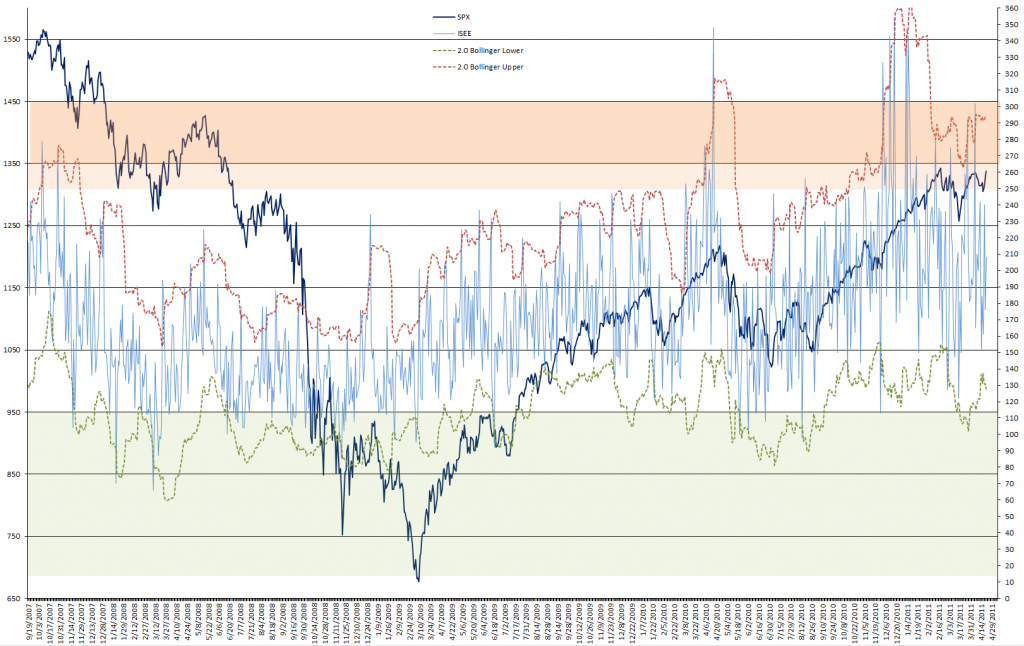
Alright, let’s take a look at our POMO chart – and I also plotted an updated ISEE chart to see whether or not we are anywhere near bullish exhaustion. Finally an update on a few of my sentiment measures to round things up.
In case you’re new here I have marked up the chart a little bit. As you can see the big crash of 2008 happened during a time when the Fed was draining the swamp – i.e. it was pulling liquidity away from its primary dealers. Once it had ‘convinced’ Congress to grant it bail out cash and authority (I’m being polite here as I don’t want black helicopters over the evil lair) it slowly started to inject liquidity and shortly after we embarked on a two year bull feast which was only interrupted when liquidity once again reverted to zero (i.e. the flat line at zero). The Fed would not stand for that and just when everyone started buying puts in the face of a major inverted H&S pattern it suddenly ramped up liquidity again and the rest is history. We peaked at about $120 Billion and since then the Fed has switched things into maintenance mode, never dropping below $70 Billion. We can only assume this is going to continue until the cash (i.e. QE2) runs out.
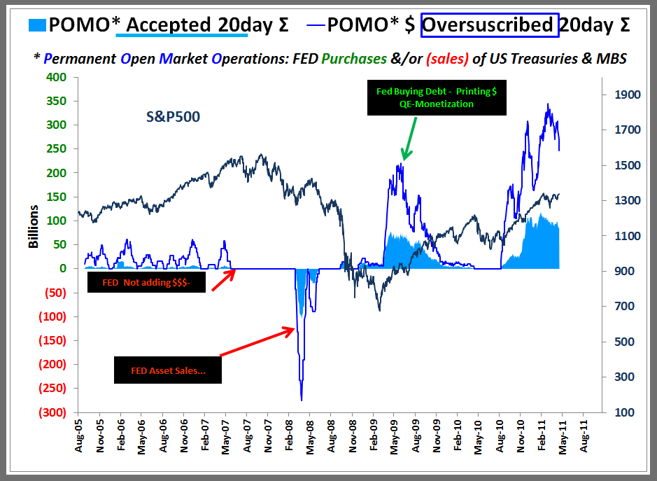
UPDATE: Volar just sent me his versions – here they are:
First one is pretty similar to mine – and same conclusions.
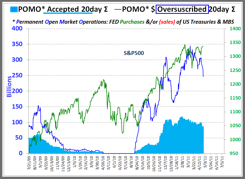
Second one shows POMO purchases in relation to purchases/sales of US Treasureis & MBS. FYI – 8/13 was the peak of the right shoulder on that inverted H&S last year. That blue line suddenly snaps higher right before the bottom on 8/30/2010. Coincidence? I think not.
Same chart, but this time he’s using the accepted cumulative on the POMO side.
Thanks Volar! Great stuff
Whether or not the Fed will find a way to extend this game beyond QE2 is something I cannot answer. I may want to add however that every time someone (i.e. a bear) has claimed that Banana Ben has reached the end of the line and equities couldn’t possibly push any higher the Fed pulled another rabbit out of its hat and proved them all wrong. Suffice to say that expecting equities to drop more than a few handles appears to border on heresy these days.
Always expect the Spanish Inquisition!
Seriously however – in terms of sentiment these are the conditions I used to go short in back in the days. But I have learned my lesson and then there’s also this:
Again, back in the days an ISEE reading outside the 20-day BB was almost guaranteed to drop the SPX by at least 100 handles. Not these days – the last push outside was via record readings pushing above 340 and it took over two months until equities responded – with a 30 handle drop.
Right now we are in pretty solid neutral territory, which is amazing given that the VIX is hovering around the 15 mark and the SPX is pushing yet again toward 1340.
Which is even more confusing given what I’m seeing on the gold:silver ratio chart. What you are looking at is an exponential drop and bullish sentiment in gold as well as silver is reaching the point where I’m wondering who the hell is selling gold/silver contracts. Always remember – for every buyer there needs to be a seller – and the latter have been taking it up the rectum for a long long long time.
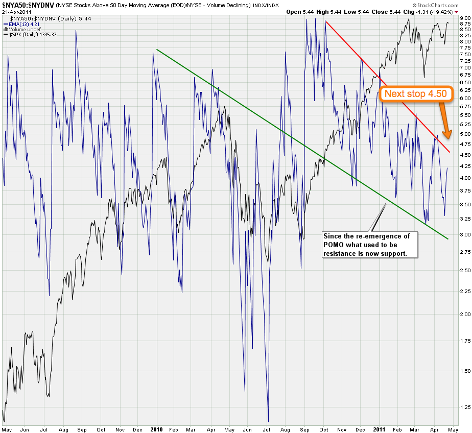
More short term I don’t expect much upside resistance until we push 4.50 on my NYA50:NYDNV ratio chart (i.e. NYSE stocks above their 50-day MA vs. NYSE down volume). If you are a Zero sub I would also recommend to look at the daily chart to gauge that upper trend line which has been good for a short term reversal thus far.
Bottom Line:
I really don’t want to be long here – but I also do not want to be short. So my focus right now is on trading FX, which also explains my recent efforts in developing and now refining ZeroFX. Which btw is showing some very interesting signals that seem to be absolutely spot on in predicting short term reversals. Again more on that in the very near future – this is going to be fun
Cheers,
Mole


