The Flow Of Investor Sentiment
The Flow Of Investor Sentiment
Make no mistake – behind the virtual facade of charts and financial tickers battles are won and lost every day. Wars are being fought where victors engage in a myriad of battle strategies, misdirections, assaults, take overs, and most recently when it comes to the bears – complete annihilation of the enemy. The raping and pillaging however we leave up to our central banksters – and when it comes to the financial markets it’s 9th century England all over again. Bernanke the Terrible has a firm grip on our coast lines and huddling up inland (i.e. in cash) is one’s best defense.
Alright – time to get serious. Sunday is our time to take a step back and to detach ourselves from the daily drama that is the financial markets. Let’s again look behind the scenes as the answers are there – if we adjust the telescope well enough to see a clear picture. Let’s dive right in.
Now many of you have heard of the TRIN. But have you ever looked at the formula and tried to understand how it’s computed? There is a reason as to why we would bother to do such a thing – please bear with me. A quick Google search digs up a great link to stockcharts.com:
The TRIN is the advance/decline ratio divided by the advance volume/decline volume ratio:
((Advancing issues/declining issues) / (advancing volume/declining volume))
Examples of TRIN calculations:
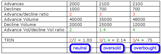
Alright – let’s think this through for a moment. Beyond the formula, which is quite simple, the question arises as to why Richard Arms (the originator) bothered to come up with that formula in the first place? Why would one divide the ratio of adv/decl issues by the ratio of adv/decl volume? That’s right – to visualize divergences between those two ratios. There is that word again that Mole loves so much – divergence – what does it mean to us and why to we care?
Simply – if you see the number of advancing issues outweigh the number of declining issues that’s pretty bullish, right? And if at the same time advancing volume is outpacing declining volume it confirms bullish sentiment. So that would be column one in the chart right above. If however the ratio of adv/decl volume lags behind then that might indicate that we are in oversold territory. That would be column two in the chart above. The inverse examples is shown in the third column in the chart above. This time the advancing issues again outpace the declining issues (obviously this example was written in a bull market – hehe) but the adv/decl volume ratio is even more bullish, indicating that buyers might be getting ahead of themselves. Obviously there are myriads of variances possible here and that is why the TRIN is helpful in quickly determining a market’s trend daily trend.
To quote the stockcharts page again:
{Richard} uses the TRIN to detect extreme conditions in the market. He considers the market to be overbought when the 10-day moving average of the TRIN declines below .8 and oversold when it moves above 1.2. Other interpretations seek to use the direction and absolute level of the TRIN to determine bullish and bearish scenarios. In the momentum driven markets, the TRIN can remain oversold or overbought for extended periods of time.
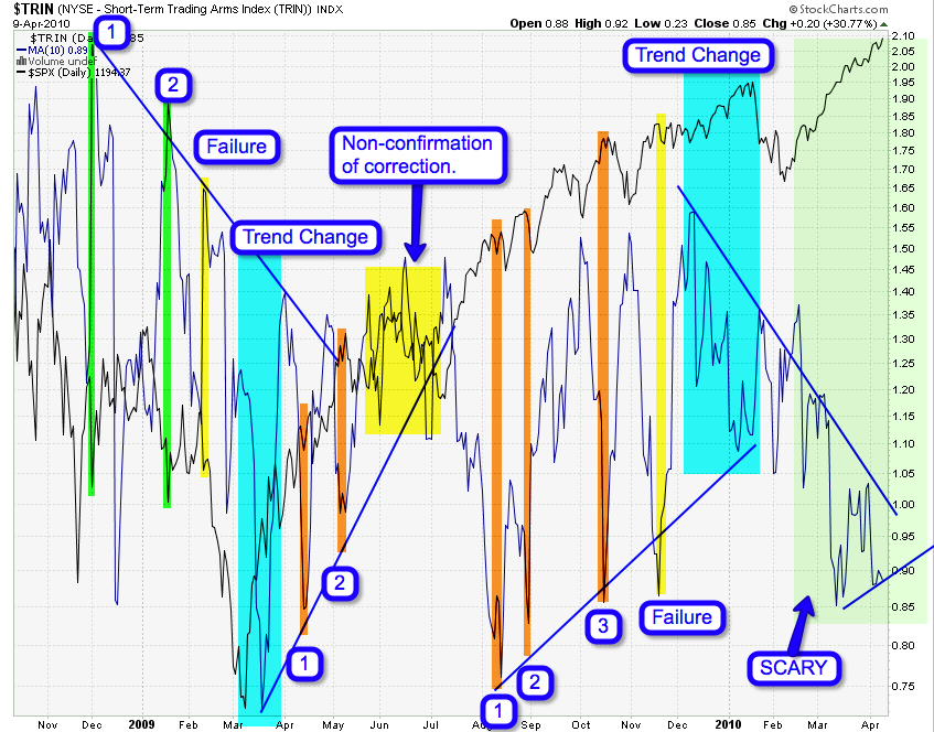
You could probably count me into the latter camp. I personally don’t care about the number that much – I care about where it comes from and where it may go. Which brings me back to my main chart of today:
I know this one looks a bit scary but it really is not – let’s walk through it together. First up – the blue line you see is a 10-day SMA of the TRIN and the black line of course is the SPX – which btw is the equity baseline I personally favor due its scope (i.e. 500 symbols) and method of weighting (i.e. capitalization based).
In order to see long term trends/swings in investor sentiment I use moving averages. This is my attempt to visualize the flow of investor sentiment if you will. What do I mean by that? Well – the chart seems to strongly suggest what we all would probably agree on based on own empirical observation of human behavior and sentiment: What’s overbought today may be oversold tomorrow and the reverse. Let’s again look at my chart – now that you have a in depth understanding of how the TRIN works.
After plotting the chart above it immediately occurred to me that bearish markets seem to experience a gradual down slope in investor sentiment as depicted by the 10-day SMA of the TRIN above in blue. Inversely bullish markets seem to experience an up slope in sentiment – which is what we have been seeing over the last year. In between – at the cusp of trend changes we also see divergences, failures, and non confirmations – a very interesting phenomenon, assuming one can pick them up in time.
Also useful in the chart above are potential long and short contrarian trade opportunities – which seem to be quite accurate when a particular sloping trend line is being touched. Also in that context it is valuable to perceive that the trend line is well formed on the inverse side of the trend – meaning it is easier to pick long opportunities in a down trend and short opportunities in an uptrend. That again in itself in an interesting observation as a trend’s pattern may lead to an early recognition of a long term trend. Maybe I’m getting a bit ahead of myself here – but it bears further study.
The scary part for the bears is the fact that the bullish MA trend line has been broken but was not accompanied by a price correction in equities. Meaning – sentiment has reset to the level where a 10-day SMA TRIN reading of 1 or 1.1 is not considered overbought anymore – the new baseline now again is 0.9 or maybe we get back to 0.8. Anyone intent on shorting the market here in a major way should take note of this and instead employ a good measure of patience.
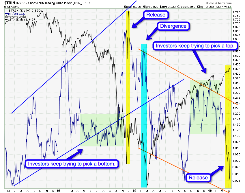
Here is a more long term perspective of the same chart as we are now using a 30-day SMA instead of a 10-day. The story is similar but the pattern reflects the larger trend. It also seems that there may be a rhythm to how investor sentiment flows – just like the phenomenon of ebb and flow when it comes to moon phases and how it exerts its gravitational influence on our oceans. After a series of channel swings we see a period of anticipation in which investors attempt to pick either a bottom or a top – the depiction of this sentiment is being shown in the sideways action of the TRIN’s 30-day SMA. Traders and investors attempted to go long in the spring/summer 2008 trading season and were quickly taken to the cleaners as the definition of ‘overbought’ (remember – officially 0.8 or less) quickly changed and a counter spike to oversold conditions did not occur, despite the fact that prices were plummeting across all sectors (aaaah, the good old days…). Then finally a spike occured and that was a final opportunity to scale out of long positions.
Then in March of 2009 we hit a low of 666.79 on the S&P500 cash index – the SPX. If you look at this chart however you will see a clear divergence in sentiment – it seems that the defintion of ‘oversold’ was in the process of changing. The rest is history – we snapped back and the bears have now find themselves in the same tough spot as the bulls in 2008 – attempting to pick a top but being taken to the cleaners at every single attempt.
What I’m seeing right now is a big spike down, which may be an inverse of the spike up we saw in November of 2008. If you follow my mental exercise a little further. Based on the first chart and now on this one – would it be unreasonable to assume that we may see a reversal lasting a week or two followed by one last ramp up to new highs and perhaps a market top? And should that top perhaps be accompanied by a divergence on this chart? We shall see – but it would fit the Minor degree A-B-C scenario that Hochberg and Prechter are considering at this point.
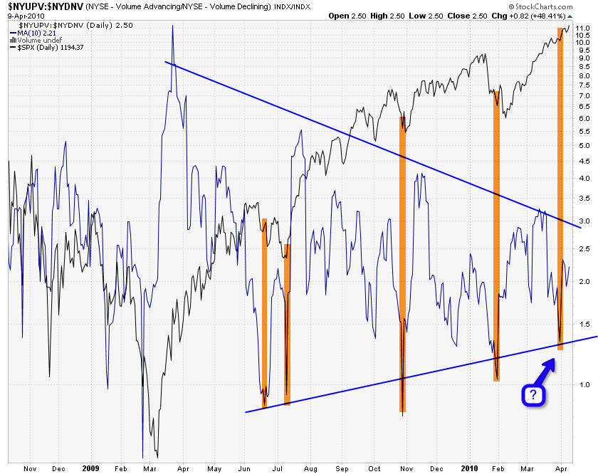
Now you know that this ADV/DECL volume chart is actually a component of the TRIN – see, it’s useful to learn what happens behind the scenes! And it’s own 10-day MA has now presented us with a little puzzler. Which is – why hasn’t the market reversed since it last touched the upper border of that triangle pattern? Maybe the answer lies in the TRIN as proposed above.
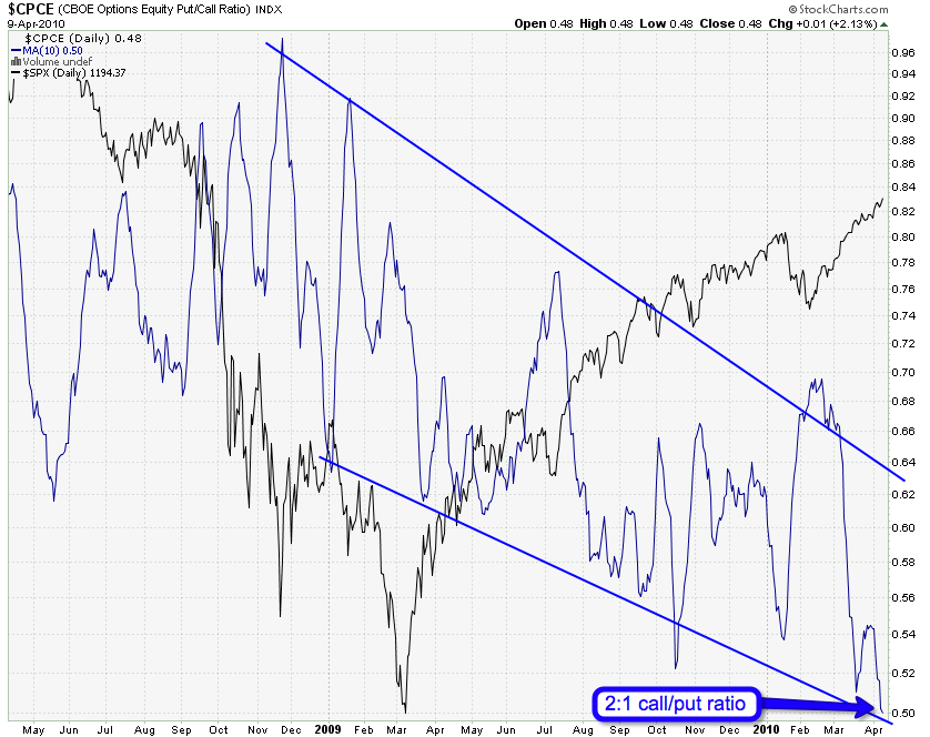
10-day SMAs galore – that’s right. This one on the CPCE put/call ratio – which does suggest a drop is coming. Quite frankly a CPCE of 1:2 (2 calls for each put) is simply ridiculous. Add to that the record ISEE equities reading I posted earlier last week and you really don’t want to be long right now on a medium term basis at least.
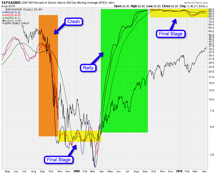
Another of my more exotic ones. This is the percent of S&P stocks (all 500 of them) trading above their 200-day SMA. And it’s over 90% of them and has been since last summer. Hey, that’s simply disgusting – if I may be allowed a teeny bit of bias here 😉
The pattern again is however interesting. There seems to be the trend phase (drop/crash and rally/ramp) – followed by a sideways MA entangling phase – followed by a trend change. Well, we had a shitload of entangling here and it’s time for a change – but from what I’m seeing in my charts above the bears might have to wait a little longer.
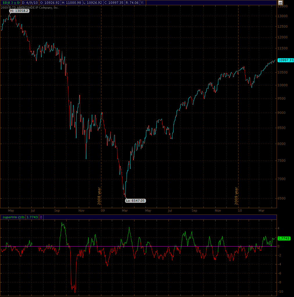
UPDATE 6:37pm EDT: Here’s a little goodie I’d thought I post since I talked so much about the TRIN:
This is a TRIN derivative I wrote a year ago which I call ‘superTRIN’. First it obviously inverses the confusing inverse direction of the original TRIN indicator. And second it normalizes the range inequalities of the original TRIN – for instance you can have an oversold reading of 2.5 but anything below 0.9 to 0.1 is considered overbought. The superTRIN however is balanced on an equal basis, meaning that a -2 reading is as bearish as a +2 reading is bullish.
Maybe I’ll post this one a bit more in the future. Quite frankly – I write indicators all the time and sometimes I simply forget all about them until an occasion arises that brings them back in vogue.
Cheers,
Mole


