


Thrilling Implied Volatility
Thrilling Implied Volatility
Apparently the odds of seeing any type of resolution before the long Easter holiday weekend are low (what are the odds I will eat my words on that one?). Which gives me an opportunity to dazzle you guys with some rather thrilling implied volatility (IV) charts. So strap yourself in and make sure you do not extend your hands or legs outside the carriage until the ride has come to a full stop.
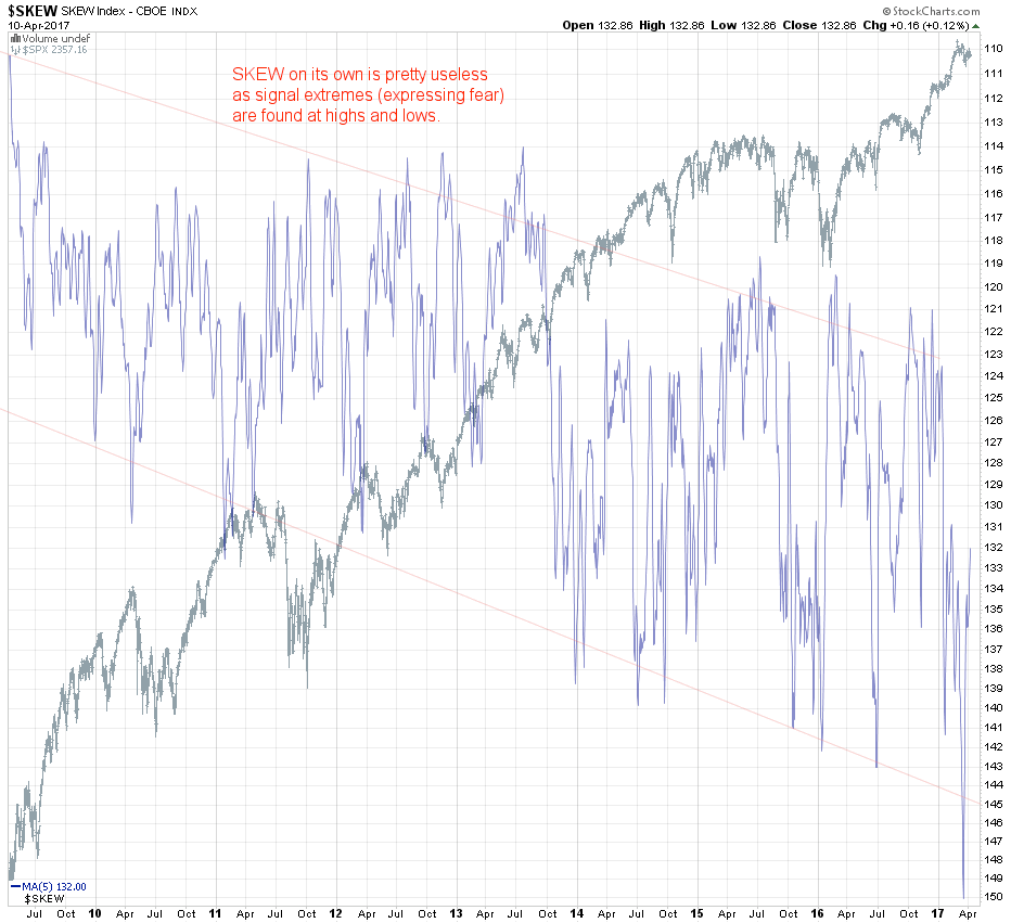
To set the stage we’re going to first talk about a pertinent chart which was originally designed to be of value to traders but thus far at least has failed to live up to its lofty promises. Of course I’m talking about the SKEW, which in my opinion (and that of many others) is only useful to a small group of professional hedgers <shameless-plug> and even those would be better off signing up here at Evil Speculator</shameless-plug>.
The CBOE Skew Index was introduced in 2011 as an index derived from the analysis of the IV smile produced across a range of deep OTM S&P 500 options. SKEW is intended to show us the extent to which investors expect a deviation from security returns, i.e. how much the distribution shows us more extreme outliers. A reading of 100 indicates a normal distribution and the higher the reading the more skewed to the right of the mean traders expect risk based returns to be.
In reality however what was intended to be a leading/predictive indicator turns out to jump a bit all over the place as is easily visible in the chart I posted above. I actually had to smooth the damn thing with an SMA(5) to show you a representation that made any sense at all. I inverted it actually so that it would follow price and as you can see the spikes toward the lower (which is actually the higher) range seem to be intensifying and have been for several years now. That is concerning as apparently post 2008 the perception of ‘tail risk’ continues to grow the higher we go. Perhaps that is also one of the underlying reasons of why so few retail traders managed to participate in one of the most profitable bull markets in history.
Or perhaps that is the very reason why the market has kept bubbling higher – now that those annoying retail rats are gone the institutional players are free to drive up prices into the stratosphere. Okay, I’m kidding of course – or maybe with I’m half serious with a wink
There are many theories out there as to why it is broken and most of them would put you to sleep. My contention is that it may just be the the formula. Because some of my own measures are fairly related but seem to work quite well. Let’s take a look but before we do a quick pointer. IF you are not familiar with the differences between the CBOE’s VIX, the VXO, the VXV, the SKEW, etc. then I strongly urge you to point your browser to one of my older posts on the topic that should sort you out in no time.
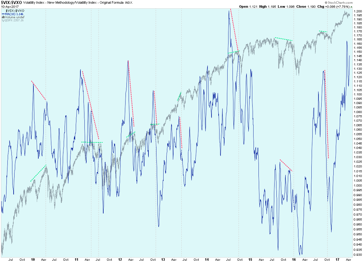
Alright here’s a brand new look at the VIX:VXO I put together just earlier today. As you can tell it’s a long term chart and thus it’s not something you want to be basing your long put positions on. However what it does for us is to highlight times when the probability of a medium term corrections (in terms of weeks of price action) is high. I think the divergences I drew are rather clear and do not necessitate further explanation.
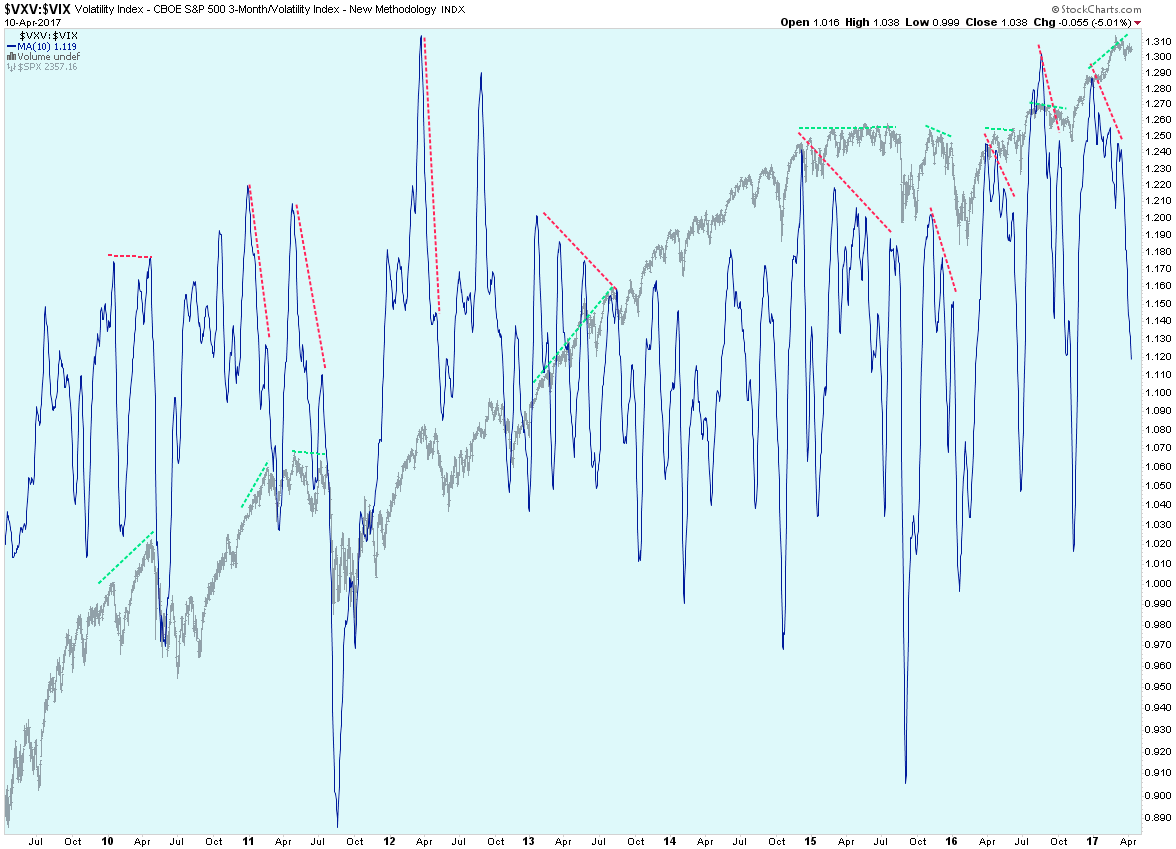
The version I actually prefer is the VIX:VXV but I would probably use both in conjunction in order to make sure to increase the chances that a more profound correction is pending. Here apparently extended divergent periods seem to produce more amplified price corrections. Of course it may take several weeks until price finally responds in kind. Incidentally note how there is now a a pretty solid signal divergence in place, which either means that VXV has risen against the VIX or that the VIX has fallen against the VXV. A quick look at the VIX shows it rising right now so my money is on the latter.
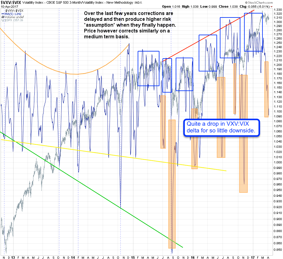
Now here’s another view on the very same ratio and one you may remember from previous momo posts over the past few months. As you may recall my expectation is a first spike lower (which seems to be in progress) followed by a retest recovery and then followed by the real massive drop taking us way past the previous lows late last month.
Caveat: This is no exact science of course but given the current magnitude of the drop in ratio compared with a rather muted price response I believe the odds are high that this has just been the overture to something much bigger.

Again the same ratio but on this chart it has been inverted (VIX:VXV). As you can tell there’s less smoothing here and I’m looking at thresholds. If we spike above the upper (green) line then buying potential is high and of course the inverse with a drop below the lower red line.
The center line is also useful it apparently marks moments when the odds of an impending correction appear to be rising. Whereas a drop below the red line tells us that easy time is over the center line for me is the point of recognition. Something is looming ahead and it’s probably not accompanied by sunshine and spiked drinks adorned with small umbrellas.
Now that I have your attention let’s get to the really juicy stuff:

It's not too late - learn how to consistently trade without worrying about the news, the clickbait, the daily drama and misinformation. If you are interested in becoming a subscriber then don't waste time and sign up here. The Zero indicator service also offers access to all Gold posts, so you actually get double the bang for your buck.
Please login or subscribe here to see the remainder of this post.


