Volatility For Dummies
Volatility For Dummies
It’s a gorgeous summer day in Los Angeles and I apparently have nothing better to do than to think of new ways of entertaining my stainless steel rats – shame on me. I am not complaining however as I am a market megalomaniac on a mission – hey, that has a nice ring to it! After Volar’s volatility post I perused many articles and papers regarding various measures of volatility now offered by the CBOE (and others) and soon realized that there may be much confusion on the subject. Do you fully understand how each volatility index works and how they differ from each other?
I didn’t think so! Which is a situation we ought to remedy once and for all. Due to some ancient genetic mutation common in my germanic tribe I happen to be obsessed with clarity and order. Thus I felt strangely compelled to produce a post that puts various measures into their respective context and more importantly assesses their real value. After all we are all about edge here at Evil Speculator. So, today I have a special treat in store for you which called for an appropriate cover page:

That’s right – the ultimate reference on what makes the VIX, VXN, VXD, VXO, SKEW, VXV, etc. tick – special digital edition for intrepid disciples of the evil lair:
VIX: It needs no introduction and is the widely used symbol for the Chicago Board Options Exchange (CBOE) Volatility Index, which shows the market’s expectation of 30-day volatility. There are three variations tied to major indexes: the VIX tracks the S&P 500, the VXN tracks the Nasdaq 100 and the VXD tracks the Dow Jones Industrial Average. The VIX is a widely used measure of market risk and is often referred to as the investor fear gauge. A few tidbits:
- The VIX was launched in 1993.
- In September 2003 the formula used to calculate the VIX was modified substantially.
- Data from the new 2003 VIX formula has been assigned the VIX ticker, but the CBOE published a reconstruction of historical data for the new VIX formulation going back to 1990.
- At the same time, the data (both historical and subsequent) associated with the ‘original VIX’ formula was assigned a new VXO ticker (see below).
Formula: It is constructed using the implied volatilities (IV) of a wide range of S&P 500 index front month options. This volatility is meant to be forward looking and is calculated from both calls and puts. The CBOE utilizes a wide variety of strike prices for SPX puts and calls to calculate the VIX. In order to arrive at a 30 day implied volatility value, the calculation blends options expiring on two different dates, with the result being an interpolated implied volatility number.
Short Description: All front month strikes IV average.
VXO: Think of it as the ‘old VIX’ as the current VXO formula was known as the VIX until 2003.
Formula: The ‘original VIX’ (which is still tracked under the ticker VXO) differs from the current VIX in two main respects: it is based on the S&P 100 (OEX) instead of the S&P 500; and it targets ATM options instead of the broad range of strikes utilized by the VIX. A few tidbits::
- The current VIX was reformulated on September 22, 2003, at which time the original VIX was assigned the VXO ticker.
- VIX futures began trading on March 26, 2004.
- VIX options followed on February 24, 2006
- Two VIX exchange traded notes (VXX and VXZ) were added to the mix on January 30, 2009.
Short Description: Front month ATM strikes IV average.
VXV: Think of it as a three month or quarter VIX. The VXV was introduced on November 12, 2007,
Formula: Like the VIX, the CBOE S&P 500 3-Month Volatility Index measures the market’s expectation of future volatility conveyed by S&P 500 option prices. However, it reflects 3-month SPX implied volatility rather than the 1-month implied volatility measured by VIX. As such, investors are able to use VIX and the CBOE S&P 500 3-Month Volatility Index to track the movement of the SPX volatility term structure in the first four listed contract months – options that account for most of SPX trading activity.
Short Description: All quarter (i.e. three months) strikes IV average.
SKEW: Also sometimes to referred to as the SIX or black swan index. The SKEW was introduced by the CBOE in February 23rd of this year and measures out-of-the-money S&P 500 options to determine the risk of unanticipated, or Black Swan, events threatening the market. The Black Swan reference, of course, is from the Nassim N. Taleb book of the same name that, in part, delineates the importance of low-probability but catastrophic events in financial markets.
Formula: The SKEW measures the implied volatility between OTM puts and calls and derive a numeric value from the difference between the two – I call it a delta. Like the VIX, which measures volatility across the S&P 500 spectrum, the higher the SKEW number, the more the danger of what traders referred to as tail risk – or occurrences that occur farther out on the edges of the traditional bell curve.
Short Description: Front month OTM put/call IV delta.
Putting It All Together
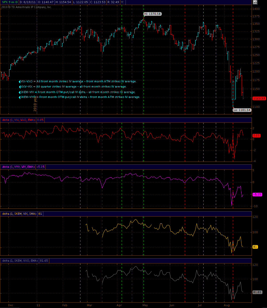
So, now that we have a nice cheat sheet on our usual volatility suspects let’s look at a chart I put together over the weekend:

What I am doing here is a simple correlation by using spreads – this allows us to discover important characteristics and divergences. Unfortunately the SKEW in TOS only goes back about half a year. I have already requested more historical data but it would probably help if all of you sent an email to support@thinkorswim.com to create a bit more urgency.
Alright, let’s take it from the top:
VIX-VXO: Front month strikes IV average minus front month ATM strikes IV average.
Or in other words – the new VIX vs. the old VIX. And clearly the VIX is leading the VXO in both directions. I would love to paint a zero line but every time I resize the chart all the indicator lines push up into the first panel. Gee – thanks TOS. But the zero mark appears to be important – as soon as we breached it things started to get pretty ugly on the equity front. I do see various divergences near medium term lows and tops which I have highlighted with red/green time lines.
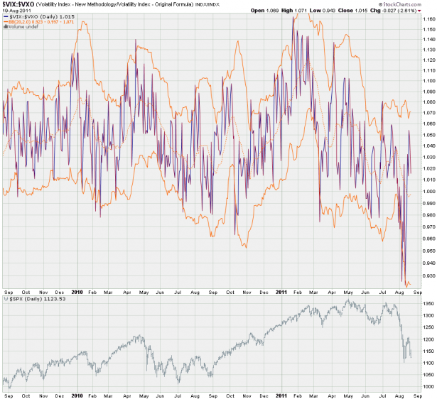
Here’s my stockcharts view – I added a common 2.0 BB to see if that provides us with a bit more context. And seemingly there is a correlation with reversals if we push outside the Bollinger.
Value: I think it’s rather useful on a medium term basis as well as long term basis. Medium term we should be tracking BB breaches and long term divergences.
VXV-VIX: Quarter strikes IV average minus front month ATM strikes IV average.
The thinking is that if the ratio gets out of whack, the VIX will ‘revert’ to the VXV. Thus when the ratio is low, the VIX should revert up. The plot thickens however and you may recall the CBOE stats I posted the other day:

See the highlighted paragraph and the chart which I grabbed directly out of the CBOE paper. So a reversion to the mean is something to look out for, in particular if we see a delta of 10% or more.
And here is my pertinent Bollinger chart. As you can tell it’s a bit more expressive on the medium term and I see beautiful divergences here.
Value: Both medium and long term value. Again BB spikes can be profitable in correlation with other sentiment indicators. On the TOS chart it also seems as if the zero mark is important from a trend perspective.
SKEW-VIX: Front month OTM put/call IV delta minus all front month strikes IV average.
The general idea is to produce a contrast between the option smile and front month volatility expressed by the VIX. Again, the SKEW measures price delta between OTM puts and calls, whereas the VIX simply captures IV across the entire vertical (i.e. all strikes). Volar agreed that it was a neat idea as SKEW and VIX have very little in common with each other – except that they measure implied volatility.
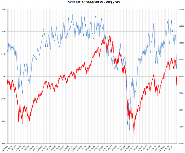
Here’s the long term view and on it’s absolutely sensational. If you are a trend trader or long term swing trader then this is the chart for you. SKEW is not offered by stockcharts.com (again, we should all bug them) and I tried to do the BB manually – unfortunately I suck in Excel and thus we’ll have to do without it. But rest assured that I will update this chart on a regular basis as it will provide us with important clues as to when the big boys are selling front month vega while buying quarter vega (and of course the inverse). When they do it will show up on this chart and it seems usually they (unlike retail schmucks) find themselves on the right side of the tape.
And to round things up here is the medium term perspective which uses a 5-day SMA. Seems it’s pretty much in line with what the tape is doing. A few nice divergences here but I don’t think it has as much weight as the VXV-VIX chart above for instance.
Value: I’d say the SKEW is best used on a long term basis – medium term it’s a bit mixed and short term relatively meaningless. The 100 mark on the TOS chart as well as the 95 mark on my long term 10-day SMA chart appear to be meaningful in respect to the ongoing trend. Perhaps you disagree and if you do please feel free to share your charts.
SKEW-VXO: That was actually an idea of mine after digging through all the CBOE information. My thinking was that comparing ATM IV with OTM IV delta would be a great exercise. But as you can see from my first chart – it barely differs from the SKEW-VIX chart, thus I decided to give this one a miss.
I do have one more index you may want to consider – unfortunately it’s only accessible via Bloomberg and I assume you need a terminal or access to Credit Suisse (and a knack for yodeling) to get your grubby hands on that data.
It’s called the Credit Suisse Fear Barometer and it measures investor sentiment for 3-month investment horizons by pricing a zero-cost collar. The collar is implemented by the selling of a 10% OTM SPX call option and using the proceeds to buy an OTM put. The CSFB level represents how far out-of-the-money that SPX put is. The higher the level, the greater the fear. I think that’s an awesome idea in theory and I definitely can appreciate the simplicity of it.
Unfortunately I do not see a major edge here – compared with the spreads shown above I think the CSFB is limping behind.
And that pretty much wraps it for today. If you see any correlation you believe should be put on the map then please knock yourself out – I am always a sucker for another sentiment chart.
Cheers,
Mole


