What’s Wrong With This Picture?
What’s Wrong With This Picture?
I’ve been scratching my head a little in the past few weeks and if you read my weekend update then you already know that some trusted correlations have either been loosening or outright reversing lately. Let me put things a bit more into context:
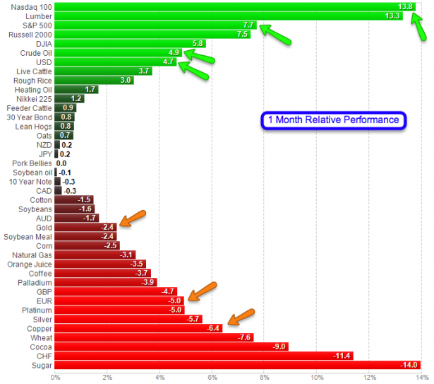
Sectors nicely sorted by 1-month performance. So what we have here is NDX up 14%, SPX and RUT up over 7% – is this really the time to rotate into tech stocks? Really? Anyway, at the same time we have crude AND the Dollar up almost 5% with commodities dropping across the board, even copper and gold.
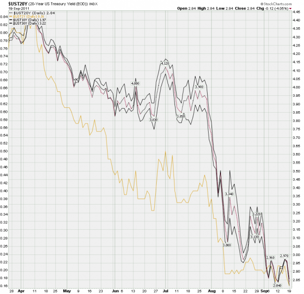
So, let me get this right – we have bonds rally (not on this chart but check out the 30-year), equities and in particular tech stocks rally, the USD rally, while copper, gold, and crude is dropping. Heck, I’m the first to caution about correlation trades if you recall, but this is a bit nuts and you ought to wonder who’s right and who’s wrong here on a long term basis.
Is it commodities and currency traders who have been long the buck, short the Euro, short Gold, and short commodities across the board in general?
Or is it the bond traders who have been pouring into long term treasuries (apparently now again joined by the Chinese) pushing down yields hard in the past three months? Plus the 2-year now pays as much as a 30-year again.
Or is it those piddly quantitative easing addicted equity traders? When yields, copper, and currencies run contrary to equities then there’s something very wrong in the state of Denmark (and apparently in the rest of the world as well). Now admittedly, short to medium term this does not matter and we trade the tape we are given. But long term folks – if you are long equities – please take note and adjust your trading horizons accordingly.
Cheers,


