Trading POMO 101
Trading POMO 101
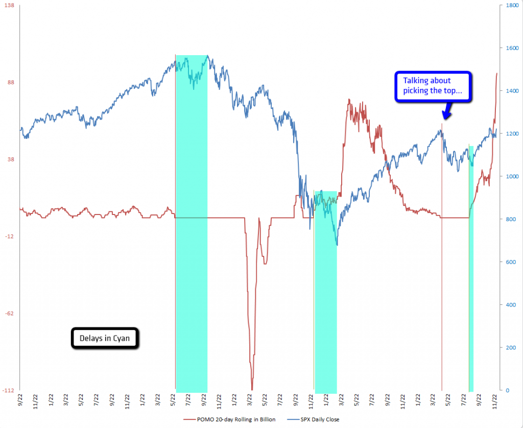
And now for something completely different. Earlier last week a generous soul sent me the Excel constructs for that coveted POMO rolling total chart, and I decided to make it the theme for this weekend post. So, I’m going to show you all my brand spanking new chart – but if you want to know what it all means you’ll have to either wait a few days or log in now as a subscriber:
The cyan regions mark delays in market response to a Fed liquidity reversal. The left axis is in Billions – which means the current total is 94 Billion – the right one is the daily close of the S&P 500. Okay, now I have given this a lot of thought and I’m about to dump it all on you:
As you know I am keeping a close eye on the POMO (and TOMO) auctions – so I’ll be updating this chart on a regular basis. Let’s start off with a general thought about this chart. I think at best it shows when to get the hell out of dodge. Which was earlier this fall when they ramped this thing up the bears’ collective asses.
Basically, this is the way I see and plan to use it: Consider the relative rolling POMO total to represent a market bias – if it’s near zero the tape may actually behave like it used to. Once that number pushes hard into positive territory (and now extreme/record readings) it represents an influx of liquidity that is extremely difficult to bet against. In other words, a zero reading means there is little to none Fed monkey business (unless of course they are using other liquidity windows, but let’s not over complicate matters). A positive reading means that there is downside liquidity resistance which most likely will diminish the magnitude of downside corrections. A negative number means the Fed is draining the swamp and that there is upside liquidity resistance that limits moves to the upside.
Now, I would be very cautious about using this as a general trend indicator – when it comes to trading context is everything. Thus you must correlate it with something context specific that represents the general state of the market. In my own case that is my trusted collection of momentum and general trend indicators. The Zero is one of them – but there are others in my arsenal as you know.
Example – Neutral POMO 20-day rolling total:
Scenario 1 – Market in oversold territory, expecting downside correction:
Since the rolling total is near the zero mark then taking short positions is probably a reasonable approach.
Scenario 2 – Market in neutral territory:
Just stay out.
Scenario 3 – Market in overbought territory, expecting an upside correction:
Again, the rolling total is neutral, so we trust our momo indicators and go long. Moves may not be huge but tradeable.
Example – Positive POMO 20-day rolling total:
Scenario 1 – Market in oversold territory, expecting upside correction:
For some reason the market was permitted to sell off – most likely the big boys wanted a good dip buying opportunity and it was the retail schmucks (that would be you) who were left holding the bag. I think, depending on the amount outstanding (let’s say $20 Billion +) going long here is probably very good medicine.
Scenario 2 – Market in overbought territory, expecting downside correction:
Here it depends on how ‘positive’ we are as well as where we are heading. If you look at 2009 you will see that rolling total actually peaked in April and then dropped and then slowly started dropping until it reached zero by late March 2010. Which – not so coincidentally – was pretty much exactly where equities topped (until most recently). So the lesson learned is that the direction of the signal line does not seem to matter, what however does matter is its value. To make this even more clear (because it’s important) let me point you at the current reading, which now stands at a rolling 20-day total of $94 Billion – wow! That’s a lot of coin, especially if you can leverage it up by a factor of 100. The sad truth (for the grizzlies) is that it may take months to work that off and that any downside until that happens will be extremely limited at best and perhaps non-existent at worst.
Example – Negative POMO 20-day rolling total:
Scenario 1 – Market in oversold territory, expecting upside correction:
That’s pretty much the inverse of the Fed buying in an overbought market. As the Fed is most likely draining the swamp any upside should be muted. Trade small and divide your target range by half. If you trade options consider rapid moves in volatility – which means either selling it or at least some clever option spreads.
Scenario 2 – Market in overbought territory, expecting downside correction:
That’s where the real fun begins and we should be so lucky. The Fed may again be hell bent on sending Congress a reminder on who’s really running the show. For some reason retail schmucks (yours truly) and less talented funds bought the last dip and burned a few shorts in the process. Just like in 2008 I would be very tempted to go short here – in particular if the Fed is continuing to reduce the rolling total into more negative territory.
And there you have it – your POMO road map. Use it in correlation with some of the other indicators we discuss here on a regular basis and you should find yourself on the right side of the long term trend.
Wait A Minute!
So, how does a record total on the POMO side contrast with record bullish readings over on the ISEE Equities chart? Damn it – I knew you’d ask that. Quite frankly – that’s a tough one. The best answer I can offer is that we may see a rapid reset here – a quick drop in the next four to five weeks. But when it comes to a more meaningful and painful correction of long term overbought conditions the jury is still out. With all that easy cash floating around I have a hard time imagining the SPX pushing below its 1000 mark.
However – if it happens – if we see a continued influx of POMO cash and the market actually tanks and is unable to snap back quickly. Well that, my dear stainless steel rats, would be a complete game changer and one that would basically mean that we had finally reached the end of the road. And that would be a very bad day over at 33 Liberty.
Moral Of The Story
Fucking Prodigy sez it best:
The writing is on the wall – indeed…
Cheers!
Mole


