Christmas Momo Update
Christmas Momo Update
Winter solstice must be near as all the trolls seem to be coming out of the woodwork attempting to make themselves at home and stir up trouble. Which I of course greatly enjoy squashing with my Thor size ban hammer I keep around just for such occasions. But quite frankly we all have much more important things to attend to than to waste time on posers and wave wankers. For ’tis the season of giving and Cool Santa dropped by early this year to deliver a sled full of charting goodies. Let’s get to it:
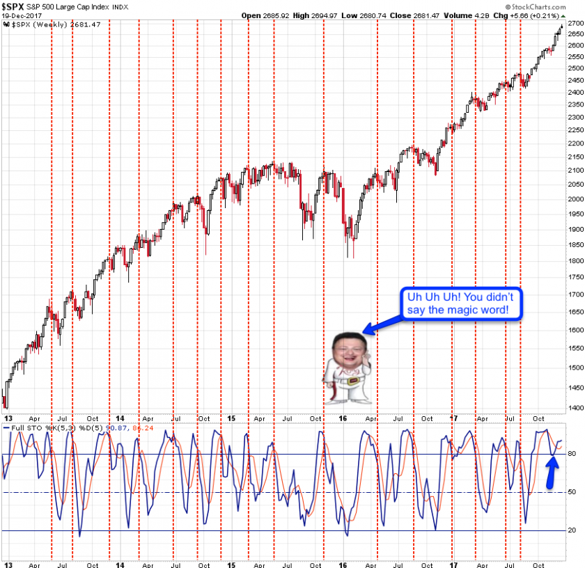
I’m kicking things off with one of my oldest momo charts: the SPX weekly stochastic. This is probably the only occasion I ever bother to look at a stochastic indicator and the reason should be obvious: it works extremely well on a medium term basis (measured in weeks).
The breaches below the 90% mark (it’s a oscillator) preceded every single major correction over the past few years although has little predictive value regarding the veracity of the ensuing downside. The last one in recent history has been during summer and after a purely obligatory dip toward SPX 2425 equities have embarked on a ramp that put even the early 2016 ramp to shame.
What’s especially worth noting is what happened in November when the stochastic first dropped through its moving average and then continued to drop toward the 90% mark – which it then touched and instantly reversed. Clever and what happened here pretty much sums up nicely this entire post: We are in a generational bull market and if you are a bear you are officially on the extinct species list.
Of course unlike some of the usual suspects in the financial blogosphere we here at Evil Speculator would never dismiss the potential of an ensuing bear market. Which is why we don’t point at one single chart and then proceed to pawn our wedding ring to bulk up on puts. Instead we accumulate as much evidence as possible and then arrive at a final assessment.
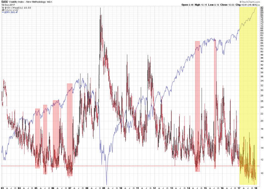
Next on the wrapping list was a long term view on how often the VIX has traded below the 11 mark for extended periods of time. I think the only comparable period would be the 2004 to 2008 credit bubble, although it must be pointed out that we seem to be excavating new ground here. The VIX continues to gyrate in a 6 handle range between 9 and 15 and it’s been going on for the better part of this year. Which quite frankly speaking is unprecedented and I don’t use this classification lightly.
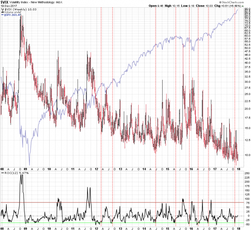
Another ‘exceptional’ chart for me is the ROC which I frankly rarely use unless I see a clear threshold. And that seems to be the -50 mark which thus far has preceded a good number of downside corrections in equities (shown via the SPX in blue). Except that it completely failed in November and as you will see below this is not the only indicator that produced a false (bearish) positive during that time.
Alright, I hope you’re sufficiently caffeinated and warmed up as we’re just getting started:

It's not too late - learn how to consistently trade without worrying about the news, the clickbait, the daily drama and misinformation. If you are interested in becoming a subscriber then don't waste time and sign up here. The Zero indicator service also offers access to all Gold posts, so you actually get double the bang for your buck.
Please login or subscribe here to see the remainder of this post.
Enjoy! 🙂


