Cognitive Dissonance
Cognitive Dissonance
Right out of Wikipedia: Cognitive Dissonance is a discomfort caused by holding conflicting cognitions (e.g., ideas, beliefs, values, emotional reactions) simultaneously.In a state of dissonance, people may feel surprise, dread, guilt, anger, or embarrassment.
When looking at my usual suspects this weekend I could not help but feel a bit of cognitive dissonance of the confused kind. A lot of things just don’t make sense right now and you don’t have to be a seasoned trader to sense that something’s rotten in the state of Denmark. For starters – we should be climbing up right now – not gyrating around the 1200 mark – what ever happened to our Santa Rally? Let’s try to make sense out of what the charts are telling us right now.
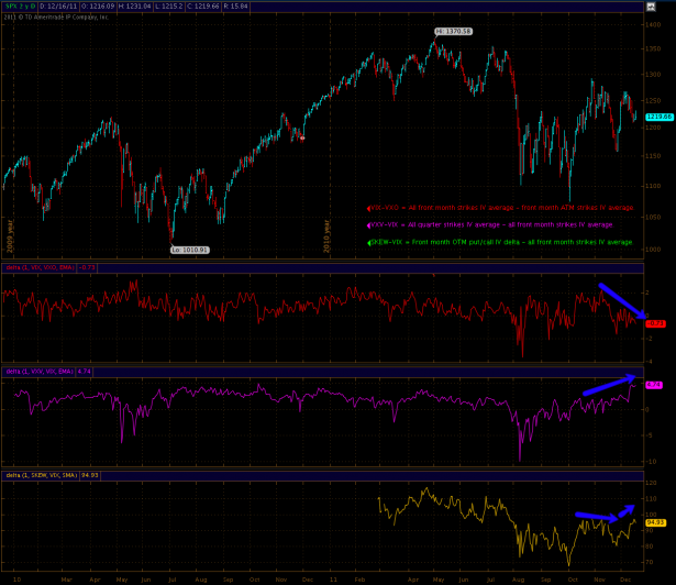
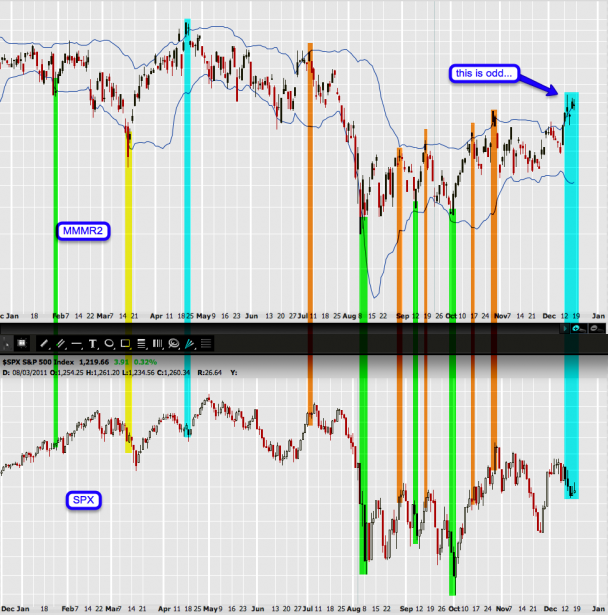
This will be our core chart for today’s post – as the general confusion I sense is reflected in volatility. If you are a sub then you have seen this chart a few times in the recent past. We are looking at volatility ratios and the name of the game is to pick up divergences against the SPX as well as against each respective ratio. In case you are a noob or simply forgot what each symbol represents then you are in luck as I have provided rough summaries on the SPX panel. Subscribers may refresh their memories via my ‘Volatility For Dummies‘ post I put together earlier this year.
Alright – if you are not used to ratio (or FX) charts then this may be a good mental guideline: The first symbol is the dominating one – meaning if the signal line pushes up it is gaining against the second symbol. Ergo the second symbol moves inverse to the ratio – if the line drops then it is gaining, if it climbs then it is losing.
Now let’s review these respective ratios and then try to make sense out of what they are telling us:
[amprotect=nonmember]
More charts and cynical commentary below for anyone donning a secret decoder ring. If you are interested in becoming a Gold member then don’t waste time and sign up here. And if you are a Zero or Geronimo subscriber it includes access to all Gold posts, so you actually get double the bang for your buck.
[/amprotect]
[amprotect=1,13,9,12,5]
First up I want to point out that this are not really ratio charts – I am actually deducting one symbol from the other. But after comparing ratio with delta charts I felt that they are pretty much telling us the same story, so let’s just pretend these are ratios we are talking about. Let’s go:
VIX-VXO: We are comparing front month IV across all strikes against only front month ATM IV. That’s pretty basic – how much are you paying for ATM strike IV when compared with the average of all front month strikes. Got it? What’s immediately apparent is that this signal line has been dropping which means that the second symbol is gaining against the first. Which again means that option buyers are paying increasingly more for ATM strike vega than they are paying for option vega across all strikes on average. In my experience this usually happens ahead of large short term moves as option sellers are expecting short term volatility in one direction or the other (usually it is against the current medium term trend, but you can’t always count on that – consider your medium term momentum or sentiment charts first).
VXV-VIX: Here we are comparing all quarter (i.e. all strikes within three months) IV against all front month IV on average. Basically a direct comparison of front month vs. quarter implied volatility. And that line has been pushing up pretty high – which means that front month IV seems to be dropping (i.e. getting cheaper), at least when compared with quarter IV. So on a three month basis it seems that option sellers are expecting more medium term movement and are protecting themselves accordingly. Perhaps a medium term trend change?
SKEW-VIX: Finally we are comparing front month OTM put/call IV delta (i.e. the cost differential between equal distance strike OTM puts vs. calls) with regular front month IV average. I know this is a bit of a mind bender. Just imagine you compare the premium of a call five strikes out with a put five strikes out – simple right? If you are paying a lot more for that put then that may be a first hint that market makers are expecting some down tape.
Of course in our case the delta between those two doesn’t tell us much about the direction but when comparing it with regular vanilla front month IV (i.e. the VIX) then we at least know whether or not option buyers are paying more for at least one side of the OTM put/call delta than they are coughing up for let’s say ITM or ATM strikes. You can then go further down that rabbit hole by doing some IV put/call comparison in for instance ThinkOrSwim but that is out of the scope of today’s post. What’s important to us is that it’s rising and that means that there is increasing SKEW when compared with Mr. VIX. Thus it would not be unreasonable to assume that we may see some OTM strikes being touched in the not so distant future.
Of course sort of ties into that VIX-VXO chart, which suggests that we are going to see some short term volatility. The fact that there is an increasing delta on the SKEW side (i.e. OTM put/call IV) tells us that one side is more heavily favored than the other. Now let’s figure out which side market makers are pricing more heavily:
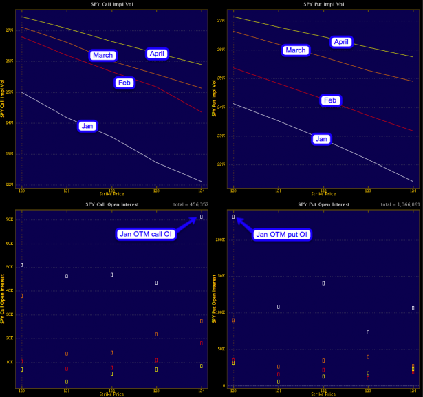
If you happen to trade with ThinkOrSwim then you can easily put this chart together yourself – just go to the tools tab. Anyway, this is very interesting to say the least: Obviously there is really no volatility smile anymore – in the past few decades we had several crashes and it’s more of a volatility decline now.
Okay, per the above let’s now look at OTM strikes: As the current strike is 122 it’s fair to compare the 124 call with the 120 put. January shows us around 22% for the 124 call and 24% for the 120 put – not too far apart and that delta is pretty common. The same applies for February, March, and April. What however strikes my interest is the difference of the February (i.e. red) line between the put and call panel – obviously it’s much more distant from March on the put side than it is on the call side.
A word to the wise – when pricing OTM options we as buyers really have to think ahead. Which means that if you expect to sell your puts or calls OTM then you don’t want to do it during the front month – you want to do it at least 30 days ahead. So given the above this affects January a lot more than it does February as you would probably want to sell those options back in January unless you expect them to be ITM. Trust me – a lot of people have gone broke buying OTM options – but again that’s a story for another day.
Bottom line here is that put IV for Jan/Feb seems to be cheaper than call IV – and hence the title of this post as January is usually a bad month for the bulls (except maybe the first week). In any case we should however expect some short term fireworks as well as some medium term fireworks – how fun!
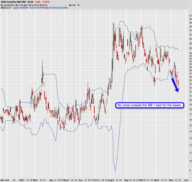
Supporting my general theme here on one hand is Mr. VIX which has been dropping – along with equities. Plus we don’t see a close outside the BB, which is now dropping along and rather steeply. All of which is bad for the bears – so perhaps MMs are looking the right way short and medium term?
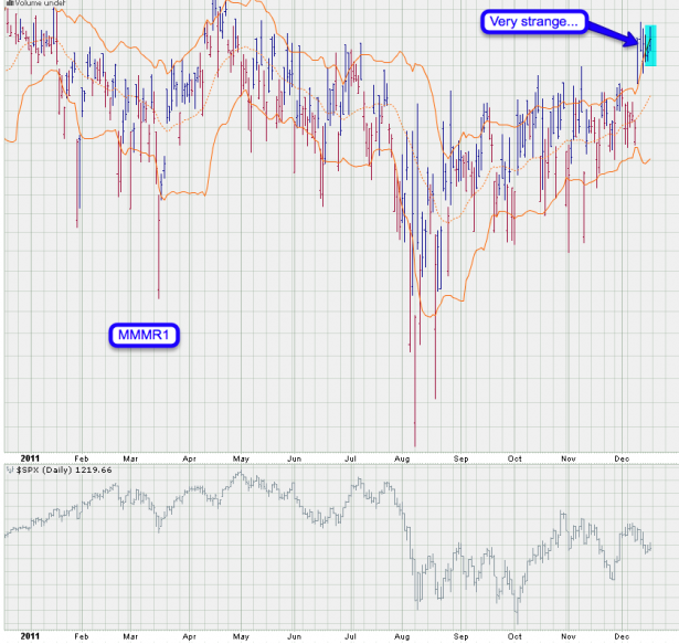
My magic MMMR1 however is in a strange configuration – we should be dropping down here and I have not seen it push higher and higher while the SPX was dropping. In the first few days I thought this merely meant more downside – and I was right. However, at this point I do not know how to interpret this chart properly and in particular with how options are being priced right now.
Here is the MMR2 – very same story. I tried to line up the SPX with the first one and it’s not exactly correct – for some reason there are spacing differences between those two. Why does Prophet chart sucks so bad on one end but does some things so well? In any case – give the correlations some leeway and just focus on the fact that the current one has almost no precedence.
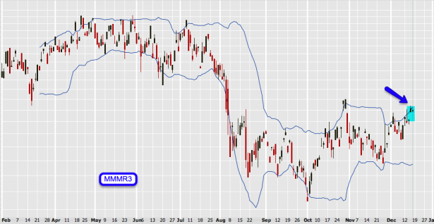
And here’s only the MMMR3 panel – same story.
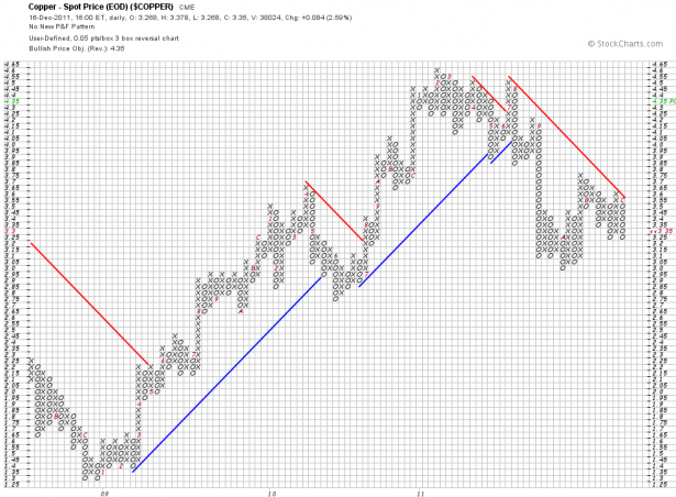
Meanwhile copper is barely hanging on to its PBO of 4.35 – if it drops below 3.25 that’ll flip the other way. Usually copper leads equities so this flies in the face of what MMs are pricing on the equity option side.
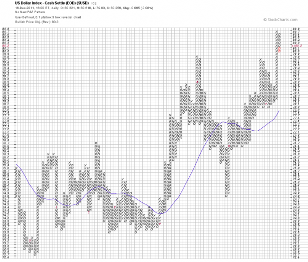
They did however predict movement and ole’ bucky seems to agree. As we expected the first leg of the short squeeze came a long way quickly and thus a little correction was to be expected. However, medium term I think we’re going quite a bit higher as promised by that inverse H&S plus the BPO of 83.3. Although not officially on the menu I am thinking Long Tail Up Reversal here on a short term basis, which would be the inverse of the Long Tail Down Reversal – thus being a sell signal. Thus – Dollar short term: a bit more downside. Dollar medium term: more upside if that BPO (and the inverse H&S) play out.
All in all we have a lot of contradicting evidence here and for the remainder of this month I will keep my trades very nimble and most likely limited to playing intra-day swings (i.e. Zero or ZeroFX) mixed with the occasional FX or commodities setup. On the equities side I simply see too much cognitive dissonance to really feel comfortable risking any significant coin on betting on a particular direction. This will most likely sort itself out in early January when the big dogs are back at their trading desks.
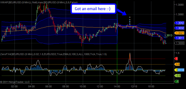
[/amprotect]Public Service Announcement: I have an early Christmas gift to reward all you well behaved Zero subs – over the weekend I implemented the ZeroFX spike alert notification system and even tested it earlier today.
This is the email I received:
Extreme signal condition detected on 5-Minute EURUSD panel:
White momentum signal UP spike to 3.77 – possible buying momentum exhaustion!
Blue participation signal UP spike to 1.9 – possible buying participation exhaustion!ZeroFX Live Feed: https://evilspeculator.com/?page_id=20376
Disclaimer: http://tinyurl.com/dsclmr
Everything seems to be working as expected and thus I decided to turn it on for everyone. Please make sure to have alerts [at] evilspeculator.com in your contact list. Merry Christmas and enjoy!
Cheers,


