Improved Mole Indicator
Improved Mole Indicator
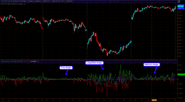
As I see a lot of conflicting evidence on my collection of long term charts I found it moot to post an obligatory update this weekend. Instead I decided to spend some very productive hours implementing a few (and overdue) improvements I had planned for the Mole indicator. After having watched it daily for almost four years now I became aware of certain characteristics of NYSE trading sessions. One that always stood out in particular is that each session seems to have its own momentum/participation range. The Mole indicator visualizes this by expansion or contraction of the advance/decline bubble (i.e. the green and red line on opposite sides of the zero mark). This way we can clearly see if it’s a low or high participation day. If you are a Zero subscriber then I’m sure you know what I’m talking about – for the rest of you guys here’s a good example:
This is only a small sample size but it is representative of what we all have been seeing for several years now. For some reason each day seems to settle at its own momentum/participation range within the first two hours of trading. It’s less apparent on the actual feed as I only show two trading days on the 5-min panel but if I zoom out a bit on my end then it becomes very clear. The screen grab above shows four NYSE sessions, each of which has its own range and characteristics, e.g. more or less volatile, more expanded/contracted, more smooth or spiky, or perhaps shifted more toward the up or down side.
A few weeks ago I added a neat new feature – blue scalping signals, which are largely based on the Mole’s intra-day gyrations. More specifically these scalping signals were derived from yet another key observation, which for some reason took me several years to recognize – guess I must have had scales on my eyes. Whenever the red line breaches above the zero mark it seems that we are nearing buying exhaustion – inversely if the green line breaches below the zero mark we often are close to a pounce higher. Great for scalping or perhaps swing trading if you favor the 5-min E-Mini. Anyway, if you take a closer look at the chart above then I believe you can clearly see this correlation aided by those blue arrows that I’m plotting on the price panel.
The one issue I was a bit unhappy with was the fact that the range of the Mole bubble seems to change every day and that makes it hard to properly configure proper thresholds that trigger those long/short reversal signals. For example I noticed that larger ranges on non-trend days seem to work extremely well. Small range days still seem to be good for scalping sometimes but everything is in a smaller range and thus the algo that triggers the signals needed to be adjusted.
So my mission this weekend was to replace those thresholds with some code that recognizes the range and then adjusts those thresholds accordingly. Sounds easy but there are a dozen ways to go about doing this – each with pros and cons. I played around a little and tried a few approaches and believe that I made some progress. If you are a Zero sub then you’ll see the new version in action starting Monday morning – any input/suggestions would be greatly welcome. Let’s watch the new version for a while and then compare notes.
FWIW – I got the idea for the Mole signals after receiving a question from one of my subs. So there you have it – you may just be seeing something the ole Mole overlooked completely, so don’t be shy
Cheers,


