Inflection Point
Inflection Point
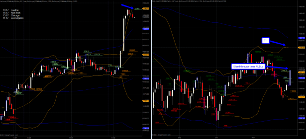
Since yesterday’s update the dynamics have shifted considerably – and I must say the timing of this could not have been more impeccable. Let’s start with a peek at the after hours AUD/JPY chart as shown on the ZeroFX:
I hate to break it to you but if you hold overnight these days you have to watch the currencies or at least the S&P futures. Since I live in LaLa Land I was of course soundly asleep. We got a Net-Lines buy at 78.16 – followed by a half-ass retest – from there it took the express elevator up to the penthouse. If you caught this entry and the ensuing spike: You lucky bastard! 😉
The spoos show us that the picture has now changed completely after a quick slice through those three stacked NLBLs I pointed out yesterday. If you are wearing your favorite tinfoil hat then I hate to disappoint as I am not going to belabor the cause of this move or complain about the Fed’s latest liquidity swap line expansion into Europe. These are forces way way out of our control and as such we simply have to adjust our trading to accommodate overnight surprise moves. Why do you think I keep harping on the futures and currencies all the time? You either learn my way of the hard way 😉
Now, I expect a little retest here and that pretty soon – more on that below. However if we push above that hourly NLBL at 1239.5 then we may just accelerate higher. Short squeeze is as short squeeze does.
The good stuff however is on the long term charts – please step into my dusty lair:
[amprotect=nonmember]
More charts and cynical commentary below for anyone donning a secret decoder ring. If you are interested in becoming a Gold member then don’t waste time and sign up here. And if you are a Zero or Geronimo subscriber it includes access to all Gold posts, so you actually get double the bang for your buck.
[/amprotect]
[amprotect=1,13,9,12,5]
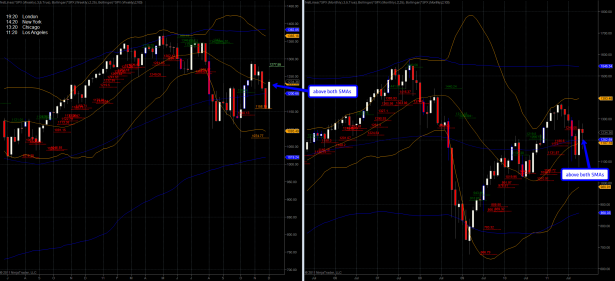
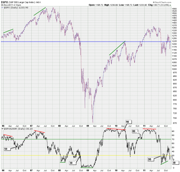
Lo and behold the mighty power of magic overnight liquidity. Alright – permit me a wee bit of sarcasm. We are now trading above both the 25-week and 100-week SMAs – which is significant progress. But even better – we are also most likely going to close the month of November above both the 25-month SMA and 100-month SMA. How’s that for a memorable exit?
In case you missed it – we just pushed above a significant inflection point – thus the title of this post. The dashed blue line indicates how 1220 served as support from 2006 through 2009 and since then mostly as resistance. Plotted below is the SPXA200R which shows us the percentage of SPX symbols trading above their 200-day SMA. And it is this very chart that is still giving me pause on a medium to long term perspective. See, it’s rather apparent that the quality of this rally is below that of the 2006 retest and much more reminiscent of the pattern painted during the 2008 crash.
Now, the good news (if you could call it that) is that there appears to be a ‘silent crash’ all around us – economically and technically speaking – but it is not reflected in stock prices for obvious reasons that however exceed the scope of this post – others have covered this subject in much detail.
My ongoing concern however from a pure trading perspective is that we may see one final slice lower after our 2011 Santa Rally, which at this point appears to be finally baked in.
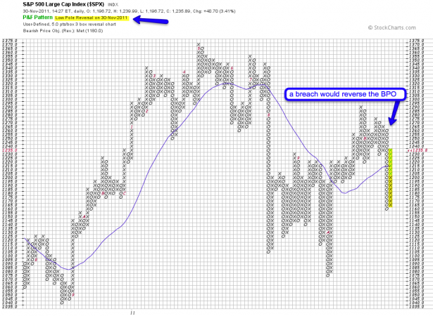
The P&F chart now shows us the low pole reversal warning I was waiting for – plus we are now back above that SMA. Bear in mind that the bearish price objective of 1180 was fulfilled but won’t be reversed unless we push above 1260 to trigger a bullish break out pattern.
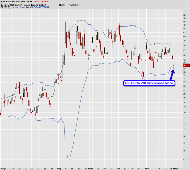
Okay, so much for the bull p0rn – you’re getting way to frisky, so let me hose you guys down with a bit of cold water. Mr. VIX is getting a bit close to the lower BB line – so the evil lair is now in VIX surveillance mode. As you know a close outside that lower line would be a first step into a VIX sell signal (relative to equities).
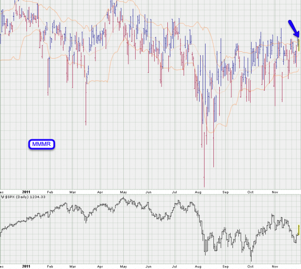
My mysterious market maker mind reader (MMMR), say that three times in a row, also seems to agree. Short term we may see a bit of a shake out shortly.
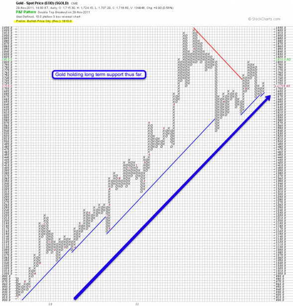
Before I go let me show you something completely different. This is my P&F gold chart and I just wanted to convey a point, which is that long term gold has remained extremely stable throughout all the recent hoopla. Bad or good economic headlines – this beast just keeps on ticking and if you are a gold bug what you really care about is that long term support line.
[/amprotect] Cheers,


