It’s Crowded At The Top
It’s Crowded At The Top
You’ve heard the old saying – ‘it’s lonely at the top’. Well, that is one of life’s lessons which most definitely does not apply to trading the markets. Quite to the contrary, mon frère – for the bulls it’s always very lonely at the bottom and usually quite crowded at the top. People are lemmings – they do what everyone else is doing expecting extraordinary results. With that mindset we’ll revisit some of our time tested momentum charts.
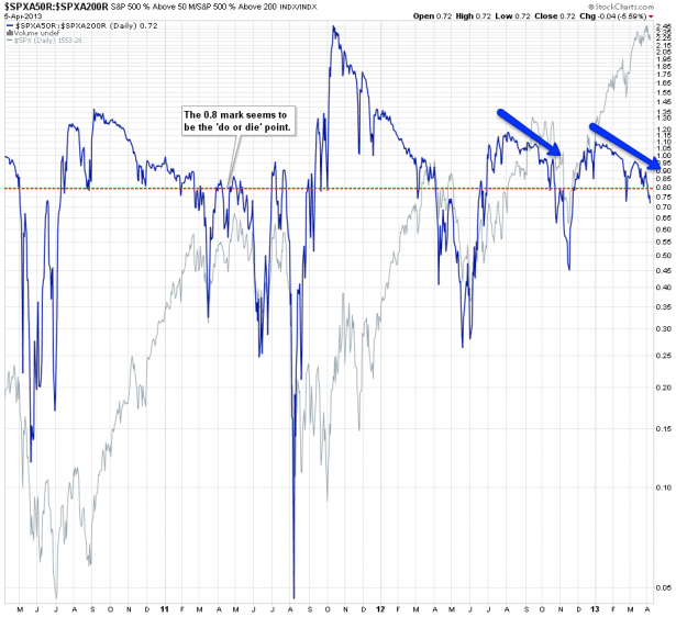
Let’s first look at market breadth – some of you may not be familiar with the term so I lifted the definition off investopedia: A technique used in technical analysis that attempts to gauge the direction of the overall market by analyzing the number of companies advancing relative to the number declining. Positive market breadth occurs when more companies are moving higher than are moving lower, and it is used to suggest that the bulls are in control of the momentum. Conversely, a disproportional number of declining securities is used to confirm bearish momentum.
And there you have it – the chart above shows you a ratio of two breadth indicators, the SPXA200R vs. the SPX50R (i.e. the percentage of all SPX symbols above their 200-day SMA vs. the percentage of symbols above their 50-day SMA). Rather apparent from just looking at the chart is that divergences usually result in market corrections. However, in the past few years (since QE became the ugly mistress of modern finance) those divergences can play out for quite a while. Usually the 0.8 mark on the ratio above was when things had a chance to slip. Doesn’t mean they have to – often we see that last minute bounce that puts the bulls back into the driver’s seat.
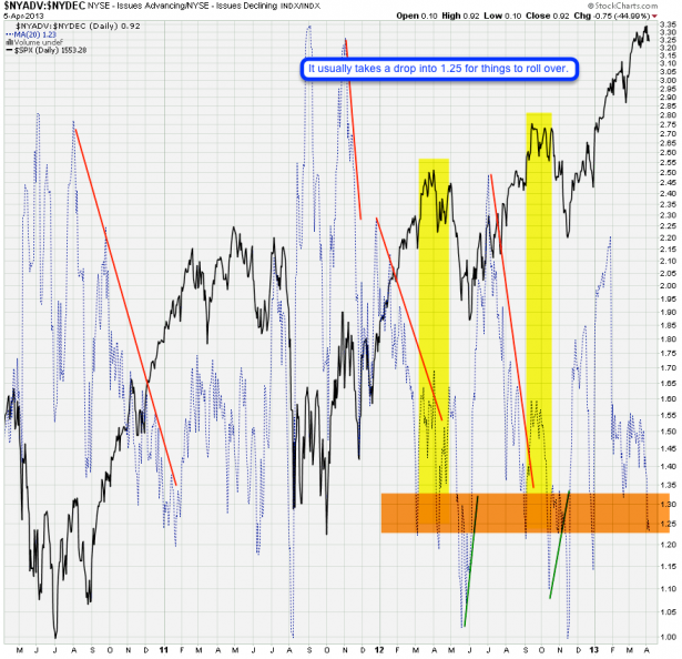
Now let’s look at advancing vs. declining issues across the NYSE. In yellow I have highlighted the periods when things finally rolled over after painting rather pronounced divergences for months. The orange horizontal cluster is where momentum usually produces a quick correction before buying interest streams back in to save the day. Yes, we are close right now but if you look carefully there’s always that last bump higher (what wave wankers refer to as that second wave) before gravity finally takes over. Hence you can’t use this chart to time a turn – you can only determine that conditions may be conducive to a correction (let that one melt in your mind for a while). I think we are getting close here but we must let price point the way – which is an exercise I pursue throughout the trading week.
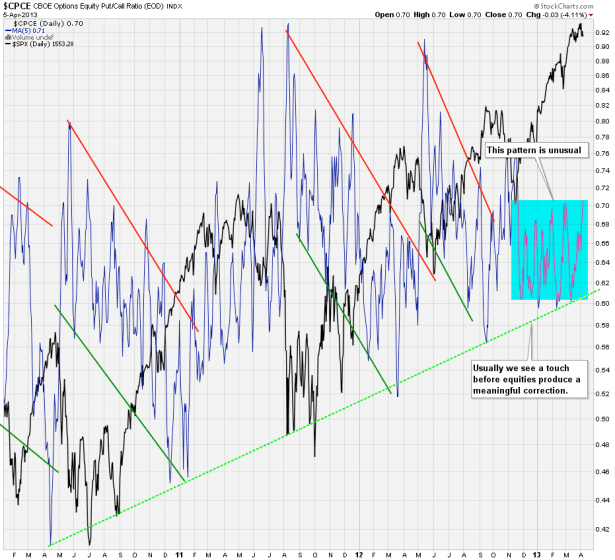
My CPCE Deluxe chart – put/call ratio on the CBOE. Now this is extremely interesting – some of you long term readers may recall that I called that green lower line the ‘beginning of the end’ – at least in the past a touch and a churn higher was necessary for a roll-over to occur. What we’ve been seeing in the past few months however is a new pattern that simply weaves its way sideways. There is frankly no telling how far this rally may run. But perhaps our trusted P&F chart may shed some more light on this question?
For that and more please step into my lair:

It's not too late - learn how to consistently trade without worrying about the news, the clickbait, the daily drama and misinformation. If you are interested in becoming a subscriber then don't waste time and sign up here. The Zero indicator service also offers access to all Gold posts, so you actually get double the bang for your buck.
Please login or subscribe here to see the remainder of this post.
Cheers,


