


Quantutorial – Garbage In Garbage Out
Quantutorial – Garbage In Garbage Out
One of my readers, let’s call him Francis, sent me an interesting email yesterday. Apparently he had been inspired by Scott’s original post on the use of scatter charts for what I call raw edge discovery (RED), for lack of a sexier term. So he proceeded to spend a significant amount of time on slinging spreadsheets in Excel, which can get quite involved and in my opinion is rather error prone as each extra condition requires the addition of at least one more column. His primary focus thus far had been mean reversion and he is now attempting to apply a similar approach to trending or momentum systems.
His main concern apparently is the right comparison periods. Should he compare post condition results with a longer previous timeframe, which then tries to isolate the intermediate term market drift and hope for a somewhat positive correlation? Bear in mind that trending systems have a pretty low win rate (i.e. 50% or less). So should winners in momentum or trending systems have a slope greater than 1 with an intercept toward zero (i.e. being steeper) to offset a low win rate, i.e, an acceleration above market drift?
Now before you read on please make sure that you’re caught up with my recent post on linear regression first. It’s rather short and to the point (especially given the topic) and I promise you that you will be able to fully grasp the concept of linear regression after reading it.
Back To The Basics
Anyway, these are great questions but pondering on all this actually made me circle back to some of the basic assumptions we seem to be making during system development as well as for RED. So let’s take a step back and ask ourselves WHAT are you actually trying to figure out and why. In essence we are attempting to find a best fit curve for a set of features. Each respective x feature consists of an x and and y value, e.g. 25, 40 as shown below.
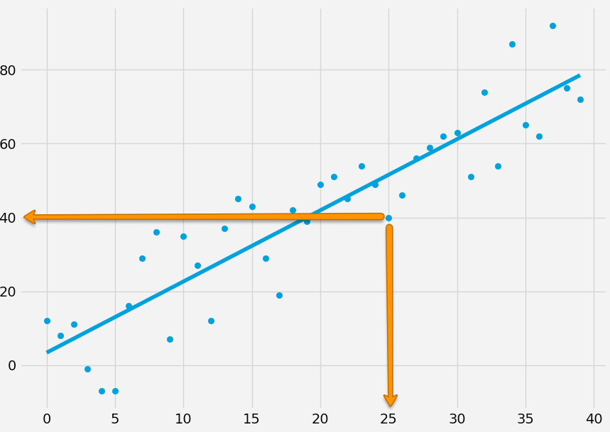
If you remember my previous post on linear regression you understand that all we are doing here are three things in order to solve for y = mx + b as well as r squared:
- We figure out m (the best fit slope) and b (the intercept).
- Then we produce ys of the best fit line by plugging m and b into each x value (y = mx + b). We now have a regression line.
- We then calculate our r or coefficient of determination. Basically this involves comparing the squared error of the mean of all the original ys to the squared error of all the ys of our regression line. That value then tells us how good our fit is.
But wait a minute. What exactly are we plotting here? Well, Scott’s post talked about mean reversion which involves defining some sort of market condition and then comparing the price delta prior and after said market condition, which effectively gives us xs and ys to be plotted in our scatter chart. But aren’t we making some very crucial assumptions? After all this is supposed to be ‘raw edge discovery’ but how raw can it really get?
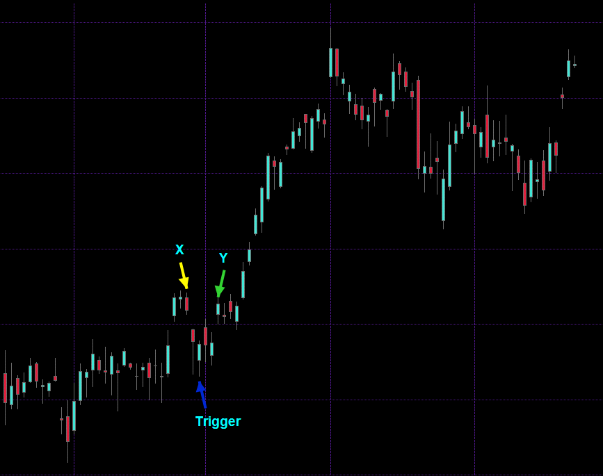
Here’s a chart of which I know nothing but that it’s a list of OHLC vectors which we visualize via candle bars. We want to perform RED for mean reversion, so what do we do? Francis’ approach thus far has been to somehow pick an entry condition (we get to that somehow further below) and then count back a certain amount of candles and measure the price delta. That gives him X. Now he counts forward a certain amount of candles and also records the price delta which now yields him Y.
So far so good. But being of discerning minds there are several crucial questions that should immediately occur to us. Let’s say we counted back three candles and counted forward three candles in order to arrive at X and Y:
- Why are we counting back three candles and then forward three? Why not back three and forward four or five? Or the opposite – count back four and forward two perhaps?
- Are we really measuring mean reversion here? Or is it simply the ability for price to revert back to its origin within x amount of candles?
- Why are we using candle intervals in the first place? In mean reversion are we given a timer for it to occur? (actually yes – which we can mathematically define by its half-life but you won’t like it what you get)
I’m sure you can think of several more questions but it all boils down to the fact that we are artificially defining an arbitrary range in hopes of discovering a market condition we can exploit. But if you look at the chart above then it becomes clear that by simply moving the measured window forward or backward will not produce the expected results. For one we would most likely wind up drowning in an ocean of noise which at best would obfuscate the much smaller number of positives that we are looking for.
We Need More Context
And there it is right there – we need more context. Because the vast majority of price series are not strictly mean reverting but follow a geometric random walk. It is the returns, not the prices, which are the ones that are usually randomly distributed around a mean of zero, but we can’t trade returns. Of course as traders we do not require a price series to be purely mean reverting in a mathematical sense, in that the change of the price series is proportional to the difference between the mean price and the current price. That just doesn’t happen in financial markets. But it suffices if price would be ‘somewhat’ mean reverting at times. Which is the very reason why we resort to using indicators, oscillators, or various statistical measures to hopefully increase our odds.
Is More More Or Less?
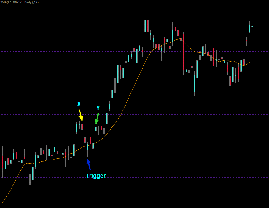
Interestingly the SMA on the chart above was added after I had picked the trigger and the x,y pair. So it seems my own personal perception of price series is subconsciously looking for price patterns I have observed in the past. Now that trigger candle just so happens to be a) a hammer and b) sits on top of that SMA. So we could conceivably introduce this as an additional condition in order to extract our x,y vectors/pairs/tuples. It would make a lot of sense but that in itself brings about a series of new questions:
- Why did I pick an SMA(14) [it was the default] and not an SMA(21) or SMA(50)?
- Why use an SMA in the first place and not an EMA or something completely different?
- For mean reversion, don’t we want to revert to the mean? So shouldn’t x and y be near that SMA and the trigger away from it?
- Do we really need to have a static count of candles for defining x and y or should we parse for a certain condition within a price window?
In particular 3. is a very interesting question as based on what I’m seeing on the chart I would probably be tempted to switch the trigger to the X mark and Y to where the trigger is. But why? Just because I’m looking at an SMA now? This goes to show how very random and subjective our own perception is. Right before I added that moving average the current arrangement seemed like a pretty good example of mean reversion to me. Now that I added more context I’m suddenly starting to see things differently.
Also 4 is something very well considering. In that particular case a supposed long campaign would have worked out fine but we would have been more profitable four candles later. We could for example define a window of let’s say eight candles and then record whether or not our target price was hit during that period. In addition let’s not forget that price continues to move and thus may change our target. What do you really define as mean reversion? The most purest form would be a reversal to the mean. But remember financial price series follow a random walk so that mean will continue moving as well. Which in turn can be approximated by a moving average.
Live With It
And all this and more are exactly the issues we continue to face even during the most ‘purest’ RED process I can envision. At some point we need to draw the line between RED and system development. On one hand we seek a pure evidence of a market inefficiency we may be able to exploit. On the other hand we are dealing with highly noisy data which requires at minimum filtering and additional price derivatives or correlations in order to separate the wheat from the chaff. Every single thing we do needs to be questioned and considered in the context of purity. In essence what we are looking for is a linear trading strategy which is truly ‘parameterless’. But such a thing cannot exist without compromise.
Garbage In Garbage Out (GIGA)
Now given all the above let’s one more time consider Francis’ questions about how to adapt RED to break out or trending systems. Well, it all depends on his xs and ys now, doesn’t it? When he was testing for mean reversion, was he really testing mean reversion or something else? Actually having seen his spreadsheets I know that he was using additional measures but I still felt that focusing on static candle ranges for x and in particular for y was somewhat unconvincing. Because at least in my mind (without yet having proven this however) I suspect that there is probably a high standard deviation within MR time windows. In other words it may take one or two candles to revert (if and when it does) or it may take seven or more. That in part also depends on the instrument traded as many futures contracts for example exhibit clear (realized) volatility patterns. Then there are roll overs and seasonality, etc. It just may be better to give yourself a window instead. Or not – we don’t know until we test for it.
Choose Your Input Carefully
The GIGA problem by the way is not just limited to mean reversion and scatter plots, which primarily deals with x/y values (you can have multiple dimensions but it gets ugly). It’s a significant and much under reported problem I see all across machine learning these days. Some of the most smartest people you ever run into seem to think for some reason that you can simply scratch together a set of arbitrary features (e.g. price, moving average, P/E ratio, volume, etc.) and throw those at a Neural Net, Support Vector Machine, Bayesian Network, etc. Which I can assure you from very personal experience will wind up failing quite spectacularly.
It doesn’t matter really what exactly you put in and what your specific belief system or market lens is, may this be purely technical, fundamental, statistical, or purely mathematical. What does matter is that you take extra care in defining your input and to think very carefully about why exactly you believe it offers value to your analysis. And then go about proving it.
Outliers
You may recall that Francis asked about the steepness of the curve and the intercept in the context of RED for trending or break out systems. I would expect those outliers to drive the best fit curve which produces a steeper curve. But only if one manages to reduce the noise factor, which is an inherent problem. Remember that linear regression uses squared errors to produce its best fit line, which by design normalizes and suppresses dominance by outliers. Now if you have noisy data then the noise will be dominant and the outliers you are seeking to identify will be dismissed as unwanted outliers. Linear regression can definitely work as RED for trend systems but it’s more complex as you will need to be extra careful about vector selection.


