Spiral Calendar Magic
Spiral Calendar Magic
As you know I’m an admirer of Chris Carolan who runs a pretty purist site for serious market analysts over at carolan.org. Chris is also the author of a book titled ‘The Spiral Calendar’ – unfortunately it’s out of print as it’s some of the best work on time cycles I have come across. I’m sure some you long term readers probably recognize his name as I’ve mentioned his SC market cycles in passing on several occasions and there is even a category dedicated to this.
Now, since the release of his book Chris has not been as prolific on the subject as I would have liked. To his credit, he does make occasional mention of SC cycles over on his blog, some of which I project into my own long term wave counts. However, I have not seen any in depth review of more recent SC cycles, which is exactly why I have been putting quite a lot of time into parsing for them on my own. Yes, it’s a tedious job – but someone’s got to do it why you guys are out hunting poon and getting into trouble.
This weekend I will reveal my own SC chart – one I have worked on for the past few months. Quite frankly – the spot on accuracy of the time cycles I was able to uncover surprised me – even after having read Chris’ book. This is not one to be missed, folks – I even suggest you print it out and plaster it on your wall – which is why I have sized it up quite a bit.
If you have no clue what the Spiral Calendar market cycle theory is all about then point your browser here for a quick and dirty introduction. You may also try to get your hands on the book – yes, it’s out of print but there are still used copies in circulation.
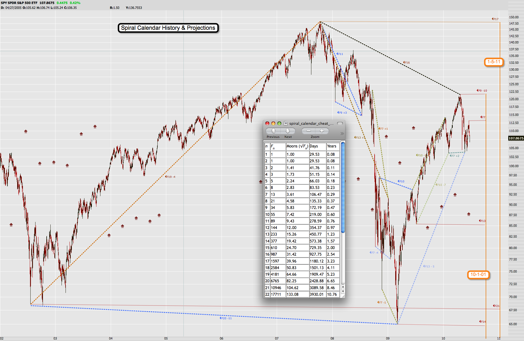
There she is – again, you probably want to open it in a separate window on your largest screen. If you have an iTampon – it’s great for zooming in/out of charts. For your convenience I have included my personal cheat sheet so you can map the days for yourself. I believe I have been pretty accurate in connecting tops and bottoms – when there was slippage I have added it to the label. Which means that if you don’t see any slippage the target date was hit spot on.
Before we talk about this chart I want to point out that it is not Chris Carolan approved. Meaning – he’ll probably see it for the first time himself and I hope he will decide to post some kind of response or rebuttal. I am probably not following his own rules to the tee – but I believe that it’s good enough for government work.
As you can see we are covering the last decade here. There are three very significant cycles that stand out immediately. The first one is the F19 cycle connecting the 2/24/2002 low to the 10/11/2007 high. Slippage: -4 out of 1909 days! That’s 2/10th of one percent.
The second one that really blew me away is the F17 cycle connecting the 2/24/2002 low to the 3/9/2009 low. Slippage: -11 out of 2429 days. That’s 4/10th of a percent.
The third one is the F16 cycle connecting the 10/11/2007 high with the most recent 4/26/2010 high. Slippage: NONE out of 928 days. That is simply incredible to say the least.
Beyond those really big whoppers there are plenty of smaller ones I have highlighted. One I should definitely mention is the F13 cycle connecting the 10/11/2007 high with the 1/05/2009 high (final high before the final low in March). Slippage: +1 of 450 days. Again, that is 2/10th of a percent.
Of course looking into the past is one thing. Projecting further out is where the rubber meets the road – unless I get to finish that damn time machine I have been working on (project received financial backing by Michael J. Fox). Of course a major consideration I kept in mind when attempting to arrive at candidates for future lows was my own wave count – so, maybe this is a bit biased. Remember that those cycles do not necessarily predict lows or bottoms – just time cycles. It’s possible to connect lows with tops and the inverse.
However, if you like me believe that the market remains in a down trend (more about that further below) then there are two target dates that stand out. One of them is 10/1/2010. The second one is 1/5/2011. The thin lines on my chart shows how I arrived at these two dates and I find them realistic in the context of my current long term wave count.
Which is shown on my long term Dow chart. I have taken the liberty to propose a possible scenario for these two dates as part of the current Intermediate wave down. Now, it’s very much possible that 1/5/2011 will be the end of Intermediate (2) instead of Intermediate (1). Absolutely a possibility, and I wanted to make sure you all understand that this is but a simple projection – one that could evolve into a variety of scenarios.
The astute reader may also notice that I have only labeled that entire drop as Intermediate (1) – which may surprise you. Yes, I am not a believer in the ‘double dip’ theory. What looms ahead is a large degree market correction no market participant has ever come close to witnessing. Frankly I don’t think we find a final bottom until the Dow touches at least the 3000 mark. There will be spikes and snap backs in between – but it won’t change the final outcome. Be prepared – mentally, emotionally, financially, and physically. Get out of debt now – and reduce your spending to a bare minimum.
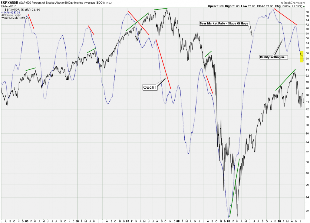
I mentioned the long term trend above – now let’s look at some evidence. You know this chart by now – I introduced the SPXA50R a few weeks ago and it actually created a bit of a stir – even Yelnick mentioned it on his blog. The highlighted area shows us that we continue to drop, which of course is bearish.
Its more long term brethren – the SPXA200R chart looks identical – as expected. Bearish. Despite the fact that we briefly pushed above the 200-day MA on the SPX during that blip up. Remember what I told you about average vs. median and you will soon abandon this simple and completely overused market indicator (which curiously still drives buy/sell decisions inside many large funds – so much for ‘advanced market analysis’).
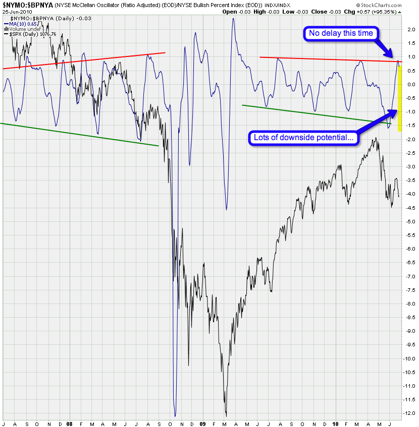
More medium term it was interesting to see a turn of the NYMO:BPNYA ratio chart to be accompanied by an actual price swing as well. Almost feels like the good ole’ days (i.e. 2008). However, bear in mind that we could still trace out Soylent Green while this thing descends – so don’t get complacent on a medium term basis. In any case – there’s much downside momentum to burn off as that tiny spike up off the 5/25 lows managed to completely burn off any upside potential on this chart. Which is what I meant a week ago by saying that the bulls exerted a lot of energy getting the tape to that 1130 mark.
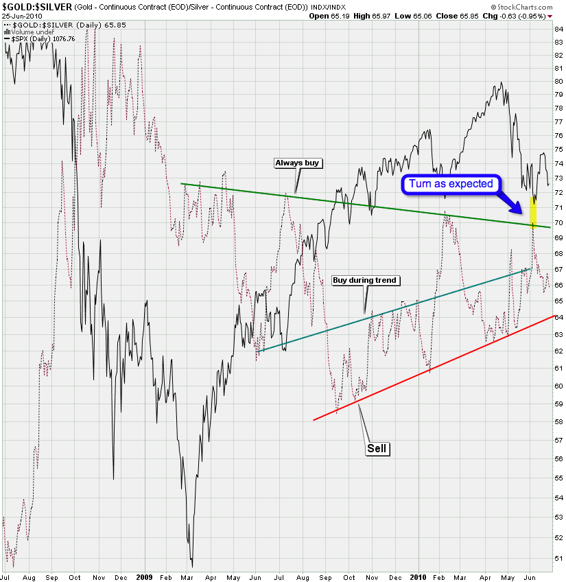
I was pretty stoked when the gold/siver ratio turned exactly where I thought it would – along with equities of course. Also interesting is that we are already pushing lower but are not spiking up on the ratio. Which means more downside potential before we touch that green line again.
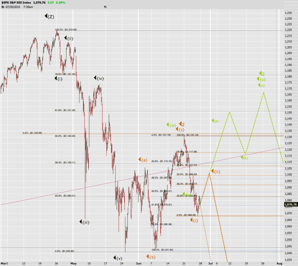
Short/medium term I see two (and a half) scenarios with the highest probability. I do think we’re getting a little bounce here so, Soylent Orange probably takes us towards 1100 before we continue downwards. Soylent Green is still a real possibility and if we push beyond 1120 then we most likely get a summer of pain before the fun for the bears starts.
Maybe now you appreciate why I am so stubborn about my long term puts and why I will probably add more positions should we be so ‘lucky’ to get another bounce into Soylent Green. In my (not so) humble opinion: Long term this market is completely screwed – the writing is on the wall. I can see clear bearish signs on my momentum charts and when I correlate those with my spiral calendar chart then I have a hard time imagining that we are going to make new highs by October. Of course price is kind in the end and if we push up to levels that make P3 almost an impossibility then I will lick my wounds and adjust my projections accordingly. Thus far I see very little reason to entertain any long term bullish scenario – if I do you will be the first ones to know.
Cheers,
Mole


